
the THERE, THERE quarterly, Volume One, Issue One
Travis Shaffer
Featuring Zora J. Murff, Cian Oba-Smith, and Terrance Purdy
2019
theretherenow.
www.theretherenow.com
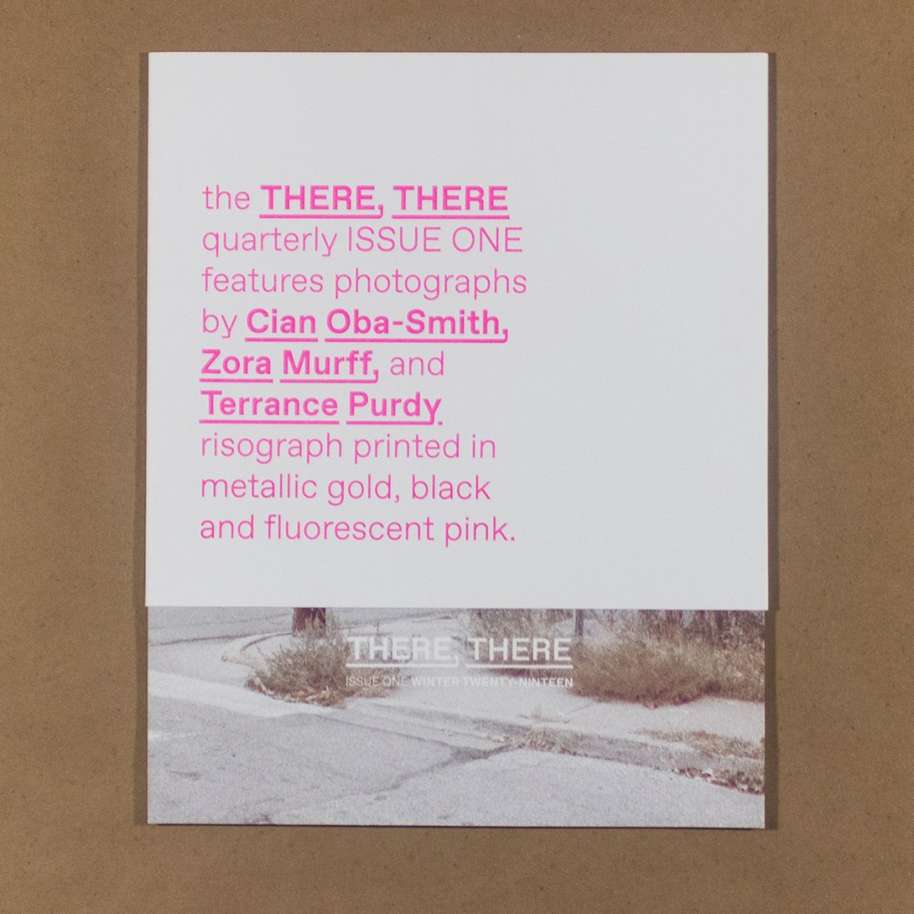
10 × 12.5 in.
18 sheets
Unbound, gathered in a belly band
Risograph
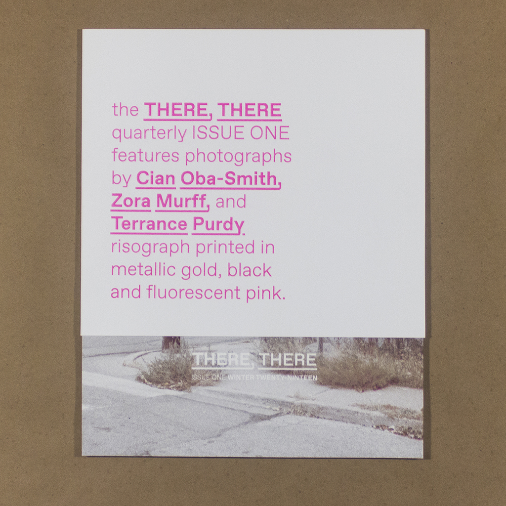
the THERE, THERE quarterly is a new photo publication from Travis Shaffer’s imprint, theretherenow. Volume One, Issue One establishes the format: work by three photographers is Risograph printed and gathered in loose sheets by a belly band that practically qualifies as a slipcase. It is published in a limited edition of one hundred copies. Drawing on photobook and portfolio traditions, the THERE, THERE quarterly argues for a re-evaluation of the status of the photo print and limited edition. Mediation supplants mimesis, challenging alike the photomechanical facticity of a darkroom print and the endless pursuit of higher resolution in digital photography. Shaffer makes his case through the publication’s structure, layout, and print production. Print production is especially important to this exploration, with the Risograph serving as a sort of lodestar – commercial and artistic, analog and digital, unique and multiple, not yet pigeonholed into a single art practice or academic discipline. In this interdisciplinary territory, the THERE, THERE quarterly poses exciting questions for photography.
The issue consists of seventeen prints with photos on the front and numbers on the back. The layout is such that the numbers aren’t needed to keep the prints in order, but they do let the reader match the images with their creator. Issue One features Zora J. Murff, Cian Oba-Smith, and Terrance Purdy. A bio of each artist is included on an eighteenth sheet with the image list and, on the reverse, a colophon and editorial statement from Shaffer. The belly band containing all this is boldly printed with the title, artists and ink colors (this text is fluorescent pink).
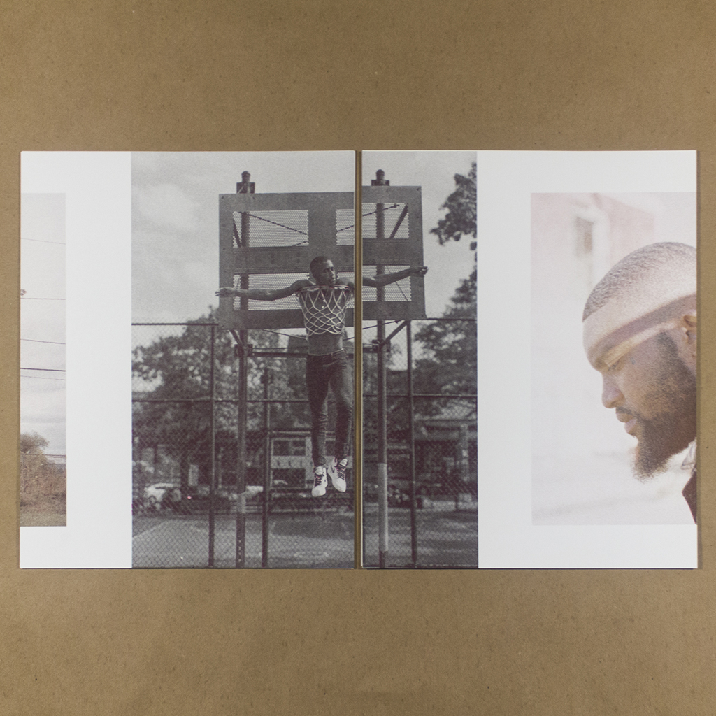
Though the prints are numbered, the photographs are laid out across two sheets each, challenging the status of the photographic print as a unit. Like any good artists’ book, the content and structure guide the reader toward a suitable approach – in this case viewing two prints side by side, with a discard pile off to the side. The reading experience is fresh but familiar, somewhere between a portfolio, a book, and a horizontal scrolling portfolio website. The images are split across each sheet differently, creating a set of unique and asymmetrical compositions. The result propels the reader forward since the next sheet must always be viewed in order to complete the image.

This amplifies both momentum and meaning, creating three relationships in each “spread” of two sheets. The central image, synthesized across the “gutter” of both sheets, relates to the image fragments on either side, which also relate to one another. This simple device provides a dynamism not available to a conventional portfolio with images viewed one at a time. It also requires that the sequence is considered temporally and spatially, like a bound book. The spread of sheets eight and nine illustrate the effect well: a man’s head, facing left, exits off the left while a horse’s head, looking the same direction, enters on the right. The interplay of these images frames the central scene: two figures in front of a brownstone seen from across a desolate intersection.
Like its structure, the publication’s print production exerts considerable influence on the meaning. Shaffer highlights the importance of Risography, placing the colors front and center on the belly band alongside the title and contributing artists’ names: “[R]isograph printed in metalic gold, black and fluorescent pink.” In the back matter, he writes: “The RISO is our campfire. Institutional by design but co-opted by artists. Absurdly analog method of digital printing. Subversively resisting the service to content inherent to the publishing paradigm.” Thus, the quarterly’s print production serves to further challenge and complexify the status of photography and the meaning of publishing.
In this case, the unusual color separation is particularly well-suited to the content. All three photographers deal with representations of blackness. Representing skin tones with metallic gold, black and fluorescent pink ink seems to speak to the constructedness of race through media, and the history of photographic processes erasing, or at least ignoring, marginal identities. Issue One strikes a good balance between the meta questions – the friction between Risography and photography – and the projects of each artist.

The artist bios stand in for an editorial statement, presenting broad lines of inquiry and leaving plenty of room for interpretation. Each artist is concerned with race and representation, but their individual approaches contribute something different to the quarterly. Zora J. Murff contributed photographs from his series At No Point In Between. His work examines the interrelationship between people and their environment, and this project looks at the lasting impact of redlining. He takes on the challenge of representing a catastrophe so slow people barely notice, a stark example of the aesthetic dimensions of politics. The images are melancholy, the tired boredom of a hot summer afternoon. His portraits are more expressionistic, intimate and closer cropped than Oba-Smith’s full bodies and sharp lines.
Cian Oba-Smith does share an interest in the relationship between people and their environment. His series Concrete Horsemen examines a subculture of black horsemen in urban Philadelphia. By delving deep into this little-known community, he challenges dominant narratives about black men in the US. His jarring juxtapositions show just how shallow are the monolithic racial identities rehearsed in media and political rhetoric. His compositions riff on art-historical equestrian poses, but include dilapidated buildings and telephone poles. Many images have a substantial depth of field to allow these incongruous urban background elements into the portrait. He emphasizes the dreamlike quality of these strange combinations with soft natural light, muted colors, and light exposures.

Oba-Smith takes a similar approach in Andover & Six Acres Estates, named for two housing complexes in London. In this case, he explicitly challenges a narrative of crime and poverty that has been constructed around a community. Yet, he does so with the same authentic curiosity, taking the time to immerse himself. Oba-Smith forges a connection with his subjects, and the images – candid, but never voyeuristic – benefit from this practice. The work presents an effective counter-narrative, but does so through open-minded observation.
Terrance Purdy takes a more active role in staging his subjects. He uses expressive lighting and a limited color range to construct moods and metaphors that distinguish the work from the more documentary modes of Murff and Oba-Smith. Skin and hair play a pivotal role in Purdy’s exploration of race and identity, and his visual style seems perfectly calculated to emphasize these elements. The influence of fashion photography is clear in his work, but he approaches fashion and consumption with a critical eye. While Murff and Oba-Smith seek to move beyond stereotypes, Purdy assaults them head on. One particularly arresting image shows the Christ-like figure of a young black man, crucified on a basketball hoop in a part. Purdy expertly draws the viewer’s eye to the point of highest contrast – the subject’s bright white shoes emblazoned with a black Nike swoosh. The image recalls Hank Willis Thomas’ works examining the commodification of black bodies in sport. However, Purdy rejects the stark, empty backgrounds of Thomas’ images and aligns his work with the rest of the quarterly by connecting the human subject to their environment.
This thematic through line is supported visually by the unifying effect of the Risography’s coarse halftone and limited color palette. The extent of this effect is easy to assess since the publication’s website features the same image sequence without the mediation of print production. The images are interwoven, with never more than two consecutive photos by the same artist. This integrates the various approaches taken by each photographer and contributes to the rhythm of the sequence. The combined work makes a powerful case for the role of the aesthetic in the politics of race and identity. Through their varying approaches to the broader context of social and economic factors, these three photographers show how artists can contribute meaningfully to conversations about race at this critical moment.
The tension between Shaffer’s vision and that of the photographers is productive and satisfying. There is enough content for the reader to encounter the images in their own right. The structure and print production eventually take a back seat, especially after the first reading. Nevertheless, the material object maintains a presence. Readers will likely look closely at the color separations, and reassembling the sheets with the belly band engages the reader in a way that stacking prints back into a portfolio or museum box doesn’t. As with any curatorial project, the success will be determined ultimately by the selection of photographers that benefit from a dialog with one another and with the material constraints of the print process. This first issue of the THERE, THERE quarterly sets a high bar.

Leave a comment