
Below you’ll find the most recent artists’ book reviews and interviews. See the submissions page to find out how your book can be featured.
-
RAGE PEN
RAGE PEN
David Blackmore and Michael Hampton
Folium
2025108 pages
8.25 × 5.83 in. closed
Perfect-bound softcover with perforated fore-edges
Xerox printing with embossed cover
Edition of 100
In 2017 artist David Blackmore turned his studio into a rage pen (rage room for American readers) and invited anonymous collaborators to vent their frustration by destroying a symbolic object. Blackmore documented the participants’ destructive actions with photo and video, but first he interviewed them about the source(s) of their frustration — and had them sign a liability waiver. RAGE PEN presents some of this photo documentation along with context about rage in society and destruction in art. The book’s most striking feature is its perforated pages, which remain folded at the fore-edge. One must rip these seams open to read the book. Any psychological discomfort this may cause is eased by the fact that the top and bottom edges of the text block have already been trimmed, to put it mildly, using a miter saw. (In fact, Blackmore chopped the books down in a live performance at the book launch.) The difference between power tools and perforation exemplifies the tension RAGE PEN sustains between frustration and catharsis.

RAGE PEN achieves this tension by withholding as much as it discloses. Readers expecting access to the interviews between Blackmore and his ‘ventees’ might be disappointed, or rather, frustrated. We do get to read the liability waiver and the email Blackmore used to solicit participation, but the bulk of the book is photographic documentation. The photographs are sandwiched between an introduction by Michael Hampton, an artist and writer whose expertise includes artists’ books and destruction in art, and a conversation between Hampton and Blackmore. Both texts add substantial cultural and art historical context without detracting from the book’s transgressive thrust. There is also a reading list, which offers interdisciplinary perspectives on destruction.

RAGE PEN is carefully sequenced, so it retains a strong sense of rhythm even once all the pages are cut. Many of the photographs alternate between action shots of participants smashing their chosen objects with isolated close-ups of the tools of destruction: a sledgehammer, baseball bat, hurling stick, and so on. Blackmore splits the close-ups across the gutter; one page emphasizes the tool’s handle, inviting the reader to take part, and the other page shows the business end, scuffed and scratched from use. No such details are visible in the action shots, where bits of debris fly through the air with remarkable force. Interrupting these are quieter moments, where the absent participant leaves the light gray background to fill most of the frame, and the remnants of their unfortunate object occupy only a fraction of the page.

These mostly empty spreads enhance the book’s pacing, but they also serve to frustrate the reader. At times, Blackmore leaves the most satisfying, salacious part of an image outside the book’s margin or buries it inside the gutter. Other images are stills from videos we are not invited to watch. A pair of safety goggles, cropped in half, and a shattered mirror evoke the reader’s limited vision. Likewise, a pair of earmuffs, neatly stacked with a face shield and protective coveralls, reminds the reader of the immersive, multisensory experience they are not, in fact, experiencing. No doubt Blackmore’s background in socially engaged art helped him calibrate this relational exchange between book and reader.

Which is to say, RAGE PEN also offers pleasure. The perforated pages emit a satisfying zip as they are separated (I used a bonefolder, but a ruler would also work). The sawn edges feel as luxurious as the deckled pages in a fine press book — only more subversive. (Blackmore is at pains to reject the fetishistic consumerism of much art publishing, though RAGE PEN is a well-crafted object.) If the goggles and earmuffs remind the reader of what they are missing, the safety gloves draw attention to the book’s tactility. Further, by withholding as much as it does, RAGE PEN requires the reader to more fully imagine what it’s like to attack a printer/scanner with a sledgehammer or bludgeon dinnerware with a baseball bat. The reader might even imagine what object they would choose to destroy, and what frustration it would represent.
Perhaps to leave room for the reader’s interpretation, RAGE PEN avoids prescriptive formulae for frustration, rage, destruction, and creation. By referring to 1960s artists like Gustav Metzger, the book posits destruction as a calculated response to consumerism, a major theme in Blackmore’s art, not just an outburst of frustration. However, this distinction may support Hampton’s contention that rage is on the rise. The fractious politics of 1960s Britain — Metzger’s circle participated in the Campaign for Nuclear Disarmament, for example — might only be surpassed by the Brexit referendum, which occurred while Blackmore conducted his initial research into “frustrative violent acts.” It is telling that RAGE PEN could be published nearly a decade later and still feel vital.
In fact, in today’s context, it may be rage — as opposed to Metzger’s cooler conceptualism — that retains the creative potential in destruction. The populist politicians who call for the creative destruction of the status quo (“take back control,” “drain the swamp,” etc.) never hesitate to suppress authentic outbursts of rage among the people. As Hampton writes, “Rage needs to be quelled, kettled, stopped, punished.” Blackmore shows that destruction, even contained within a studio, can transform individuals and create new social relationships.
-
One More Day
One More Day: A Collection of Collections
Sonny Meno-Gutierrez
202672 pages
8.5 × 8.5 in. closed
Perfect binding
Digital printing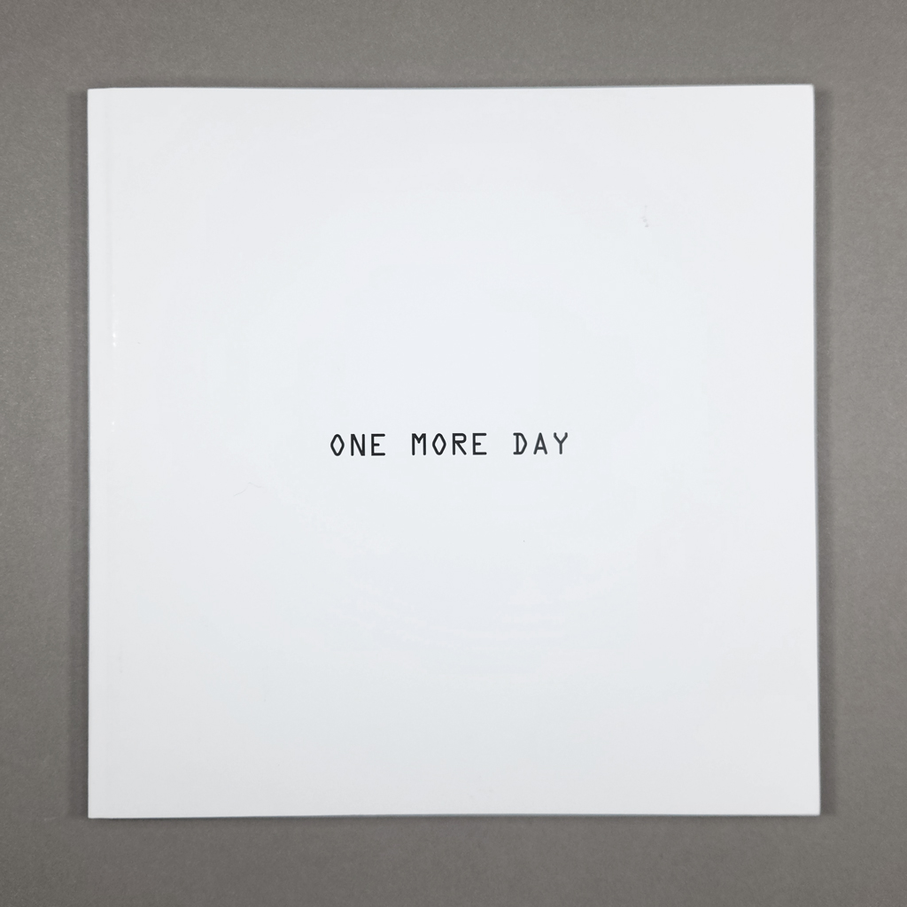
One More Day is an omnibus edition of photo series by Sonny Meno-Gutierrez. Some of the projects already exist as separate photobooks, but they function differently within One More Day. The book is, as the subtitle puts it, “a collection of collections.” Some of the photo series are obviously collections, but in other cases the collecting framework accentuates features that might otherwise be overlooked. Like any good collection, One More Day broadens and deepens the meaning of the works that comprise it.
Much of the photography has a deadpan aesthetic, and Meno-Gutierrez is clearly influenced by the likes of Bernd and Hilla Becher and Sol Lewitt. The series 29 Mattress Firms was previously published as an homage to Ed Ruscha’s Twenty Six Gasoline Stations, and the title One and Four Sons nods to Joseph Kosuth, while the series itself echoes Douglas Huebler. For a more contemporary reference, One More Day looks like something from Joachim Schmid’s 96-volume series Other People’s Photographs. Except, importantly, Meno-Gutierrez makes his own photographs, even when they look like found snapshots. What makes Meno-Gutierrez’s work particularly interesting is that he harnesses the aesthetics of photoconceptualism to different ends. Unlike the largely white canon of conceptual art, Meno-Gutierrez is a third culture kid, CHamoru and Chicano, who was born in Guam and moved around in a military family. By collecting pieces of place and time, Meno-Gutierrez locates himself, wherever he is.
Like LeWitt’s PhotoGrids, One More Day is a square softcover with black title text set in the center of the bright white cover. The OCR-A typeface recalls the Quartz Date timestamps that appear in some of the photographs (Meno-Gutierrez shoots on film). Similar title pages identify each series inside, but there are no page numbers or headers that might distract from the images. The photographs, scanned from prints, reproduce well on the coated stock. Which is not to say that these are technically ‘good’ photographs. Some are, but others look more like crime scene snapshots than conceptual deadpan. Meno-Gutierrez is not interested in the decisive moment so much as the aftermath.
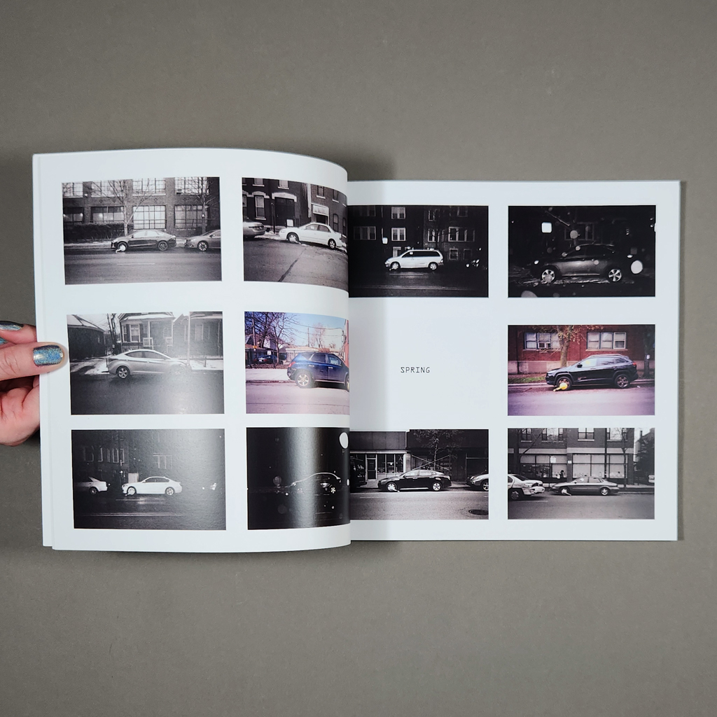
Boot Season exemplifies Meno-Gutierrez’s preference for duration. The boots referenced in the title are, in fact, those put on parked cars. Unfortunately for the drivers of Chicago, boot season never ends: the photographs are arranged into fall, winter, spring, and summer. Each page has two columns of three horizontal photographs, some color and some black and white. Even as the time of day and weather change, the compositions are quite consistent. The booted car is centered, shot in profile from across the street. The array is impressive, but the individual photographs reward close looking. The state of the car and its surroundings tell a story.
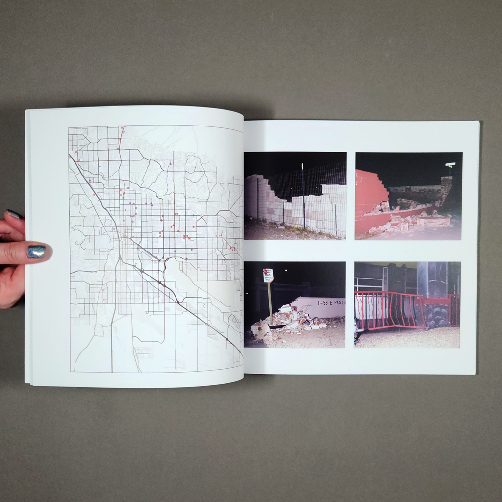
College Town Consequences is another collection of motorist misfortune: a grid of broken fences, walls, signposts, and anything else that stood in the way of an errant driver. The scenes are photographed at night, illuminated by headlights or camera flash, lending them the look of a tabloid magazine, if not a police file. They are visually reminiscent of Andy Warhol’s Death and Disaster Series, except for the critical fact that the cars are missing. Again, Meno-Gutierrez focuses not on the moment of impact, or even the immediate aftermath, but on a longer duration. A crumpled bus shelter has been cordoned off with caution tape. A cartoonishly bent wrought iron fence has been patched with chain link. If these provisional repairs suggest healing or resilience, there are also wounded trees whose survival is less certain. Collected over several years, the thirty-five photographs take a longer view of disaster and its impact on a single community.
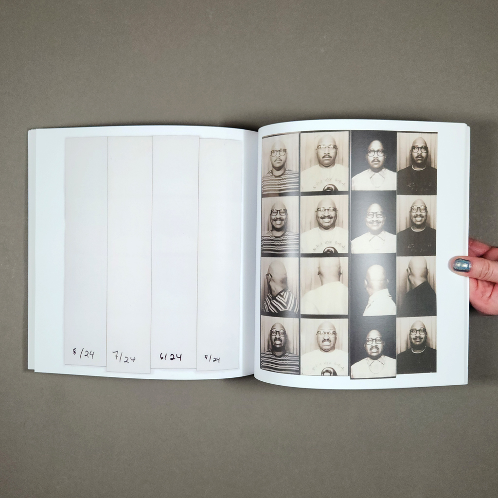
One and Four Sons is just a procedural as Boot Season or College Town Consequences, but the result is more personal. It is a collection of self-portraits, made in a photo booth, each month from January 2024 to December 2025. Dates are hand-written onto the backs of the photo strips, which are revealed with a turn of the page. Each strip has four images, and each one follows the same formula: the artist is deadpan, he smiles, he turns his head, and he grimaces. The order occasionally changes, probably by accident, but the four faces are as consistent as Meno-Gutierrez’s appearance: glasses, mustache, shaved head. Glimpses of personality come through in dress and undress, but the most authentic thing captured may be the artist’s commitment to the process. By using a photo booth, which is both a place and a camera, One and Four Sons distills the way Meno-Gutierrez constructs and performs identity through place and time.
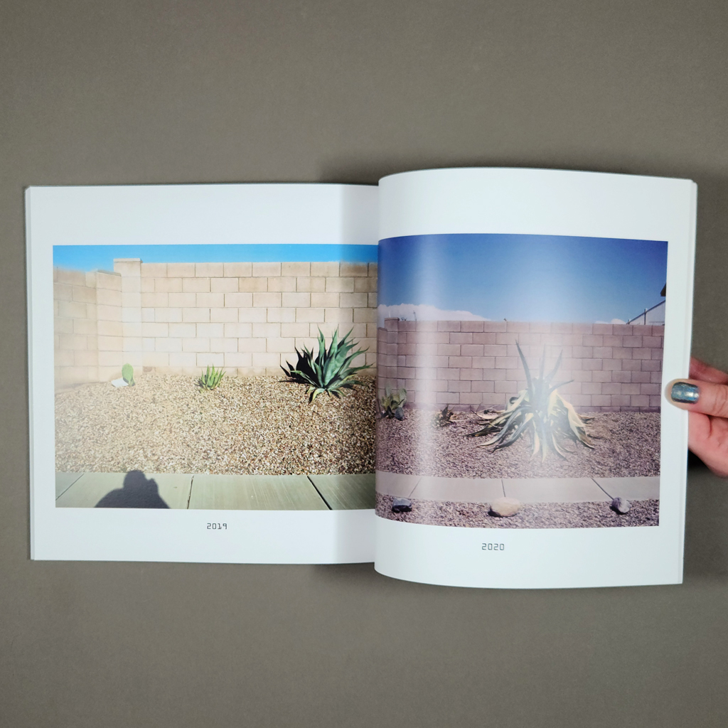
One More Day concludes with Existential Check-In, a series spanning 2019–2026. The photographer is back behind the camera, but the work seems even more personal than One and Four Sons. The subjects are three succulents: a prickly pear, an agave, and a larger agave of a different species. Over eight pages, each with a single photo and a caption with the year, we see the plants struggle, wither, and grow. (It is hard to say whether one or two may have died and been replanted.) The style is, again, deadpan. The plants have been dropped into a desolate strip of gravel between a sidewalk and a block wall, which serves as a neutral backdrop. Above the wall, a strip of desert sky adds a shock of color. Meno-Gutierrez casts a shadow into the first image, identifying himself with the subjects he will return to over the next seven years. Like Meno-Gutierrez’s monthly visits to the photo booth, it seems more like we are checking in on the photographer than on the plants — especially as the project covers the COVID-19 pandemic. Perhaps because of this identification, it is surprisingly gratifying to see the plants flourishing by the end of the sequence.
One collection that does not appear in One More Day — but could — instead comprises Meno-Gutierrez’s zine After Words. The zine pairs portraits of (mainly hardcore) musicians, taken after their set, with their hand-written response to the question, “what’s a lyric that you like to perform?” Yet again, Meno-Gutierrez focuses on the aftermath instead of the main event, although he does include some action shots, which account for the musicians’ bedraggled appearances. I mention After Words, and the challenge of photographing music, because it typifies Meno-Gutierrez’s larger attempt to reorient photography away from instantaneity and toward duration, where the medium confronts its limitations in interesting ways. The difference between a linear progression, like the growth of a plant, and a collection of separate instances, like car accidents, is only apparent. Zoom out far enough, and a line becomes a point. Zoom in close enough, and the point reveals a story.
-
Typesetting on a Winter’s Afternoon
Typesetting on a Winter’s Afternoon
Michael Koppa
Text by Raymond Stanley Nelson, Jr.
The Heavy Duty Press
201892 pages
4.5 × 6.5 × 0.5 in. closed
Sewn signatures attached without adhesive to stiffened paper covers; contained in a folded paper enclosure with an explanatory insert
Letterpress printing
Edition of 26 copies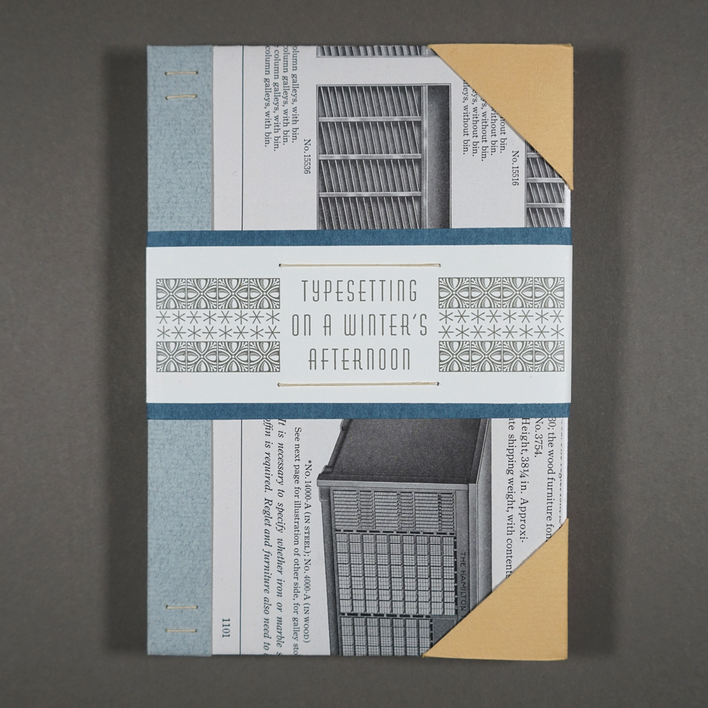
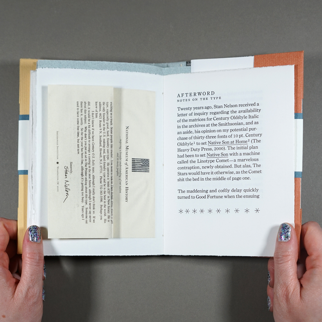
Typesetting on a Winter’s Afternoon was the first book Michael Koppa produced after reinaugurating The Heavy Duty Press in 2016. It is a fine press edition of Raymond “Stan” Nelson’s story, which was initially enclosed in a letter from Nelson to Koppa and later published under the same title in the journal Parenthesis. This backstory — and there will be more — is essential to appreciating the book, because it is largely about the relationship between the text and its paratext — not just the foreword, afterword, and colophon but everything that goes into a fine press publication of such ambition and quality. Chief among these things is time. Typesetting on a Winter’s Afternoon is a contemplation on time, endings, and afterlives.
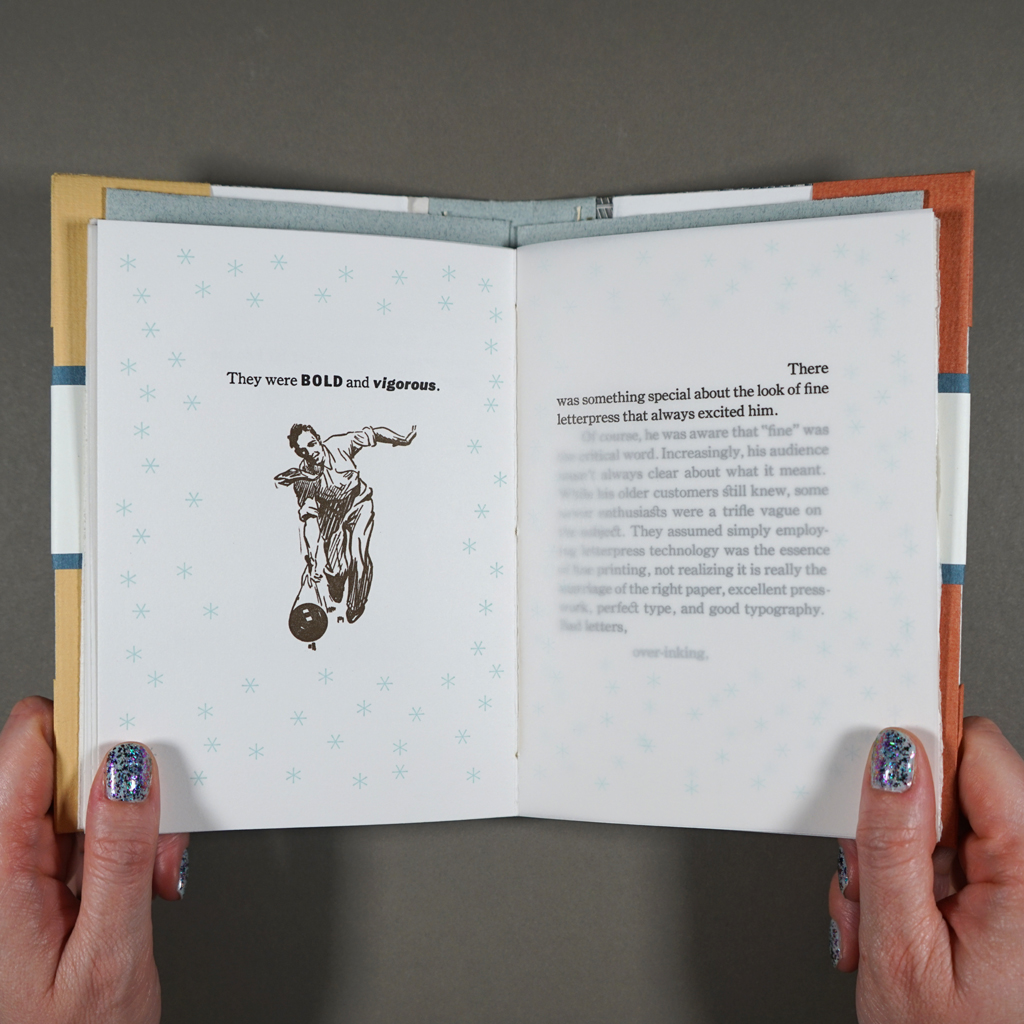
Illustrations by Koppa accompany an edited version of Nelson’s text. Tipped into the afterword, there is also a scaled down, digitally printed facsimile of Nelson’s 1998 letter to Koppa, which would eventually set the project in motion. Before I address each of these elements, I must stress that the reading experience is more than the sum of its parts. To quote Nelson’s narrator, fine printing is “the marriage of the right paper, excellent presswork, perfect type, and good typography.” Indeed, Typesetting on a Winter’s Afternoon is printed impeccably from foundry type on three well-chosen papers. The non-adhesive binding with stiffened covers is clever and original but not distracting. It allows the book to open easily without feeling delicate. Yet, Typesetting on a Winter’s Afternoon exceeds Nelson’s standards. Even as the book calls attention to its own paper, printing, and binding, it is clearly about more than fine printing.
The book’s covers hint at its paratextual backstory. Each copy of the edition is bound in pages from a 1923 American Type Founders Company catalog. It was Koppa’s quest, in the early days of The Heavy Duty Press, for 10 point Century Oldstyle Italic that put him in touch with Stan Nelson (along with Don Black, Fritz Klinke, and Theo Rehak). At the turn of the twenty-first century, when digital technology had rendered letterpress commercially obsolete but not yet made it easy for printers to communicate online, this is what it could take to find a font of type: a Linotype technician in Toronto (Black), a letterpress supplier in Silverton, Colorado (Klinke), the ATF’s last employee, recently retired (Rehak), not to mention the head of the Smithsonian’s Graphic Arts Collection (Nelson). Koppa provides an extended statement on all this, plus the book’s production, on a separate sheet folded loose into the book’s enclosure. I rehearse this history not to namedrop letterpress luminaries but to show the proverbial village behind the scenes that unfold in the book’s narrative.
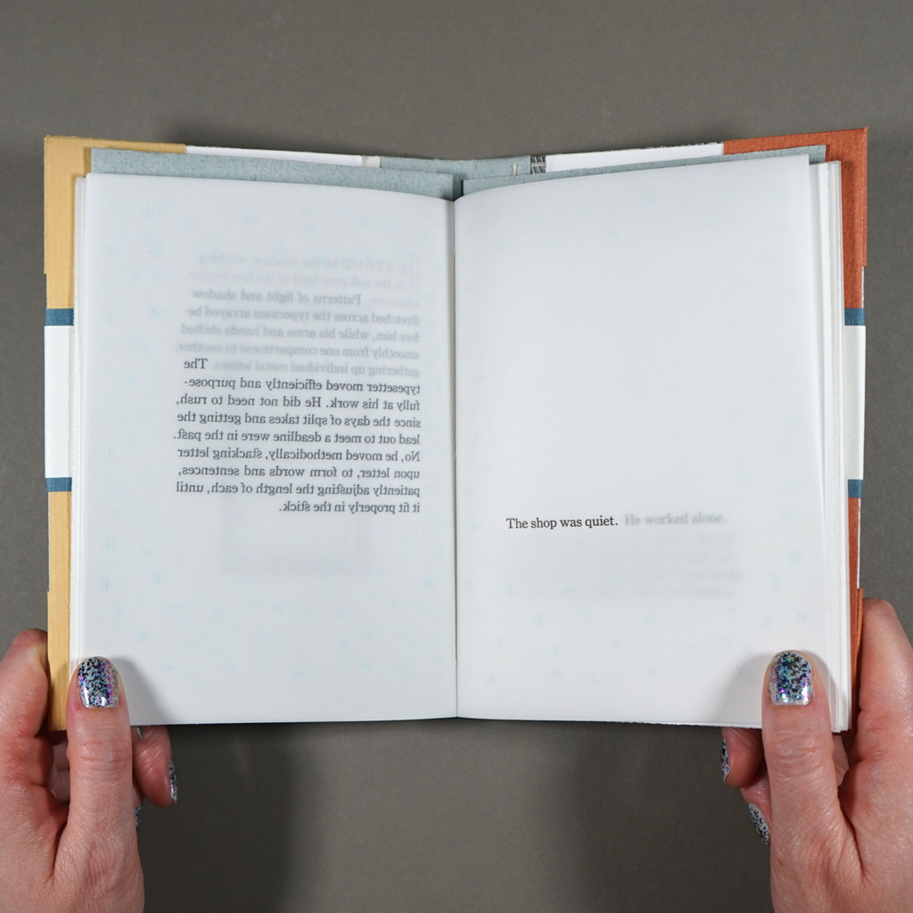
In contrast to Koppa’s tale of correspondence and serendipity, Nelson’s story is about solitude, methodical work, and contemplation. I’ve referred to Nelson’s text, written in close third-person perspective, as a story, but perhaps it would be better to say memoir or lyric essay. In any case, the narrative presents a printer, presumably middle aged, as he sets type alone in his shop and reflects on the past and future of fine printing. References to “electric lights” and the cold tubes of a radio make it hard to place the story in time. If it takes place in 1998, the protagonist is certainly old fashioned, but that is hardly a surprise for a letterpress printer. A central motif is a weight-driven clock, which the printer inherited from his grandmother and winds every Monday. The clock is not alone in representing a precarious balance between finitude (the grandmother’s death) and continuity (its weekly winding). Running out sorts, the printer muses that he can order more metal type — but for how much longer?
What Nelson seems to value is continuing to work, slow and steady, in the face of finitude. Like the clock, the typesetter rhythmically sets letter after letter, line after line, page after page. He dutifully proofs his type before leaving the studio, and he will make corrections in the morning. We learn that the printer has children, but there is no didactic reverie about passing down his craft to the next generation. Instead, the printer upholds his standards, even as the world around him changes. He is no longer driven by deadlines but by his own appreciation for the craft: “He had done a satisfying day’s work, and tomorrow would be tomorrow.”
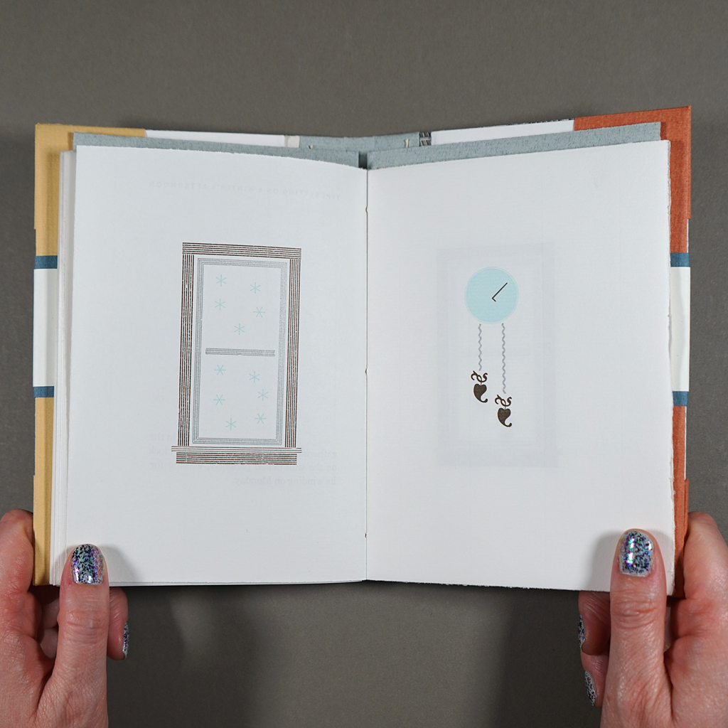
Nelson’s text sets a high bar for Koppa as illustrator, designer, typesetter, and printer. Not only does Koppa meet the protagonist’s exacting standards, he takes risks and introduces humor without detracting from the writing’s lyricism. Most of the illustrations are impressively assembled using type ornaments, including the recurring motif of the clock. As time passes, the hands (a letter L) advance, and the weights (two fleurons) descend ever further. Through the shop window, made of decorative rule, delicate blue snowflakes fall. The same blue asterisks surround the text in the pages’ generous margins, setting an exterior around the deeply interior narrative. Koppa is so adept at illustrating with ornaments, it is a surprise when the reader encounters conventional images printed from metal cuts. Fortunately, Koppa saves these for a more humorous passage where he illustrates the sort of bad printing the protagonist is lamenting.
Koppa’s intentional over-inking and misregistering cannot be mistaken for mistakes, because the rest of the printing is flawless. Much of the book is printed on translucent drafting vellum, leaving more than one page visible at a time. Koppa sets the type so that a single paragraph can be read, perfectly registered, through the overlaid pages. The text accumulates, layer by layer, like the snowfall around it. This also leaves conspicuous whitespace on each page, where the preceding type has been peeled away. The resulting reading experience emphasizes not only the passage of time but the persisting presence of absence.
Typesetting on a Winter’s Afternoon explores time more expansively than the title suggests. Yes, Koppa centers the progressive, continuous time of the falling snow, the ticking clock, the setting of type, and the turning of pages. Koppa also logs 320 shop hours, over three winters, to produce the book. However, gaps in time are just as important. For example, there is the hiatus of The Heavy Duty Press, during which Koppa raised a family, and during which the meaning of Nelson’s text transformed alongside technology and culture. The completed book serves as a time capsule. In the years since its completion, Don Black and Theo Rehak have passed away, and a global pandemic has altered many peoples’ perspectives on time. Koppa could not have predicted the latter, but he knew the future would be different when he printed the book’s dedication: “for the next millennium.”
Still, Koppa seems less interested in immortality than in resurrection. Endings lead to new beginnings: Theo Rehak spun off a type foundry, the Dale Guild, with equipment from the bankrupt American Type Founders Company, and Fritz Klinke, who purchased the ATF’s remaining cast type, continues to supply printers through his shop, NA Graphics. Likewise, Koppa has kept The Heavy Duty Press active since re-launching it with Typesetting on a Winter’s Afternoon. Which is to say, what matters is not how long copies of the book survive but what future contemplation and creation they catalyze.
Given this open embrace of the future, it seems fitting that the reader never learns what text the protagonist is typesetting. Nor does the reader see it to completion. Nonetheless, the physical and visual reading experience of Typesetting on a Winter’s Afternoon is so resolved that the reader gets a sense of closure.
In books, of course, openness and closure can be literal. As the reader closes Typesetting on a Winter’s Afternoon, they confront, once again, the 1923 catalog of the American Type Founders Company. In this way, Koppa keeps the book open — to connection, to chance. For a story about the solitude of the studio, Typesetting on a Winter’s Afternoon says a lot about contingency and collaboration. Artists, even in rural Wisconsin, are nodes in a network of experts and enthusiasts. This is especially true of bookmakers and publishers. The studio is warm and quiet on a winter’s afternoon, but the books belong in the world outside.
-
In the Stitch
In the Stitch
Chika Ito
202612 pages
4.13 × 5.83 in. closed
Sewn-pamphlet with unbound card, needle, and thread inserted; enclosed in a belly band
Inkjet printing
Edition of 88
In the Stitch is a slim yet surprising pamphlet by Chika Ito. The artist, who works as a paper conservation lab technician and makes her own inks, can wring maximum impact out of minimal materials. Indeed, with only one line of text, the materials do much of the work in In the Stitch.
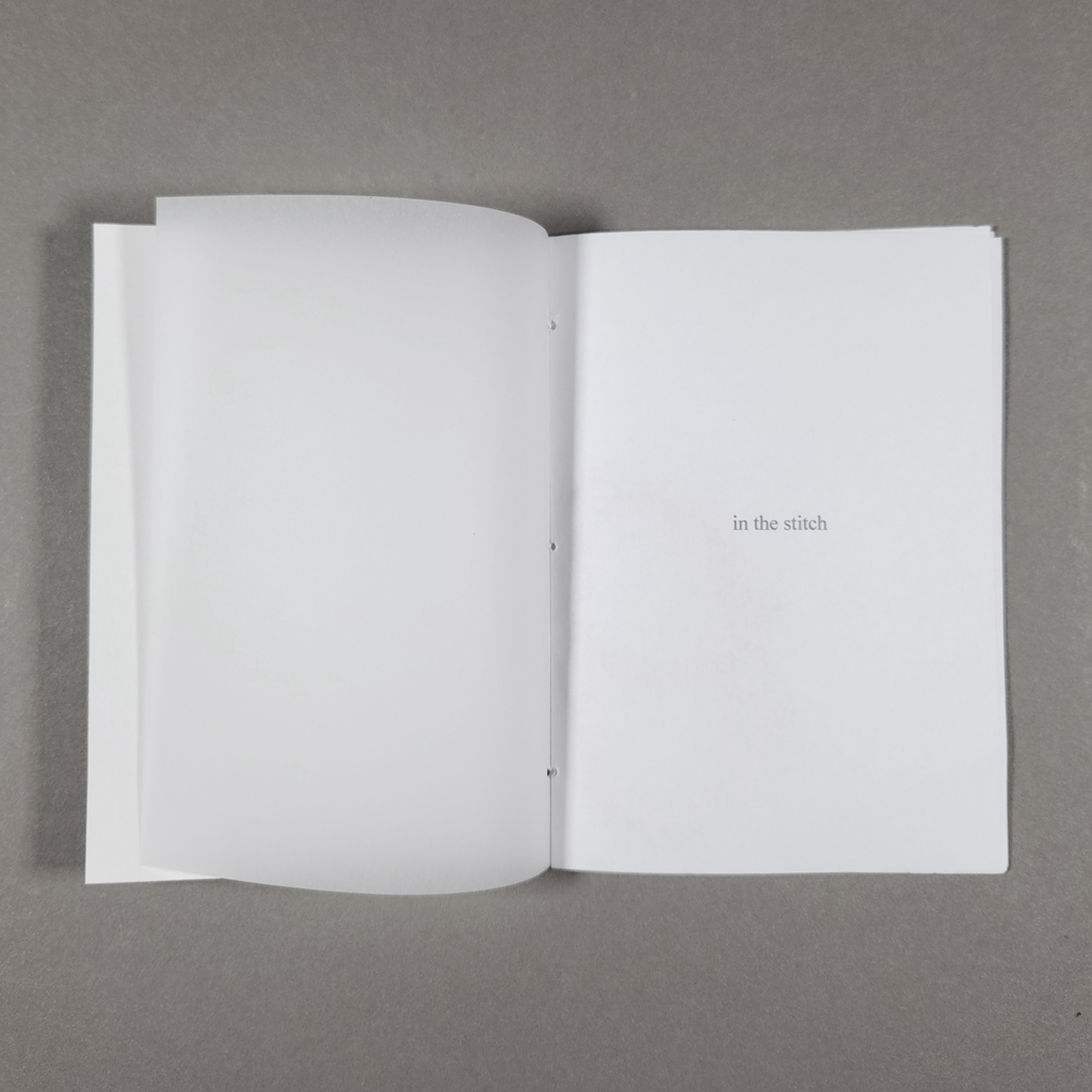
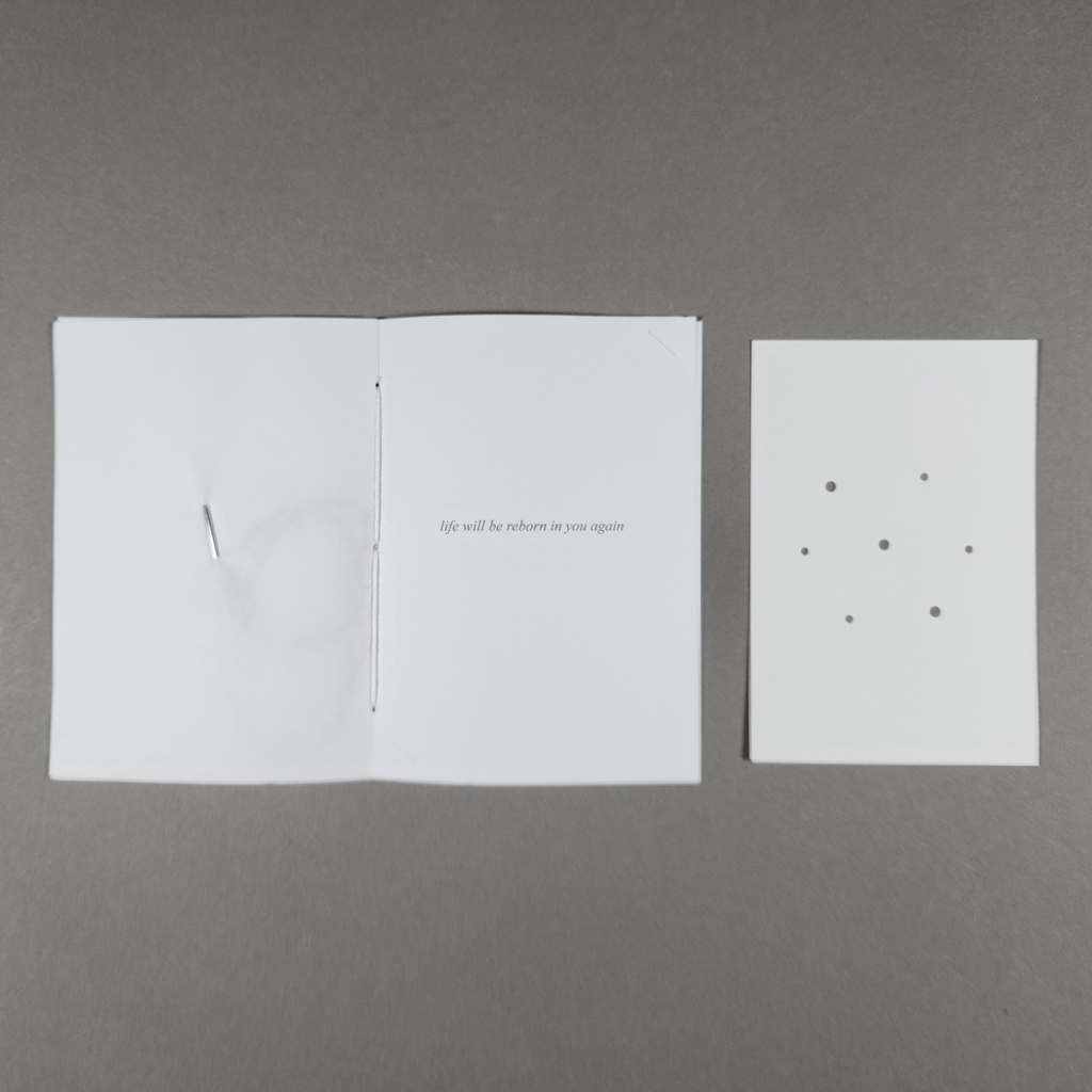
The book’s title is set lowercase and printed in gray on a paper belly band, which reveals a blank white cover once removed. The first opening is also blank, but the outside signature is a translucent drafting vellum, showing through to the title printed in the second opening. Having thus eased the reader in, the next opening is rather more surprising. The turn of the page reveals a tapestry needle, already threaded with red embroidery floss, stabbed through the recto. Remarkably, these materials are so light that the thin paper not only supports but conceals them. The next opening contains another inclusion: a card whose corners are tucked into slits in the recto. The card is plain white but punched with seven holes, arranged in a hexagon with a center point. The next spread is, again, blank, followed by a colophon.
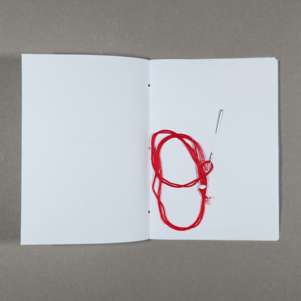

The initial reading experience — if one can call it that — is quite brief. But, if one takes Ito’s implicit invitation and removes the inserted materials, a final surprise is printed behind the hole-punched card. A single line of text reads: “life will be reborn in you again.” As the colophon explains, the book is inspired by Palestinian poetry and embroidery. The phrase is the final line of the poem “Ever Alive” by Fadwa Tuqan, who has been called the mother of Palestinian poetry. Read through Tuqan’s poem, the needle and thread take on new meaning. The needle, which punctures the book’s page, can also be used to sew together, to repair. (The pamphlet itself is bound in a similar embroidery floss, only white.) Red, the thread evokes blood: violence, life force, and inheritance.
Embroidery, tatreez in Arabic, is itself a form of inheritance. UNESCO has recognized tatreez as part of Palestinian cultural heritage. In this centuries-old tradition, flowers are among motifs that symbolize rebirth and hope, and these could perhaps be produced using the hole-punched card as a template. Or maybe one could make the fishnet pattern in a classic keffiyeh. That uncertainty is the point; the reader must decide what to make of the many possible permutations. This open-endedness is a longstanding interest of Ito’s. She understands the book as an interactive medium that guides but does not control its reader.
Likewise, embroidery embodies the tension between freedom and constraint. Feminist theorists and artists, for example, have reclaimed the stitch. They have recovered ways that needlework could allow for creativity and expression, even as it disciplined middle-class girls for marriage and motherhood — and lower-class women in garment factories. The stitch has been theorized as a seam, something that brings together two other, separate things. As a mode of mediating difference, the stitch therefore joins the cut and the fold — two other material metaphors so ably embodied by books.
Whether the stitch is about resisting oppression, suturing wounds, or connecting people across divides, the resonance with Tuqan’s poetry is clear. As Palestinians suffer under war and occupation, the question of whether we can break out of established patterns is urgent. So too is the need to preserve cultural heritage, as Ito does by reimagining tatreez, in the face of concerted campaigns to delegitimize or outright erase whole cultures. Urgent, yes, but In the Stitch doesn’t tell the reader what to do. Its blank pages are less a mirror than a projection screen. In the Stitch demands what the reader already knows is necessary.
-
“Tear Gas Flash Bangs Fires” Consume Us and Will Consume this Book
“Tear Gas Flash Bangs Fires” Consume Us and Will Consume this Book
Paul Valadez
2026286 pages
9.5 × 13.75 in. closed
Unbound altered book
Ink lettering on cover with graphite and watercolor inside
Unique (1 copy)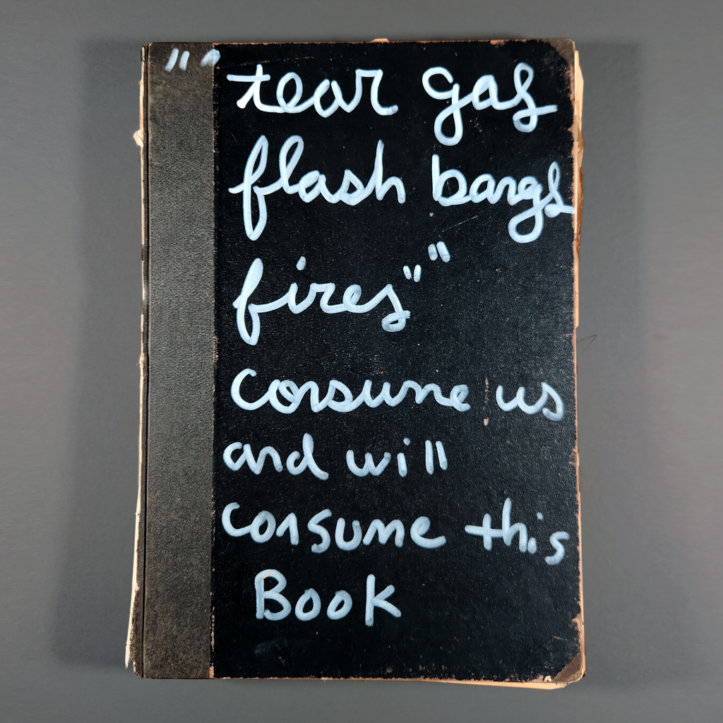
Most of the books I review have been donated to Artists’ Book Reviews — an exchange of artistic and critical labor. If anything, it is this reciprocity that is new for Paul Valadez. The Texas-based artist gives his work away, no strings attached. Inspired by indigenous potlatch practices, Valadez’s lifelong “Potlatch Project” amounts to a conceptual artwork that frames his prolific painting, drawing, and collage. Among these works are altered books, like “Tear Gas Flash Bangs Fires” Consume Us and Will Consume this Book.
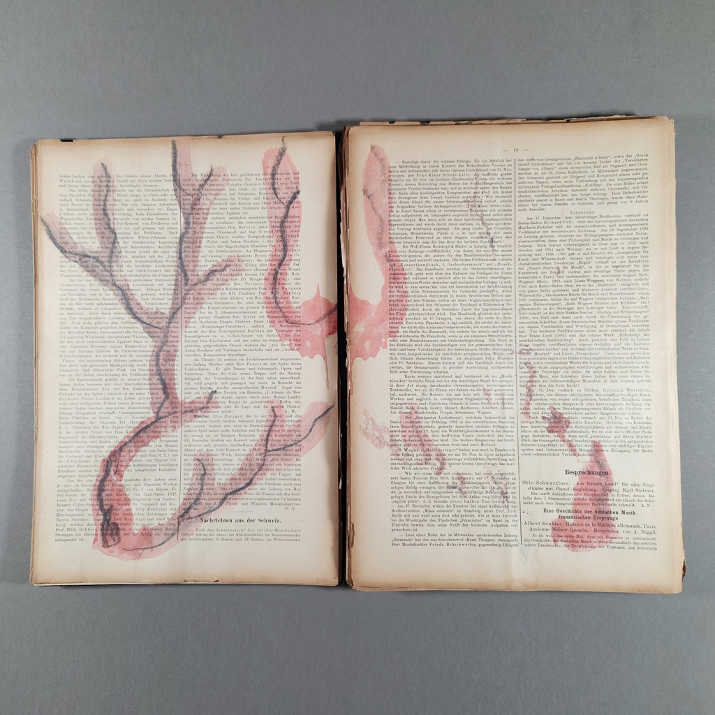
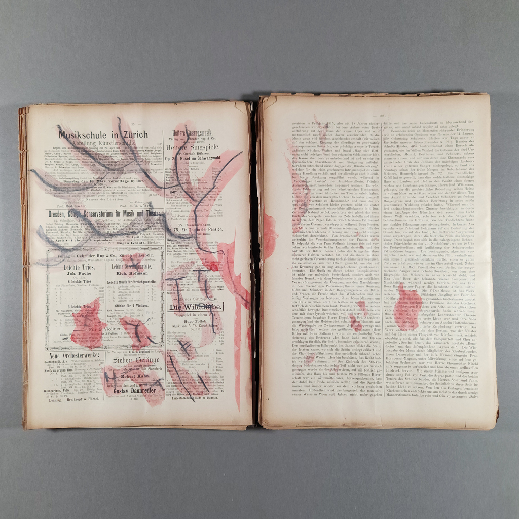
The book’s title is scrawled on the front cover in a casual mix of cursive and print, white paint marker on fading black board. On the back cover, the same hand declares: “Original Unique Drawing on ACID FULL Book.” Indeed, the book is falling apart. The covers are detached, spineless, with roughly 280 loose pages stacked between them. I am reminded that, in addition to gift-giving, a potlatch may involve the ritual destruction of valuable goods.
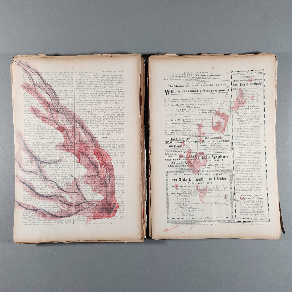
In this case, the original book is of questionable value. It is, or rather, was a bound volume of the periodical Schweizerische Musikzeitung und Sängerblatt (Swiss Music Journal and Choral Gazette) from 1897. The German-language journal was letterpress printed on thin paper, now yellowed and brittle. The sheets are faintly creased from being folded horizontally before being bound, and now unbound, in their current form.
The relatively large (9.5 × 13.75 in.) pages, busy with printing, provide an ideal surface for Valadez’s gestural, semi-abstract drawings of fires. Every verso in the book has a drawing, rendered in graphite with red watercolor on top. The watercolor tends to bleed through to the recto, where the fingers of flames suggest a bloody handprint. The drawings are varied enough to propel the reader, despite their restricted visual vocabulary. Some of the fires contain crosses, and others are surrounded by a scalloped mandorla of what might be smoke, perhaps hinting at the Catholic iconography common in Chicano art. Still other drawings are more abstract, like lightning branching across the page. This is a new direction for Valadez, whose paintings and drawings are usually figurative and often contain text.
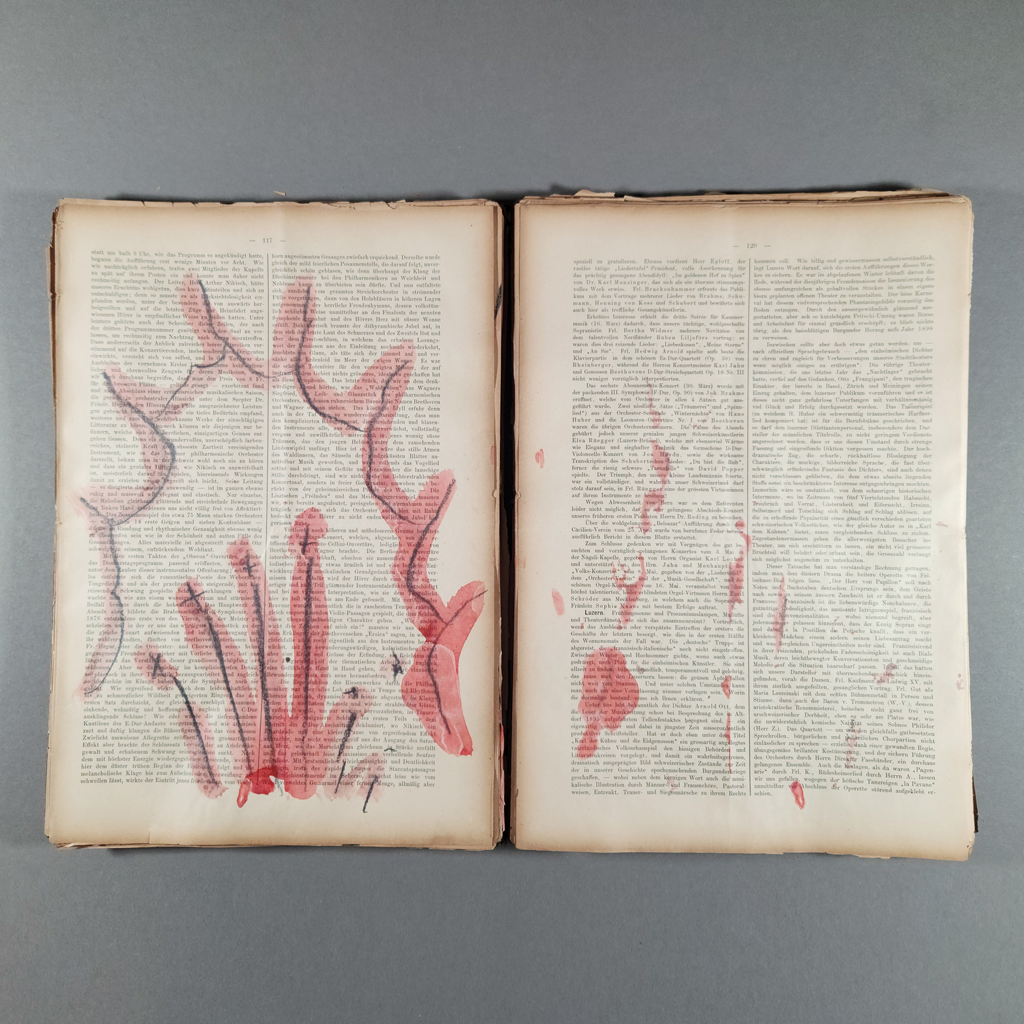
Of course, there is text in the book, and it is more significant than it first appears. Like many Mexican-Americans, Valadez was never taught Spanish. Instead, as he grew up listening to older relatives talk in Spanish, he associated the language with the forbidden knowledge of adults. Unable to converse with half his family, Valadez spent much of his time reading, no doubt informing his interest in collage (and visual communication, more broadly). If this was a happy outcome, Valadez also found himself marginalized among some of his Chicano peers for not speaking Spanish. Thus, the inability to read the text — albeit, in this case, German — signifies the troubles of the adult world, the generational loss of colonization and assimilation, and the marginal perspective of an outsider.
The book’s music also matters. Beginning with his sprawling collage series, The Great Mexican-American Songbook, Valadez has played with the idea of the “Great American Songbook.” He is interested in both Americanness and greatness. For an artist who feels marginalized within mainstream American culture as well as the art world, the Great American Songbook represents the canon of great art. This is what he has set alight, via the Swiss Music Journal and Choral Gazette in “Tear Gas Flash Bangs Fires” Consume Us and Will Consume this Book.
So, we return to the book’s promise of self-destruction. Is this to be mourned or celebrated? The inscription on the back cover, “original unique drawing,” raises a related question: is this a single work or more than a hundred? The singular “drawing” — not drawings — could be a verb, in which case the book documents the performance of drawing. In fact, Valadez does make drawings in public and give them away to spectators. The question is not whether this is an artists’ book, but rather what the reader must do with the drawings. Are they meant to be kept or given away? Am I obliged to preserve this brittle book for posterity, or to multiply Valadez’s generosity by distributing the drawings and destroying the book?
Fire is imbued with such questions and contradictions. It symbolizes violence but also transformation and enlightenment. No doubt the titular tear gas and flash bangs have something to say about current events, which hardly seem enlightened. Yet destruction and renewal are inseparable. The canon crumbles, making room for artists like Valadez. Finally, fire is something we can share without losing — a fitting metaphor for Valadez’s radical generosity.
-
Serpents
Serpents
Philip Zimmermann
2025
Spaceheater Editions2 volumes, 40 pages and 60 pages
10.325 × 8.5 × 0.75 in. together in slipcase
Pamphlet and double-pamphlet stitched softcovers with wrappers
HP indigo printing inside with foil-stamped covers and blind-embossed slipcase
Edition of 60 copies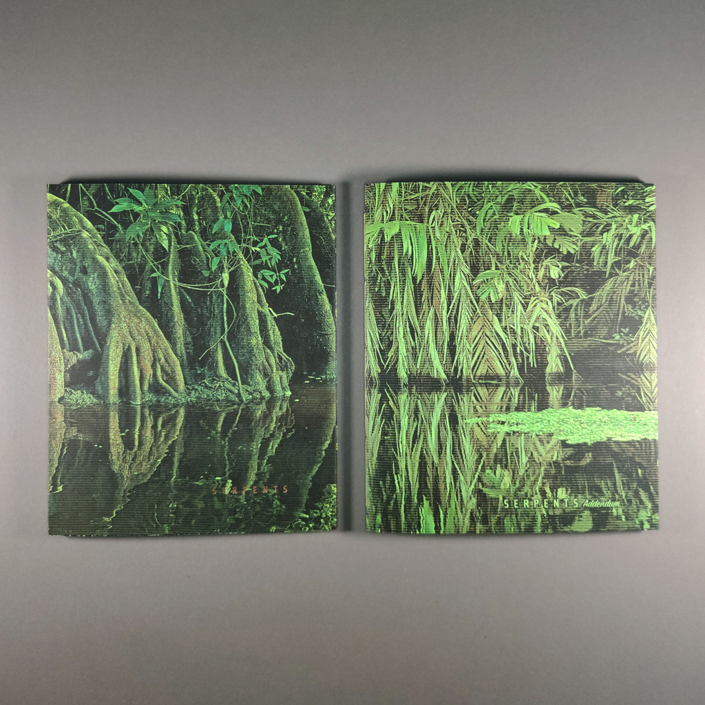
Philip Zimmermann calls Serpents a “visual and poetic rant” about 2025, the Year of the Snake. Having survived 2025, it came as no surprise that the book is two volumes. The first volume is a posthumous collaboration with Bern Porter, whose poem “The Last Acts of Saint Fuckyou” forms the main text: an apocalyptic, alphabetized litany of ethical and epistemological ills. The second volume reprises Zimmermann’s 2020 Swamp Monsters, an unflattering rogue’s gallery of politicians, oligarchs, and influencers responsible for all this turmoil. If the first volume suggests that things have always been this way, the second volume counters that it doesn’t have to be; we know who to blame. Serpents offers consolation but not complacency.
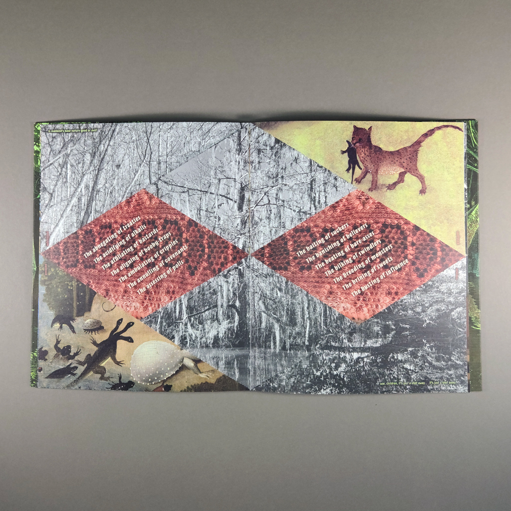
While the second volume of Serpents is a sequel to Swamp Monsters, the first volume is more reminiscent of Zimmermann’s landmark High Tension. The pages are cut diagonally, forming a diamond of smaller diamonds in the center of each spread. Porter’s poem is set, atop a snakeskin background, in the center diamond on both verso and recto. The red-toned scales give the entire diamond motif a reptilian aspect, although it also resembles the “hazard identification diamond.” In any case, the sharp angles, busy patterns, and diagonal text provoke feelings of anxiety. Having fractured the spread into diamonds and triangles, Zimmermann quilts together images from different sources and adds additional text along the margins.
The central text, Porter’s poem, was first published in 1975, but it feels fitting for this moment. Or perhaps it is timeless, a result of its quasi-biblical delivery and utter strangeness. For each letter of the alphabet, Porter lists seven acts: “The abnegating of treaties / The acidifying of alkalis / The affiliating of bastards…” Porter mixes serious and silly, obvious and obscure. His saint sews chaos and contradiction: “The breeding of monsters / The brining of sweets / The busting of influence…”
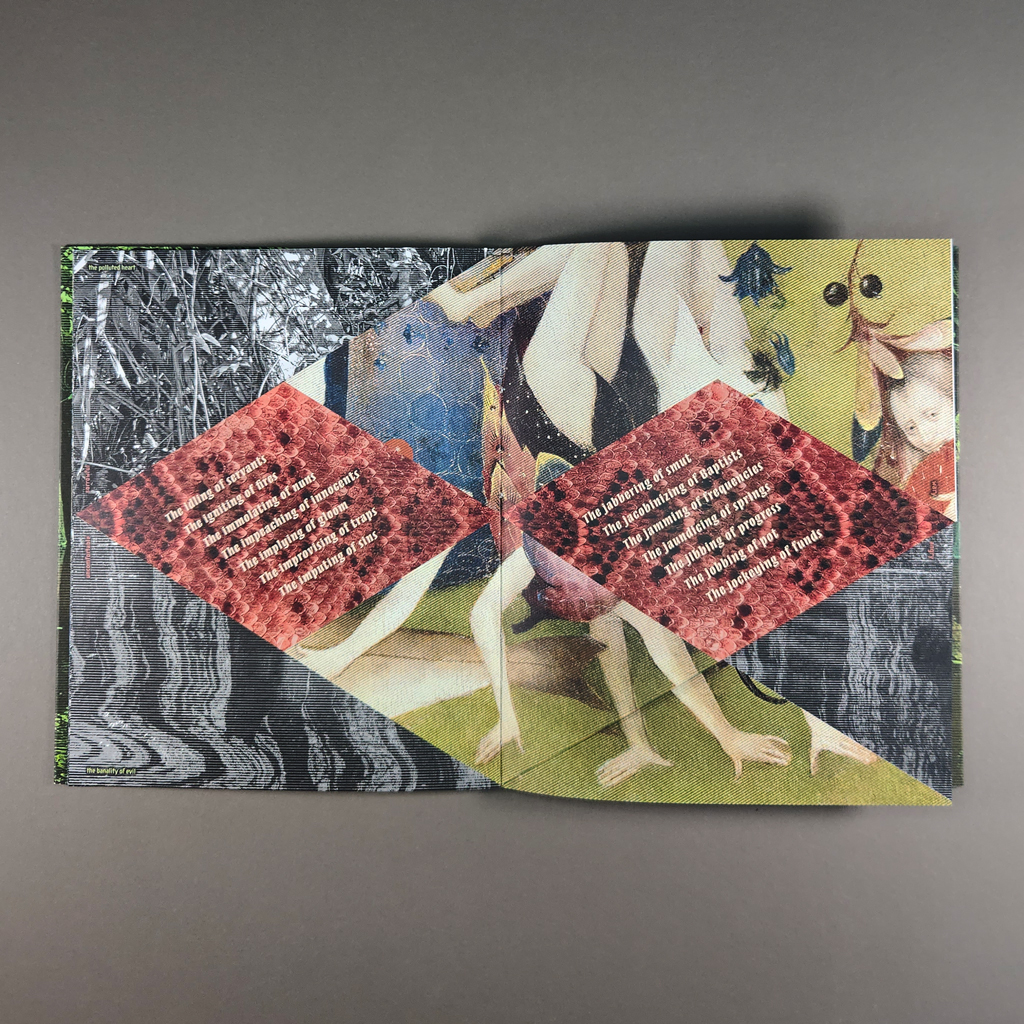
Surrounding Porter’s poem, Zimmermann quotes from other sources. Song lyrics, ranging from the Rolling Stones’ “Gimme Shelter” to Childish Gambino’s “This is America” cohabitate with Dante and Hobbes. A clever couplet places Elon Musk in 1984, showing just how Orwellian his vision is: “Ignorance is strength / empathy is weakness.” Paired words set parallel to the fore-edge seem to record one’s psychic response to this dystopian state of affairs. The diagonally cut pages split the pairs, creating new phrases with every turn. “Frightened / serious” turns into “wary / serious,” then into “wary / angry.”
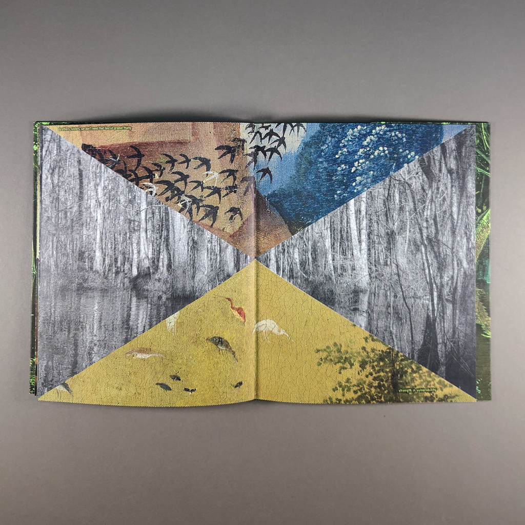
In addition to the text, Zimmermann borrows some of the imagery. Scenes from The Garden of Earthly Delights by Hieronymus Bosch populate most pages. Zimmermann takes advantage of the triptych’s narrative arc from paradise to hell, but he tells his own story. Porter’s poem gives way to the fires and explosions of Bosch’s hellscape, then an eerie spread with nothing but birds. No humans remain, not even to be tormented by demons. All of this is patterned together with Zimmermann’s own photographic imagery, desaturated and heavily half-toned snapshots from the swamps of Louisiana and jungles of Costa Rica. Screened with horizontal lines rather than Ben-Day dots, the swampy reflections of Cypress trees look as though they could be tuned with an antenna. (Incidentally, Bern Porter, a physicist as well as a poet, helped develop the cathode ray tube.)
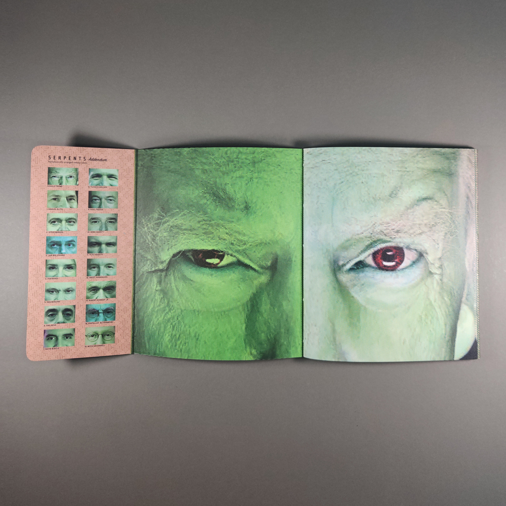
In the second volume, an addendum of “alphabetically arranged swamp scum,” the visual effects are more B-movie than CRT television. Each spread is a close-up of a latter-day demon, one eye on each side of the gutter. The faces are tinted green, and the eyes are red. Aside from Donald Trump’s mugshot-turned-merchandising-opportunity and Mark Zuckerberg’s iconic soulless stare, many of these powerful people are hard to identify. Zimmermann provides a visual index on the dust jacket flaps, but the faces are equally effective as interchangeable avatars of evil. The aesthetic is undeniably campy, yet the images still produce a queasy, anxious feeling in the reader.
Zimmermann has long been interested in human nature, good and evil, and cycles of violence. Perhaps these issues are so timely because they are timeless. Evil has been with us since the beginning, Bosch reminds us — even in paradise a serpent coils around a tree in the distance behind Eve. Yet, Zimmermann’s serpents suggest a particularly contemporary vision of hell, one in which the acolytes of Steve Bannon (number two in the addendum) continue to “flood the zone with shit.” Bosch and Porter admirably anticipated the experience of doom-scrolling through the twenty-first century. More than horror or suffering, they convey chaos and corruption (in the full sense of the word).
Like so much of Zimmermann’s work, Serpents pairs politics with personal experience. The second volume, with its righteous indignation, is only an addendum; the uncertainty and anxiety in the first volume is the heart of the project. If we entertain the biblical allegory, then Serpents leaves open the possibility of resisting the temptations of greed, vanity, and power. Yet, it seems the world is a swamp, not a garden. By rendering the likes of Steve Bannon and Tucker Carlson as movie monsters, by reveling in the absurd inventions of Bosch and Porter, Serpents shows, in contrast, that real evil is both murky and banal.
-
Recueil no. 1
Recueil no. 1
Mélyna Dall’ara
202516 pages
5.5 × 8.25 in. closed
Stab binding
Digital printing with relief printed insert
Edition of 20 copies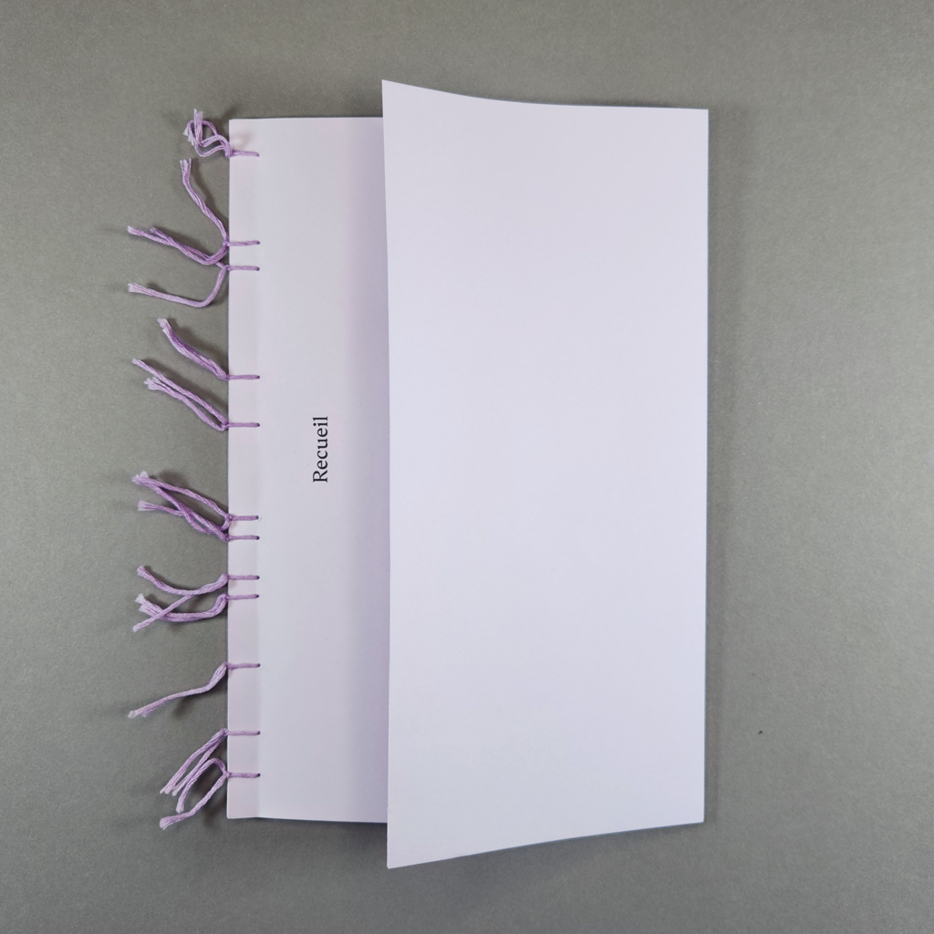
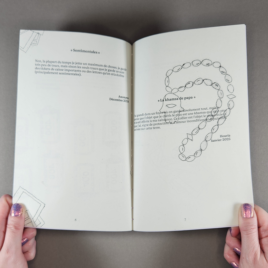
Recueil, French for collection or anthology, is a micro-magazine published by graphic designer Mélyna Dall’ara. The magazine’s mission is to spotlight ordinary people and practices. In this first issue, contributors share about a significant object they have kept. Their short testimonies are illustrated with charming Tetra Pak engravings by Dall’ara. Reproduced and digitally manipulated, the illustrations distill the issue’s underlying themes: the materialization of memory amid increasing digitization.
In both subject and style, Recueil stems from Dall’ara’s master’s research in design. As a designer, she views her role as a sort of cultural mediator. In Recueil she explores how private, individual acts can, in fact, connect people with one another. Along with ordinary people, Dall’ara is invested in ordinary materials, which provide her with generative constraints. She blends digital and analog techniques and blurs the lines between art, design, and craft. By collecting anecdotes about collecting, Dall’ara flattens the hierarchy between herself as publisher and her contributors. This sensibility will continue in the second, forthcoming, issue of Recueil, which will address cooking — another everyday creative act rarely afforded the status of art.
The magazine’s low price (only €3) further democratizes the project. Dall’ara was able to give a copy to any contributor who wanted one and hopes to increase the edition size for future issues. Surely both the distribution and the price will need to increase to sustain the project, but the reciprocity between the contributors and the publisher reflects Recueil’s values. Though the contributors are identified only by first name or remain anonymous altogether, sharing such personal stories — death and loss are, unsurprisingly, common themes — is a vulnerable experience. In exchange, Dall’ara expresses care through craftsmanship.
This care is evident immediately, thanks to Recueil’s unconventional stab binding and folded front cover. Instead of using a single thread and knot, each of the twelve asymmetrically spaced sewing stations is tied off individually. The ends of the soft, lavender floss are left as decorative tassels that mark the time and attention that went into the binding. The front cover, also lavender, is folded back to create a flap that conceals a printed foreword and a keepsake: a relief-printed title card with hand-scalloped edges.
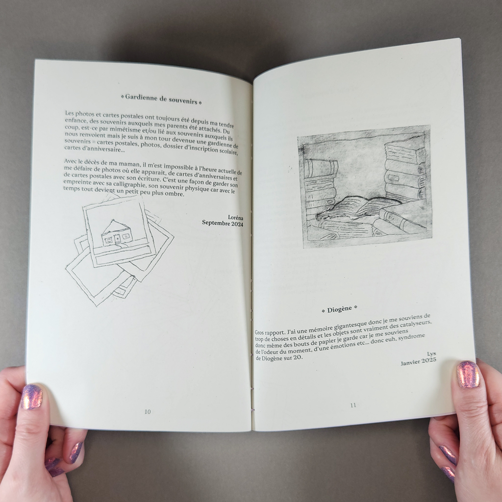
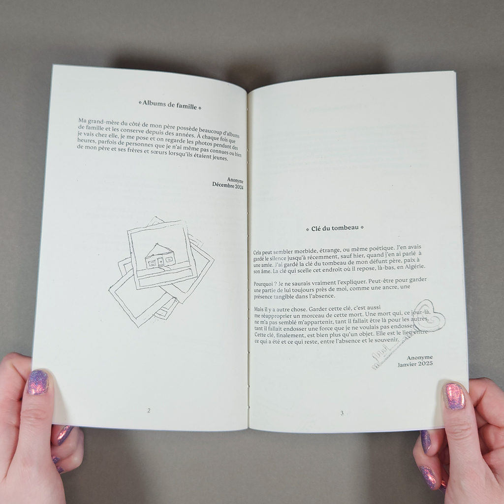
Inside, the design is just as thoughtful. The typography is restrained; the only embellishments are the fleuron’s surrounding each contribution’s title. The texts range from one to three short paragraphs. None occupies more than half a page. Some of the objects described are predictable: baby clothes, photo albums, and movie tickets. Others are more surprising: an anonymous contributor has kept the key to their father’s tomb in Algeria. Yet the contributors describe the same impulses and share their stories with a similar tone, a combination of puzzlement, reverence, and confession. We get glimpses of biography but hardly enough to distinguish the writers — or to prejudge them before empathizing. Dall’ara successfully focuses on commonalities rather than differences.
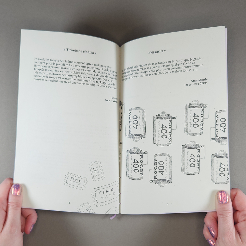
Many of the objects kept form bodily connections, not unlike religious relics. A necklace from a father, a grandfather’s shaving kit, postcards that preserve a mother’s “imprint” and “physical memory” through her handwriting. Many of these relations have passed away, but death is not the only displacement; travel and migration also recur.
The imagery is more playful than the typography. The line quality resembles a stick-and-poke tattoo, but Dall’ara created the original engravings on Tetra Pak instead of a metal plate. (The layered material — paperboard, plastic, and aluminum — lends itself to intaglio printing. It is easy to engrave, and its smooth surface can be wiped clean, leaving ink only in the incised areas.) Dall’ara then digitized the prints, allowing her to rotate, repeat, crop, and otherwise manipulate the imagery throughout the magazine. Some of the images appear more than once, but they are never completely identical. These repeated images — a stack of photos, a picture frame — serve as icons, categorizing as well as illustrating the anecdotes they accompany.
The Tetra Pak engravings exemplify Dall’ara’s approach to everyday materials, but they also resonate thematically. Just as a mother’s handwriting retains a physical trace, the engraving process functions as a material metaphor for memory. An absence — a cut — is filled with ink, then pressed into presence. The recycled packaging, inscribed with meaning, echoes the movie tickets and receipts saved by Recueil’s contributors.
In turn, the publication enlists the reader in the duty to keep and make meaningful. The serial format, the promise of future issues, underlines the reader’s responsibility to safely store the delicate volume for some time. It has become cliché to discuss the printed book (or magazine) in an era of digital publishing. Recueil reminds the reader that other material culture is also threatened, not just photographs and letters but movie tickets and metal keys. What do we throw away — or delete — today that future generations will wish we kept? By celebrating vernacular practices like collecting and cooking, Recueil will record what might otherwise be forgotten.
-
Warten
Warten
Constanze Kreiser
202120 pages
8.25 × 5.75 in. closed
Pamphlet stitch
Digital printing with graphite and cut-out embellishments
Varied edition of 20 copies
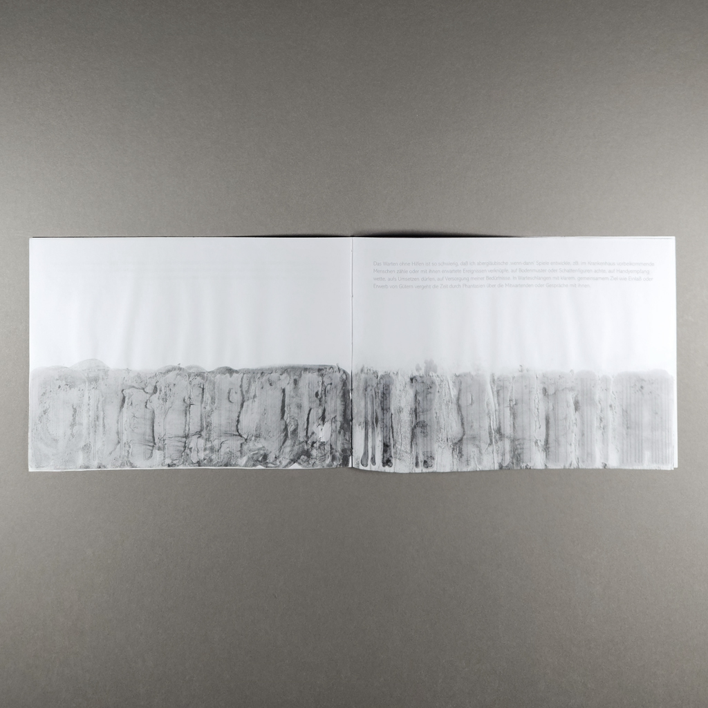
Warten is a book about waiting for a book about waiting. Constanze Kreiser created Warten (“waiting” in German) while waiting for a copy of Maurice Blanchot’s Awaiting Oblivion to arrive at a local bookstore. Created in 2021, Warten is also about Covid-19. The wait for Blanchot’s book, and the making of Warten in the meantime, are therefore only interruptions in a longer wait. In Blanchot’s book, two unnamed characters find themselves in a hotel room, trying to remember what brought them there. Their attempts to recall their first meeting instead show the limits of memory and the power of imagination to construct reality — and therefore to reveal reality as constructed. Warten is Kreiser’s version of Blanchot’s hotel room: a liminal space we temporarily inhabit, a space where the greatest presence is an absence.
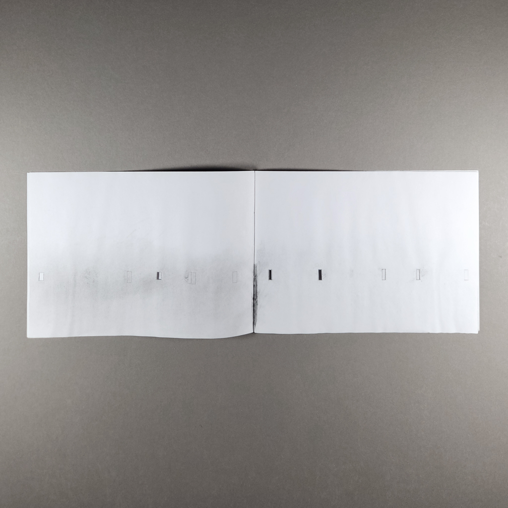
Of course, Warten does not literally represent a hotel room, but the twenty-page pamphlet contains more space and time than its slim proportions suggest. Kreiser produced the book in a variable edition of twenty copies, but the size, page count and text (written in German) are constant. My review copy is embellished with graphite and hand-cut rectangles. Other copies are stained and burned and have pages slit into horizontal flaps. These insistently handmade interventions contrast with the stark, minimalist quality of the printed book.

Beneath the cutting and staining, the book’s spare pages present conventional paragraphs of text set in a thin sans-serif typeface. Below these are abstract illustrations, each one an orderly sequence of rectangles. Text and image remain separated by whitespace which dominates the composition. As the book progresses, the rectangles stretch. They begin as short windows, turn into narrow slits, and finally collapse into vertical lines. They also increase in frequency, from one or two per page into sequences that resemble barcodes.
If the imagery therefore suggests some sort of progress, the text rejects any such notion. Each paragraph is a reflection on waiting. Some are quoted from Blanchot, and others are written by Kreiser, but none of them go anywhere or resolve anything. They look back in reflection or forward in anticipation but ultimately circle the absence at the center of the book, as if orbiting the gravitational pull of a black hole. Whereas Blanchot’s protagonists confront their differing realities through dialogue, Kreiser tells the reader directly how she feels and why. Nevertheless, writing amid a coronavirus lockdown, she can come to no conclusions. In Blanchot’s terms, she is writing within the disaster, not aboutthe disaster.
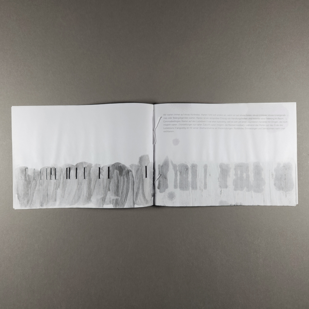
In this context, it is worth reexamining the images, especially the cut-out rectangles. These windows let the reader look through the recto to the next page, but they also keep the previous page in view on the verso. Like memory and anticipation, the cut-outs disrupt the book’s linear progression by reopening the past as the reader moves toward the future. Or maybe we are meant to look at the absences, not through them. Only toward the end of the sequence, when Kreiser’s graphite embellishments are applied loosely in a liquid medium, do the cut-outs reveal anything but whitespace, and then only a murky gray wash.
Warten enacts the experience of waiting that Kreiser describes. We hurry, then linger. We focus, then let our minds wander. We see patterns where there is noise — or nothing at all. We count and measure. We predict, desire, and forget. What is remarkable about Warten is not so much that we find meaning where there is none, but that we can do so even while reading about it.Kreiser is like a magician who explains her illusion and still fools the audience.
Warten also enacts the experience of not waiting. After all, the book exists because Kreiser could wait no longer for her copy of Awaiting Oblivion to arrive. It exists because, as Kreiser puts it, “the enforced immobility of waiting turns into an urge for action.” There is indeed a sense of urgency in the cutting, burning, and staining that distinguish each copy of the book. Repetition and failure are recurring themes in Kreiser’s work, and it is hard not to see the varied edition of Warten as a structure for Kreiser to work through the pandemic, to write the disaster. It would be too literal to invoke Lacan’s description of jouissance as a stain, but Warten exemplifies the paradoxical painful-pleasure that comes with repeated attempts — and failures — to find satisfaction.
-
Workshopping at WSW
Workshopping at WSW
Emily Larned
2025
Alder & Frankia22 pages
4.375 × 11 in. closed
Saddle stitch with gate folds
Risograph
Edition of 500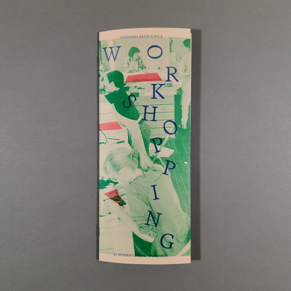
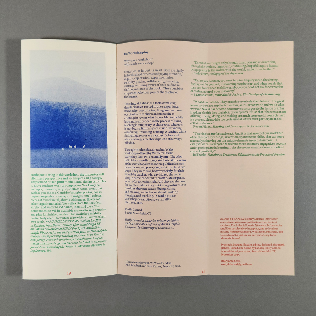
Workshopping at WSW is essentially a catalog of workshops held at the Women’s Studio Workshop in Rosendale, NY — except the workshops are from 1983–1999, and some of them never ran. The staple-bound pamphlet is part of Emily Larned’s Efemmera Reissue series, under her imprint Alder & Frankia, which is dedicated to reinterpreting and recirculating feminist ephemera. Workshopping is a charming slice of time, and the reader sees Larned’s hand making the slice. By valorizing overlooked administrative labor, Workshopping puts into practice the feminist ideals it documents.
It is easy to imagine that the original WSW newsletters and catalogs looked something like Workshopping. Its narrow format, toned paper, and three-color Riso printing could pass as a conventional brochure, although its gate folds make the simple structure surprisingly interactive. The text — descriptions of workshops and brief bios of the facilitators — is reproduced verbatim. Some of the workshops feel of their moment, and others could be offered today. They index the progress made by women artists and the work that remains to be done. There are workshops on specific techniques, theories, and histories, and others that are more about empowerment and consciousness raising. Many challenge the boundary between art and the everyday, like Linda Montano’s “Learning to Pay Attention (Art for Life)” and “Circulating Energy,” in which the famed performance artist would help participants work through trauma.

The entries are organized chronologically, with the years “stamped” in red ink, forming a timeline down the right margin. Larned has added meticulous image credits and notes about missing information plus a reflective statement on teaching and learning. There are also photographs from the WSW archives, printed in blue monochrome, which give a sense of the studio but do not document the specific workshops in the text. Larned has overprinted green and red forms to accentuate details in the photographs, as one might highlight a passage of text. Tucked into the back inside cover is a self-addressed envelope. Instead of sending payment for a workshop, the enclosed form encourages readers to submit their own imagined workshop to Larned’s exhibition at WSW, also titled Workshopping, which runs from October 3, 2025–January 23, 2026.
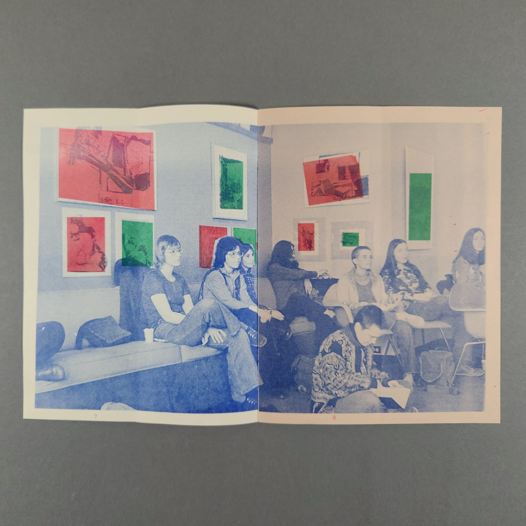
The publication is interactive in more subtle ways, too. The gate folds conceal content, inviting readers to reveal images behind the text much as Larned uncovers unfamiliar ephemera in the archive. The overprinted additions to the images remind the reader that Larned’s intervention is not neutral: she chooses what to include and exclude. What might be discounted as administrative or editorial labor — compiling a pamphlet from extant texts — is also writing, art, design, and curation. Most notably, Larned has excluded straightforward book arts workshops in favor of more experimental, cerebral, and therapeutic offerings.

The selection makes a stronger case for Larned’s argument that envisioning and proposing, much less leading, a workshop is a considerable creative undertaking. It also means that many of the workshops likely never ran. As Larned’s project statement explains, only about half of proposed workshops filled, and the ones presented in Workshopping are hardly the most practical. The descriptions represent artists imagining experiences that did not yet exist and taking calculated risks, balancing what seemed interesting and important with what would attract participants. In other words, creating a workshop isn’t so different from making art. The reader also gets to imagine the workshops into existence. Without knowing which workshops really ran, they are equally real in the mind of the reader. This is the power and peril of archival sources: so much is left to the imagination.
Larned neither romanticizes nor demonizes the archive — she uses it. The Efemmera Reissue series reanimates feminist ideas to put them into practice. In Workshopping, that mission is threefold: the workshop descriptions have ideas that remain valuable today; readers can contribute concepts of their own; and Larned models a feminist archival methodology. By inviting its readers to contribute speculative workshops, Workshopping produces another archive. Workshopping is reciprocal, not extractive, as concerned with the future as it is with the past.
-
how to build a ____.
how to build a ____.
Madeleine Aguilar
2023
bench pressIssues:
1. Madeleine Aguilar
2. Ray Madrigal
3. Jane Ferry
4. Bex Ya Yolk24 pages
7 × 8 in. closed
Saddle stitch
Risograph printing
Editions of 250
Madeleine Aguilar calls how to build a ____. “a series of artists’ responses to organizing their creative practice in 20 steps.” I wouldn’t usually begin a review by quoting from an artist’s statement, but the challenges — and risks — of distilling one’s practice are central to this project. Fortunately, Aguilar is particularly good at explaining herself and her imprint, bench press. She writes, “bench press is a risograph press based on friendship, play & collaboration. books are remnants of generative conversations & mutual exchange between artist + publisher.” The series may blur generic boundaries (zine, pamphlet, manifesto), but one thing is clear: this is not about bookmaking, it is publishing as artistic practice.

Bench press prefers books that do something (guidebooks, workbooks, instruction manuals). How to build a ____. falls into this category, even if the guidance is sometimes more poetic than practical. Each pamphlet is printed in two colors on legal-size paper in classic office colors (mint, goldenrod, lavender). Along with the Risograph printing, itself an office technology, the paper choice amplifies the contrast between practical instruction, with its implied hierarchy (expert and novice, manager and employee), and the horizontal dialogue in each issue of how to build a ____. To date, these collaborations feature Jane Ferry, Ray Madrigal, Bex Ya Yolk, and Yutian Liu (although Liu’s issue came out in 2025, after I received my review copies). Aguilar also created an issue of her own.

Aguilar’s design unifies the variety provided by her collaborators. The main text, the twenty numbered steps each artist takes to organize their practice, is set in bold, black type at the top of each page. The imagery, which sometimes includes handwriting, is printed in a second color. The contrast ensures that the main text is legible even when unruly images fill an entire page. These are not neat, finished pieces. We see how the artists plan and reflect on their work, through sketching, writing, photography, and collecting. The images seem to challenge or complicate the text as often as they illustrate it.
Each artist has a distinct practice, which comes through in their pamphlet, but there are also common threads among the artists — hardly a surprise since they have a mutual friend in Aguilar. Attention and mindfulness are one such connection. The mix of practical and poetic advice is another similarity. These features connect how to build a ____. to a tradition stretching back to conceptual art and Fluxus works of the 1960s and ‘70s. Yet there are clear differences, and how to build a ____. feels thoroughly contemporary. The artists’ politics are more explicit, their identities are more important, and their bodies are more present. If artists in the sixties read eastern philosophy and did drugs, artists today read queer theory and do therapy.

Another difference is how the interest in process manifests. How to build a ____. is not a renunciation of authorship in favor of the reader. True, the reader may follow the instructions offered, but the process behind the pamphlet is just as important. No matter what the reader does, the collaboration between the artist and publisher happened; it was more than a thought experiment. Aguilar takes advantage of the immediacy of the Risograph process to introduce new artists to bookmaking and publishing. The result feels like a dialogue between artist, publisher, and machine, unfolding in real time.
It might be too much to claim that how to build a ____. inaugurates a new genre, but the series fills a void where other forms fall short. The pamphlets are more interesting than most artist’s statements. They are less presumptuous than most manifestos. They are more imaginative than most websites and more substantial than most social media posts. Each of these has its place, and they are not mutually exclusive. I was glad that the inside back cover of each issue features the artist’s bio, and I eagerly looked up their websites. Still, how to build a ____. strikes a satisfying balance between process and product, creation and reflection, thinking aloud and dialogue.
