
Below you’ll find the most recent artists’ book reviews and interviews. See the submissions page to find out how your book can be featured.
-
Recueil no. 1
Recueil no. 1
Mélyna Dall’ara
202516 pages
5.5 × 8.25 in. closed
Stab binding
Digital printing with relief printed insert
Edition of 20 copies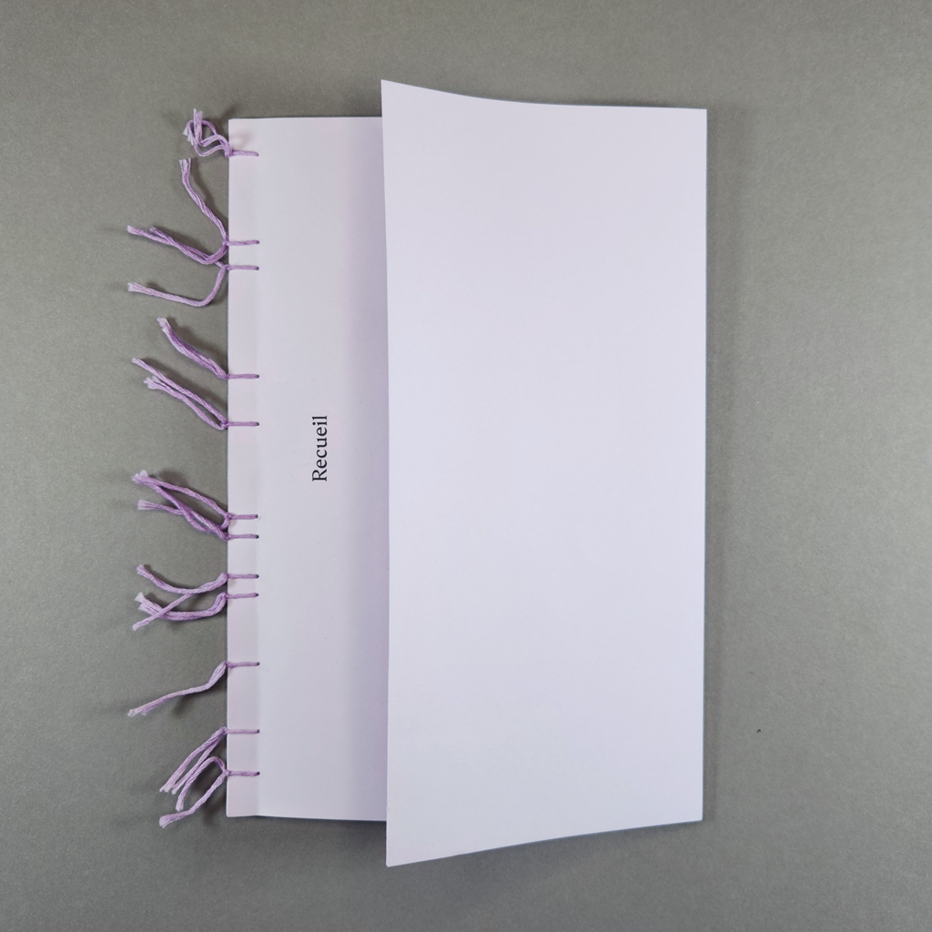
Recueil, French for collection or anthology, is a micro-magazine published by graphic designer Mélyna Dall’ara. The magazine’s mission is to spotlight ordinary people and practices. In this first issue, contributors share about a significant object they have kept. Their short testimonies are illustrated with charming Tetra Pak engravings by Dall’ara. Reproduced and digitally manipulated, the illustrations distill the issue’s underlying themes: the materialization of memory amid increasing digitization.
In both subject and style, Recueil stems from Dall’ara’s master’s research in design. As a designer, she views her role as a sort of cultural mediator. In Recueil she explores how private, individual acts can, in fact, connect people with one another. Along with ordinary people, Dall’ara is invested in ordinary materials, which provide her with generative constraints. She blends digital and analog techniques and blurs the lines between art, design, and craft. By collecting anecdotes about collecting, Dall’ara flattens the hierarchy between herself as publisher and her contributors. This sensibility will continue in the second, forthcoming, issue of Recueil, which will address cooking — another everyday creative act rarely afforded the status of art.
The magazine’s low price (only €3) further democratizes the project. Dall’ara was able to give a copy to any contributor who wanted one and hopes to increase the edition size for future issues. Surely both the distribution and the price will need to increase to sustain the project, but the reciprocity between the contributors and the publisher reflects Recueil’s values. Though the contributors are identified only by first name or remain anonymous altogether, sharing such personal stories — death and loss are, unsurprisingly, common themes — is a vulnerable experience. In exchange, Dall’ara expresses care through craftsmanship.
This care is evident immediately, thanks to Recueil’s unconventional stab binding and folded front cover. Instead of using a single thread and knot, each of the twelve asymmetrically spaced sewing stations is tied off individually. The ends of the soft, lavender floss are left as decorative tassels that mark the time and attention that went into the binding. The front cover, also lavender, is folded back to create a flap that conceals a printed foreword and a keepsake: a relief-printed title card with hand-scalloped edges.
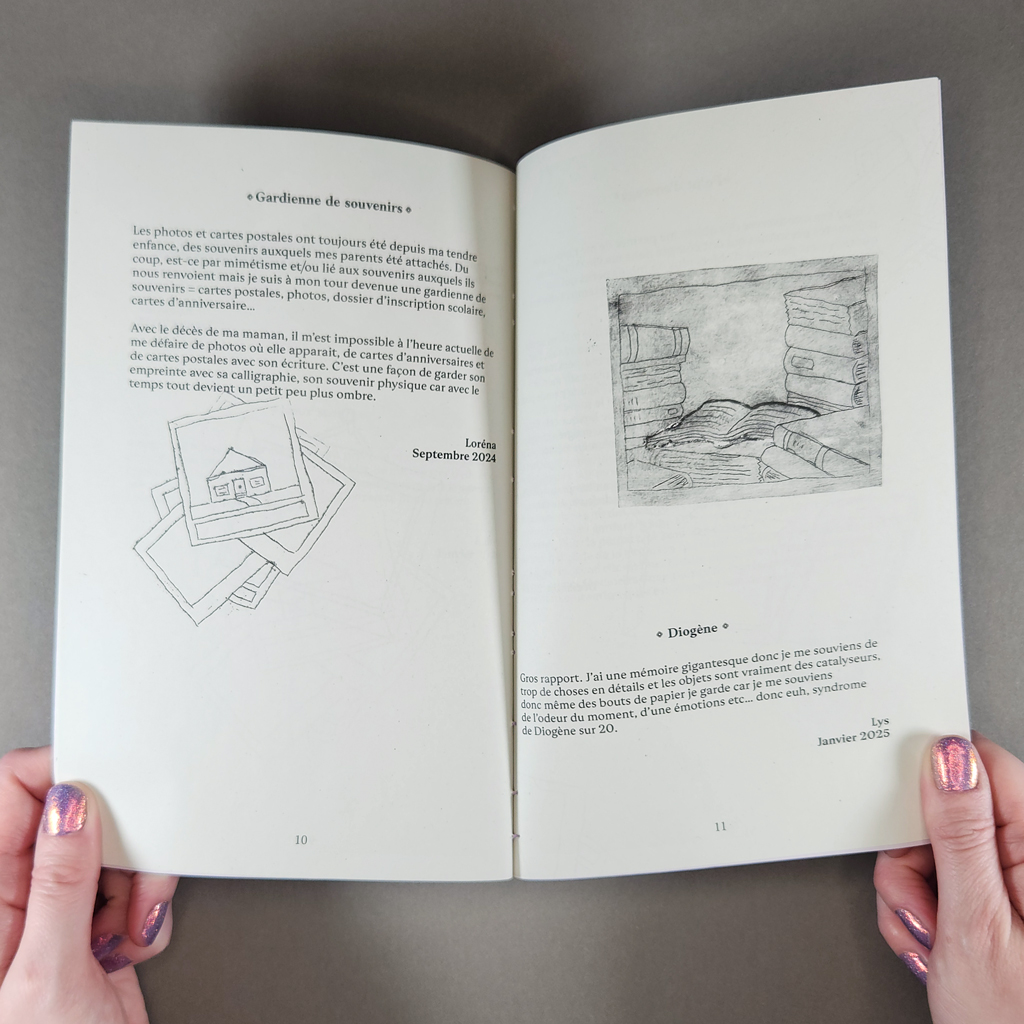
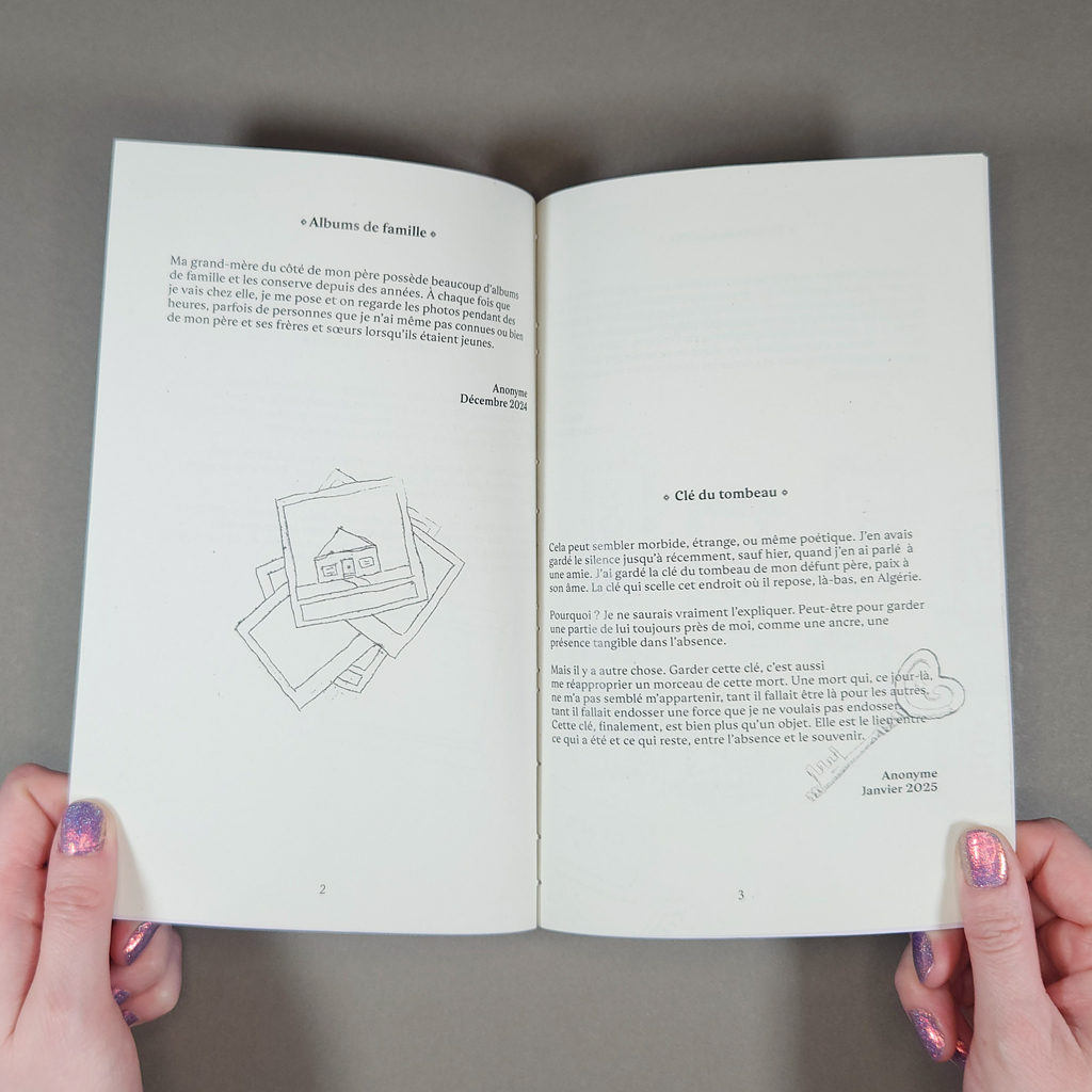
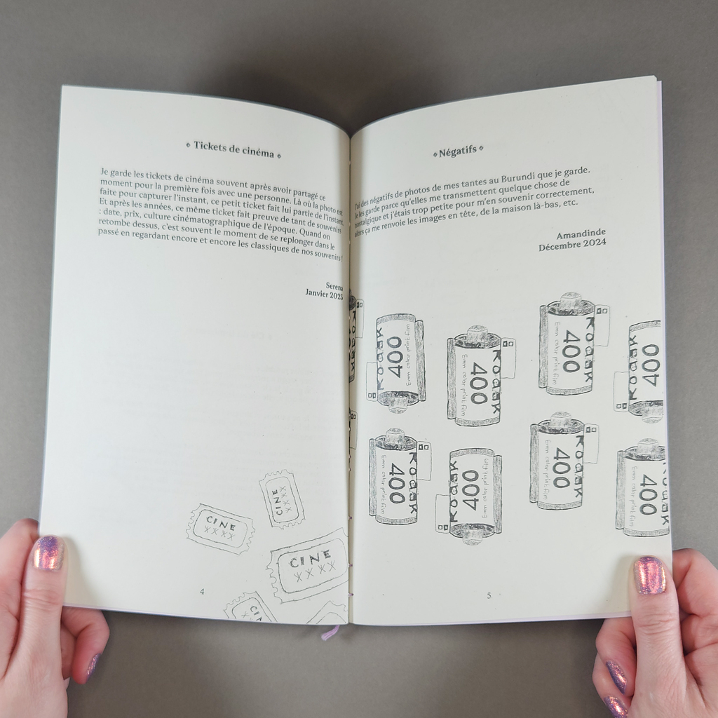
Inside, the design is just as thoughtful. The typography is restrained; the only embellishments are the fleuron’s surrounding each contribution’s title. The texts range from one to three short paragraphs. None occupies more than half a page. Some of the objects described are predictable: baby clothes, photo albums, and movie tickets. Others are more surprising: an anonymous contributor has kept the key to their father’s tomb in Algeria. Yet the contributors describe the same impulses and share their stories with a similar tone, a combination of puzzlement, reverence, and confession. We get glimpses of biography but hardly enough to distinguish the writers — or to prejudge them before empathizing. Dall’ara successfully focuses on commonalities rather than differences.
Many of the objects kept form bodily connections, not unlike religious relics. A necklace from a father, a grandfather’s shaving kit, postcards that preserve a mother’s “imprint” and “physical memory” through her handwriting. Many of these relations have passed away, but death is not the only displacement; travel and migration also recur.
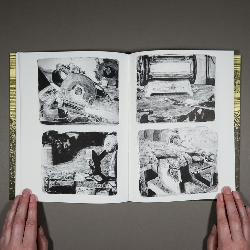
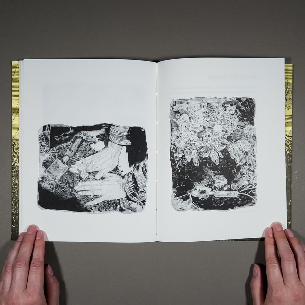
The imagery is more playful than the typography. The line quality resembles a stick-and-poke tattoo, but Dall’ara created the original engravings on Tetra Pak instead of a metal plate. (The layered material — paperboard, plastic, and aluminum — lends itself to intaglio printing. It is easy to engrave, and its smooth surface can be wiped clean, leaving ink only in the incised areas.) Dall’ara then digitized the prints, allowing her to rotate, repeat, crop, and otherwise manipulate the imagery throughout the magazine. Some of the images appear more than once, but they are never completely identical. These repeated images — a stack of photos, a picture frame — serve as icons, categorizing as well as illustrating the anecdotes they accompany.
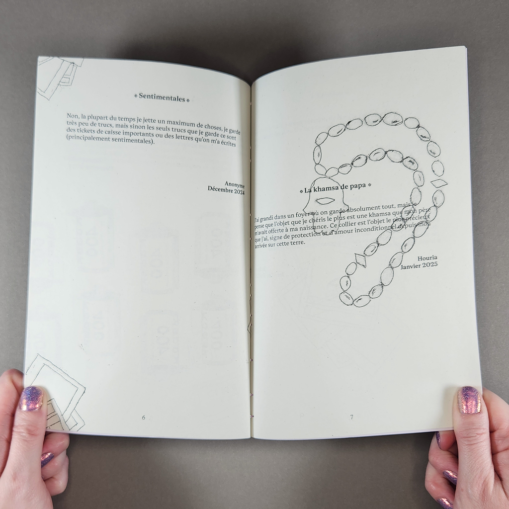
The Tetra Pak engravings exemplify Dall’ara’s approach to everyday materials, but they also resonate thematically. Just as a mother’s handwriting retains a physical trace, the engraving process functions as a material metaphor for memory. An absence — a cut — is filled with ink, then pressed into presence. The recycled packaging, inscribed with meaning, echoes the movie tickets and receipts saved by Recueil’s contributors.
In turn, the publication enlists the reader in the duty to keep and make meaningful. The serial format, the promise of future issues, underlines the reader’s responsibility to safely store the delicate volume for some time. It has become cliché to discuss the printed book (or magazine) in an era of digital publishing. Recueil reminds the reader that other material culture is also threatened, not just photographs and letters but movie tickets and metal keys. What do we throw away — or delete — today that future generations will wish we kept? By celebrating vernacular practices like collecting and cooking, Recueil will record what might otherwise be forgotten.
-
Warten
Warten
Constanze Kreiser
202120 pages
8.25 × 5.75 in. closed
Pamphlet stitch
Digital printing with graphite and cut-out embellishments
Varied edition of 20 copies
Warten is a book about waiting for a book about waiting. Constanze Kreiser created Warten (“waiting” in German) while waiting for a copy of Maurice Blanchot’s Awaiting Oblivion to arrive at a local bookstore. Created in 2021, Warten is also about Covid-19. The wait for Blanchot’s book, and the making of Warten in the meantime, are therefore only interruptions in a longer wait. In Blanchot’s book, two unnamed characters find themselves in a hotel room, trying to remember what brought them there. Their attempts to recall their first meeting instead show the limits of memory and the power of imagination to construct reality — and therefore to reveal reality as constructed. Warten is Kreiser’s version of Blanchot’s hotel room: a liminal space we temporarily inhabit, a space where the greatest presence is an absence.
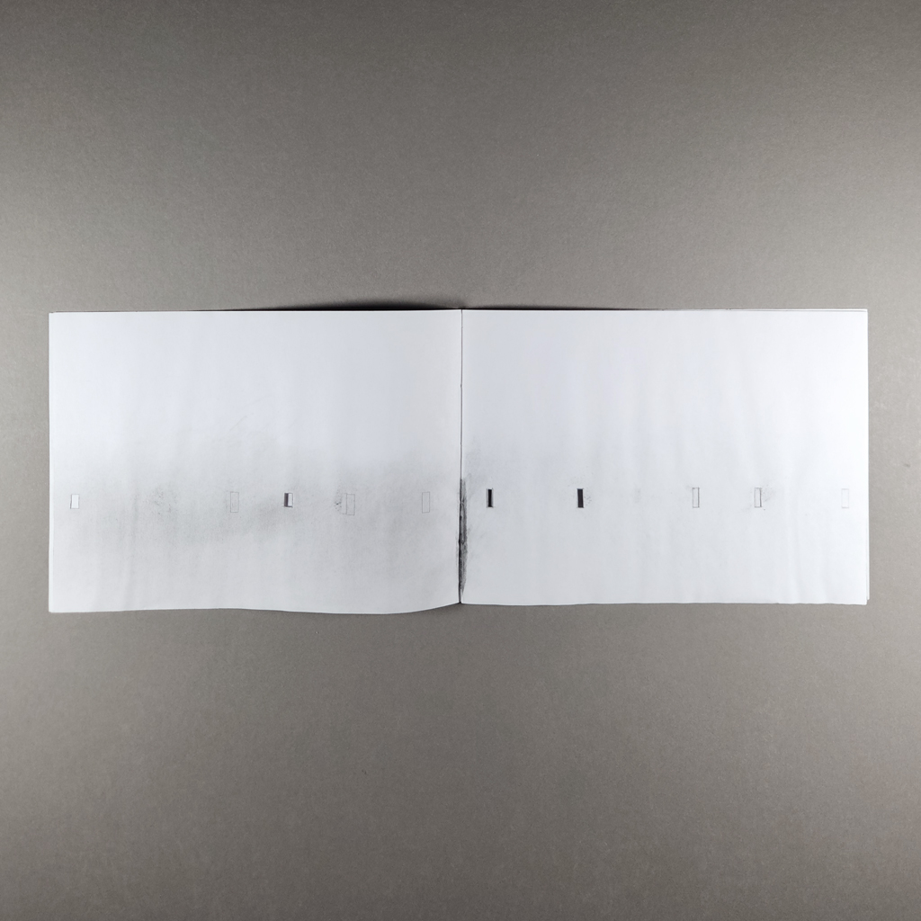
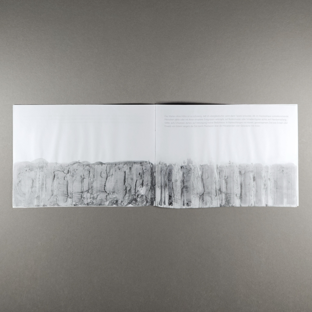
Of course, Warten does not literally represent a hotel room, but the twenty-page pamphlet contains more space and time than its slim proportions suggest. Kreiser produced the book in a variable edition of twenty copies, but the size, page count and text (written in German) are constant. My review copy is embellished with graphite and hand-cut rectangles. Other copies are stained and burned and have pages slit into horizontal flaps. These insistently handmade interventions contrast with the stark, minimalist quality of the printed book.

Beneath the cutting and staining, the book’s spare pages present conventional paragraphs of text set in a thin sans-serif typeface. Below these are abstract illustrations, each one an orderly sequence of rectangles. Text and image remain separated by whitespace which dominates the composition. As the book progresses, the rectangles stretch. They begin as short windows, turn into narrow slits, and finally collapse into vertical lines. They also increase in frequency, from one or two per page into sequences that resemble barcodes.
If the imagery therefore suggests some sort of progress, the text rejects any such notion. Each paragraph is a reflection on waiting. Some are quoted from Blanchot, and others are written by Kreiser, but none of them go anywhere or resolve anything. They look back in reflection or forward in anticipation but ultimately circle the absence at the center of the book, as if orbiting the gravitational pull of a black hole. Whereas Blanchot’s protagonists confront their differing realities through dialogue, Kreiser tells the reader directly how she feels and why. Nevertheless, writing amid a coronavirus lockdown, she can come to no conclusions. In Blanchot’s terms, she is writing within the disaster, not aboutthe disaster.
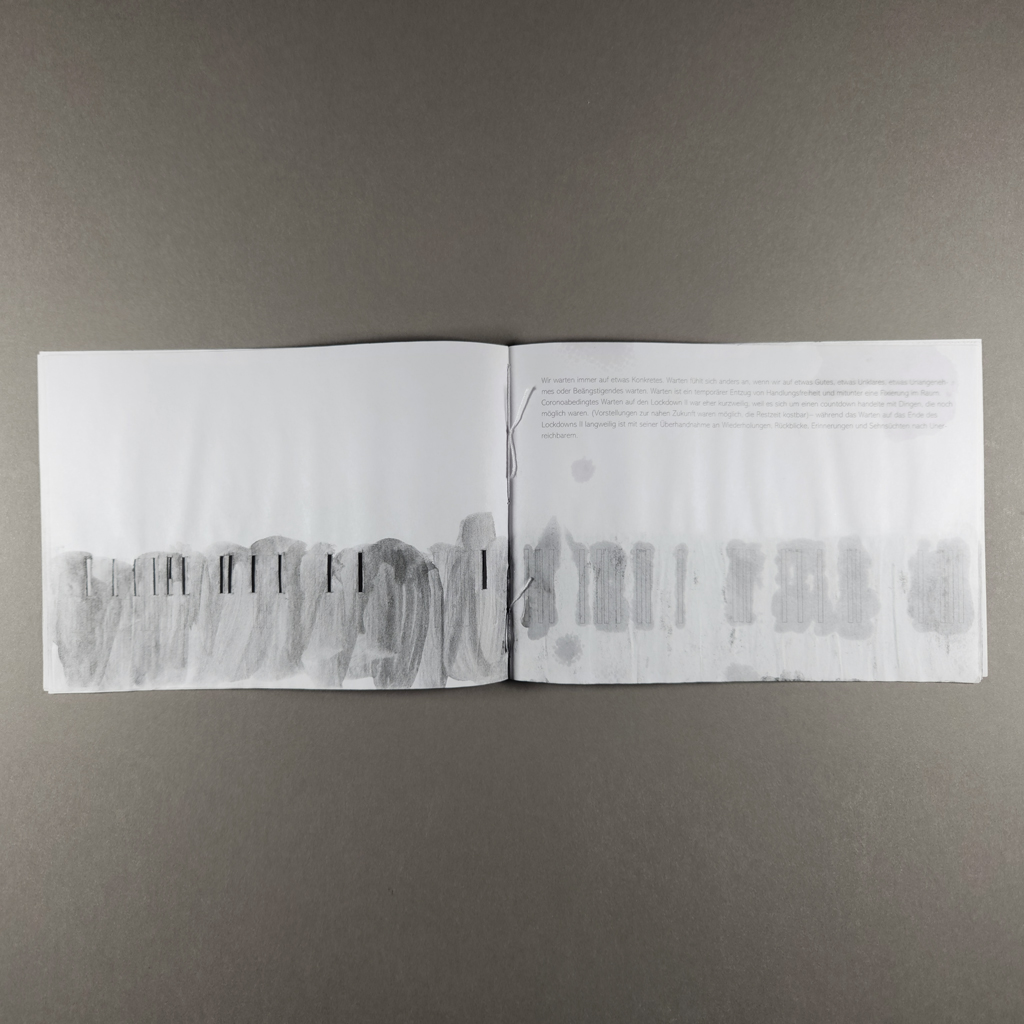
In this context, it is worth reexamining the images, especially the cut-out rectangles. These windows let the reader look through the recto to the next page, but they also keep the previous page in view on the verso. Like memory and anticipation, the cut-outs disrupt the book’s linear progression by reopening the past as the reader moves toward the future. Or maybe we are meant to look at the absences, not through them. Only toward the end of the sequence, when Kreiser’s graphite embellishments are applied loosely in a liquid medium, do the cut-outs reveal anything but whitespace, and then only a murky gray wash.
Warten enacts the experience of waiting that Kreiser describes. We hurry, then linger. We focus, then let our minds wander. We see patterns where there is noise — or nothing at all. We count and measure. We predict, desire, and forget. What is remarkable about Warten is not so much that we find meaning where there is none, but that we can do so even while reading about it.Kreiser is like a magician who explains her illusion and still fools the audience.
Warten also enacts the experience of not waiting. After all, the book exists because Kreiser could wait no longer for her copy of Awaiting Oblivion to arrive. It exists because, as Kreiser puts it, “the enforced immobility of waiting turns into an urge for action.” There is indeed a sense of urgency in the cutting, burning, and staining that distinguish each copy of the book. Repetition and failure are recurring themes in Kreiser’s work, and it is hard not to see the varied edition of Warten as a structure for Kreiser to work through the pandemic, to write the disaster. It would be too literal to invoke Lacan’s description of jouissance as a stain, but Warten exemplifies the paradoxical painful-pleasure that comes with repeated attempts — and failures — to find satisfaction.
-
Workshopping at WSW
Workshopping at WSW
Emily Larned
2025
Alder & Frankia22 pages
4.375 × 11 in. closed
Saddle stitch with gate folds
Risograph
Edition of 500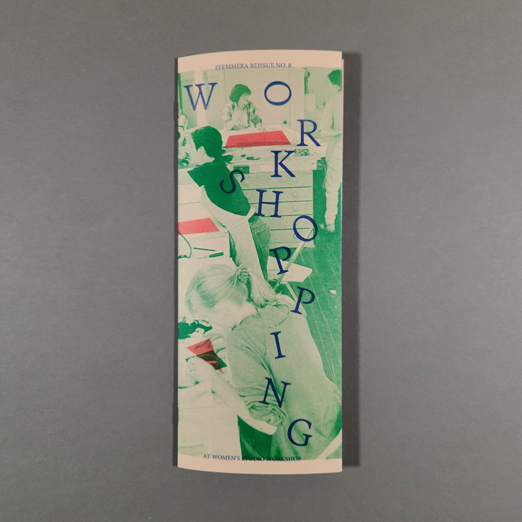
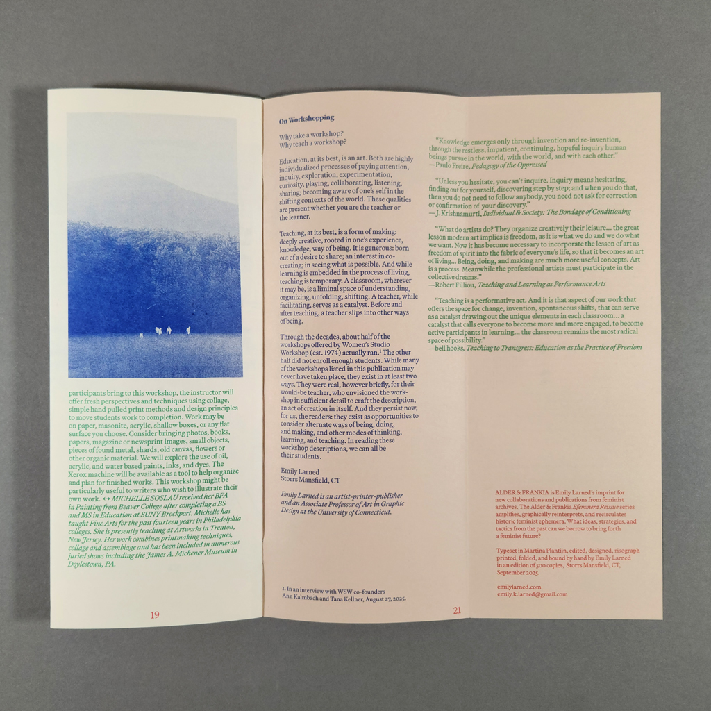
Workshopping at WSW is essentially a catalog of workshops held at the Women’s Studio Workshop in Rosendale, NY — except the workshops are from 1983–1999, and some of them never ran. The staple-bound pamphlet is part of Emily Larned’s Efemmera Reissue series, under her imprint Alder & Frankia, which is dedicated to reinterpreting and recirculating feminist ephemera. Workshopping is a charming slice of time, and the reader sees Larned’s hand making the slice. By valorizing overlooked administrative labor, Workshopping puts into practice the feminist ideals it documents.
It is easy to imagine that the original WSW newsletters and catalogs looked something like Workshopping. Its narrow format, toned paper, and three-color Riso printing could pass as a conventional brochure, although its gate folds make the simple structure surprisingly interactive. The text — descriptions of workshops and brief bios of the facilitators — is reproduced verbatim. Some of the workshops feel of their moment, and others could be offered today. They index the progress made by women artists and the work that remains to be done. There are workshops on specific techniques, theories, and histories, and others that are more about empowerment and consciousness raising. Many challenge the boundary between art and the everyday, like Linda Montano’s “Learning to Pay Attention (Art for Life)” and “Circulating Energy,” in which the famed performance artist would help participants work through trauma.

The entries are organized chronologically, with the years “stamped” in red ink, forming a timeline down the right margin. Larned has added meticulous image credits and notes about missing information plus a reflective statement on teaching and learning. There are also photographs from the WSW archives, printed in blue monochrome, which give a sense of the studio but do not document the specific workshops in the text. Larned has overprinted green and red forms to accentuate details in the photographs, as one might highlight a passage of text. Tucked into the back inside cover is a self-addressed envelope. Instead of sending payment for a workshop, the enclosed form encourages readers to submit their own imagined workshop to Larned’s exhibition at WSW, also titled Workshopping, which runs from October 3, 2025–January 23, 2026.
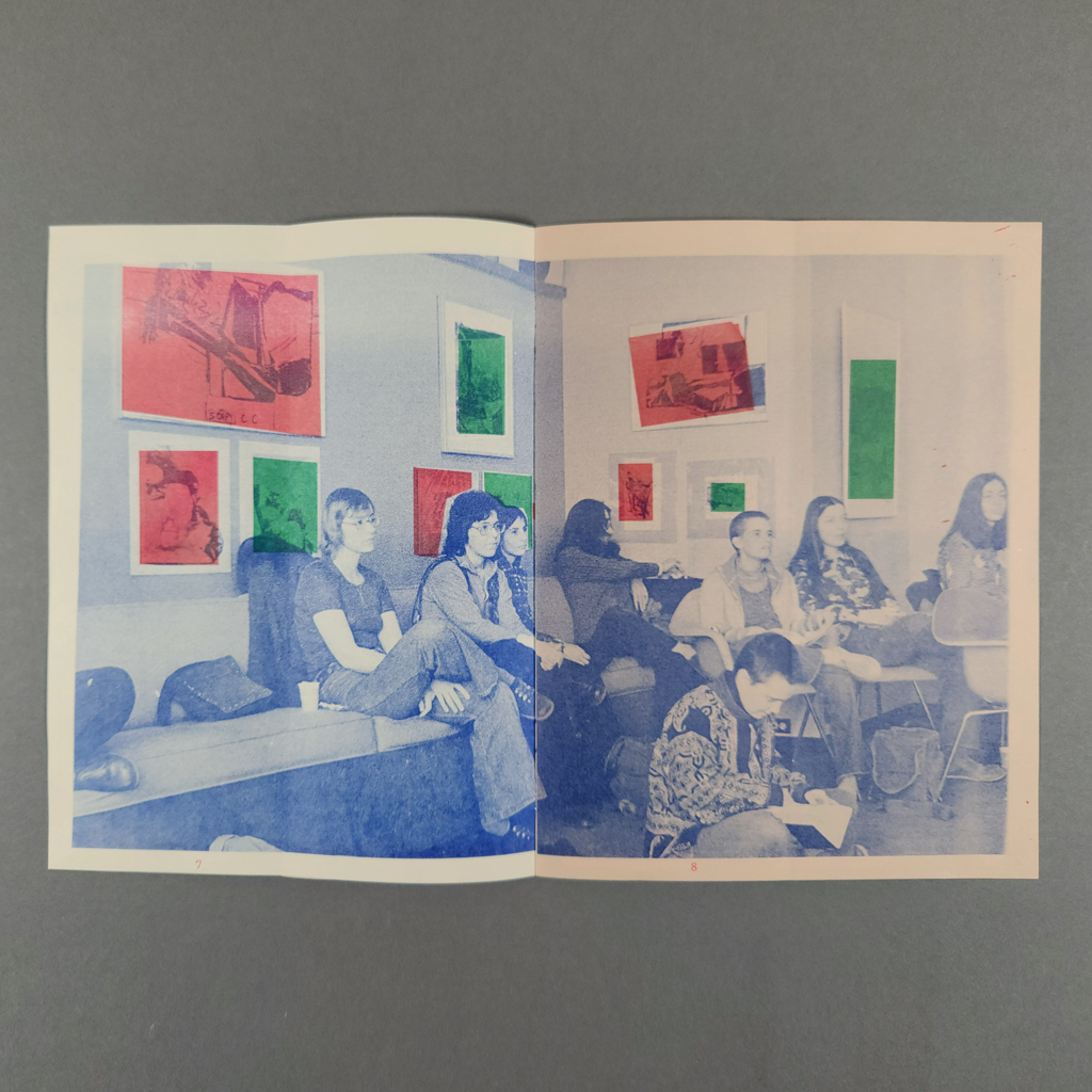
The publication is interactive in more subtle ways, too. The gate folds conceal content, inviting readers to reveal images behind the text much as Larned uncovers unfamiliar ephemera in the archive. The overprinted additions to the images remind the reader that Larned’s intervention is not neutral: she chooses what to include and exclude. What might be discounted as administrative or editorial labor — compiling a pamphlet from extant texts — is also writing, art, design, and curation. Most notably, Larned has excluded straightforward book arts workshops in favor of more experimental, cerebral, and therapeutic offerings.

The selection makes a stronger case for Larned’s argument that envisioning and proposing, much less leading, a workshop is a considerable creative undertaking. It also means that many of the workshops likely never ran. As Larned’s project statement explains, only about half of proposed workshops filled, and the ones presented in Workshopping are hardly the most practical. The descriptions represent artists imagining experiences that did not yet exist and taking calculated risks, balancing what seemed interesting and important with what would attract participants. In other words, creating a workshop isn’t so different from making art. The reader also gets to imagine the workshops into existence. Without knowing which workshops really ran, they are equally real in the mind of the reader. This is the power and peril of archival sources: so much is left to the imagination.
Larned neither romanticizes nor demonizes the archive — she uses it. The Efemmera Reissue series reanimates feminist ideas to put them into practice. In Workshopping, that mission is threefold: the workshop descriptions have ideas that remain valuable today; readers can contribute concepts of their own; and Larned models a feminist archival methodology. By inviting its readers to contribute speculative workshops, Workshopping produces another archive. Workshopping is reciprocal, not extractive, as concerned with the future as it is with the past.
-
how to build a ____.
how to build a ____.
Madeleine Aguilar
2023
bench pressIssues:
1. Madeleine Aguilar
2. Ray Madrigal
3. Jane Ferry
4. Bex Ya Yolk24 pages
7 × 8 in. closed
Saddle stitch
Risograph printing
Editions of 250
Madeleine Aguilar calls how to build a ____. “a series of artists’ responses to organizing their creative practice in 20 steps.” I wouldn’t usually begin a review by quoting from an artist’s statement, but the challenges — and risks — of distilling one’s practice are central to this project. Fortunately, Aguilar is particularly good at explaining herself and her imprint, bench press. She writes, “bench press is a risograph press based on friendship, play & collaboration. books are remnants of generative conversations & mutual exchange between artist + publisher.” The series may blur generic boundaries (zine, pamphlet, manifesto), but one thing is clear: this is not about bookmaking, it is publishing as artistic practice.

Bench press prefers books that do something (guidebooks, workbooks, instruction manuals). How to build a ____. falls into this category, even if the guidance is sometimes more poetic than practical. Each pamphlet is printed in two colors on legal-size paper in classic office colors (mint, goldenrod, lavender). Along with the Risograph printing, itself an office technology, the paper choice amplifies the contrast between practical instruction, with its implied hierarchy (expert and novice, manager and employee), and the horizontal dialogue in each issue of how to build a ____. To date, these collaborations feature Jane Ferry, Ray Madrigal, Bex Ya Yolk, and Yutian Liu (although Liu’s issue came out in 2025, after I received my review copies). Aguilar also created an issue of her own.

Aguilar’s design unifies the variety provided by her collaborators. The main text, the twenty numbered steps each artist takes to organize their practice, is set in bold, black type at the top of each page. The imagery, which sometimes includes handwriting, is printed in a second color. The contrast ensures that the main text is legible even when unruly images fill an entire page. These are not neat, finished pieces. We see how the artists plan and reflect on their work, through sketching, writing, photography, and collecting. The images seem to challenge or complicate the text as often as they illustrate it.
Each artist has a distinct practice, which comes through in their pamphlet, but there are also common threads among the artists — hardly a surprise since they have a mutual friend in Aguilar. Attention and mindfulness are one such connection. The mix of practical and poetic advice is another similarity. These features connect how to build a ____. to a tradition stretching back to conceptual art and Fluxus works of the 1960s and ‘70s. Yet there are clear differences, and how to build a ____. feels thoroughly contemporary. The artists’ politics are more explicit, their identities are more important, and their bodies are more present. If artists in the sixties read eastern philosophy and did drugs, artists today read queer theory and do therapy.

Another difference is how the interest in process manifests. How to build a ____. is not a renunciation of authorship in favor of the reader. True, the reader may follow the instructions offered, but the process behind the pamphlet is just as important. No matter what the reader does, the collaboration between the artist and publisher happened; it was more than a thought experiment. Aguilar takes advantage of the immediacy of the Risograph process to introduce new artists to bookmaking and publishing. The result feels like a dialogue between artist, publisher, and machine, unfolding in real time.
It might be too much to claim that how to build a ____. inaugurates a new genre, but the series fills a void where other forms fall short. The pamphlets are more interesting than most artist’s statements. They are less presumptuous than most manifestos. They are more imaginative than most websites and more substantial than most social media posts. Each of these has its place, and they are not mutually exclusive. I was glad that the inside back cover of each issue features the artist’s bio, and I eagerly looked up their websites. Still, how to build a ____. strikes a satisfying balance between process and product, creation and reflection, thinking aloud and dialogue.
-
The Streets Are Very Quiet
The Streets Are Very Quiet
(You Look Like The Right Type, Book 2)
Mark Addison Smith
2022
Printed at Fort Orange Press448 pages
9 × 6 × 2 in. closed
Smyth-sewn, case-bound
Digital printing inside with foil-stamped cover
First edition of 150
The Streets Are Very Quiet belongs to a series of daily drawings titled You Look Like The Right Type, which Mark Addison Smith began in 2008. It is also a COVID project. The book therefore captures the uncanny combination of continuity and disruption that characterized life after March 2020. The same tension is inherent in Smith’s project: each day he jots down a phrase he overhears, then renders it in expressive hand lettering, sometimes accompanied by illustration. Snatched from the flow of conversation, these specimens of speech are captured on Bristol board like butterflies pinned in a shadowbox. So too does the book interrupt Smith’s yearslong project with a front and back cover. In this case, the pause is welcome. The Streets Are Very Quiet is a playful yet sensitive archive whose importance will only grow as 2020 recedes from public memory.

The book’s archival function is enhanced by its hardcover heft. It is durable, bordering on monumental. The selection of 365 compositions is also significant, although they come from the early months of the pandemic, not a complete calendar year. No longer able to eavesdrop in public, Smith arranged online conversations with strangers to continue his daily drawings. He explains his process in the book’s foreword and includes an appendix with follow-up interviews at the end. Keeping with his usual method, he transcribed the conversations rather than recording the audio. Nevertheless, most of the texts in The Streets Are Very Quiet are longer than the serendipitous phrases from the pre-COVID project. One result is that the conversations span multiple pages, helping to invest the reader and propel them forward.
There are still plenty of stand-out phrases, though. There is still absurdity and serendipity. After so many years, Smith knows a good quote when he hears it — and he knows how to visualize it. If anything, the longer passages showcase his subtle translations of volume, rhythm, tone, and attitude from sound into image. Paradoxically, the reader gets a better sense of the speaker’s voice and also the artist’s hand. Smith’s lettering strains under the amount of text he works with each day. Even before COVID, his commitment to You Look Like The Right Type was impressive, but in The Streets Are Very Quiet, he no longer makes it look easy.
Of course, appearances can deceive. Smith conveys spontaneity, but the compositions are always well resolved. In another balancing act, the line drawings are just good enough; they hold up to the lettering without overpowering it. The lettering is the main event, but the illustrations add depth and complexity to the book. Outlines overlap and intersect, especially in human figures, visualizing the central theme of connection. Yet the figures seem insubstantial; not fragile so much as fleeting.

It may seem surprising that You Look Like The Right Type can speak so eloquently to pandemic isolation when the project is rooted in public spaces and interpersonal exchange. However, the strange mix of mundane observations and existential questions that characterized the stay-at-home period fits perfectly with the decontextualized clips of conversation that Smith illustrates. If artists notice details that others ignore or ask big questions without hoping for answers, then sheltering in place made artists out of many people in the spring of 2020. Not that we just sat around thinking: The Streets Are Very Quiet reminds the reader just how much there was to do — and how much pressure there was to do something, anything — during those early months. The reading experience replicates that feeling of being pulled in so many directions while stuck in one place, only now it is enjoyable.
From the beginning, You Look Like The Right Type was as much about isolation, or at least separation, as it was about connection. The texts are unguarded, but the speakers remain strangers — even to Smith. Ironically, it was only through the pandemic that the project evolved from eavesdropping to dialogue. Smith excels at visualizing voice, but his very ability to cut and polish a piece of conversation only removes it further from its origin. His compositions are bittersweet, like a stunning image on a postcard that can only wish you were there. That begins to change with The Streets Are Very Quiet. Yes, we feel the pain of separation and confront the limits of mediation, but we also remember the consolation of connection.
-
American Weather
American Weather
Mary Margaret Alvarado and Corie J. Cole
2024
NewLights Press64 pages
9.25 × 7 in. closed
Link-stitched softcover with detachable jacket
Risograph inside and letterpress cover
Edition of 200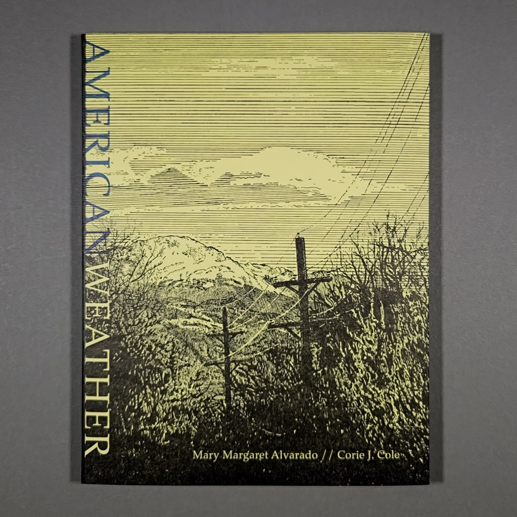
American Weather is a collaboration between writer Mary Margaret Alvarado, artist Corie J. Cole, and publisher Aaron Cohick. Alvarado first published the titular essay in 2015, in the immediate aftermath of a mass shooting near her home in Colorado Springs, where Cole and Cohick also lived. With their local perspectives, the artists aim to counter national news cycles and narrative structures. At the same time, Alvarado braids personal, political, legal, and sociological evidence into a broad indictment of American gun culture. Throughout, Alvarado shows how failures of storytelling and imagination helped propel the country toward this horrific status quo. By rejecting these patterns, American Weather tells a compelling story without normalizing, much less glorifying, violence and seeks “to make a world where it’s easier to be good.”
Cohick and his partner, Cole, had been reading Alvarado’s essay for years, a repeated ritual after one mass shooting then another, before he decided to republish it. The result is not quite an illustrated essay, since Cole’s images tell their own story. Likewise, the text is never merely a caption. American Weather is a hybrid book with interwoven movements of text and image. These include a new afterword in which Alvarado profiles RAWtools, a local organization that buys back guns to melt down and forge into tools and other functional objects. By depicting this redemptive process, Cole addresses gun violence without portraying violence or victims, a particularly thorny challenge for a figurative artist.

Like the guns, Cole’s images have been transformed by fire: they are underpainted on ceramic tiles, the irregular edges of which have been preserved in the Risograph-printed book. In the main essay, the images are cropped close and kept abstract. It is the afterword that provides enough context to interpret these jumbles of gun parts. Following Alvarado’s written afterword, a straightforward sequence of Cole’s paintings shows the process from gun to garden tool. Perhaps the sense of closure implied by this linear narrative of progress is resisted by the trowel, which evokes the cyclical, seasonal activity of gardening. A gun can be unmade; a shooting cannot.
The book easily integrates the illustrations, afterword, and original essay, because the texts themselves follow multiple lines of inquiry. I mean this literally: Alvarado walks the path taken by the shooter. She goes to a gun club and learns to shoot. She parses the cognitive dissonance of a workplace active shooter training/holiday gathering and recounts a traumatic incident involving her sister and nephew. She visits RAWtools and interviews Pete, who had turned in his gun after losing his son, and then his wife, to suicide. For Alvarado, writing takes place out in the community, not behind a computer screen.
In this sense, American Weather is a natural fit for NewLights Press. Cohick prioritizes process over product. He works iteratively and returns to previous projects. Cohick also appreciates a manifesto, so he knows how to present a persuasive piece like Alvarado’s while still leaving room for the reader. But whereas Cohick’s solo publications, including his manifestos, often challenge legibility, American Weather is crystal clear. The typography is conventional, the text is kept separate from the images, the margins are generous, and the book is clearly organized (despite lacking page numbers). The collaborators’ shared interest in process instead manifests in their working with members of the community, like Pete and Mike at RAWtools.

Many artist-publishers are interested in community, in how publishing makes a public. Such questions are particularly pertinent for American Weather because Alvarado’s analysis centers on the quality of community, on “front-porch versus back-deck culture.” She demonstrates that today’s interpretations of the Second Amendment rely on “the idea that society is a fiction,” evoking a frontier mythology where each individual is “an army unto himself.” After recounting several scenarios from her training simulation at the firing range — the same one that police officers use — Alvarado poses her own scenarios, ones that reflect the reality of gun violence in America. She finishes, “Imagine that all the scenarios are relational: your wife, your sister, your son. Then move on from there: his wife, her sister, their son. This is how we have a society, if we want one.”
Art may seem powerless against gun violence, but American Weather reveals how much of American gun culture is a matter of storytelling and imagination. This is precisely the terrain where art is effective, especially publishing, with its capacity to connect people with one another. In her artist’s statement, Cole distinguishes between childish and child-like ideas. Wishing to end all violence may be childish, but so is the reassuring simplicity of news stories and training simulators, with their good guys and bad guys, neighbors and outsiders. American Weather counters these corrosive narratives with nuance and context, but the book also indulges in its own utopian speculation. As Cole writes, “if we can’t imagine it, it can never be.”
-
praying for joy
praying for joy
Isabel Baraona
202520 pages
Saddle-stitched pamphlet
6 × 9.5 in. closed
Digital printing
Edition of 50
Praying for joy is a short pamphlet containing a single poem by Isabel Baraona. A single poem, but one created by remixing and redacting two earlier pieces. Praying for joy shares its title with a painting series from 2010 and deals with themes that have long interested Baraona. Like the artist, the reader returns and reworks material in praying for joy; each page is an erasure of the same longer poem, which occupies the pamphlet’s center spread. These erasures build toward the full poem and then break it apart, beginning and ending with a few spare lines. The premise is simple, but the reading experience elegantly enacts the book’s themes and offers alternatives to the artistic traditions Baraona investigates.

From the beginning, praying for joy foregrounds the role of the reader with life-size hands, rendered in ink or watercolor outline, on the outside covers. On the inside covers, the respective hands face palm up and seem to be holding blood vessels or nerves — recurring motifs in Baraona’s work — or perhaps they are flayed open, revealing their inner workings. Less typical of Baraona’s books, there is no other imagery in the book, and the text is conventionally typeset. Each page retains the layout of the complete poem, with empty spaces where words and lines were redacted. By setting type only on the pamphlet’s rectos, Baraona emphasizes the text’s incremental evolution, although the relatively opaque cream paper makes the palimpsest more textual than visual.

Like much of Baraona’s oeuvre, praying for joy deals with gender and power, bodies and language, subject and object, and artistic creation itself. Such themes invite psychoanalytical readings, and the invitation is explicit in the earlier work remixed into praying for joy — Baraona dedicated her 2013 poem “Prière de Bonheur” to Belgian writer and psychoanalyst Henry Bauchau. Like that earlier poem, praying for joy addresses the tragic female archetypes inherited from classical literature.

As the pamphlet progresses toward the center spread, the possibilities opened by erasure are closed. The first page reads: “I, / we, / saved by nonsense, by a shared laughter / praying every day for joy.” But the I and we who first share laughter become: “I, male subject / we, female plural / praying every day for joy.” Baraona can radically shift the meaning and tone of each iteration with minimal changes from page to page. The added word “barely” can turn hope into despair. A subject can be made into an object, their actions taken and attributed to someone else. Then, the poem breaks apart, and possibilities return to the blank spaces between words and lines.

In addition to the text’s themes, the reading experience itself is psychoanalytical. As the reader pulls apart and pieces together fragments, what is redacted (or repressed) speaks as loudly as what is said. And, like Lacan’s ideal ego, the promise of a unified whole, the in-tact poem in the center spread, is illusory: it points back to Baraona’s earlier works, which point back to Bauchau or Euripides and Sophocles, and so on. Nevertheless, praying for joy leaves the reader with cause for hope. The paranoid style of reading between the lines is balanced by the reparative possibilities of remixing and reworking a text.
In terms of art practice, it is promising to see Baraona revisit older works, including one-of-a-kind paintings, and produce an affordable, accessible pamphlet that is undeniably a work of art in itself. Pieces like praying for joy invite new readers to consider how a book’s material and structure informs its meaning and, in the case of this English version, to enjoy Baraona’s writing in addition to her image-making. Old criteria about “primary” or “autonomous” works of art not only risk overlooking works like praying for joy but miss the point of its connections with other texts and traditions.
Indeed, such connections constitute another cause for hope, one with consequences beyond the practice of artists’ books and publishing. What makes tragedy tragic is inevitability. The tragic character — a woman like Medea or Cassandra — knows their fate but does what they must do anyway. Baraona breaks the cycle. Remixing, redacting, and revising reminds the reader that other possibilities already exist within the text. Nothing is inevitable. Baraona’s refrain, “praying every day for joy” is a genuine expression of hope and desire. Even as we work within a given tradition, new meanings — and maybe even new endings — are possible.
-
Interruption: A List of Words and Phrases
Interruption: A List of Words and Phrases
Julie Graves Krishnaswami
Design by Megan Mangum
2022
the jenny-pressSelf-covering accordion with thread loop for hanging
7.5 × 5.5 in. closed
Offset printing
Edition of 300
Interruption: A List of Words and Phrases is based on Julie Graves Krishnaswami’s 2021 Interruption Carbon Series. The original drawings, made through an elaborate process with stenciled vinyl letters and carbon paper, trade some of their material qualities for an impressive visual presence — the accordion book stretches over eight feet long — and additional context from its sharply written foreword. Since the book’s text is gathered from decontextualized fragments like “pardon me” and “may I interject,” the foreword helpfully identifies their source (proceedings at the U.S. Senate Judiciary Committee) and notes that the interrupted speakers are all women. By pairing text from the halls of power with materials evoking pink-collar clerical work, Interruption spotlights the silencing of women from all walks of life.

Krishnaswami examines the phenomenon of women being interrupted through drawing and performance, but the accordion book structure is particularly well suited for the poetics of continuity and discontinuity. That very quality can also pose problems — how to separate the text and paratext or how to treat the outside and inside covers — which designer Megan Mangum cleverly resolves. The front cover of Interruption unfolds horizontally like a typical codex. The three-page foreword is housed in this bi-fold, separating it from the “list of words and phrases,” which tumbles down vertically on lighter weight paper.
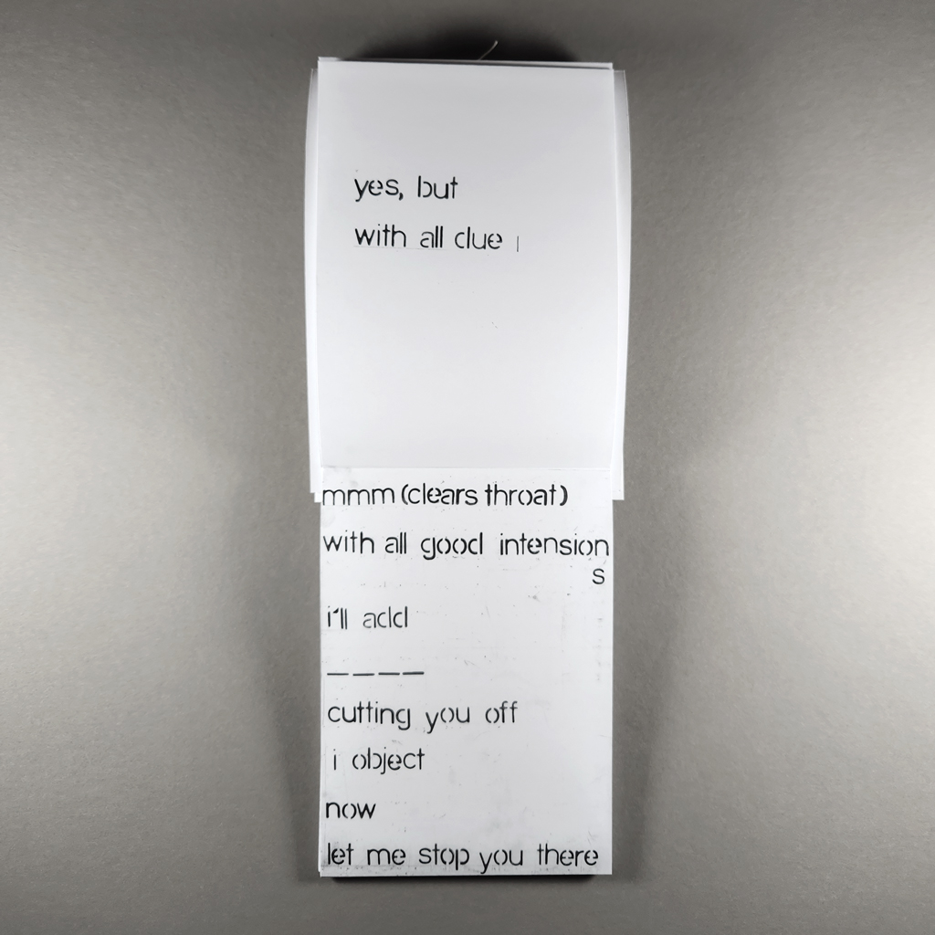
In an accordion, the folded page breaks are present but attenuated, and the book can be read page by page or seen all at once. In fact, a thread loop is sewn through the cover’s spine so the book can be hung vertically. Thus, the book stops incessantly, but the list of interruptions seems endless. The paradox of endless ending is accentuated by the page layout. A phrase like, “let me stop you there” might land just above a folded edge, but elsewhere a yawning gap follows “with all due,” marking the space where “respect” ought to be — but isn’t.
The partial page breaks of the folded panels are enough to gently organize the text. Rhythms and patterns emerge from what first appears to be a random selection of interruptions. The phrases seem to follow Krishnaswami’s train of thought rather than their order of appearance in the original Senate transcripts, and the artist’s acerbic humor comes through in her sequencing and juxtaposing. Krishnaswami’s presence, which is critical given the issues at stake, also manifests in traces of her hand — smudges and stray marks, outlines and guidelines — which the book’s offset printing convincingly transmits. (Indeed, I found myself reflexively checking my fingers for graphite despite knowing the book is printed.) Digital tools could make quick work of finding and aggregating interruptions in a Senate hearing, but Interruption foregrounds cognitive and manual labor.

The value of labor — pink collar, professional, artistic — is central to Interruption but remains provocatively unresolved. In the foreword, Krishnaswami argues that if even the most accomplished and powerful women are disrespected in the U.S. Senate, then everyday women hardly have a chance. But a Senate hearing isn’t everyday speech. Nominees and expert witnesses grandstand, stonewall, duck questions, and bloviate. One might argue that Krishnaswami’s source text differs from everyday speech by type, not merely degree. Amid all too familiar interjections, “reclaiming my time” reminds the reader of the Senate’s rules of order.
On the other hand, power plays and performance are hardly relegated to C-SPAN. If Krishnaswami said Interruption was based on a staff meeting, I would believe it. Interruption is about structure — linguistically, artistically, and politically — rather than content. The use of “I” and “you” in most of the excerpts further blurs the original context, thrusting the reader into both roles, interrupter and interrupted.
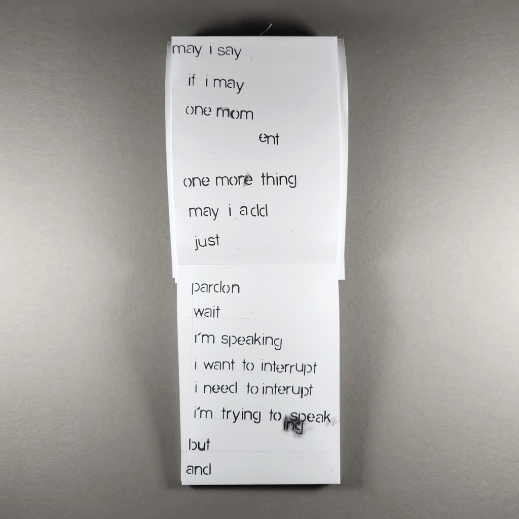
Ultimately, Interruption is, itself, an interruption. By defamiliarizing ubiquitous phrases, it calls attention not only to the larger phenomenon but to important nuances within everyday speech. Consider the escalating urgency in “I want to interrupt / I need to interrupt” or the difference between “I’m speaking” and “are you hearing me.” As an interruption, the book’s ability to hang for display is more than an afterthought. Imagine if it were hung in a boardroom or a classroom, an insistent reminder of the power behind practically invisible words and phrases. Not a panacea, to be sure; like the folded edge in an accordion, Interruption is only a pause, a moment to reflect before stopping or carrying on.
-
Last Pages
Last Pages
Rahel Zoller
2024
Edition TaubePerfect-bound softcover
200 pages
6.25 × 9.25 in. closed
Offset printingReview by Michael Hampton

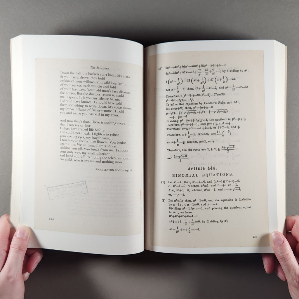
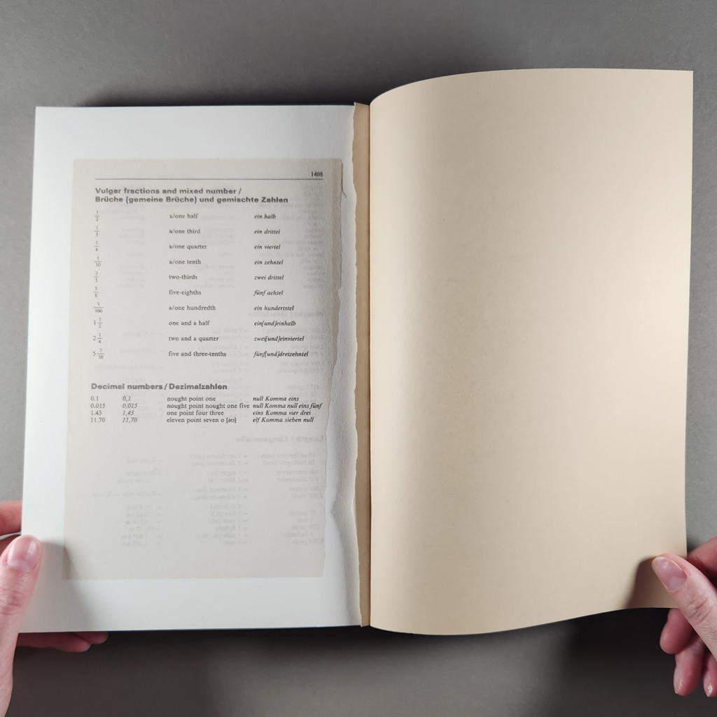
In her extended collection of illustrated final page samples, torn from discarded books found in various street book swaps, recycling bins and gutters of European cities during the summer of 2022, Rahel Zoller presents the reader with an extended cache of high and low material that demonstrates her bibliographic athleticism and dedication. First, she had to spot and salvage this detritus, then organize it into Last Pages, which displays a bank of serendipitous samples in Dutch, English, French, German Fraktur, Norwegian, and Vietnamese.
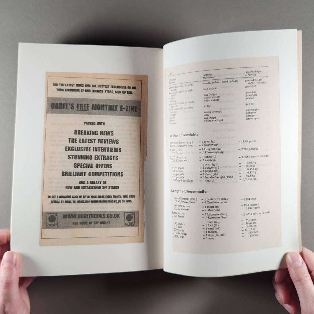
Following in the footsteps of that great 17th century antiquarian scavenger, John Bagford, whose life spent going through the binder’s waste of London’s printshops resulted in his two massive folios of scraps, Fragmenta manuscripta and Fragmenta varia, Zoller’s book is a highly personalized collection.[1] Lacking any standard paratextual apparatus (Table of Contents, Introduction, Colophon), the 200-page picture gallery is no Dewey Decimal-systemized library, parceled up into categories and genres.
No, everything is put together here in a dissonant, jumbled pile, “a textual menagerie of chance” as the blurb on the bespoke Edition Taube bookmark puts it, confirming Liam Gillick’s observation in Industry & Intelligence (2016), that contemporary art is “a pile” and “essentially an accumulation of collapsed ideas.” So, Zoller is on interdisciplinary message here. There is however a discernible ordering principle: sequential page numbers of vagrant loose leaves (reproduced as color facsimiles) which start at number 15 and continue to 1408, the very first page being an inapplicable Author Index located at the very beginning rather than end of this bizarre book!

Diving in, it soon becomes clear that Indexes, General Bibliography pages and Acknowledgements abound, quite naturally (even a Pronunciation page), but as the former are divorced from any referential contents, their striking beauty as stranded typographic artefacts is disclosed. We get self-help lit aplenty, topics such as binomial equations and karate, a hymn sheet, a recipe for a fragrant tea blend, followed by its author, Patricia Lousada’s, bio (each last page has been photographed back and front, appearing as recto and overleaf verso throughout) and learn that A Man for All Seasons had an alternative ending, plus, via a helpful running header, that noir detective Mike Shayne was on the case in Murder Wears a Mummer’s Mask.
So, narratives start, go nowhere, and end abruptly, each acting as an inadequate terminal précis of what has gone before, stories or discourse we can guess at but not immediately consume. Typically tantalizing as a random concluding sentence is
Bang went the cracker and out fell the usual assortment of a paper hat, a bad joke, and a lucky charm.
The sole identifiable text (speaking personally and without any Googling), is Stephen Knight’s The Final Solution, an outlandish, and now discredited Jack the Ripper hypothesis involving the British royal family. So, detection or reverse engineering of missing titles, is one of the interactive reader games which Last Pages sets up — a pastime which could very easily become obsessional. In contrast, the special offer and order pages of defunct imprints such as Grafton Books and design elements like the ironically named Futura typeface hang redundantly on white backgrounds.
Faded material piles up: yellowed and autumnally toned in subtle ways, embrittled acidic pages, and the cryptic loose leaves of books doubling as the actual evidence for “special types of chronographs” in Craig Dworkin’s memorable phrase.[2] An inviting blank page is graffitied with a child’s red crayon scrawl, a classic oval stamp in violet ink, courtesy of Poplar Public Libraries, London. In some respects, these lost, last pages resemble palms that must be read for their fate lines and forks, possibly even used stochastically for bibliomantic purposes.
So much for page view analytics then, Rahel Zoller’s Last Pages is curated to deliver a series of hits, the ultimate being that its own final page has itself been torn out, in a moment of whimsical, designer vandalism, leaving us to wonder about its content and fate, or even, perish the thought, tear out and scatter its own facsimile pages to the four winds! Rather that, than see odd disbound vellum pages from Latin incunables used to make lampshades, a fad in 1930s stockbroker belt England!
Inevitably, anything marketed as last will be elegiac in tone, suggestive of an imminent global doomsday. Take this editorial description of Stanley Schtinter’s Last Movies and compare it with Last Pages, the sentiment here virtually identical:
Last Movies antagonises the possibility of survival in an age of extremity and extinction, only to underline the degree of accident involved in a culture’s relationship with posterity.
So, in an age of increasing geopolitical disturbance and uncertain horizons, Zoller’s trail mix of synecdochic samples — or ‘speciments’ in Bagford’s early modern jargon — the lost limbs of phantom bodies, comprise a sort of reliquary, perhaps with eschatological undertones, for the armchair scavenger with a taste for bibliographic mysteries.
[1] For more on Bagford, see my review of Whitney Trettien’s book, Cut/Copy/Paste:
Michael Hampton, “Cut/Copy/Paste: Fragments from the History of Bookwork,” Openings: Studies in Book Art Vol. 6, No. 1 (2023) BR 1–2, https://journals.sfu.ca/cbaa/index.php/jcbaa/article/view/99/185.[2] Craig Dworkin in Michael Hampton, Against Decorum (Information as Material, 2022), 1.
-
Melt
Melt
Philip Zimmermann
2023
Spaceheater EditionsSmyth-sewn softcover with exposed spine; separate z-fold colophon
Hinged metal container with clear plastic window
200 pages
3.25 × 5.125 × 1 in. closed
UV-cured inkjet printing with foil stamping on front cover and container label
Edition of 175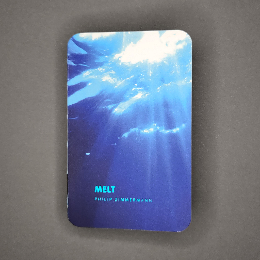
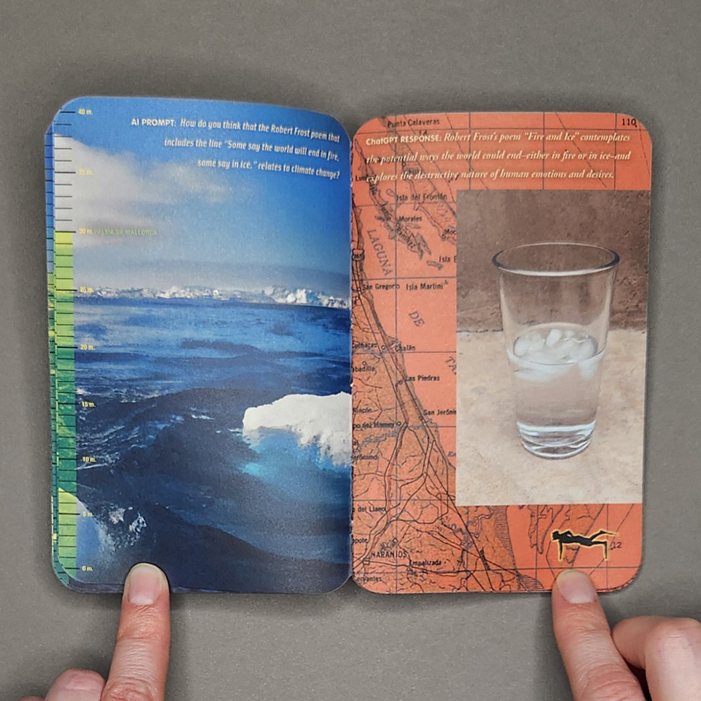
Melt is the second in what Douglas Adams might call Philip Zimmermann’s increasingly inaccurately named trilogy of books on climate change. (The first is Landscapes of the Late Anthropocene, and Zimmermann has since published In the Desert and Accelerated Entropy). Melt exhibits the hallmarks of Zimmermann’s best work, which would be no surprise after fifty years of bookmaking, except that most of the book’s text and imagery is generated using artificial intelligence.
Melt must be experienced in more than one manner; it is both a flipbook to be watched and a complex text-image sequence to be carefully read. Certain elements play out in discrete sections while others run the length of the book. Given the topic, issues of speed, duration, and closure are central.
The page count (two hundred) is derived from a list of the first hundred cities likely to be submerged by rising seas. Each verso presents one city alongside a graduated scale of projected sea level rise. As the book progresses, so does the sea level, from one meter above today’s sea level (Miami is the first to go) to forty meters (Beijing). The cities thus rise from the bottom of the page toward the top, while the scale fills up. This is activated, like captivating, horrifying progress bar, when the book is flipped through, but the main animation is across the gutter.

While whole cities are annihilated on the verso, the recto features something mundane but poignant: a glass of iced water melting in the Arizona heat. Behind this animation, which only occupies a portion of the page, details of different maps serve as backgrounds. These too are animated in the sense that they are tinted in increasingly alarming shades of red, turning them into literal heat maps. So, by flipping the book, the reader raises global temperatures and sea levels all in the (accelerated) time it takes to melt a glass of iced water. As the rectos redden, the left side of the book stays consistently cool thanks to the main feature: behind the sea level scale each page is dominated by a full-bleed image of a coastal environment — glaciers, sea ice, ocean waves — rendered by DALL-E.
Zimmermann includes the text prompts that spawn these images, but most of the book’s text is drafted by ChatGPT 3.5. The book is far from an excuse to use AI, but Zimmermann is clearly interested in its capabilities and shortcomings: he asks it to analyze a poem by Robert Frost and to write its own poem in the style of Charles Bukowski. He even prompts ChatGPT to suggest what sort of images would be effective in a book like Melt. Yet the book remains a critical investigation, however much Zimmermann enjoys playing with authorship and new technology, because of the unavoidable connections between AI and climate change.
These connections, whether the energy and water consumption of server farms or the fact that AI itself might pose an existential threat to humanity, add to the uncanny effect of Zimmermann’s dialogue with ChatGPT. In addition to poetry, he asks the AI to produce an essay on why humanity is slow to act in the face of existential threats. The large language model invokes human nature to explain why people might continue to develop real estate in Miami, though this is only one factor among “a complex interplay of factors” — a mealy-mouthed non-answer that those of us who teach in the age of AI have learned to recognize. Elsewhere, ChatGPT answers Zimmermann with a surprising frankness, almost unimaginable among politicians or powerbrokers.

Glimpses of Zimmermann’s humanity (and authorship) do come through. His text prompts retain a dramatic, lyrical quality that seems to accommodate his human readers more than his AI collaborator. He also manipulates DALL-E to render images that seem less real, like glacial ice of “an impossibly unnatural swimming pool-like azure.” Or perhaps that is what it takes for DALL-E to approach the grandeur of the natural world. Overall, the images seem plausible, aided by a disorienting, fractal quality that makes it hard to determine distance or scale. They are also dramatic; even as we read Zimmermann’s instructions for “majestic, but sad, images…that make us feel both lonely and desperate,” we cannot help but feel lonely and desperate, albeit layered under irony and self-awareness.

Most of all, Melt elicits feelings of urgency and anxiety. The reading experience is information overload. Pursuing the continuous texts means ignoring cities, some with millions of inhabitants, as they succumb to sea level rise. Conversely, animating the melting iced water conveys a sense of urgency but obfuscates the root causes and long-term solutions addressed in the book’s AI-generated essays. In fact, ChatGPT warns the reader about cognitive biases toward short-term thinking. Eventually, of course, the full book can be read — and enjoyed — just not all at once. Arguably, Melt is as much about time and attention as it is about climate change and AI.
Perhaps this is why I found Melt more affecting than many artists’ books on climate change, and more thoughtful than most AI art I have encountered. Time and attention are two sides of the same coin. As climate change curtails our future, what do we do with the time we have left? If AI frees us from menial tasks, what do we do with the time we gain? Melt doesn’t prescribe answers, but Zimmermann’s curiosity, empathy, and attention seem like ways to make the most of the time we have.
