

Tia Blassingame is an Assistant Professor of Book Arts at Scripps College and serves as the Director of Scripps College Press. A book artist and printmaker exploring the intersection of race, history, and perception, Blassingame often incorporates archival research and her own poetry in her artist’s book projects for nuanced discussions of racism in the United States. Her artist’s books are held in library and museum collections including Library of Congress, Stanford University, the Metropolitan Museum of Art, Bainbridge Island Museum of Art, and State Library of Queensland. In 2019, she founded the Book/Print Artist/Scholar of Color Collective to bring Book History and Print Culture scholars into collaboration with Book Arts artists of color.

I was especially excited to talk to Tia Blassingame because of her holistic, critical approach to the artists’ book field. She decenters the book object and focuses on the interconnected roles of artists, curators, collectors, librarians, teachers, students, and the institutions they move in. I believe this perspective is necessary for the field to mature and, importantly, to do so with racial and social equity.
The following interview took place via email beginning July 24, 2020. It has been edited for clarity.
Levi Sherman: How did you find your way to book arts? What was the first artists’ book you made?
Tia Blassingame: I come from a fairly bookish family, a family of educators. My mom taught elementary school. My dad was a historian and Yale professor of African American Studies and History; my brother an educator in Mathematics and LSAT testing. Libraries, overflowing bookshelves, stacks of books, the presence of Black writers, scholars, and artists were a constant part of my foundation years. Looking back it seems that Book Arts in some form was always around me whether as rare books, historical documents, the scholarship of Black art historians, children’s books, manuscripts.
I properly came to artist’s books after developing an interest in learning letterpress printing. I was located in New Haven and had searched for opportunities to learn or at least check out a letterpress print shop locally. I reached out to New Haven Arts Workshop, but they had just sold off their letterpress equipment. When I contacted Yale University about simply visiting the letterpress studios in their residential colleges, they told me that I was not considered “affiliated with Yale,” so I started looking farther afield. I ended up taking a weeklong letterpress workshop at the Center for Book Arts. I was working full-time at the time, so I think I used my leave to take the week off. From that class, I simply went down the rabbit hole.
The first artist’s book that I created? Well, even now friends of the family mention illustrated books that I created and gifted them as a kid. That involved illustration and storytelling. So self publishing at least seems to have been a lifelong interest.
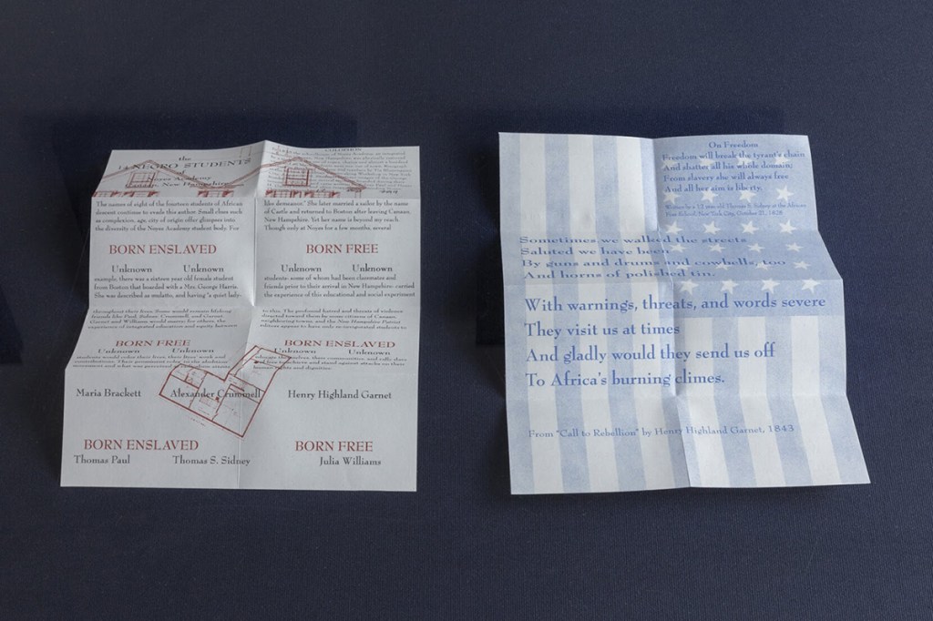
The first proper artist’s book that I attempted was months prior to starting a Master’s degree in the Art of the Book at Corcoran College of Art & Design in Washington, DC. I had been conducting research for several years about an early integrated school in New England. While I was an artist in residence at the Santa Fe Art Institute and immediately after at MacDowell, I was letterpress printing and creating what I did not realize was an artist’s book, or even a book, as I didn’t have the vocabulary or bookmaking skills, but I was laying out the pages and considering the reader/viewer’s relationship with the piece, its pacing. But I was frustrated because I wasn’t able to bring it together. It is really just now that I am coming back to that work to edition it. I still have the letterpress prints and have since incorporated them into bound forms, but in some cases I have re-considered the forms or layouts.The Negro Students of Noyes Academy in Canaan, New Hampshire (2019) is the culmination of those letterpress pieces that were started at SFAI and MacDowell almost ten years before. In this case, the resulting Students book was Risograph printed at Endless Editions at Robert Blackburn Printmaking Workshop in New York City. My ideas around the reader/viewer’s relationship with the book changed from when I was considering it in my lovely studio at MacDowell, but I’m excited about how the reader/viewer and this version of Students will develop a relationship and discuss race in terms of early New England integrated education.
LS: Has art always been the outlet for your historical and archival research? Or did your interest in history precede its emergence in your art practice?
TB: No, well at least not visual art. I always wrote verse or poetry tied to my research but it was more for me to roll over an aspect of the process or a fact or connection that energized me. Prior to shifting to visual art, I was writing essays and manuscripts on architectural history, architecture and perception that never quite captured the essence or energy that interested me. The last two times that I was an artist-in-residence at MacDowell, for example, I was conducting the field research upon which Students is partly based. The final time, I was writing a traditional essay and then turning it into pages, an outgrowth of experimentation that I had started in the preceding months as an artist-in-residence at Santa Fe Art Institute, where I had been making clumsy letterpress prints about Noyes Academy.
The love of research, libraries and looking to history and historical documents to make sense of, and seeing connections to the present, were instilled by my dad. The rare books and documents that littered our home, his study and his offices were a constant. The conversations in our home — I expect partly because everyone including my brother and mom, in addition to being voracious readers, could draw so easily from history, memory, personal experiences — were always tangled and enlivened, in part, by history, oral history, and books.
Also I can’t overstate my brother’s influence as a reader of science fiction, mystery by white and Black authors HG Wells and Ray Bradbury to Octavia Butler, comic books, Agatha Christie to Chester Himes, and beyond. Whose library growing up had been the Library of Congress as my family had lived in DC-Maryland before I was born and my brother had accompanied my dad to the LOC while he conducted research. Who as a young kid had read his entire set of Encyclopedia Britannica and moved on. A set that endlessly entranced me with its images framed by text. My brother’s seamless movement between comics and literary works, and his serious regard of comics with his verbatim, but lively, retelling of a page or entire comic, or excited describing of a comic character — their powers, backstory, and incidents from various volumes — with the same seriousness and thoroughness that he would give to a Stephen King novel or Beckett definitely helped develop my interest in text and image, books as art, but also open to all types of content and treatment.
In many ways I see no disconnect between the arts and historical research. A well-turned sentence or a well-timed and intonated joke or story can be art and personal or oral history. Book Arts gives me a way to integrate the two.
LS: Elsewhere you talk about using period typefaces to evoke specific histories in your work. Is it fair to say that other artists perhaps ignore historical connotations of letterpress printing, or trade on a sense of nostalgia rather than contending with unpleasant aspects of the past? Can design and technology be separated from its context?
TB: With each project, in some way I am building a relationship between the book and the reader/viewer and orchestrating how they physically engage with that book. I look to the tools that I have at my disposal of which typography is just one. I am interested in that space where a typeface like Caslon is in popular use while bondsmen and bondswomen are doing the back-breaking work of building the foundations of our nation, providing the wealth and leisure time for a Thomas Jefferson or a George Washington.
When you think of printmaking or architecture, for example, they hold and carry forward certain traditions while embracing and exploiting technological advances. But for me I look at the context in terms of race and racism. As such, nothing — at least in the United States — can be divorced from them. That contextualization adds depth and it is in the tangles of those layers that we can reach a more nuanced and, to me, interesting discussion.
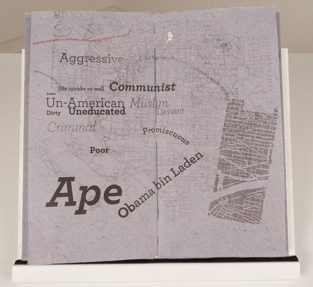
At times I break my aims of using typefaces tied to the era that I am presenting, but I do this with specific intentions in mind. For example, in Past Present: DC (2015) I span several decades and employ various typefaces in metal and wood type, from the Government Printing Office, as well as polymer. I included Archer typeface in Past PRESENT: DC because it has a certain persuasive and almost charming nature to it. In that case I use it to boldly and increasingly populate the pages of that book with bumper stickers and commentary from the news cycle that employed racial tropes present during the earlier periods covered in PAST Present: DC. Plus in the making there is some twisted enjoyment in using the same typeface of Martha Stewart’s Living Magazine to aid the reader in making connections between how candidate and later President Obama was depicted with how ordinary Black citizens have been portrayed in popular culture for centuries: as apes, animals, dangerous, lazy, stupid, etc.
In I AM and YOU ARE, there is minimal text. Mainly captions with an introduction in the former, or with extended colophon, the latter. Both are set in Scripps College Old Style and were printed at Scripps College Press. SC Old Style is a bit fussy, and there was definitely a feeling of claiming it to make space for and acknowledge the pain and experiences of Black women and girls in a way that those drawers of type had not. I expect in some way it was also for me to make space for myself and the work I am trying to do as an educator within that studio. Typesetting those succinct captions that call out, acknowledge and play with stereotypes, but also pain as well as expressing joy and pride. At the end of the day I am typesetting and using the power and the history of Goudy, Scripps Press, Scripps librarian Dorothy Drake, the typeface to say subtly and completely these Black girls and women matter as we know the Scripps students since the school’s inception matter.

LS: If race and racism inflect design, technology and aesthetics, what are we to make of art that doesn’t grapple with those dimensions of, say, typography or printing?
And on a related note, how do you bring those questions into your teaching?
TB: I think the silence speaks for itself. If you have no interest in addressing race or racism, then you avoid the conversation, and happily remain in your bubble. Which I’ve found Book Arts folks to be very good at doing.
With all the white letterpress printers and Book Arts folks making prints and work about anti-racism or for Black Lives Matter protests this summer, I just wonder how much is performative, because none of their work ever addressed such before May 25th, 2020. And I wonder how many Black artists they are drowning out of the discussion. How many will still be interested in these issues on May 25, 2021 or 2025 or 2035? How many simply used their privilege to center themselves in the discussion and assuage some guilt instead of amplifying the work and voices of Black artists?
I expect in many ways my presence, my body, my Blackness, within the field, the studio, the classroom brings those questions forth. Course development is an exciting and at times imperfect space to explore issues, topics that the field typically does not. I’m honest with students in my seminar classes like Race & Identity in Book Arts that there is little to no relevant discourse or scholarship within the field, so we may have to make it ourselves. Or in my studio courses like this semester’s The Artist’s Book: Representing Blackness we are making our own path with the help of Black artists working in printmaking and the book form to study their work and strategies. We forge our own path, because these artists have been ignored and not received the scholarly analysis they deserve. There is no wealth of articles or books to form a foundation for the class. Instead we hear directly from the artists in studio visits, artist talks, a variation on students interviewing them (see scba.omeka.net), and ideally over the course of the semester the students simultaneously become researchers and artists in the conversation. Basically we’ve cut out the middleman for now until scholarship in the field catches up.
LS: I love this approach — what Book Arts lacks in history it makes up for with living artists. Can you talk about how your art and teaching practices inform one another?
TB: From teaching, I have a better appreciation of printmaking and book techniques as well as from students a greater flexibility and desire to experiment. It is interesting to me that the things that I try to instill in my students — flexibility, willingness to experiment and break through your own expectations to see and maybe shift what you are capable of doing — are all things that they help to reinforce in me and my teaching and studio practice. Through the teaching, I also get to explore the spaces and people ignored by the field, and then work to write them in.
Whenever I am conducting DIY investigations or independent research, attending talks/panels/conferences or taking workshops, I am always looking with an eye to expanding what I teach and how I teach. I am always looking through a pedagogical lens and from the view of a student. Attending even a poorly organized and taught class should make me a better teacher and stretch my knowledge base, skill set.
The artists that interest me are varied, but in my own research my focus is primarily on Black artists, who are typically not part of the conversation in the field. In my research I search for them with the goal of writing them back into the Book Arts field. I do something similar in my courses and in my role as Director of Scripps College Press.
The list of artists that I share with students in assignments, host as visiting artists is diverse. The push that many instructors experienced this year to decolonize their syllabi, I did not experience in the same way. Though I did re-interrogate my syllabi. With a course like Representing Blackness, it is more important to substantially foreground Black artists like multimedia artist and printmaker Daniel Minter of Indigo Arts Alliance or papercut artist Janelle Washington or printmaker and founding member of Black Women of Print Delita Martin, but also to allow students to look at how they present themselves and their communities versus how their white counterparts represent Blackness. If we are discussing my Harvest: Holding & Trading (2013), then we should also examine artists’ books on slavery by book artists such as Maureen Cummins’ The Business is Suffering or Fred Hagstrom’s Little Book of Slavery (2012). If we are examining, Clarissa Sligh’s It Wasn’t Little Rock (2004), then we should be interrogating work by white artists about the civil rights era such as Clifton Meador’s Long Slow March (1996) or Jessica Peterson’s Unbound (2014) or Cause and Effect (2009). While I am more interested in what a Black artist says about their experience, culture, history, I think it is valuable to see how their approach or connection to the subject matter contributes or does not contribute to the artwork. Is there a care and respect that they bring to the work that a white artist cannot? Why are they making this work? I think it is an important conversation to have within my classes and with my research.

Leave a comment