

This is part two of a two-part interview. Read part one here.
Levi Sherman: It’s so empowering to have an instructor that holds themselves to the values they profess in the studio. Can you talk about a recent experiment or a time when you’ve broken through your own expectations as an artist or teacher?
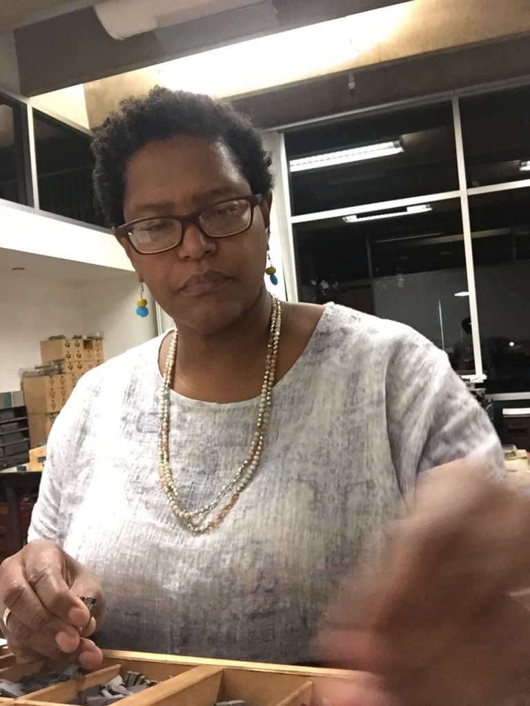
Tia Blassingame: I typically build into my artists’ book project an aspect that pushes me to work with a technique in which I need to build mastery or for some reason I’ve avoided. It’s baked into each project, and not something that is necessary for the reader/viewer to know.
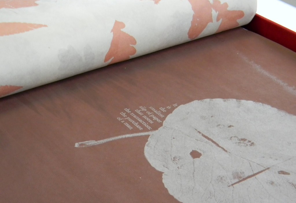
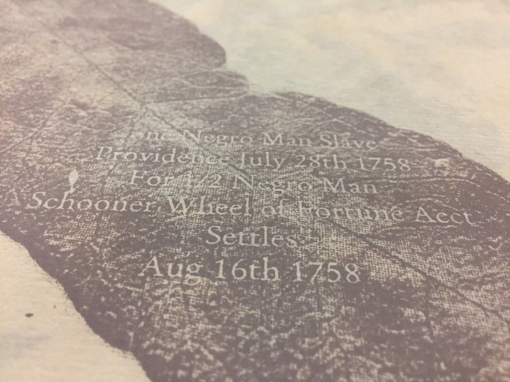
For example, in Harvest: Holding & Trading I used screen printing mainly because it had been a technique that I found underwhelming. The colors seemed too garish, the whole process messy. It just did not appeal to me. So with that project I pushed myself to gain control of the colors. In that project all colors have some amount of brown and largely represent the skin tones of captive Africans that were brought to Rhode Island over the course of the 18th century.
For my most recent project, Colored: A Handbook, I had taught paste paper making, which is always one of those techniques that half the class loves. Meaning half the class hates it. In the end, they have way too many sheets that simply end up in the trash. Rarely are they incorporated into their work aside from as endsheets or the cover of an odd blank book or two.

I know I had not brought the technique into my own artist’s book projects. So for this book I wanted to challenge myself to use it in a way that made sense for the writing and subject matter. I had previously encountered Madeleine Durham’s paste paper and used them in blank books. Last year I had an opportunity to take a workshop with her. This gave me a chance to experiment and see the many ways that I might be able to create patterns and texture that supported a book that looks at the centuries of Black presence — joy and pain — in the United States. Also I found the process surprisingly meditative. In the end, I expanded my incorporation of paste paper to another related artist’s book including African American: A Handbook. Furthermore I expanded this experimentation to combining paste paper and natural dyes. I’m looking forward to where that takes me beyond this set of artist’s books.
And now I have an example and different method of teaching paste paper — as in intimate collaboration with your content — to my students. In this case my art and teaching practice have been expanded.
LS: You manage to achieve the same soft, layered look of pressure printing with your paste paper and even screen printing. I think of it as something of a signature style, a way to identify your work at a glance. What is it in your process or content that draws you to that aesthetic?
TB: Yes, initially in the paste paper workshop I think my inclination toward a more muted realization was misunderstood, or confused with not understanding how to correctly perform the technique. Eventually that tendency and desire to achieve a more muted palette was recognized.
I typically prefer a more muted or subtle color scheme. Colors, their combinations have meaning. I do not use any colors arbitrarily in my artists’ book projects. At times I may explicitly call out their meaning in the colophon. Other times I feel like it is clear or that, if not, the colors still have the intended effect upon the reader/viewer.
Since I was a kid, I’ve been struck by how art teachers, my classmates, artists would refer to the color brown as ugly or unattractive, undesirable. I couldn’t help but look at my own hands and arms, and know they were wrong. In grad school, art school, those same flippant comments, dismissal of brown continued. I want to say it was without self-awareness, but I doubt it.
For me the stark whiteness of a page or sheet of paper is artificial and jarring. The color white, pure white, in the natural world is an anomaly. I know students often start and get stuck on using stark white paper. Even when there are alternatives of varied hues. In their case, they are using what they know, what is comfortable. Copier paper, notebook paper, textbook paper is typically stark white. So I have to push them out of their comfort zone to explore, and experience how colored, cream, natural papers print, take and shift ink colors.
For the muted colors that I use and the shades of brown ink that I may present, I prefer how muted papers draw them down…to a place that is comfortable for the eyes of the reader/viewer. And might make them linger for a bit on a page, an image, a word, concept. This is just another Book Arts technique that I employ to engage the reader/viewer in a relationship with the book, a conversation on race.

There are very few examples of my use of white paper. In a book like Mourning/Warning: An Abecedarian (2015) or Mourning/Warning: Numbers & Repeaters (2018), the paper is slightly nicer than regular copier paper, but as bright a white. Making the browns that have been added to the nautical flags feel like they belong. The white gives some indication of a primer with only the essential information included. In Hers: A Primer of Sorts (2013), I used white rice paper only because I was broke and was committed to complete this artists’ book for Al-Mutanabbi Street Starts Here. I had already written the text, settled on the book layout, and planned the execution. When it came time to start the edition, I did not have the funds to complete it as I originally envisioned. So I reconsidered how to complete the edition. I happened to have a pad or two of rice paper. I had a decent printer, and it turned out the paper went through the printer. It printed beautifully. To tamp down the starkness of the white paper, I covered the pages with a veil of images of letterforms and lace fabrics. This was also helpful because I was using upcycled almanac covers that were slightly yellowed and age worn. The text is printed on the reverse of each page and becomes apparent when the text block is pulled away from the covers in this flutter book.
LS: Since you’ve spoken so eloquently about how color operates in your work, I wonder if you might do the same for book structure. The complexity, scale and interactivity of the binding seems carefully calibrated for each project.
TB: I am engaging the viewer/reader in a conversation about historical and contemporary racism by using printmaking and book arts techniques to seduce the reader through materials, color, tactility, pacing in order to slow the reader’s initial impulse to flee or avoid a discussion of race.
Each artist’s book project has different perimeters from how I push myself as I mentioned, but primarily the relationship that I am looking for the reader/viewer to have is with the book, how I want the reader/viewer to physically engage with that specific artist’s book. I consider how I can utilize typography, materiality, tactility, and so on to facilitate that relationship, control the reader/viewer.
Harvest: Holding & Trading (2013) employs color and sound and translucency to build an interaction with the reader/viewer that ebbs and flows. Influenced by the size and placement of text and image, the viewer will move close to the page. The rhythm and rustling of non-color field pages and relatively silent ones act as a metronome that can both guide the reader’s pace and create a haunting soundtrack as captive Africans are brought into view. Harvest is intended to be emotional and disorienting.
Black in Dictionary is meant to seduce through tactility, color, pattern, scale. It feels good in your hands, but also you want to hold it and not put it down or share it. The paper has bits of glitter embedded in it, but it is also buttery and appealing to touch. The imagery on the flags — photos of my skin and jewelry — is muted, misty — almost enjoyable to view despite the jarring text from a slang dictionary. What is it to hold close and almost covetously an artist’s book that highlights derogatory terms to describe African Americans? What is it to maintain this conversation on race because the decisions that I make in creating the work have stalled your impulse to flee or avoid the topic?

My work doesn’t have an easily identifiable signature look because each project demands several different things: some invisible that are for me and the process, others to ensure a specific physical engagement and building a relationship with the artist’s book. The signature is there for those willing to look below the surface and obvious.
LS: Do you find that artists’ books as a medium are particularly capable of that seduction and intimacy that allows you to challenge readers with a conversation about race?
TB: Absolutely. We all have some relationship with, feelings about, memories of books and reading. Good or bad. So there is a different response, emotions that a work using the book format can elicit. A different attention, connection that the viewer makes. Intellectual, emotional, physical response that you can draw from the viewer. That can be quite intense. Books or their absence, being read to or not growing up, being voracious reader or struggling, have an effect on everyone, but it also gives us strong memories and responses to the physical representation of a book…and can make us responsive to bookishness — those book characteristics: pacing, pages, covers, text and/or image, narrative, propelled by the reader, some space for their imagination to fill in the story, presence, intimate experience between the reader and the book or story or characters or author/artist.
LS: Are you currently working on any projects that have you excited?
I’m excited about a collective that I started last year: the Book/Print Artist/Scholar of Color Collective. The collective brings Book History and Print Culture scholars into conversation and collaboration with Black, Indigenous, and People of Color (BIPOC) book artists, papermakers, curators, letterpress printers, papercutters, printmakers and more to build community and support systems. We are over thirty individuals connected and grounded by our shared passion for book arts and the unique potential of artists’ books as vehicles for social change and racial unity. Our current and future collaborations across media and disciplines will continue to morph as our group grows and our connections shift and deepen. This year we had events such as a conversation on Antiracist Bookworks through University of Maryland at College Park and BookLab, a series of panels hosted by the Bibliographical Society of America with the final one in January 2021. I’m already planning more collaborations for 2021 and beyond.

Leave a comment