
ISOLATIONS
Marianne Dages
2019
Huldra Press
4.125 × 9.625 in.
2 cards in a glassine envelope
Letterpress and rubber stamp
Edition of 50

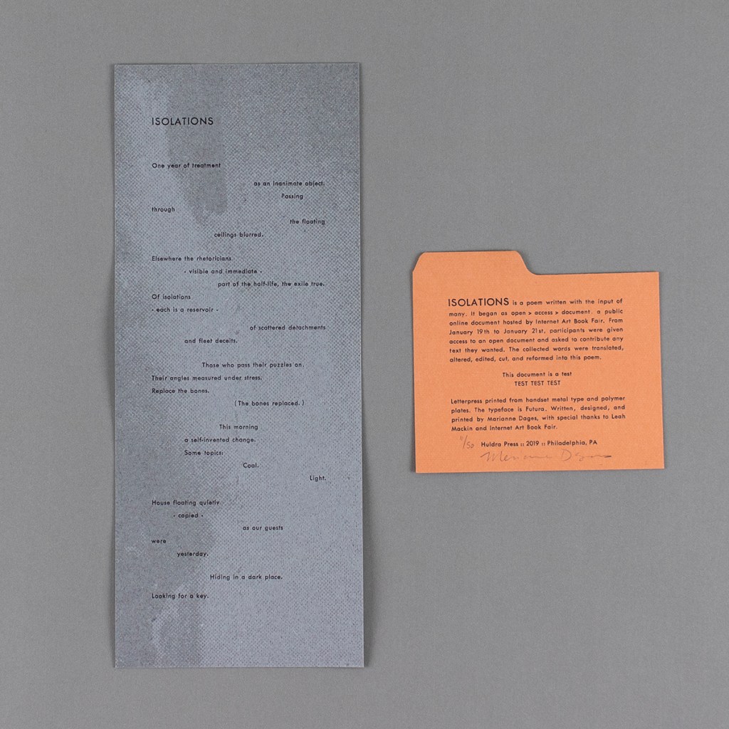
ISOLATIONS possesses a monumentality that defies its dimensions. Perhaps it is best thought of as a miniature broadside, employing scale – which is a metaphor – rather than size. Following this interpretation, the thick, toothy handmade paper and heavy impression of the letterpress printing give the broadside a sense that its text is almost literally set in stone. Marianne Dages has visually enhanced the paper’s considerable tactile texture by printing a gritty, grey background. But the broadside doth protest too much. Its fixity is a foil for the fungibility of language, which is the key to this process-based project.

Before its ink was pressed into paper, ISOLATIONS began online under the name open > access > document. Open > access > document was a Google Doc, hosted and promoted by Leah Mackin’s Internet Art Book Fair. From January 19–21, 2019, contributors could write and edit the document as they pleased. Dages would then massage the text into its final form. Dages redacted, augmented and even translated the document into a short poem of seven stanzas, its dense language spread thin across the broadside’s spare surface.
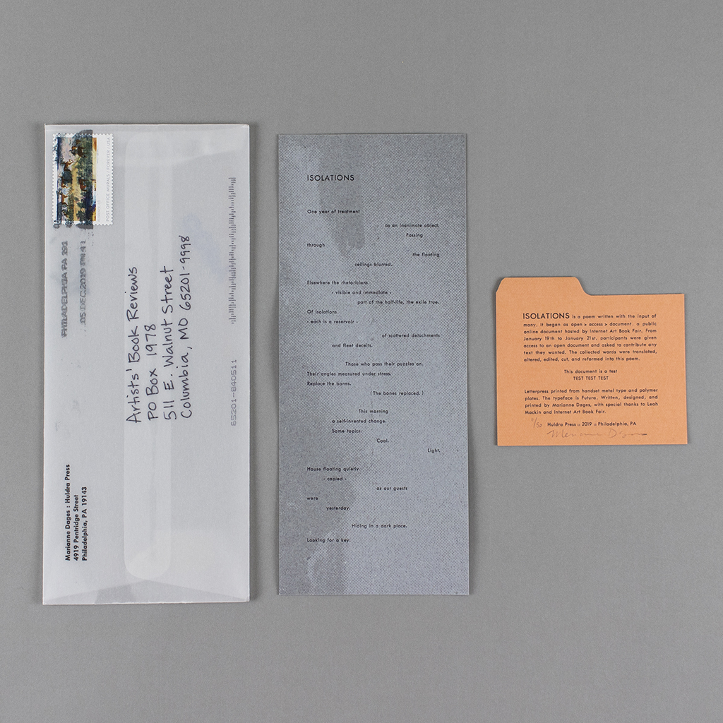
Given this unusual approach to writing, the publication must be reviewed in terms of concept and process, and not merely a finished object. However, that is not to say that ISOLATIONS cannot be appreciated on its own. The broadside is exquisitely crafted, with great attention given to its materials and print processes. In fact, this careful consideration warrants approaching the work’s enclosure as part of the artistic argument, meaning there are three components: the broadside, the colophon and the envelope.
The broadside’s stony appearance is contrasted by the clean, minimal typography. The typeface is Futura and the open spacing of words and lines seem to reflect the erasures Dages made from the original text. The handmade paper and letterpress printing evoke a fine press quality that is complicated by the two other components. The colophon is letterpress printed on vintage card stock. It is cut to resemble a catalog card, and its orange color lends further support to its bureaucratic appearance. Of course, two points can’t make a pattern, so it is the third element that triangulates the piece’s aesthetic – the unassuming envelope.
The rubber-stamped, glassine envelope is a translucent membrane, bridging the aesthetics of the special collections with that of the circulating library. If the handmade paper exudes refined taste, the glassine envelope signals the attempt to bring this luxury to the masses. Tellingly, its alternate name, vellum, is a misnomer. It announces its shortcomings even as it distinguishes itself from a standard #10 window envelope. In the case of my review copy, the envelope was addressed and stamped directly, emphasizing its functional role.
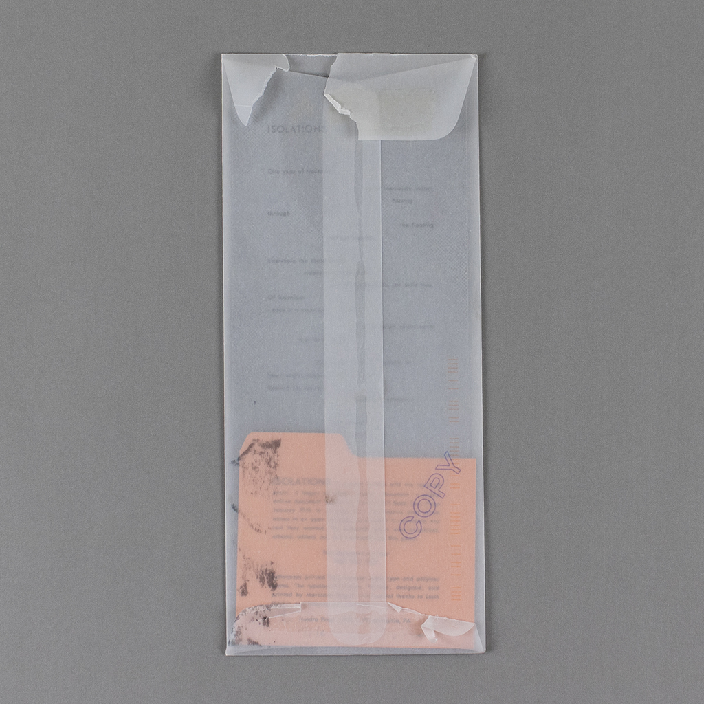
This simple assembly of anachronisms achieves remarkable complexity through its juxtaposition of high and low culture. The vintage cardstock is inside an envelope with a contemporary date stamped by the postal service. The handmade paper is carefully cut to a standard size to fit the mass market envelope, which is in turn marked “copy” by the artist with a readymade rubber stamp. The colophon, perhaps hand cut to look like a catalog card, nevertheless bears the hallmarks of a fine press edition; it is numbered and signed by hand below impeccable letterpress printing.
The digital presentation of the project is equally well considered. The original open > access > document Google Doc is embedded on a dedicated webpage on the Internet Art Book Fair. The Google Doc retains its functionality, allowing a visitor to request access to made edits. Presumably such a request would be denied, but the presentation retains the medium specificity of a collaborative cloud document. Also included are the first words added to the document, “This document is a test / TEST TEST TEST.” The phrase is repeated on the colophon, reinforcing the tie between the web and print versions, and affirming the importance of the poem’s paratext, including the writing process.

This treatment is indicative of Dages’ (and Mackin’s) nuanced understanding of the relationship between art and media. ISOLATIONS employs letterpress printing and vintage stock without resorting to nostalgia. Likewise it uses Google Docs without subscribing to technological determinism, rendering the poetics a result of the process and nothing else. Rather, ISOLATIONS connects to a long tradition of de-centered authorship and process-oriented poetry, showing how letterpress printing and Google Docs constrain and enable this inquiry as all media always have.
These ideas emerge in the poem itself. Themes of floating and detachment evoke the ephemeral, intangible digital writing process. There is an extension and compression of time that seems fitting for the anachronous enunciation of the work; narrative retelling gives way to a fragmented immediacy. The text evokes a sense of mystery, with references to puzzles, hiding and “looking for a key.” The visual treatment of the text, with its gaps and silences, contributes to this sensibility.
Reading these silences as redactions sharpens the sense of mystery and loss. The physicality of the printed text only underscores the ephemerality of the original writing. Even without knowing the details of Dages’ editing process, ISOLATIONS foregrounds intertextuality and emphasizes the labor of poetics. The poetics of labor are equally present, invoked through the language of office work, from rubber stamps to Google Docs. This medium-specific misuse of ambivalent commercial writing tools clearly resists technological determinism, yet ISOLATIONS is hardly a celebration of human genius. As with Dages and Mackin’s earlier collaboration, Ultrices, the use of chance operations and distributed authorship complicate the very notion of writing. ISOLATIONS embraces its own contingency, a poem that could have been otherwise.
Dages shows a way forward for a field that too often ties artistic possibilities to a particular medium. She demonstrates that language is material whether it is in a word processor or a press bed. ISOLATIONS refuses a reductive view of technology or tradition, and compromises neither craft nor concept. Dages makes visible the process of writing and reminds the reader that communication occurs also in the silences. ISOLATIONS is a collaboration not only with Mackin and the Internet Art Book Fair, but also the unnamed contributors to the open > access> document, a testament to trusting the process and the confidence that an artist can turn a crowdsourced Google Doc into an eloquent poem on a beautiful broadside.

Leave a comment