
Inscription, Issue 1: Beginnings
Edited by Gill Partington, Adam Smyth, Simon Morris
Information as Material
2020
Inscription journal: 12 × 12 in. offset-printed perfect-bound codex, 134 pages
Sean Ashton, Living In A Land: 12 in. vinyl LP
Craig Dworkin, Clock: 6.625 × 6.625 in. offset-printed, saddle-stitched pamphlet in a slipcase, 12 pages
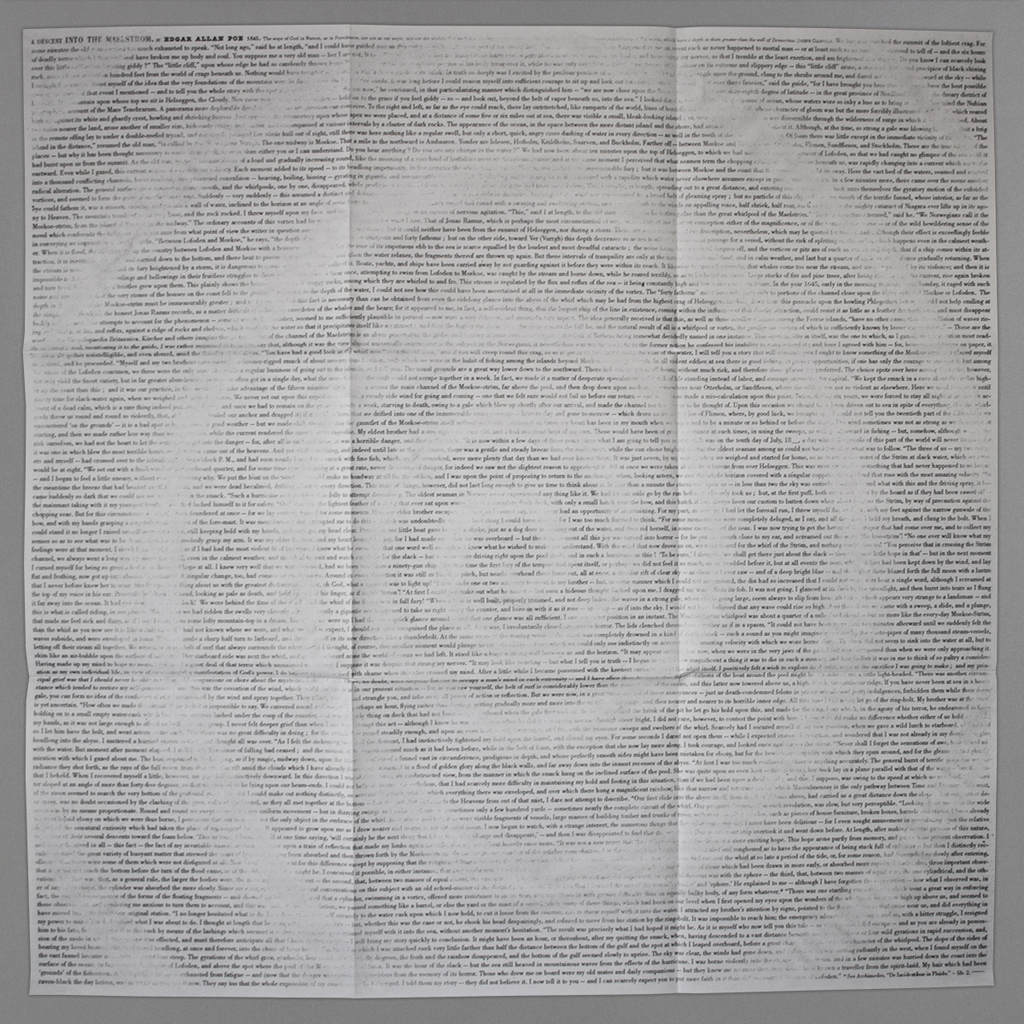
Jérémie Bennequin, An Erasure into the Maelström: 36 × 36 in. offset-printed, folded broadside
Craig Saper, Global Reading Supplement: Augmented reality app

As “the journal of material text,” Inscription is necessarily self-aware, so its inaugural issue is appropriately titled “Beginnings.” Each contributor grapples in some way with beginnings, endings, and time more generally. The journal’s organizing principle — and a recurrent visual motif — is the spiral. As a concept of time, the spiral is neither linear nor cyclical, but rather allows for new variations on familiar themes, think Mark Twain’s (probably apocryphal) observation that “history doesn’t repeat itself, but it often rhymes.” However, in the case of Inscription, the spiral organization is as much spatial as it is temporal. That is, the diverse contributions — from book history and literature to poetics and pedagogy — are connected by the universal impulse to inscribe and the inescapable influence of time.
Inscription’s self-awareness is no surprise as a project of Information as Material, a publisher whose mission is to create new meaning through reframing. A journal is such a framing device, and one that Inscription’s editors examine, exploit, and expand. This expansion, also symbolized through the centrifugal movement of the spiral, manifests most visibly in the various components that accompany the primary codex and its relatively conventional scholarly contributions. (I say relatively because many of the essays tend toward lyricism and self-reflection, and because reading them requires rotating the over-sized, perfect-bound codex in a spiral fashion and reading from both directions since the journal has two beginnings with two prefaces.)

Craig Dworkin, Clock: 6.625 × 6.625 in. offset-printed, saddle-stitched pamphlet in a slipcase
These additional components comprise: an augmented reality poem by Craig Saper; an audio recording of poet Sean Ashton on a vinyl LP; what appears to be a 45 rpm record but is actually a printed poem-essay by Craig Dworkin; and a three-foot-square, two-sided erasure of Edgar Allen Poe’s A Descent into the Maelström by Jérémie Bennequin. The dimensions of the complete assembly are determined by the 12-inch record, and the journal’s editors plan to include a record with each issue. The square codex itself mirrors the record with a hole drilled through the middle. Indeed, the reader spins the codex like a record, but the hole is not the axis. Instead, it doubles upon opening, two eyes looking back at the reader.
For all of this eccentric and lavish production, the publishers do an admirable job of making the content available. A complete digital version is available open access, including the audio recordings and video documentation of Saper’s augmented reality piece. A downloadable PDF gives the reader some idea of the admittedly cumbersome reading experience of the printed codex, but thankfully the full text of the articles is also available in more conventional HTML. The journal strikes a similar balance between risk-taking and rigor in terms of process. The artist- and writer-in-residence roles may be somewhat unusual for a journal, but submissions are double-blind peer reviewed, and the editorial board is stacked with big names in artists’ books and related fields.

Although I cannot manage a review of individual articles and contributions here (many deserve such attention), together they show the promise of Inscription’s interdisciplinary approach. The wide-ranging perspectives and methods are effectively bound together by themes of materiality and mediation, and each contribution seemed of comparable quality. The articles that seemed furthest outside my areas of interest or expertise were unexpectedly engaging, and those that were closer found fresh approaches to familiar topics. Two standouts were “On Stone,” Serena Smith’s rhizomatic reflection on lithography stones, and “Writing the Birds: Barrawarn,” Australia-based Catherine Clover’s attempt to notate birdsong and imagine a decolonized, vernacular poetics. It is easy to imagine many of the articles in other journals, but in Inscription they resonate with one another in an exciting way and will reach readers who might otherwise stay within their disciplinary borders.
With submissions of this caliber, the success of the journal hinges on its ability to add value to its content. The exceptional production value alone does so, from the high quality of conventional figures and illustrations to the execution of the ancillary artworks. The editors must also continue to balance the strength and flexibility of each issue’s theme. “Beginnings” was a natural fit for the first issue, so “Issue 2: Holes” may ultimately prove whether Inscription can forge a community of contributors and readers from so many different disciplines. The innovative, interactive format of the journal certainly gives readers a reason to subscribe and may even convince writers that their work is better off with Inscription than a more conventional publication.

The emphasis on material production does leave a nagging question about the practicality of the printed version and the authenticity of its online cousin. There is a case to be made about the materiality of digital inscription, one that might inspire an unconventional website or digital publication of some sort. However, for the sake of accessibility, I am glad that Inscription’s digital presence is thoughtful but conventional. There are real limits to the hard copy journal — I happen to own a record player, but I had to abandon reading on the couch when rotating the 24-inch-wide codex became impractical and ultimately finished the issue at a table in my studio. As a celebration of “material text,” Inscription pushes at the limits of a physical publication, but ultimately retains its thesis by documenting its materiality online rather than attempting to re-mediate it digitally. I truly hope the journal’s impressive production will attract more readers than it excludes, and if the popularity of artists’ books is any indication, I think it will.

Leave a comment