
Typesetting on a Winter’s Afternoon
Michael Koppa
Text by Raymond Stanley Nelson, Jr.
The Heavy Duty Press
2018
92 pages
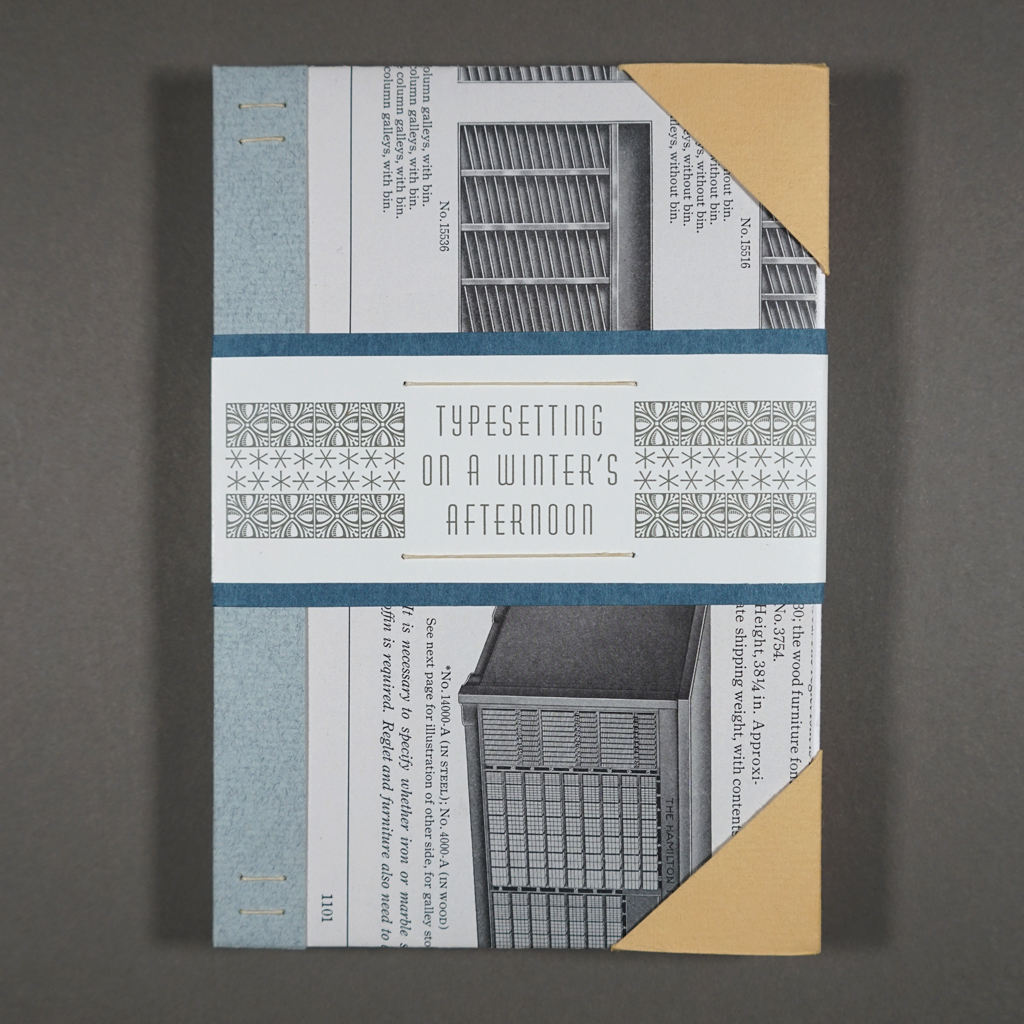
4.5 × 6.5 × 0.5 in. closed
Sewn signatures attached without adhesive to stiffened paper covers; contained in a folded paper enclosure with an explanatory insert
Letterpress printing
Edition of 26 copies
Typesetting on a Winter’s Afternoon was the first book Michael Koppa produced after reinaugurating The Heavy Duty Press in 2016. It is a fine press edition of Raymond “Stan” Nelson’s story, which was initially enclosed in a letter from Nelson to Koppa and later published under the same title in the journal Parenthesis. This backstory — and there will be more — is essential to appreciating the book, because it is largely about the relationship between the text and its paratext — not just the foreword, afterword, and colophon but everything that goes into a fine press publication of such ambition and quality. Chief among these things is time. Typesetting on a Winter’s Afternoon is a contemplation on time, endings, and afterlives.
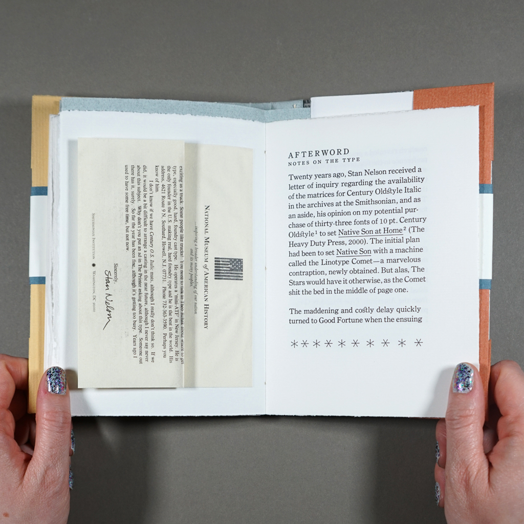
Illustrations by Koppa accompany an edited version of Nelson’s text. Tipped into the afterword, there is also a scaled down, digitally printed facsimile of Nelson’s 1998 letter to Koppa, which would eventually set the project in motion. Before I address each of these elements, I must stress that the reading experience is more than the sum of its parts. To quote Nelson’s narrator, fine printing is “the marriage of the right paper, excellent presswork, perfect type, and good typography.” Indeed, Typesetting on a Winter’s Afternoon is printed impeccably from foundry type on three well-chosen papers. The non-adhesive binding with stiffened covers is clever and original but not distracting. It allows the book to open easily without feeling delicate. Yet, Typesetting on a Winter’s Afternoon exceeds Nelson’s standards. Even as the book calls attention to its own paper, printing, and binding, it is clearly about more than fine printing.
The book’s covers hint at its paratextual backstory. Each copy of the edition is bound in pages from a 1923 American Type Founders Company catalog. It was Koppa’s quest, in the early days of The Heavy Duty Press, for 10 point Century Oldstyle Italic that put him in touch with Stan Nelson (along with Don Black, Fritz Klinke, and Theo Rehak). At the turn of the twenty-first century, when digital technology had rendered letterpress commercially obsolete but not yet made it easy for printers to communicate online, this is what it could take to find a font of type: a Linotype technician in Toronto (Black), a letterpress supplier in Silverton, Colorado (Klinke), the ATF’s last employee, recently retired (Rehak), not to mention the head of the Smithsonian’s Graphic Arts Collection (Nelson). Koppa provides an extended statement on all this, plus the book’s production, on a separate sheet folded loose into the book’s enclosure. I rehearse this history not to namedrop letterpress luminaries but to show the proverbial village behind the scenes that unfold in the book’s narrative.
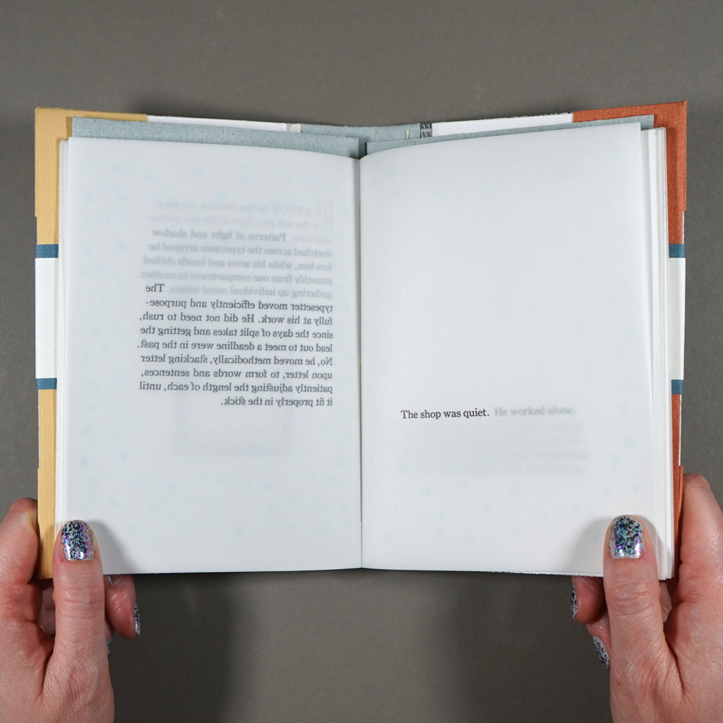
In contrast to Koppa’s tale of correspondence and serendipity, Nelson’s story is about solitude, methodical work, and contemplation. I’ve referred to Nelson’s text, written in close third-person perspective, as a story, but perhaps it would be better to say memoir or lyric essay. In any case, the narrative presents a printer, presumably middle aged, as he sets type alone in his shop and reflects on the past and future of fine printing. References to “electric lights” and the cold tubes of a radio make it hard to place the story in time. If it takes place in 1998, the protagonist is certainly old fashioned, but that is hardly a surprise for a letterpress printer. A central motif is a weight-driven clock, which the printer inherited from his grandmother and winds every Monday. The clock is not alone in representing a precarious balance between finitude (the grandmother’s death) and continuity (its weekly winding). Running out sorts, the printer muses that he can order more metal type — but for how much longer?
What Nelson seems to value is continuing to work, slow and steady, in the face of finitude. Like the clock, the typesetter rhythmically sets letter after letter, line after line, page after page. He dutifully proofs his type before leaving the studio, and he will make corrections in the morning. We learn that the printer has children, but there is no didactic reverie about passing down his craft to the next generation. Instead, the printer upholds his standards, even as the world around him changes. He is no longer driven by deadlines but by his own appreciation for the craft: “He had done a satisfying day’s work, and tomorrow would be tomorrow.”
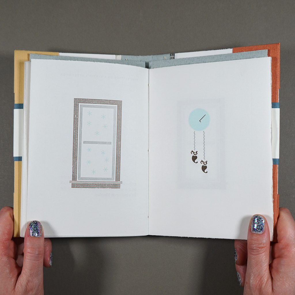
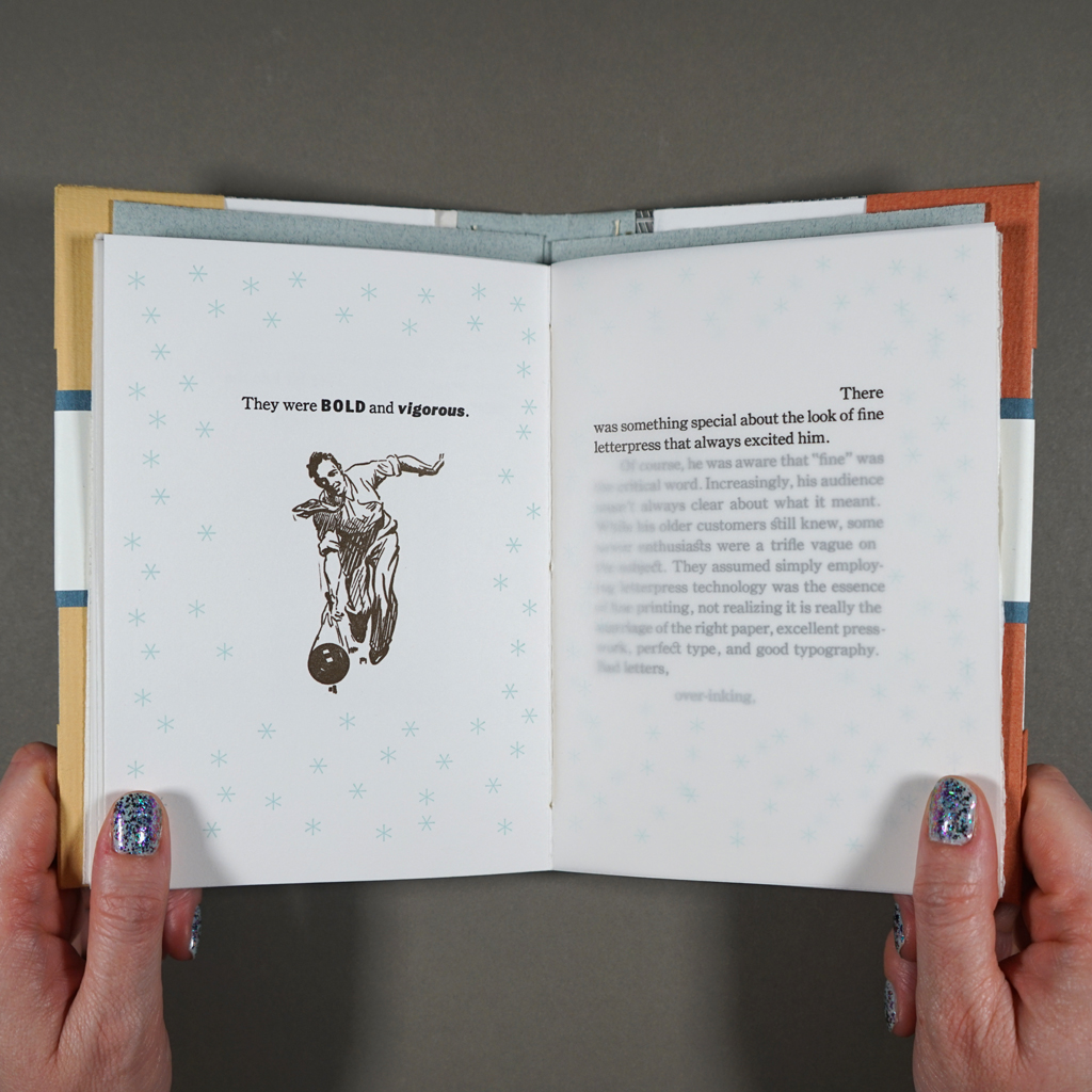
Nelson’s text sets a high bar for Koppa as illustrator, designer, typesetter, and printer. Not only does Koppa meet the protagonist’s exacting standards, he takes risks and introduces humor without detracting from the writing’s lyricism. Most of the illustrations are impressively assembled using type ornaments, including the recurring motif of the clock. As time passes, the hands (a letter L) advance, and the weights (two fleurons) descend ever further. Through the shop window, made of decorative rule, delicate blue snowflakes fall. The same blue asterisks surround the text in the pages’ generous margins, setting an exterior around the deeply interior narrative. Koppa is so adept at illustrating with ornaments, it is a surprise when the reader encounters conventional images printed from metal cuts. Fortunately, Koppa saves these for a more humorous passage where he illustrates the sort of bad printing the protagonist is lamenting.
Koppa’s intentional over-inking and misregistering cannot be mistaken for mistakes, because the rest of the printing is flawless. Much of the book is printed on translucent drafting vellum, leaving more than one page visible at a time. Koppa sets the type so that a single paragraph can be read, perfectly registered, through the overlaid pages. The text accumulates, layer by layer, like the snowfall around it. This also leaves conspicuous whitespace on each page, where the preceding type has been peeled away. The resulting reading experience emphasizes not only the passage of time but the persisting presence of absence.
Typesetting on a Winter’s Afternoon explores time more expansively than the title suggests. Yes, Koppa centers the progressive, continuous time of the falling snow, the ticking clock, the setting of type, and the turning of pages. Koppa also logs 320 shop hours, over three winters, to produce the book. However, gaps in time are just as important. For example, there is the hiatus of The Heavy Duty Press, during which Koppa raised a family, and during which the meaning of Nelson’s text transformed alongside technology and culture. The completed book serves as a time capsule. In the years since its completion, Don Black and Theo Rehak have passed away, and a global pandemic has altered many peoples’ perspectives on time. Koppa could not have predicted the latter, but he knew the future would be different when he printed the book’s dedication: “for the next millennium.”
Still, Koppa seems less interested in immortality than in resurrection. Endings lead to new beginnings: Theo Rehak spun off a type foundry, the Dale Guild, with equipment from the bankrupt American Type Founders Company, and Fritz Klinke, who purchased the ATF’s remaining cast type, continues to supply printers through his shop, NA Graphics. Likewise, Koppa has kept The Heavy Duty Press active since re-launching it with Typesetting on a Winter’s Afternoon. Which is to say, what matters is not how long copies of the book survive but what future contemplation and creation they catalyze.
Given this open embrace of the future, it seems fitting that the reader never learns what text the protagonist is typesetting. Nor does the reader see it to completion. Nonetheless, the physical and visual reading experience of Typesetting on a Winter’s Afternoon is so resolved that the reader gets a sense of closure.
In books, of course, openness and closure can be literal. As the reader closes Typesetting on a Winter’s Afternoon, they confront, once again, the 1923 catalog of the American Type Founders Company. In this way, Koppa keeps the book open — to connection, to chance. For a story about the solitude of the studio, Typesetting on a Winter’s Afternoon says a lot about contingency and collaboration. Artists, even in rural Wisconsin, are nodes in a network of experts and enthusiasts. This is especially true of bookmakers and publishers. The studio is warm and quiet on a winter’s afternoon, but the books belong in the world outside.

Leave a comment