
A Carol at Sixty Nine
Peter and Donna Thomas
2026
14 folded panels
2.5 × 2.5 in. closed
Single-sheet, cut and folded structure with hard covers and paper slipcase
Letterpress printing on handmade paper
Edition of 69 copies
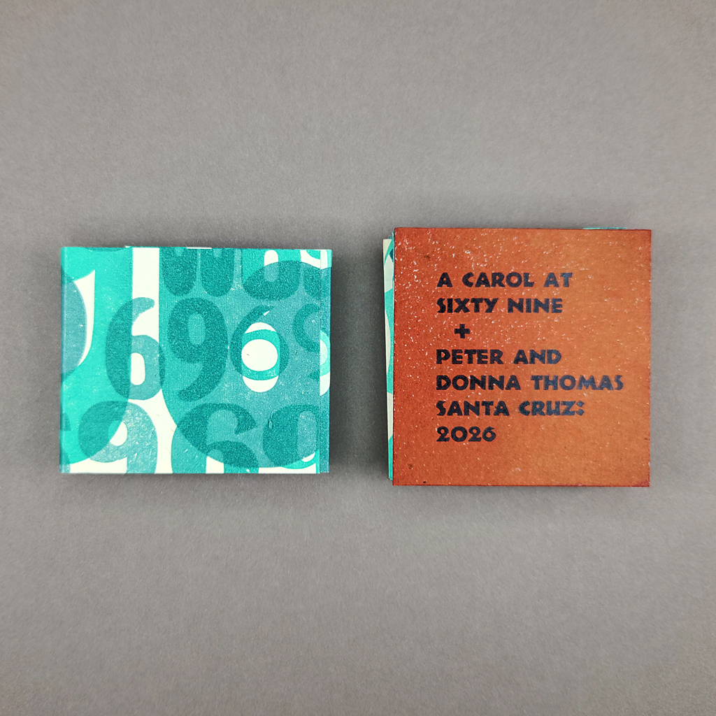
Peter and Donna Thomas are known as collaborators, and both names are on the cover of A Carol at Sixty Nine. In this case, though, Donna served as muse rather than artist. The book was a surprise, the latest in an occasional series celebrating milestone birthdays (see also: Route 66, Sixty, and 55). The title comes from an early version of Walt Whitman’s poem, “A Carol Closing Sixty-Nine.” The poem was eventually published in Sands at Seventy, so Thomas is working in a tradition of birthday books. A Carol at Sixty Nine honors the original text but adds new layers of meaning, not just for Donna but also for the reader.
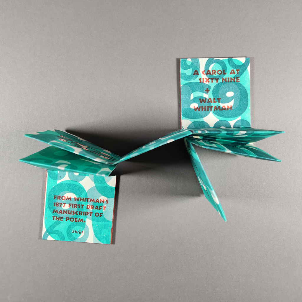
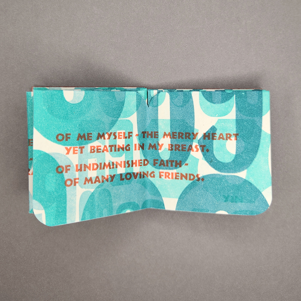
Like much of the Thomases work, A Carol at Sixty Nine is quite small, just 2.5 inches square when closed. The single-sheet book is a hybrid map-fold meander structure with fourteen panels. Rather than a rectangle, it unfolds into an irregular shape resembling “69.” Or from the other side, “pd” — a fitting visual pun from a letterpress printer. The handmade paper is cream colored, but most of the surface is covered in teal 69s, printed from an assortment of wood type. Atop this background, the poem’s text is printed in vermillion, a sharp contrast echoed in the brick-red cover boards. The hard covers help the folded book stay closed and keep it flat when it’s open. They also add to the pleasure of handling the book, which unfolds both vertically and horizontally. To help navigate the unfamiliar structure, portions of the poem are printed across two-page spreads rather than individual pages.
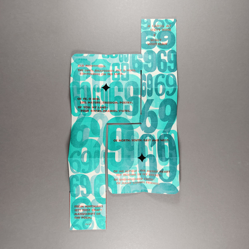
There is no imagery per se, but the overprinted numbers form energetic, abstract compositions. Much of the book’s visual impact comes from the rhythm of negative space within and between numbers. These negative forms are echoed in the rounded corners cut into the sheet, which give the 6 and 9 a diamond-shaped counter instead of the usual oval. The scale of the numbers compared to the pages, and the overall density of the printing, give the book a more commanding presence than its size suggests. Still, the smaller type of the poem demands a closer look, which is rewarded by the satisfying textures of wood type on handmade paper. The reading experience, particularly the interplay of visual, verbal, and structural meaning, reflects Thomas’s long engagement with miniature books. A Carol at Sixty Nine immerses the reader, even as it fits in the palm of their hand.
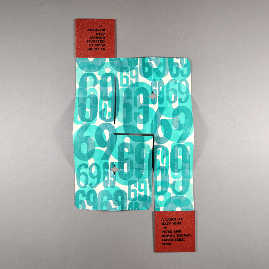
The strange geometry of negative spaces, the mix of straight and curved forms, is echoed in Neuland, the typeface Thomas has chosen for the poem. The text is bold enough to be read when the book is laid flat but still appropriate for reading at arm’s length. Printed over the teal background, the red text is tempered without turning muddy. Also set in Neuland but subtly printed in the same teal as the background are two words: yin and yang. I will return to these after addressing the poem itself.
In “A Carol Closing Sixty-Nine.,” Whitman reviews his own oeuvre. He rehearses his main themes, including the United States, faith, and freedom, and juxtaposes his ageing body with his unfailing spirit. Whitman, who died at seventy-two, was already in ill health when he wrote the poem, so it is no surprise that Thomas would revise the text to make a more celebratory birthday present. His version reads:
Old repetitions.
The lines, rhapsodies, joy & hope,
continuing on the same.Of ye, O God,
Life, Nature, Freedom, Poetry.
Of you, my Land –
your rivers, prairies, States.
Of North, south, east and west.
Of me myself – the merry heart
yet beating in my breast.
Of undiminished faith –
of many loving friends.
Thomas retains references to the land but not to the flag. The heart is “yet beating” but no longer contrasted with “the body wreck’d” and “sluggish blood.” Nevertheless, there is a sense of recognition in this posthumous collaboration, a shared understanding among artists of a similar age separated by more than a century.
These common themes bring us back to yin and yang. The visual resemblance between the ancient symbol and the number 69 led Thomas to explore the idea of opposing forces that are nevertheless inseparable, that contain something of their opposite within them. For Whitman, such pairs included the body and the spirit, the nation and the individual, and nature and poetry. For Thomas, yin and yang also symbolize his partnership, in life and art, with Donna. The two have been creating books together for more than fifty years.
Inspired by the origins of yin and yang, Thomas looked to Chinese astrology to commemorate 2026. The red text color derives from the Year of the Fire Horse, and the teal-green is meant to sustain and balance that energy. If Chinese philosophy and Walt Whitman seem like strange bedfellows, it is worth considering how both inspired sixties counterculture (culminating, of course, in ’69). There is a shared rejection of materialism and embrace of nature, a rejection of domination and embrace of balance and multiplicity. Besides, any contradictions between Transcendentalism and ancient Chinese philosophy would only illustrate the point that contrast can create cohesion.
Few things in art truly universal, but the themes in A Carol at Sixty Nine come close. This is why a poem from 1888 still resonates in 2026. It is why one writer’s look back at his own oeuvre can speak to the partnership between two other artists. It also explains why anyone else would be interested in reading a birthday gift so thoughtfully tailored to its recipient. In editing Whitman, Thomas does what any fine press publisher would do: he captures the spirit of the original text and helps it speak to today’s reader. The book is a gift to all of us.


Leave a Reply