Five Oceans in a Teaspoon
Dennis J. Bernstein and Warren Lehrer
2019
Paper Crown Press
6.875 × 6.5 × 1 in.
300 pages
Smyth-sewn hardcover
Offset inside with foil-stamped cloth spine and paper cover

The 1984 book French Fries by Dennis Bernstein and Warren Lehrer is a landmark work of visual literature. In the years since, Bernstein’s poetry has continued to win acclaim and Lehrer has set the bar for designers and book artists in visual literature. The duo’s new book, Five Oceans in a Teaspoon, is a masterful contribution to the genre they’ve helped shape. It is a multi-modal project, including animations, exhibitions and performances. This review will focus on the printed book, published by Paper Crown Press.
Five Oceans in a Teaspoon is an autobiography in poems. There are eight movements, which are organized loosely by theme more than chronology. There are a total of 225 poems, which in no way exhaust the extraordinary life Bernstein has led. He has reported on wars, taught in prisons, hosted a radio show and survived open heart surgery. Yet, Bernstein’s work is about ordinary people. As he reflects on his life, he reminds the reader that the very struggles which leave us feeling confused and alienated are part of our shared human condition.

This collaborative work benefits from a degree of fluidity in roles. The text is Bernstein’s and the visualizations are Lehrer’s, but the process is more complex than that. For Bernstein, the material qualities of text and the page as a physical space affect writing as well as reading. He touches on this in an interview with Lehrer: “I had decided that big notebooks were too intimidating. All that blank space. The wonderful thing was, I had started thinking about visuals with some of these short poems. I even did some drawings.” Likewise, Lehrer is able to interpret the text so successfully because he approaches the poems as a writer as well as a designer. His instinct for wordplay destabilizes and extends Bernstein’s concise writing, drawing out double meanings and alternative interpretations. Five Oceans in a Teaspoon exhibits an uncommon chemistry that must surely be the result of decades of friendship and collaboration.
The book’s design provides structure for, and access to, the unconventional reading experience. Each poem takes one page or one spread, setting a steady pace for the reader as they make their way through too many poems for one sitting. The ribbon bookmark gives the reader permission to pause, perhaps using the table of contents to rest strategically between movements. None of this would be remarkable in a standard book, but in this case the straightforward paratext contrasts markedly with the visual treatment of the text itself.
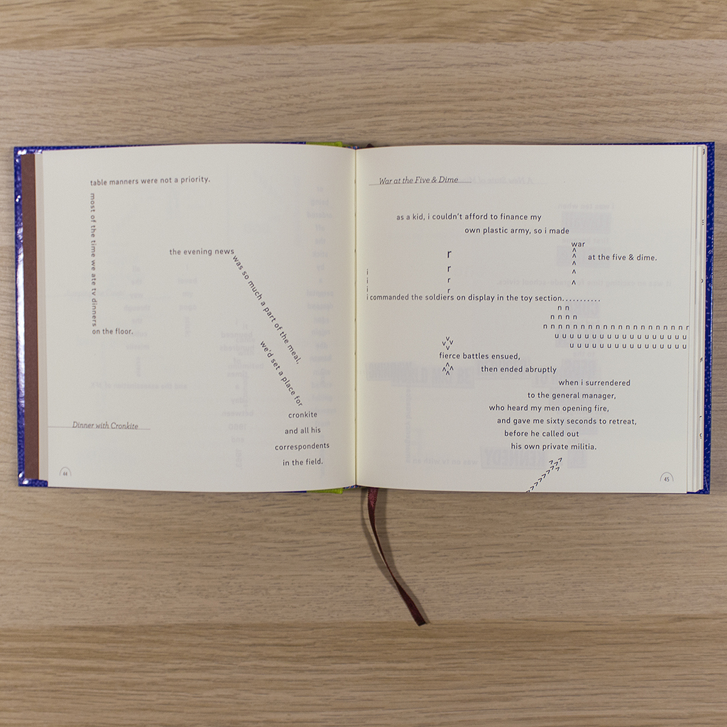
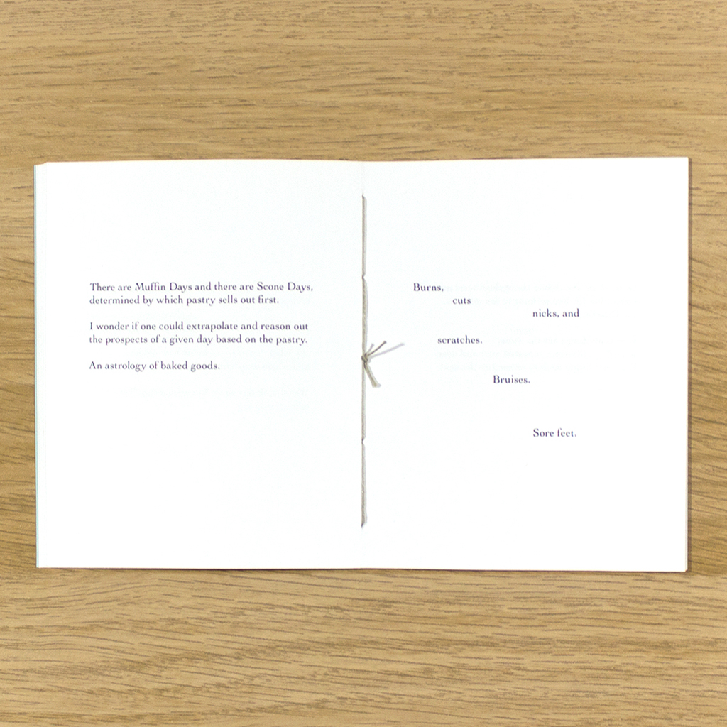
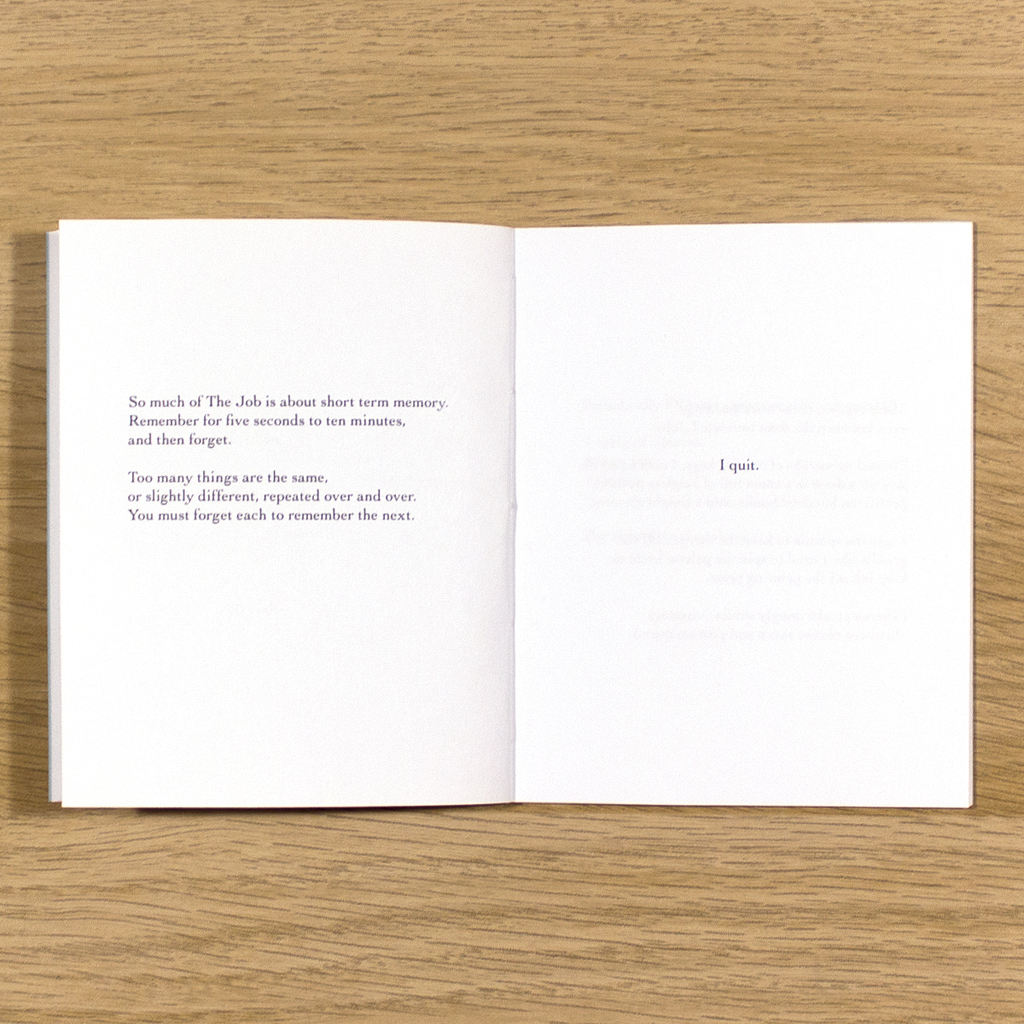
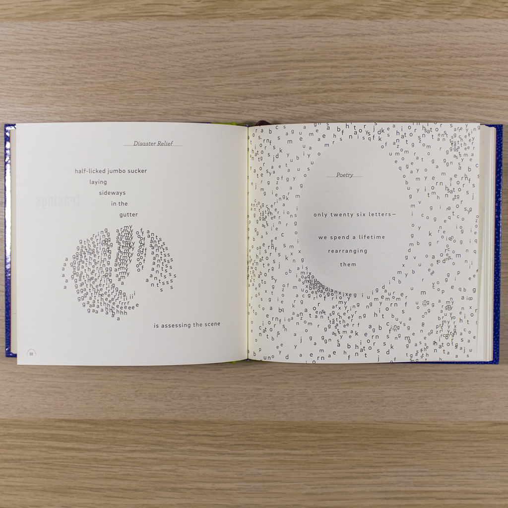
The visuals range from the purposeful placement of text on the page to the addition of patterns and marks and letters without words. Some interpretations are abstract, others representational. Some illustrate ideas, and some represent concepts. At times the reader must see text as image to complete a picture. In other cases, visual elements complete the words. Like its other paratextual components, the physical presence of the book helps with the complex negotiation that is reading. The hefty codex is reassuring and familiar. Reading the poems is non-trivial, but not in an adversarial way. The book helps the reader learn how to approach the text. Its sheer length gives the reader ample time to improve.
The challenge then is how to keep the book from being about itself. One effective choice is the cover design, which is bright and busy with illustrative swirls of type. The lime green book cloth, shiny blue paper and iridescent foil title are so much louder than the black and white inside printing that Bernstein and Lehrer’s exceptional visual literature seems only natural. More importantly though, is the decision to begin the book with the section “Lake Childhood,” which chronicles how Bernstein navigated childhood and schooling with dyslexia. What better way to talk about the physical presence of language than visual literature? Not all the poems in this movement are about dyslexia, but one can see how Bernstein’s irreverence, introspection and penchant for observation develop in this context. With playful and imaginative visualizations, Lehrer shows the reader just how difficult reading can be, and how that very difficulty could have motivated Bernstein’s career(s) in writing.
As a memoir, the quantity and brevity of the poems lend a remarkable sense of intimacy. We don’t usually imagine our friends and family along some grand linear narrative. We know people through anecdotes and vignettes that reveal their character. The 225 poems in Five Oceans in a Teaspoon function precisely this way, welcoming the reader into the kind of small moments that are usually reserved for our closest acquaintances.
Lehrer’s visualizations are so effortless that they seem inevitable, and yet leave the reader convinced that he could have presented the poem a dozen other ways. Turning the page is like listening to a perfect jazz solo, then staying for the second set and hearing the same song handled differently and just as well – inevitable, but unpredictable. The restrained visual vocabulary keep the renderings cohesive as Lehrer develops novel solutions. These constraints are important, but they are not the point. The book is not about process, it is about the poetry. The interpretation never overpowers Bernstein’s text.
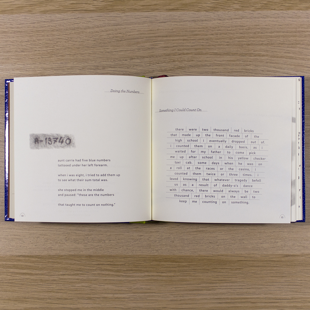
The book’s sequence is driven by the poetry. There is certainly variety among the visualizations throughout the book, but the introduction of a new visual device doesn’t signal a new section of the book. The introduction of display typefaces on page 46 or photography on page 64 provide a nice surprise, but don’t change the mode of interpretation or the course of the narrative. The visuals demonstrate experimentation and innovation, but within the unit of the page or spread. This frees the poetry, and the relationship among poems, to advance the story and succeed as a memoir. Five Oceans in a Teaspoon is a moving testament to Bernstein’s view of the world, and the experiences that have shaped it. Once again, Bernstein and Lehrer show the potential of visual literature as a mature field. Beyond self-reference and inter-art discourse, the interplay of text and image (and text-as-image) packs a powerful intellectual and emotional punch.