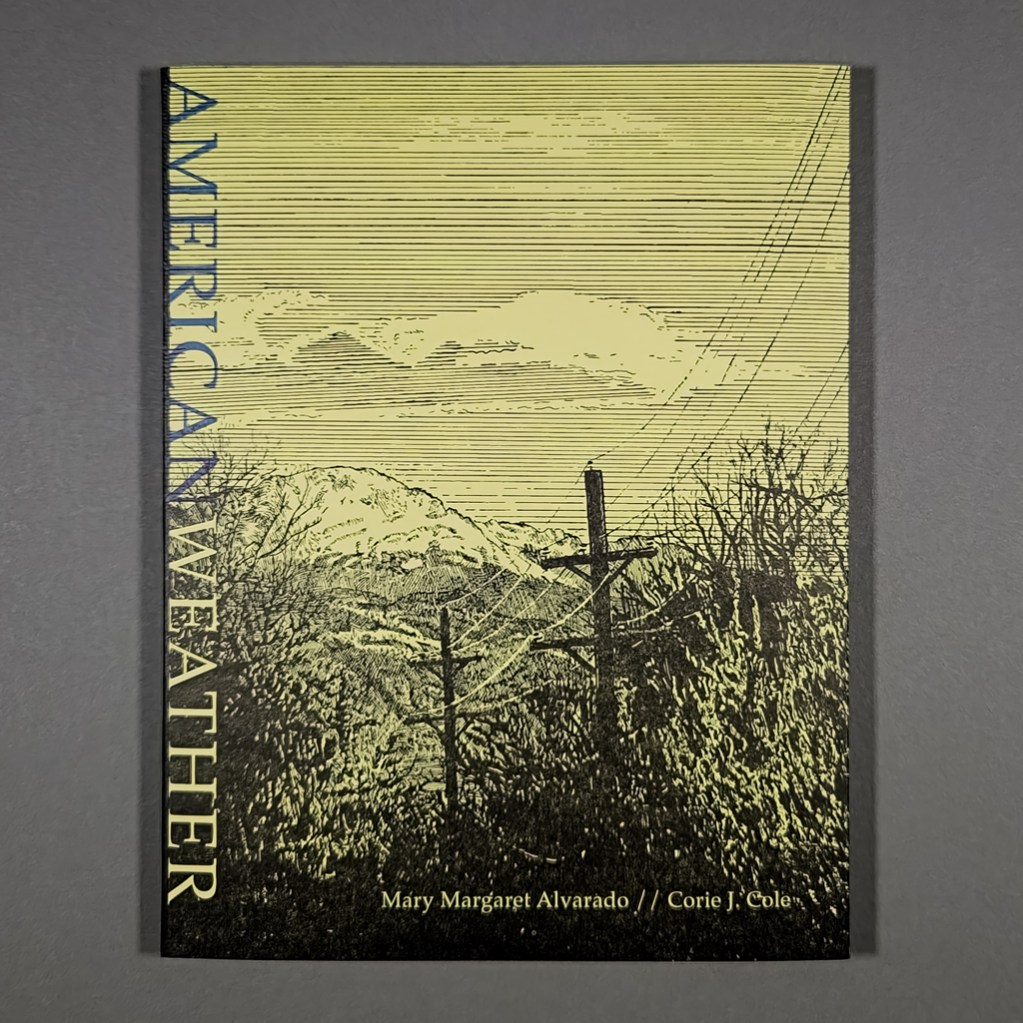
American Weather
Mary Margaret Alvarado and Corie J. Cole
2024
NewLights Press
64 pages
9.25 × 7 in. closed
Link-stitched softcover with detachable jacket
Risograph inside and letterpress cover
Edition of 200
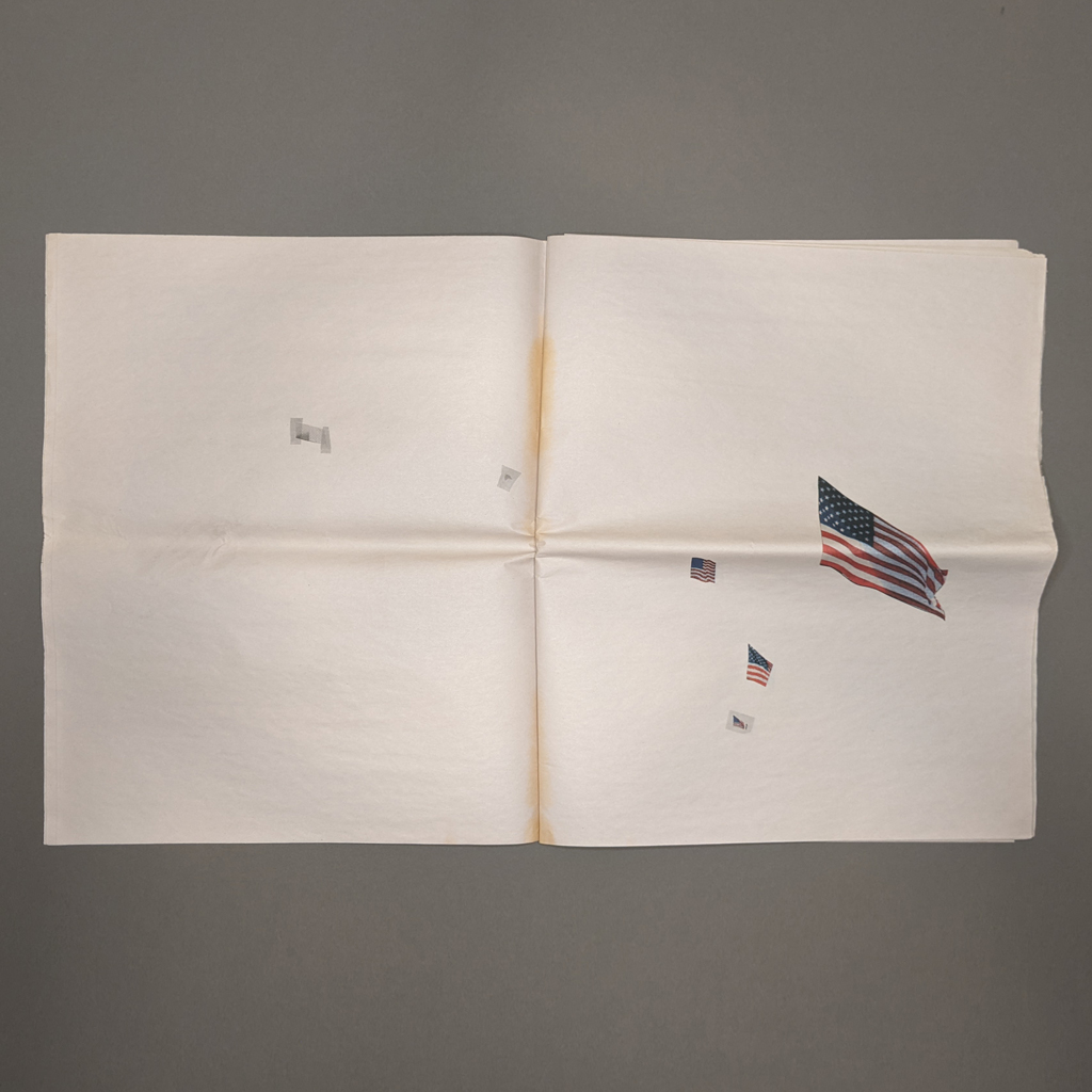
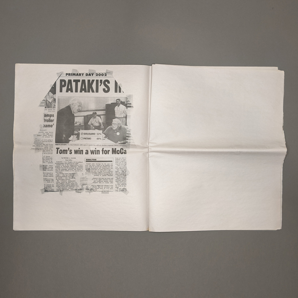
American Weather is a collaboration between writer Mary Margaret Alvarado, artist Corie J. Cole, and publisher Aaron Cohick. Alvarado first published the titular essay in 2015, in the immediate aftermath of a mass shooting near her home in Colorado Springs, where Cole and Cohick also lived. With their local perspectives, the artists aim to counter national news cycles and narrative structures. At the same time, Alvarado braids personal, political, legal, and sociological evidence into a broad indictment of American gun culture. Throughout, Alvarado shows how failures of storytelling and imagination helped propel the country toward this horrific status quo. By rejecting these patterns, American Weather tells a compelling story without normalizing, much less glorifying, violence and seeks “to make a world where it’s easier to be good.”
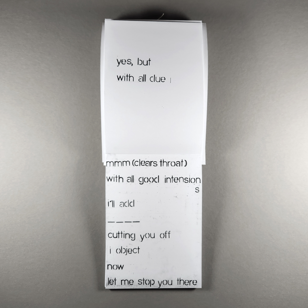
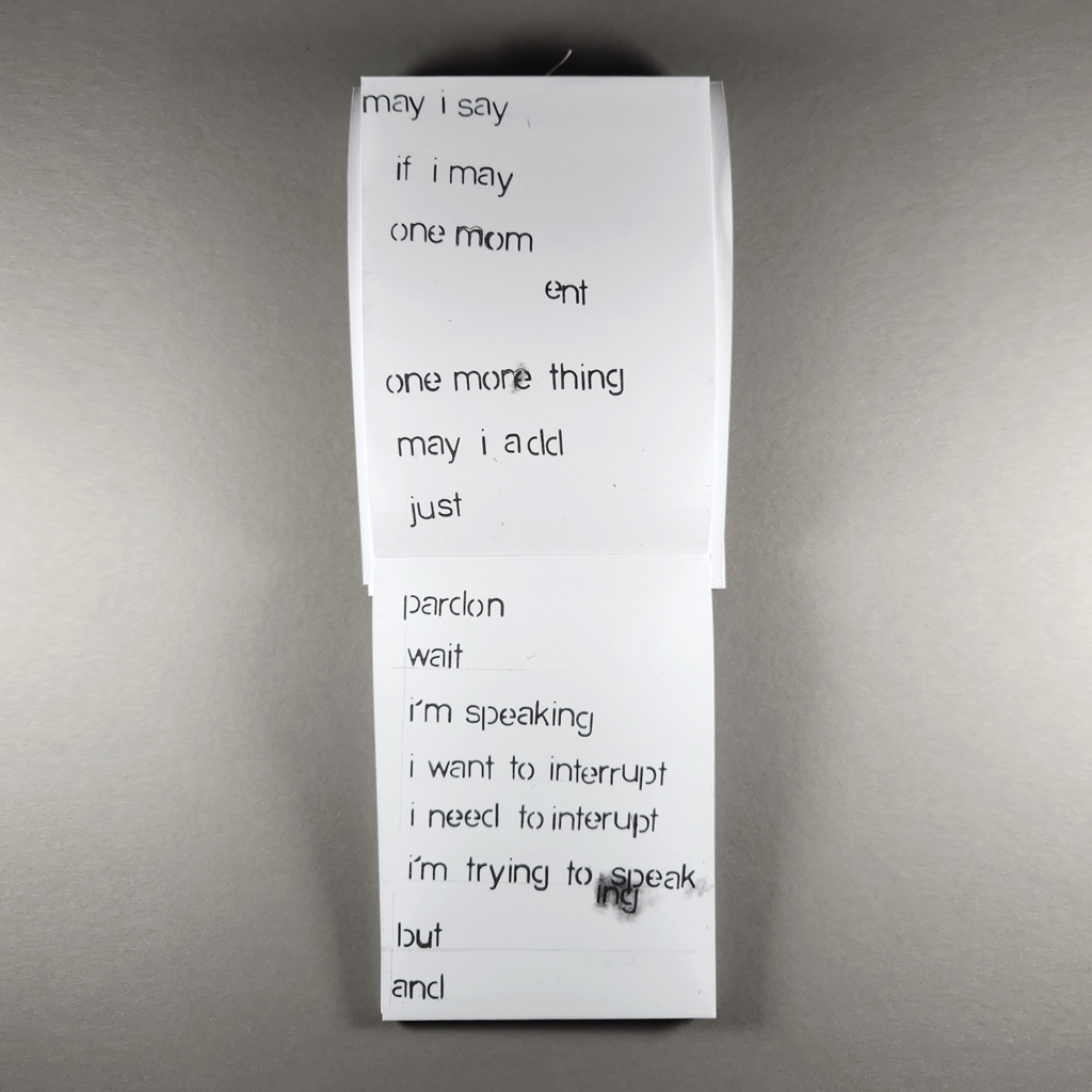
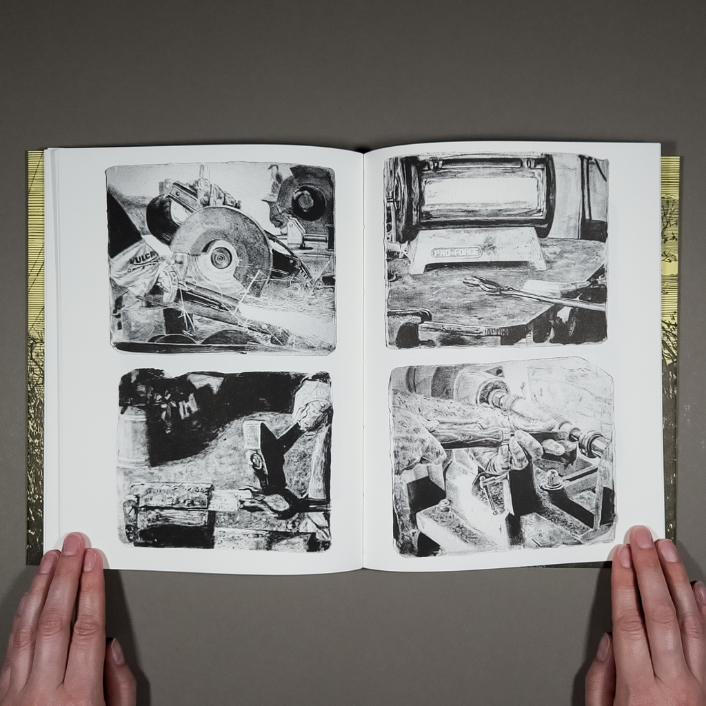
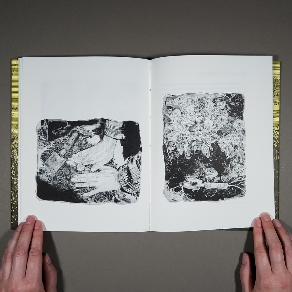
Cohick and his partner, Cole, had been reading Alvarado’s essay for years, a repeated ritual after one mass shooting then another, before he decided to republish it. The result is not quite an illustrated essay, since Cole’s images tell their own story. Likewise, the text is never merely a caption. American Weather is a hybrid book with interwoven movements of text and image. These include a new afterword in which Alvarado profiles RAWtools, a local organization that buys back guns to melt down and forge into tools and other functional objects. By depicting this redemptive process, Cole addresses gun violence without portraying violence or victims, a particularly thorny challenge for a figurative artist.

Like the guns, Cole’s images have been transformed by fire: they are underpainted on ceramic tiles, the irregular edges of which have been preserved in the Risograph-printed book. In the main essay, the images are cropped close and kept abstract. It is the afterword that provides enough context to interpret these jumbles of gun parts. Following Alvarado’s written afterword, a straightforward sequence of Cole’s paintings shows the process from gun to garden tool. Perhaps the sense of closure implied by this linear narrative of progress is resisted by the trowel, which evokes the cyclical, seasonal activity of gardening. A gun can be unmade; a shooting cannot.
The book easily integrates the illustrations, afterword, and original essay, because the texts themselves follow multiple lines of inquiry. I mean this literally: Alvarado walks the path taken by the shooter. She goes to a gun club and learns to shoot. She parses the cognitive dissonance of a workplace active shooter training/holiday gathering and recounts a traumatic incident involving her sister and nephew. She visits RAWtools and interviews Pete, who had turned in his gun after losing his son, and then his wife, to suicide. For Alvarado, writing takes place out in the community, not behind a computer screen.
In this sense, American Weather is a natural fit for NewLights Press. Cohick prioritizes process over product. He works iteratively and returns to previous projects. Cohick also appreciates a manifesto, so he knows how to present a persuasive piece like Alvarado’s while still leaving room for the reader. But whereas Cohick’s solo publications, including his manifestos, often challenge legibility, American Weather is crystal clear. The typography is conventional, the text is kept separate from the images, the margins are generous, and the book is clearly organized (despite lacking page numbers). The collaborators’ shared interest in process instead manifests in their working with members of the community, like Pete and Mike at RAWtools.

Many artist-publishers are interested in community, in how publishing makes a public. Such questions are particularly pertinent for American Weather because Alvarado’s analysis centers on the quality of community, on “front-porch versus back-deck culture.” She demonstrates that today’s interpretations of the Second Amendment rely on “the idea that society is a fiction,” evoking a frontier mythology where each individual is “an army unto himself.” After recounting several scenarios from her training simulation at the firing range — the same one that police officers use — Alvarado poses her own scenarios, ones that reflect the reality of gun violence in America. She finishes, “Imagine that all the scenarios are relational: your wife, your sister, your son. Then move on from there: his wife, her sister, their son. This is how we have a society, if we want one.”
Art may seem powerless against gun violence, but American Weather reveals how much of American gun culture is a matter of storytelling and imagination. This is precisely the terrain where art is effective, especially publishing, with its capacity to connect people with one another. In her artist’s statement, Cole distinguishes between childish and child-like ideas. Wishing to end all violence may be childish, but so is the reassuring simplicity of news stories and training simulators, with their good guys and bad guys, neighbors and outsiders. American Weather counters these corrosive narratives with nuance and context, but the book also indulges in its own utopian speculation. As Cole writes, “if we can’t imagine it, it can never be.”