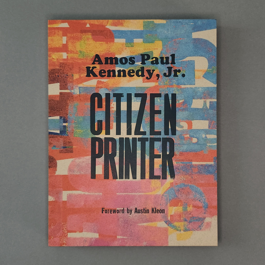
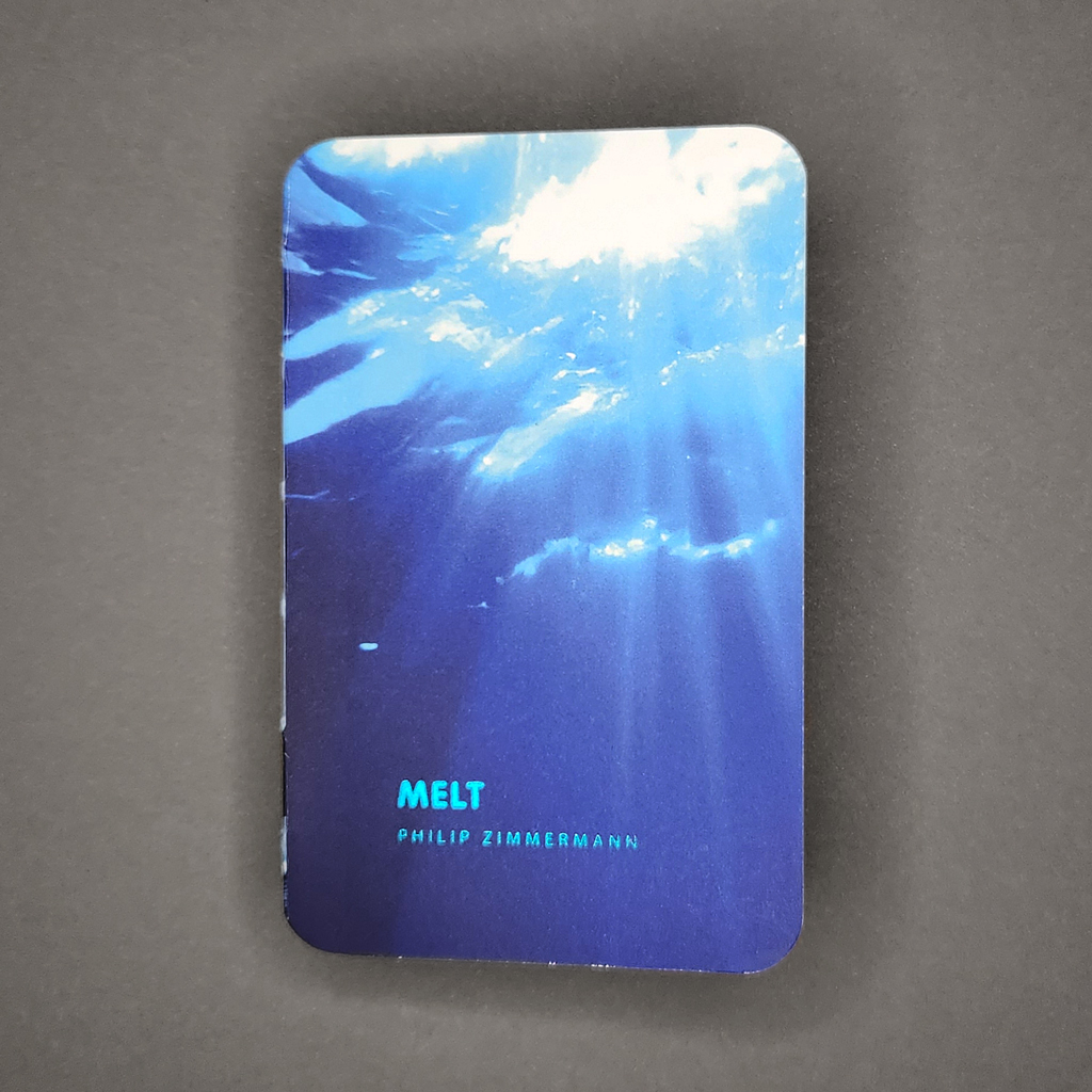
Melt
Philip Zimmermann
2023
Spaceheater Editions
Smyth-sewn softcover with exposed spine; separate z-fold colophon
Hinged metal container with clear plastic window
200 pages
3.25 × 5.125 × 1 in. closed
UV-cured inkjet printing with foil stamping on front cover and container label
Edition of 175
Melt is the second in what Douglas Adams might call Philip Zimmermann’s increasingly inaccurately named trilogy of books on climate change. (The first is Landscapes of the Late Anthropocene, and Zimmermann has since published In the Desert and Accelerated Entropy). Melt exhibits the hallmarks of Zimmermann’s best work, which would be no surprise after fifty years of bookmaking, except that most of the book’s text and imagery is generated using artificial intelligence.
Melt must be experienced in more than one manner; it is both a flipbook to be watched and a complex text-image sequence to be carefully read. Certain elements play out in discrete sections while others run the length of the book. Given the topic, issues of speed, duration, and closure are central.
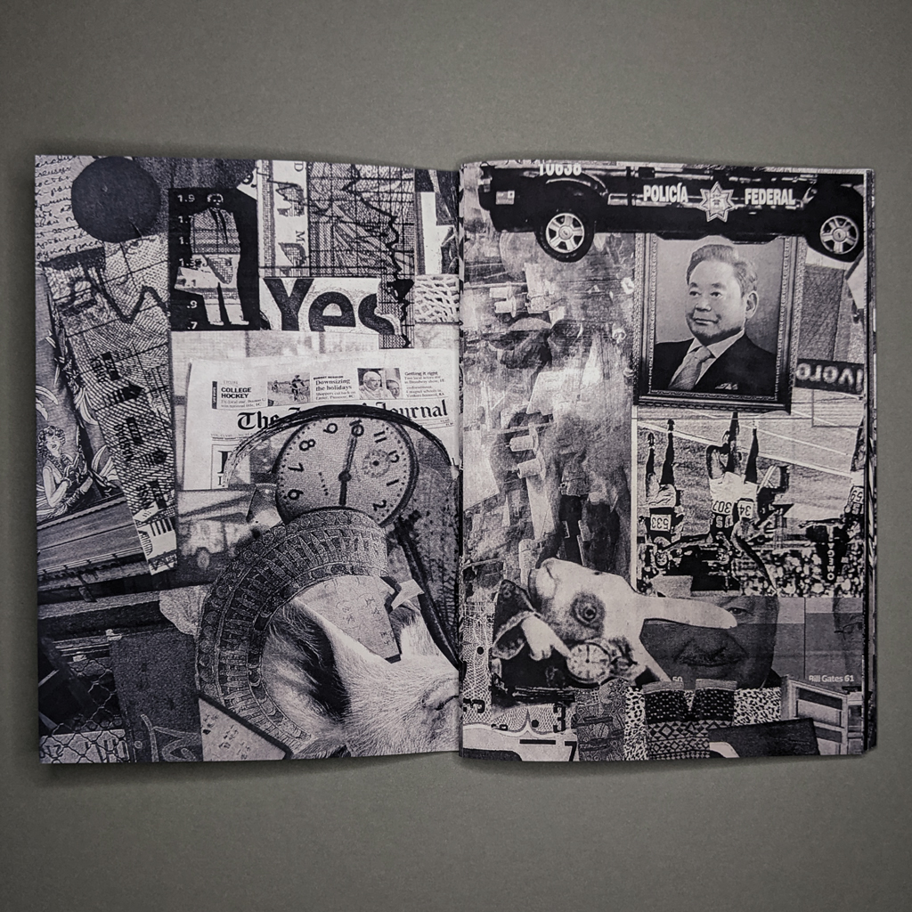
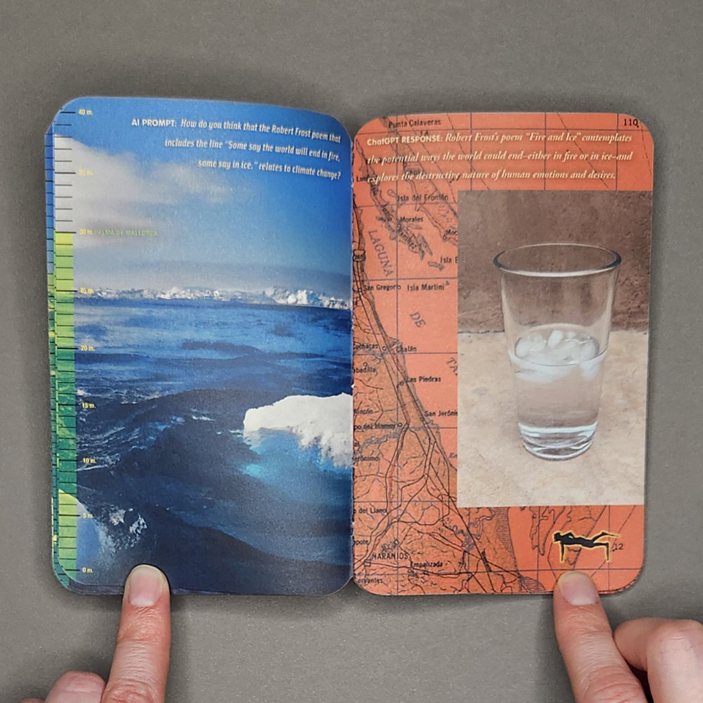
The page count (two hundred) is derived from a list of the first hundred cities likely to be submerged by rising seas. Each verso presents one city alongside a graduated scale of projected sea level rise. As the book progresses, so does the sea level, from one meter above today’s sea level (Miami is the first to go) to forty meters (Beijing). The cities thus rise from the bottom of the page toward the top, while the scale fills up. This is activated, like captivating, horrifying progress bar, when the book is flipped through, but the main animation is across the gutter.

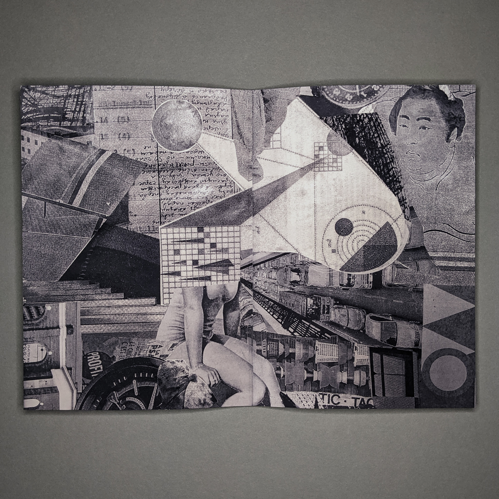
While whole cities are annihilated on the verso, the recto features something mundane but poignant: a glass of iced water melting in the Arizona heat. Behind this animation, which only occupies a portion of the page, details of different maps serve as backgrounds. These too are animated in the sense that they are tinted in increasingly alarming shades of red, turning them into literal heat maps. So, by flipping the book, the reader raises global temperatures and sea levels all in the (accelerated) time it takes to melt a glass of iced water. As the rectos redden, the left side of the book stays consistently cool thanks to the main feature: behind the sea level scale each page is dominated by a full-bleed image of a coastal environment — glaciers, sea ice, ocean waves — rendered by DALL-E.
Zimmermann includes the text prompts that spawn these images, but most of the book’s text is drafted by ChatGPT 3.5. The book is far from an excuse to use AI, but Zimmermann is clearly interested in its capabilities and shortcomings: he asks it to analyze a poem by Robert Frost and to write its own poem in the style of Charles Bukowski. He even prompts ChatGPT to suggest what sort of images would be effective in a book like Melt. Yet the book remains a critical investigation, however much Zimmermann enjoys playing with authorship and new technology, because of the unavoidable connections between AI and climate change.
These connections, whether the energy and water consumption of server farms or the fact that AI itself might pose an existential threat to humanity, add to the uncanny effect of Zimmermann’s dialogue with ChatGPT. In addition to poetry, he asks the AI to produce an essay on why humanity is slow to act in the face of existential threats. The large language model invokes human nature to explain why people might continue to develop real estate in Miami, though this is only one factor among “a complex interplay of factors” — a mealy-mouthed non-answer that those of us who teach in the age of AI have learned to recognize. Elsewhere, ChatGPT answers Zimmermann with a surprising frankness, almost unimaginable among politicians or powerbrokers.

Glimpses of Zimmermann’s humanity (and authorship) do come through. His text prompts retain a dramatic, lyrical quality that seems to accommodate his human readers more than his AI collaborator. He also manipulates DALL-E to render images that seem less real, like glacial ice of “an impossibly unnatural swimming pool-like azure.” Or perhaps that is what it takes for DALL-E to approach the grandeur of the natural world. Overall, the images seem plausible, aided by a disorienting, fractal quality that makes it hard to determine distance or scale. They are also dramatic; even as we read Zimmermann’s instructions for “majestic, but sad, images…that make us feel both lonely and desperate,” we cannot help but feel lonely and desperate, albeit layered under irony and self-awareness.

Most of all, Melt elicits feelings of urgency and anxiety. The reading experience is information overload. Pursuing the continuous texts means ignoring cities, some with millions of inhabitants, as they succumb to sea level rise. Conversely, animating the melting iced water conveys a sense of urgency but obfuscates the root causes and long-term solutions addressed in the book’s AI-generated essays. In fact, ChatGPT warns the reader about cognitive biases toward short-term thinking. Eventually, of course, the full book can be read — and enjoyed — just not all at once. Arguably, Melt is as much about time and attention as it is about climate change and AI.
Perhaps this is why I found Melt more affecting than many artists’ books on climate change, and more thoughtful than most AI art I have encountered. Time and attention are two sides of the same coin. As climate change curtails our future, what do we do with the time we have left? If AI frees us from menial tasks, what do we do with the time we gain? Melt doesn’t prescribe answers, but Zimmermann’s curiosity, empathy, and attention seem like ways to make the most of the time we have.