Neil Majeski
Curious Details in Postcards
From the series: The Last State or the Penultimate
2021
4.5 × 7 in. closed
24 pages
Saddle-stitched, softcover pamphlet
Inkjet and laser
[In a departure from the usual Artists’ Book Reviews format, this mini review is part of a series on Neil Majeski’s pamphlet series, The Last State or the Penultimate. The first of these mini reviews covered Majeski’s series as a whole.]
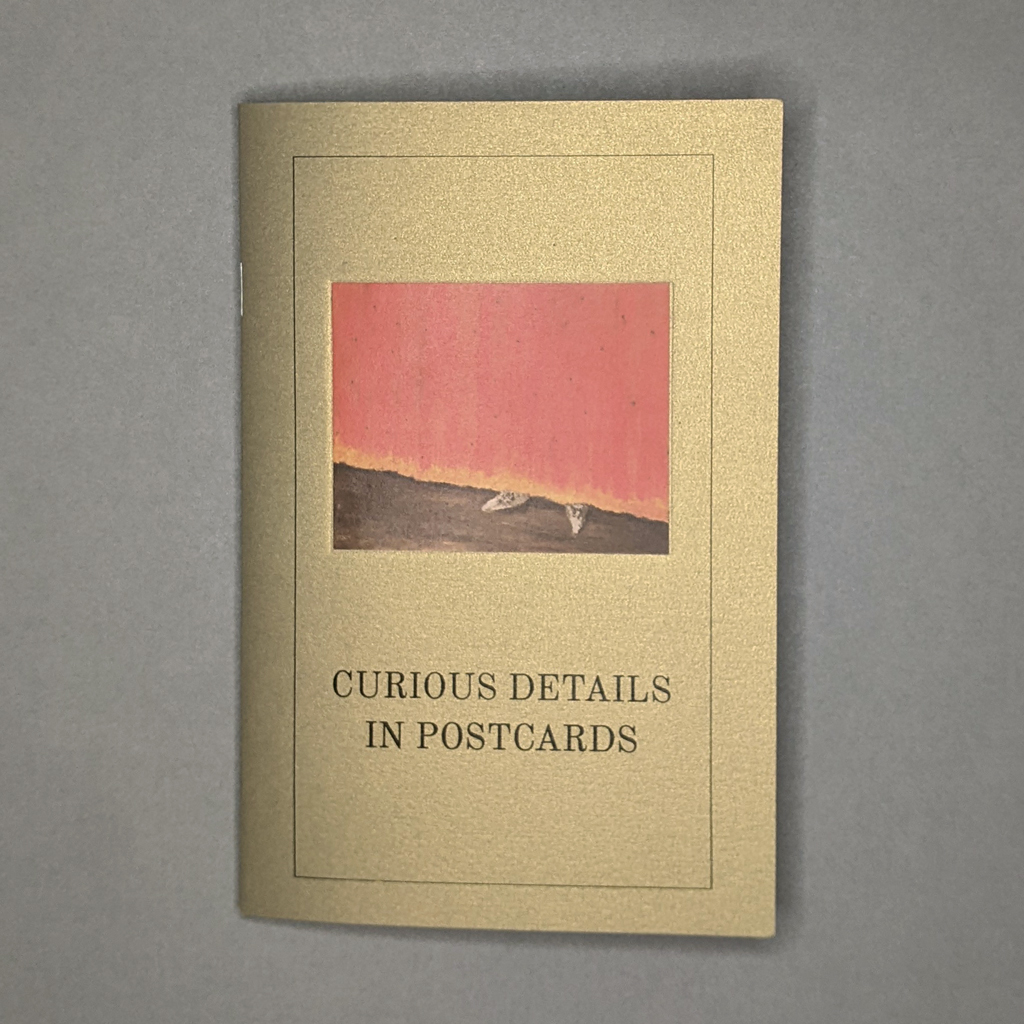
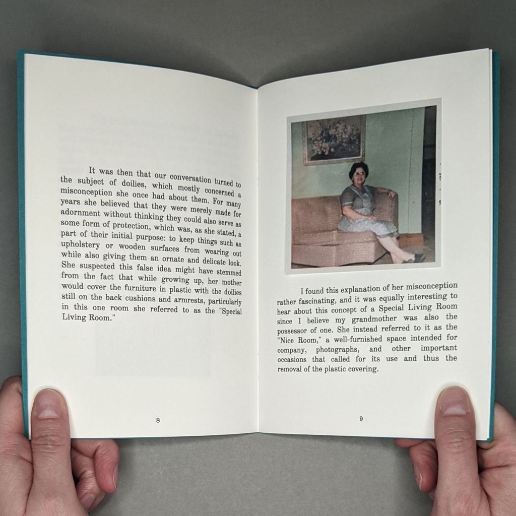
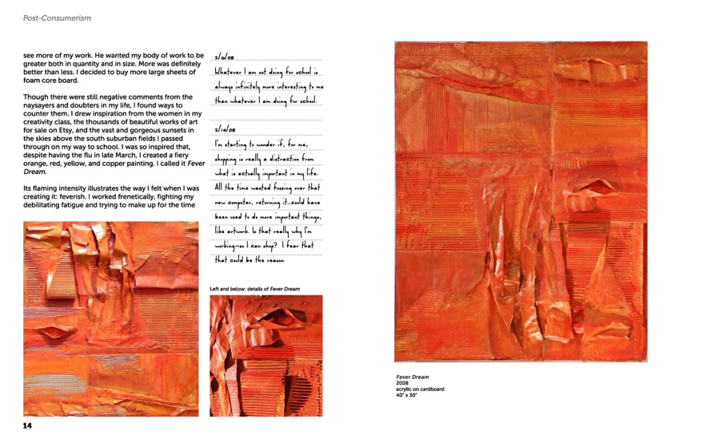
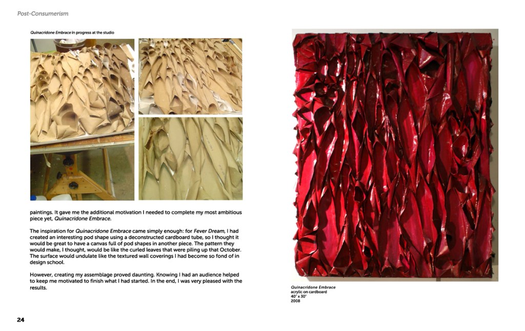
Of all the pamphlets in Neil Majeski’s series, The Last State or the Penultimate, Curious Details in Postcards strikes me as the most distinct. Published two years after the previous title, The Perverse Doilies, this fourth pamphlet approaches similar themes from new directions. It is also the most lavishly illustrated, with twenty-four color illustrations tipped in on as many pages. The sparkly gold cover paper seems suitably opulent, but the book’s subject matter, as with the rest of the series, is humble. Majeski takes the reader on a tour through a few vintage postcards, no doubt from estate sales and antique stores. If the rest of the series explores the power objects can exert, Curious Details in Postcards grapples with the relative agency of authors and readers.
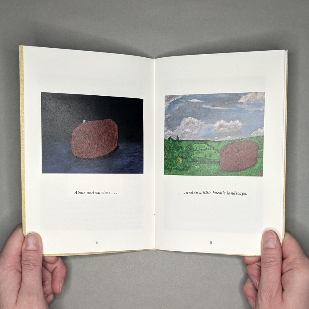
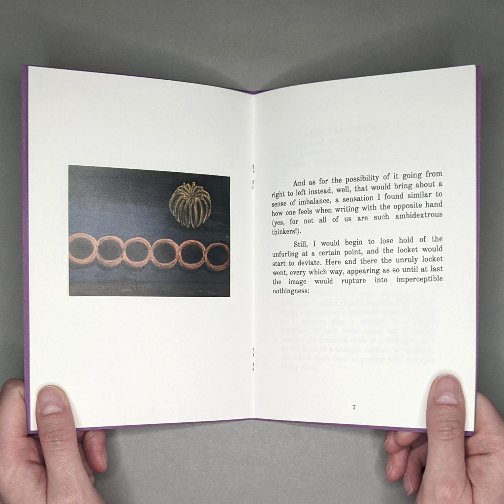
Majeski remains interested in the dialogue between object, image, and imagination, but Curious Details in Postcards puts the emphasis on images and imagination. He transports details from postcards into paintings, tracing his train of thought for the reader. He speculatively completes a house that is partly hidden behind other buildings, then imagines it into a bucolic landscape of his own design. He adds a humanoid face to a stalagmite to better demonstrate its animalistic form. Yet, even as the book’s text and image render free flowing ideas, Majeski reminds us that postcards are objects as well as images. In fact, some of the details he points out result from the postcards’ photomechanical production processes.
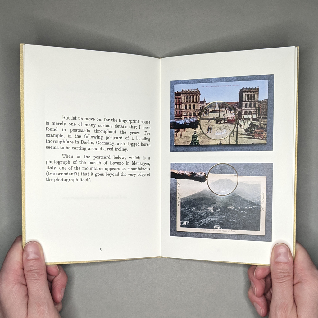
This attention to mediation, which is present throughout the series, is taken up with a new strategy in Curious Details in Postcards. Many of the illustrations tipped into the pamphlet are photographed through a magnifying glass. Majeski could simply scan the postcards at a high resolution and crop the enlarged details, but he chooses to show us the act of his (and our own) looking. These images remind the reader that looking is always interpretive, and Majeski’s text is accordingly rife with qualifications.
The subjective, if not unreliable, narrator walks the reader through each postcard in real time, as if the two are looking at the image together: “And this one I shall make a bit fun….” But just as he leaves the reader searching for a man hidden in a photograph of an apparently empty banquet hall, Majeski turns his attention to another matter entirely: a 1952 Met Museum catalogue of miniature paintings, English Paintings in the Huntington Gallery. In fact, the pamphlet on postcards sports a cover image from this second half, where Majeski is instead preoccupied with the pointy little shoes poking out beneath the floor-length dresses of various viscountesses.
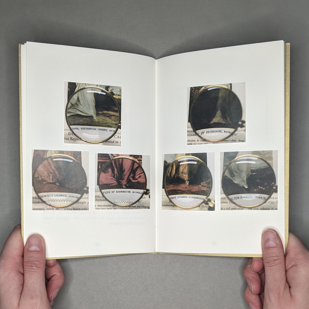
Six magnified feet, cropped out from their context, are arrayed across a two-page spread with an almost obsessive, fetishistic quality. The reader is suddenly aware of who is holding the magnifying glass and the camera. Majeski is not the painter, though; he has merely revealed an existing typology. In sharing his newfound interest, he mediates a strange dialogue between his readers and the original painters, patrons, and viewers.
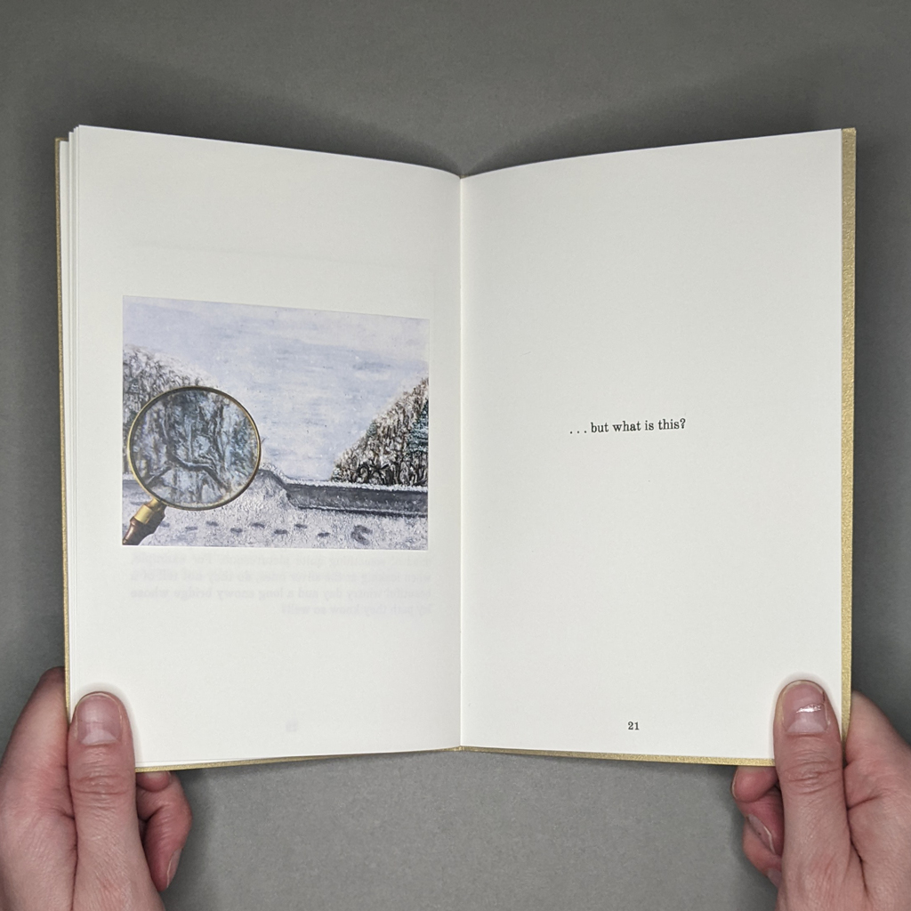
By way of conclusion, Majeski’s mind wanders back to his postcards and imagined landscapes. He leaves us with a magnified view of his own painting — “…but what is this?” The rhetorical question is not just an exhortation to look closely, but a genuine expression of the curiosity that runs throughout The Last State or the Penultimate. By continuing to look and ask questions, Majeski seems to learn as much about himself as the cultures that produced his postcards and miniature paintings.
I thought about saying that the reader learns as much about themselves as Majeski, the postcards, and the paintings — it would have made a tidy end to this review — but the reality is more complex. Even as Majeski tells us to look closely, he orchestrates every aspect of what we see and read: sequence, juxtapositions, size, cropping, and so on. Furthermore, the real-time narration resists the reader’s ability to peruse the images in whatever order they please. Therefore, Curious Details in Postcards is, like Majeski’s paintings, ultimately a material rendering of his own thinking, a negotiation between object, image, and imagination. The fact that Majeski can delightfully subvert the reader’s expectations in such a short book, much less one that is part of a series, shows his firm command of the medium.