
Pictures From the Outside
Chantal Zakari
Eighteen Publications
2023
136 pages
5.875 × 8.25 in. closed
Offset printing
Edition of 500
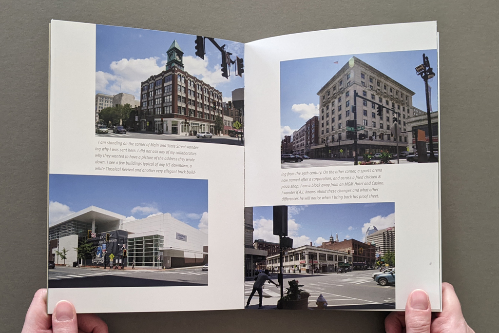
For Pictures From the Outside, Chantal Zakari asked her incarcerated adult students if there was a significant place they would like to see photographed, and then attempted to make the photographs they requested. The premise seems simple, but the vicissitudes of memory and the logistics of teaching a class in a prison conspire with the slippage between words and pictures to challenge the artist. The resulting book is complex and defies categorization. Its procedural approach, relinquishing of authorship, and play between text, image, and imagination echo Conceptual art. It makes visible the material and practical constraints of the prison system in nuanced ways akin to Institutional Critique. And its exploration of social relations and interpersonal communication resonate with various forms of social practice. However, these categories of contemporary art don’t fully convey the content created by the thirteen incarcerated contributors, whose reference points are further from the art world. Nor do they capture the combined effect of Zakari’s finished photographs, her written reflections on the process, the students’ writing (from plainspoken memoir to fantastic allegory), and documentation of the process, including hand-drawn maps and diagrams instructing Zakari’s photography and laser prints annotated with art direction.
Given all this, Pictures From the Outside is not a quick read, although it can be read in a single sitting. The weight of the subject matter is matched by the heft of the book, whose 136 pages are supported by thick binder’s board covers (uncovered but with printing and in-lay) and an exposed but durable smyth-sewn binding. Physically, its dimensions and relatively thick coated paper make the reader feel comfortable handling the book, including its two gatefold spreads that open to a panoramic 23.5 inches. Visually, unobtrusive page numbers and other thoughtful design elements help the reader navigate among the thirteen contributors without disrupting the unified statement of the book. In other words, Pictures From the Outside is a successful synthesis of form, content, and structure.
Indeed, the project exemplifies the book as medium in more than one sense. Yes, the book offers a moving, thought-provoking, and informative reading experience. But as Zakari explained in our interview, the reader of the finished book is a secondary audience. First, the book was created as a medium of exchange among Zakari and her students. In documenting its own creation, Pictures From the Outside records complex negotiations between people, between media, between times — between inside and outside.
Instead of saying more, I will let the interview below show why I think Pictures From the Outside is an excellent and important artists’ book.
[Chantal Zakari and I spoke via Zoom in November 2023. The transcript below has been edited for length and clarity.]
Levi Sherman: Was the project conceived as a book or did it evolve that way?
Chantal Zakari: Yes. I consider myself a book artist. I have a little bit of a problem with the term, I have to say — and I hate to start with the negative, but when people think of book arts, they think of handmade books. Whereas I’m always thinking of offset-printed multiples in editions of 500–1,000. That’s partially because I was trained as a designer, and offset is really what excites me. If I have an exhibit, it is usually a translation of the book. I love redesigning and re-organizing the same material in a three dimensional space.
I’m primarily interested in combining text and image and often the text is not me speaking. I either collaborate or interview. It’s not always a full collaboration. But, as you know, when you interview there can be collaborative editing, trying to get the text right requires some back and forth. I am mostly interested in making connections with people, often with subcultures.
LS: When did all this content start to cohere for you? When did you get the sense it would be successful?
CZ: I don’t know how to measure its success yet. I don’t have enough distance from it. What I could say is that it’s an honest book. I tried to stay close to my collaborators’ requests. I made the photos, brought them back to prison so that the students could make choices.
In fact, the reason why I started thinking about this project was because I wanted to talk about photography, and editing, as part of a class project. But the limitation of teaching inside is that students have no access to photography equipment. So, I decided that I would be the one to make the photos for them, and they could be my art directors and edit the images I bring back. It started as an excuse to teach about photography and text/image relationships.
LS: The role of art director raises questions about authorship and control.
CZ: Yes, from the development of concept, to the design of the book, authorship and control keeps shifting in this project. It originated with my idea, but then, their requests, their diagrams, my interpretation of their diagrams into photographs, their editing and comments, to finally, my design of the book. The book’s design is one hundred percent me, because by the time we had the content finalized, it was pretty much the end of the semester, and I couldn’t see them any more.
Except for one student who got out while I was designing. I was able to interview him in person outside the prison, as a free man, and we were able to have a more casual discussion. He saw the book while in progress and was able to give me feedback on the design.
Authorship in this project is layered. I’m not just the designer; I’m also participating, my voice is part of the book. My collaborators were editing the photos, but then there are some photos that are purely my creation. As I was photographing the requests, I also discovered other things I wanted to photograph. I included them in the book because they provide a greater context, for example the photo of the restaurant patio, or the bulletin board near the masjid… But as a designer, I was really interested in the connection between the diagrams, the photographs and the writings, and the overall sequencing of those three elements. The concept starts with the diagram which is a different way of thinking about space and a different way of reorganizing your memory of that space.
LS: You as the artist have the generative constraint of making a good photograph based on art direction from people who maybe haven’t seen the place in a long time. But that’s a very different type of constraint than incarceration. How do those different types of agency play out?
CZ: On many levels. First of all, my collaborators had control as to where I had to go and how I would photograph the place. Some of them kept it very simple, the back door of the courthouse, for example. Others asked for something more open ended, the night sky filled with stars.
But the diagrams are meticulously designed. One has even a little star that says, Stand here, and then underneath — I love it because he says, I trust your judgment. I loved that level of control and also trust.
I think for them the appeal was to be able to place a request for a picture and try to visualize how it would look. Whereas, for me it was the excitement of bringing back a photo of a place they had not seen in years. So it was important that I follow directions as closely as I could.
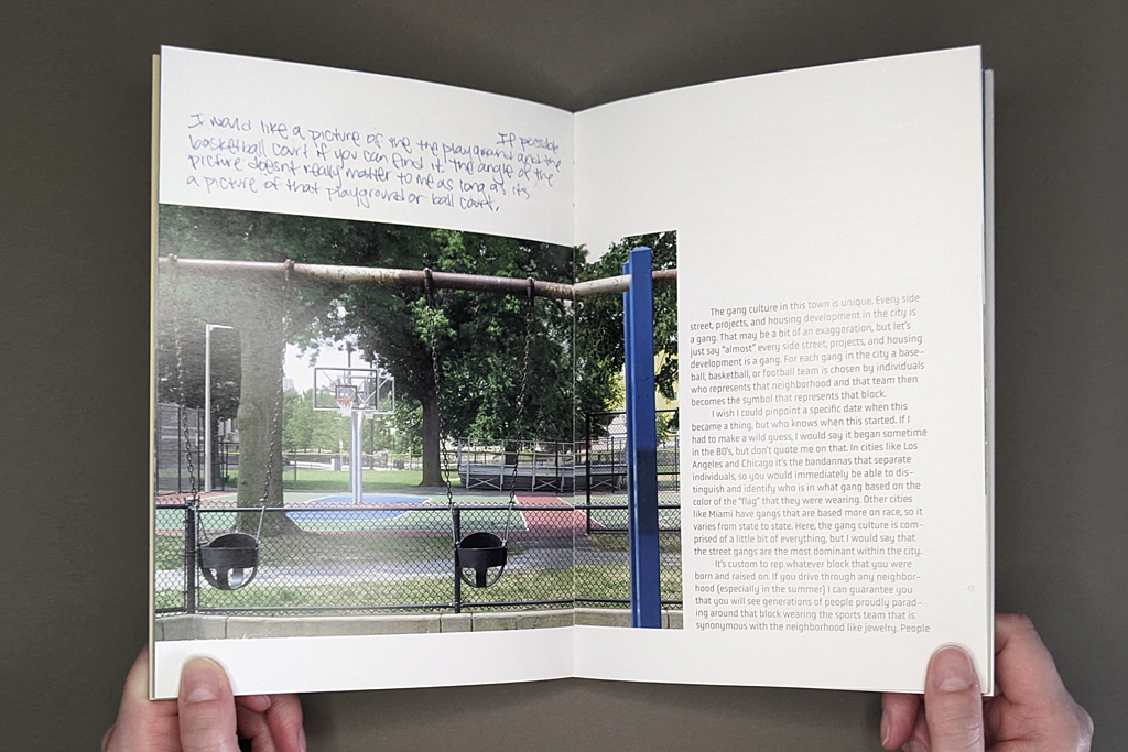
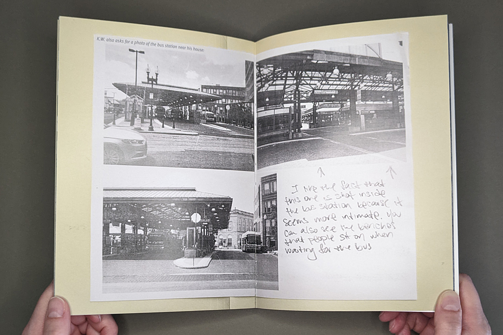
One good example is where K.W. is drawing a map of his neighborhood playground, and he’s got all the street names. Everything is written down clearly, but once I got there, I realized it’s not as accurate as it looks. K.W. had been inside for more than fifteen years at that point. He went in when he was sixteen. So, you know, there is no way he could have remembered all the street names accurately. And then, he wrote, stand here and photograph looking this way, it was completely the wrong orientation, it didn’t face the playground.
In photography, we talk about the connotation and denotation of an image. In this case, the students assigned me with the denotation of the photograph. This particular building, or the basketball court, or the night sky… But the connotation is in how a photograph is made, how it can be evocative, beyond the subject. It’s not just a picture of a building; it’s a picture of a building under a particular kind of weather. Or as N.M requests a picture of the night sky, but I chose to leave some light from the house right underneath the sky — and that’s my choice on how to frame the picture.
Once I brought back the photos we had discussions on how to edit them: why is this picture formally interesting, or why is that picture more meaningful? But even after they made some choices I traveled back to the sites to rephotograph. I had shot all the images in July, and I realized that I didn’t want some of the pictures to be shot on a bright sunny day, I wanted a cloudy day or a snowy day. So I revisited most spots later in the winter as well.
LS: Were people ever surprised by the photographs you made?
CZ: Well, K.W.’s example is a good one, because right from the onset he told me that the public housing where he grew up was demolished, and would I be able to find a picture of those buildings on the internet. I was only able to find two images. He said, yeah, I grew up in one of these buildings, but there were so many of them — who knows if it was that particular one or not? So K.W.s photographs are also about urban renovation and how our vision for public housing has changed, hopefully for the better.
The photographs I made show things as they existed a year or two ago, but the memories of my students are from fifteen, twenty years ago, they’re of the past. And the moment I made that picture it was frozen in time. Today, two years later, those places don’t look the same anymore. And by the time some of the students come out of prison, it’s not going to look like the photograph I made at all.
LS: Right, there’s photographic time. And the book is a time based medium with its own temporality, but there is also the duration of the physical book’s survival — which is different from the laser prints your students marked up (some of which are shown in the book). And then, of course, there is carceral time, which has a long history with photographic time, as Allan Sekula has shown.
CZ: Time when you are incarcerated is often thought of as empty time. That is not often true — incarcerated people have jobs, and my students were taking two classes, they were very busy. So, the time is not as empty as we tend to think.
LS: I wonder how that temporal complexity translates to the reading experience. I’m thinking of structural concerns like sequence and pacing, but also how to keep the reader invested even as they are kept outside or separate in some ways.
CZ: While designing the book I was thinking a lot about sequencing. The sequencing is based on connections I make between each story and photographs. I start with the idea of the home. C.V. asked me to go to his childhood home. He wanted me to photograph the house from a lower angle, from down the hill, the way he would have seen it when he came back from school. To me, there is the symbolic power of this image. It’s about a time when life is simpler, you look at the house from a bright sunny perspective, it’s a safe place, and a time of innocence.
From there, I move to K.W., who asked for a picture of his neighborhood; the bus stop, and the basketball court. Again, it has to do with childhood. R.G. asked for the bodega or S.A. for the Masjid. These are community spaces, what sociologists would call a third space. Several asked for a photo of their schools. A few of them were really good students at school, but for the most part many did not have fond memories of being at school.
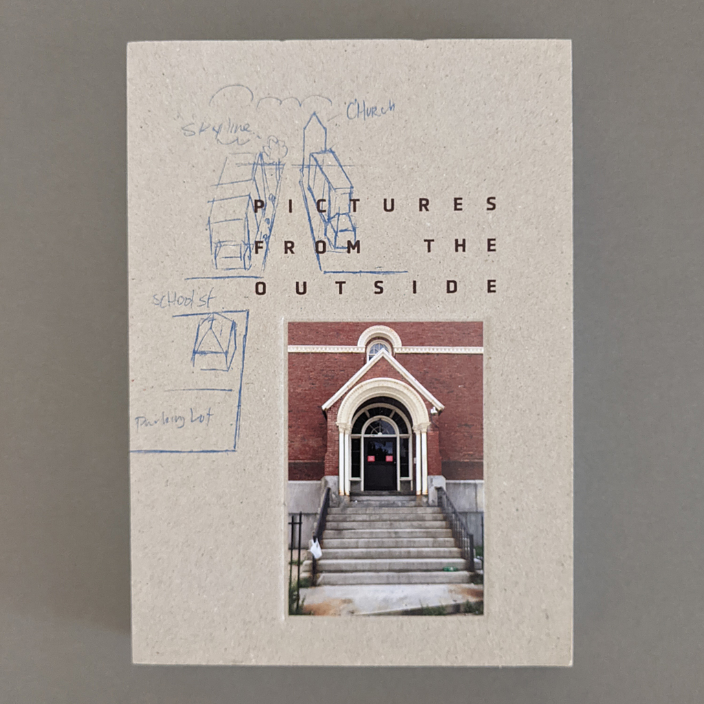
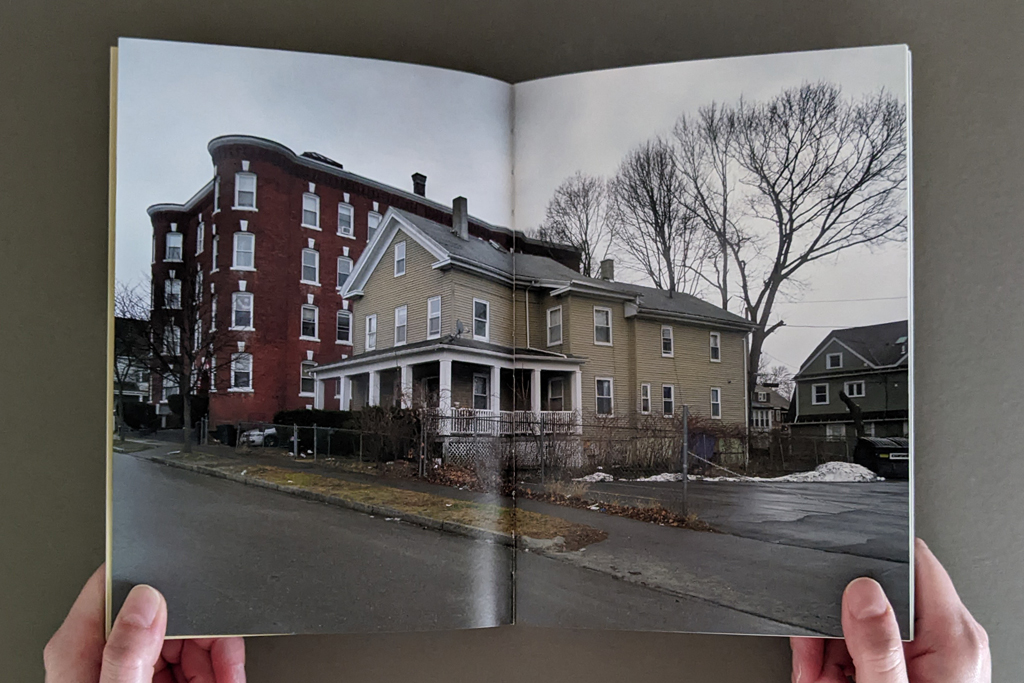
The conceptual climax of the book, for me, builds in two places. One is C.M., who asked me for the back entrance of the courthouse — which is also the cover image. That is a key image, because, for him, this is really the place where he was transformed from an ordinary citizen into an incarcerated person. R.G. also asked for the image of the building, as he puts it “I caught my case,” that was very powerful to me. Not only because he trusted me with this information, but also because he was willing to confront his worst moment.
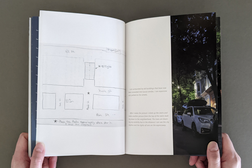
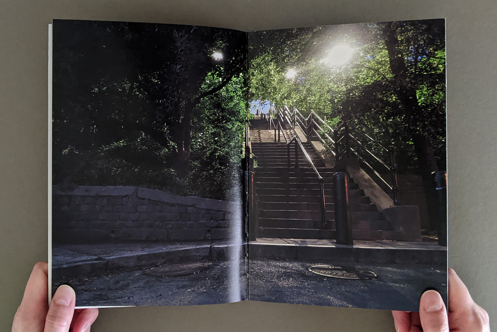
And then the second climax for me is the street alley of stairs that M.O. requested. It’s a place where he and his friends would find some privacy when they were teenagers. He talks about kissing girls. The text is full of emotions in that sense. His grandparents would take him up the stairs to go to church. You climb up the stairs to reach a church, a symbolic heaven… And what I really love is that when you turn the page, and you see his handwritten text, he says, the image is about him becoming a better person. M.O. asked for the picture to be made at night so there is a magical glow, and a certain amount of spirituality. The photograph, to me, becomes about redemption.
LS: The reader immediately recognizes that image of the back door to the courthouse from the front cover, which retroactively complicates whether you are inside or outside. The book draws the reader in, but also keeps them at arm’s length. For example, the contributors’ initials anonymize the person, but also serve as a thumb index, which helps the reader navigate and offers a place of physical contact between the reader and the writer.
CZ: I wanted you to be very aware of the change in voice from one person to another. They are each individuals with unique stories that merit their own space in the book. I hate that I had to reduce them to initials and keep them anonymous. I wish I could use their names, because their names are their identity, and it also would have given the reader a much more concrete description of their ethnic and racial identity — majority persons of color.
But, on the other hand, I also wanted to think of the book as one continuous piece, not just separate thoughts and separate experiences. In some cases, the stories connect pretty well. There are a lot of parallels.
There is one other thing worth mentioning about the design of the book: I started designing a horizontal book, because many of the photographs were horizontal. It allows for more space and more opportunities to juxtapose; I could literally have the diagram on one side and the photograph on the other side, which was very appealing to me. But eventually, when I made a prototype, I just didn’t like that it looked like a photo album. I wanted a smaller object that was a little bit more intimate. And the book was not thick enough. I wanted something that had more of a body to it. It didn’t feel right when I held it in my hands.
A smaller, vertical book, this version, really restricted some of the juxtapositions I was making. Instead these connections were translated into the turning of the page. It kept images separate from each other but the narrative became more dependent on the sequencing of elements.
LS: The page turning strengthens the continuity among the contributors, because they aren’t each isolated onto a single spread. The reader understands that the story continues even as the pages are turned.
That cohesion brings me back to the issue of text, image, and diagram. And not just text, but type and handwriting. So, there are different degrees of indexicality.
CZ: Because I couldn’t include their names, I had to include their handwriting. That’s the connection to their individuality. Also, because many were new to the computer, they were more comfortable writing by hand. On the outside, we have lost our connection to handwriting mostly because of technology, but in prison, they mostly use handwriting. And many of them have a beautiful handwriting. I saw it as a form of personal expression.
On the other hand, I couldn’t use their handwritten pages for the longer narratives. There needed to be some editing, so translating it into typography was more appropriate. Typography also gives the stories a certain amount of authority, less casual. Whereas when they’re giving me a personal note, saying, photograph the starry night, that, to me, had to be handwritten.
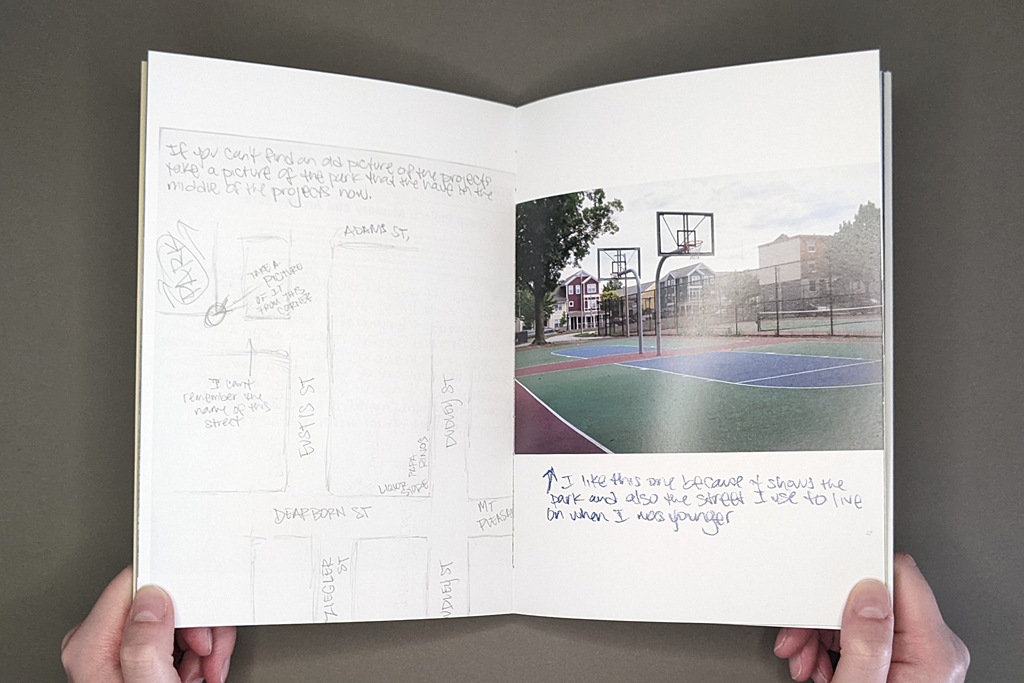
As for the connection between diagrams, photographs, and text, what interests me as an artist are indirect connections, more open ended and abstract links. New meanings come out of that, and the relationships are more interesting. So, for example, there is a photograph of a basketball court and swings in a playground which is coupled with the text of K.W. describing gang culture in his neighborhood. You know, you might associate those swings with childhood, but K.W. was at the playground and part of a gang at the same time. He lost both of his brothers to gang violence, and he himself was incarcerated because of gang violence. In his narrative he talks about neighborhood gangs identifying themselves through sports team logos. There are levels of meaning; the text does not become a caption to the image, and the image isn’t an illustration to the text. That’s really important for me. I am interested in creating new meanings through these combinations, and not simply captioning the photographs.
LS: To whatever degree it’s useful to distinguish between a photobook and an artists’ book, I think these complex relations between text and image are what makes Pictures from the Outside an artists’ book that uses photography, not a photobook. Even disregarding the conceptual way you use photography as a service and as a way of relating to people, which goes beyond a straightforward photobook, those new meanings come through at the semiotic level, between text and image.
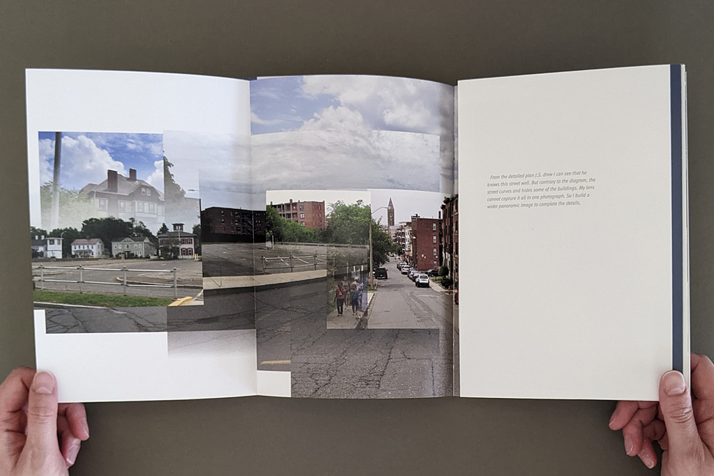
CZ: That’s an interesting observation, I hadn’t made that distinction. There are instances where the photograph is not enough, right? J.S. made a diagram, which is also on the cover. It is of a seemingly very straight street — midway a parking lot, and at the end of the street there is a church — but when I made the photograph it just didn’t all fit into the frame. He’s got a much more diagrammatic way of understanding the space that didn’t translate into my photograph. I wasn’t able to make that work. That’s why I created a photomontage for him, because in this instance I couldn’t capture the distortion of the space and fit everything he wanted to see.
LS: It was thinking about the inadequacy of any of these modes of communication on their own that made me wonder when the book resolved successfully. If photography alone is not enough, and verbal communication is not enough, then the book can combine them. But if it’s about bearing witness to incarceration, or to any one of these individual lives, is even the book adequate? Can text, image, and diagram do that?
CZ: For me, it was important that the photograph, as an object, was the gift. I was able to bring back the photographs into the prison. One book that I really loved — I read it a long time ago — Lewis Hyde’s The Gift. He talks about the art object as a gift that can be disseminated. Art is often part of the money system, right? We need to be able to make a living just as much as any other professional. As a result, you’ve got the gallery system, the fairs, the portfolios, the framing costs, you know — it’s expensive, we are part of an industry. But it’s nice to be able to just simply make an image and give it away.
The photo may or may not be good, but it’s the act of creating that photograph that was more important for me. I had the freedom to move freely; but my students didn’t, so that was my gift to them.
LS: It’s worth saying, though, that these are successful photographic images. Still, there are different materialities with different purposes and audiences. The grayscale laser prints that are shown in facsimile are different from the high-quality full-color printing in the rest of the book. The reader can see how those grayscale prints have been handled and annotated; the exchange is physically present. The finished book has its own tactile quality, which is important to the overall experience. The different materialities seem related to their respective audiences and the type of exchange that you, as the artist, have with each.
CZ: The laser prints are not precious, as objects. But the image is still very significant, because this is the first time that the students saw these places. Like C.M. — that was really the first time he had seen his childhood home in years, and that day he had tears in his eyes, even though I was giving him these shitty laser prints. He had tears in his eyes because those few dots were able to revive a memory from his past life. That laser print was also a way for him to connect to his peers, and share his past. My students had known each other through prison, but now there was a way to say, look, this is where I grew up. This is my home, my bodega, my elementary school, this is where I played football.
It’s just regular office paper. The beauty of it is that you can make notes on it and not feel like you’re destroying it. A lot of what I collected was in writing, because my time with them was very limited. So I used a lot of sticky notes to write down my comments, and they would respond back. The writing between us was very important. These objects are just bridges between us. In art, we give too much importance to the precious object. The laser prints worked just as well.
LS: I was glad you included the laser prints. They distill the idea of publishing, of using print media and text and image to communicate between people. It’s not just the information that’s being conveyed, but there is a negotiation of trust and agency.
Those different levels of communication might be a good segue to my last question, which is about your hopes for the project, and maybe the line between art and activism.
CZ: I have very strong feelings about art and activism. Thirty years ago, when I was in art school, I was interested in connecting my art to activism — partially because in art school I was taught to work in a studio in isolation of the outside world. And I was very uncomfortable with becoming an artist working in a bubble. I wanted to connect to a community, to make art that is relevant. My design skills helped me accomplish projects that would do that, and that’s how I ended up working in the book form. I also wanted to make cheap and accessible art objects, the multiple, that could be distributed and reach an audience outside the art world. I was very committed to that idea.
To some degree I’m still committed to that idea, but as the art world has turned toward political art, I have discovered that I am not interested in making didactic pieces. I don’t think I have any answers to these big problems, so I would never try to make art that says, you know, something direct like, stop smoking cigarettes. Maybe because as a kid, whenever somebody told me not to do something, instead, I would react negatively and do it. That strategy is doomed to fail.
Not knowing the answer is what excites me when I’m making art. If I don’t know the answer, then art becomes a process of discovery.
I have really strong feelings and many, many thoughts about incarceration and the prison system, but I don’t see this book trying to change anybody’s mind about that. Increasingly, I have very strong feelings about education in prison, and its power and limitations. But this book is not about that either. For me, the book is about the process of collaborating with these incarcerated men, to connect with them on a human level, to talk about photography and art, to make a connection to their past. To give them a voice to be creative. And if I could give you a sliver of what it means to be incarcerated, that’s great.
I am not on a crusade. I can do that through different means, not with my art. All art is political, but I don’t believe in didactic art.
LS: The distinction between political art and activist art is important, but sometimes gets lost.
CZ: Persuasive art, to me, parallels advertising, and that’s a complete turn off. So I am very cautious about making that distinction.
LS: Which is related to that aspect of unknowing or discovery. So, I’m wondering if there are ways you learned or evolved or came to understand things differently through this project?
CZ: Many things. From a formal point of view, trying to make twenty to twenty-five unique photographs about buildings, avoiding people, is a challenge, you try to be inventive and photograph them differently. I am not an architectural photographer, so I was focusing more on the environments. And as a book designer, I tried things that I had never tried before. So you’re always evolving in that way.
It’s not just the book; it was the whole experience of collaborating that probably transformed me. It would be too presumptuous for me to know exactly how I changed, but if you are open, you allow yourself to change all the time.
As an artist I have a hard time committing to making art about one issue. The next project I will do is probably something I have never done before. That’s not how the art world works, curators and gallerists want to know that you have a focused voice. I have similar approaches in many of my projects, but I like exploring a lot of ideas.
LS: Collaborating with students seems like an especially good way to learn through the process, to put yourself in the beginner’s mindset. I found myself thinking about photography and its limitations, how images are constructed and how they work on the viewer, and making connections with the visual literacy I teach as an art historian. What better way of “seeing seeing” than translating someone’s verbal description of a mental image through the mediation of a camera, print production, and the book? The project captures so much of what we try to do when we teach visual literacy.
CZ: When we teach, we assign projects, for example, go photograph a building. But the real teaching happens when we critique the work and discuss the nuances. How did you photograph the building? Or are you photographing when the light condition is very low? There are so many other elements that contribute to the meaning of a photograph, and how one reads it emotionally.
That’s what this book taught me. I went back many times to photograph these places. The class took place in June, the majority of the photographs were done in July, and I was back in class in August to bring back the images. That was the last time I saw my students. Later I went back to the sites in the winter to take more pictures under different weather conditions. Then I got a new camera, so I rephotographed the next spring and summer again. If you look at the photographs in the book the seasons keep changing.
I’m growing as an artist, but I don’t know if that’s the focus of the book. It’s not about showcasing my growth — that’s what happens internally when you’re working on a project.
LS: What’s next for the project?
CZ: I guess I would like to place these books in libraries. That’s what’s so great about a book. I could make a show, and it disappears within a month or two. But a book stays.

Leave a comment