
Below you’ll find the most recent artists’ book reviews and interviews. See the submissions page to find out how your book can be featured.
-
Prisoners’ Inventions
Prisoners’ Inventions
Angelo
Temporary Services (Brett Bloom and Marc Fischer)
Edited by Mairead Case and designed by Partner & Partners
Half Letter Press
20208.5 × 5.5 in. closed
200 pages
Perfect-bound softcover
Digital printing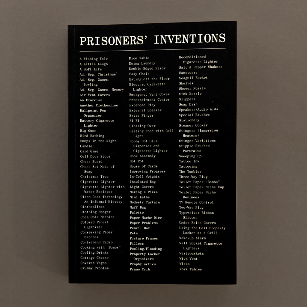
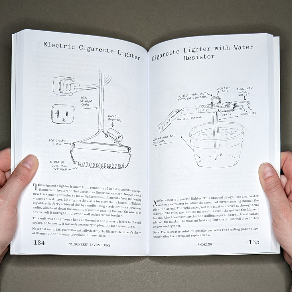
Prisoners’ Inventions is what the title suggests: a compendium of devices designed, built, and used by people incarcerated in US prisons. First published in 2003 with WhiteWalls, this 2020 edition is significantly expanded from its original 132 pages, and has just been reprinted (with minor edits) in 2024. The project’s full history is helpfully detailed in a foreword by Temporary Services. There is also an introduction by Temporary Services’ collaborator, Angelo, who was then incarcerated in California. It is Angelo who provides the prisoners’ inventions, which he renders in extraordinarily detailed ball point pen drawings and lively prose. Some of the texts are short and instructional, but more often Angelo pairs his drawings with a one- or two-page narrative. The inventions are categorized (storage, cooking, etc.) inside the book, but presented in a single alphabetized list on the front cover. With its uneven mix of prison slang, household objects, and familiar words made strange by their context, the cover effectively previews the reading experience.

Angelo is not only the author and illustrator but also the one who aggregates the inventions. Most are things he has used (and often things he has made), but a few have only been described to him by other inmates. In either case, Angelo emphasizes the way knowledge is shared among incarcerated individuals. He is quick to credit a cellmate who taught him a particular technique or namecheck an inmate whose handiwork was renowned. In other words, oral tradition and storytelling are at the heart of this paper book of printed text and image. Though less visible, written correspondence is also a constant presence. Indeed, one could argue the entire project is a work of mail art since the collaboration unfolded (without state permission) via post.
The mutual dependence of text and image, and the combination of straightforward instructions with personal anecdotes, reminded me of my conversation with Chantal Zakari about her own book with incarcerated collaborators, Pictures From the Outside. No matter how evocative, each medium is ultimately inadequate on its own. Even if Angelo’s drawings can explain how an invention might be used, they cannot capture its lore. In fact, what the drawings can and can’t convey drives the reader’s experience (at least the reader who has limited first-hand experience with such inventions). On the one hand, ball point pen enables Angelo’s meticulous detail, which gives a sense of scale, mechanics, and ergonomics. On the other, the medium gives little sense of material or texture. The result is that the outlines of something might look familiar, only to have its textual description wrench away its relatability. What looks like plastic or metal may be toilet-paper-mache or carved soap.
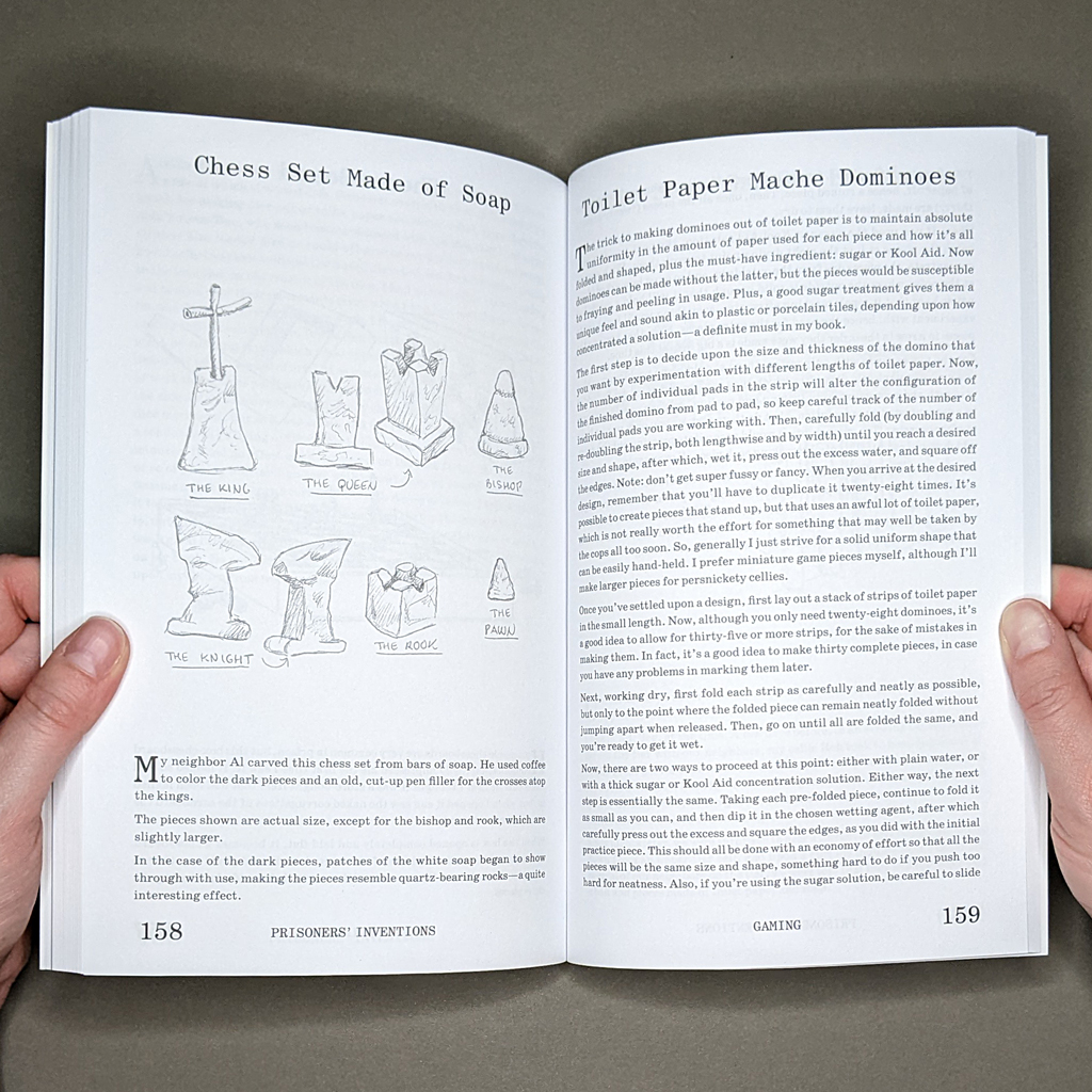
The tactile experience of such materials will be foreign to many readers, although Angelo admirably describes, for example, the sticky process of working Kool-Aid and toilet paper into a set of dominoes as well as the satisfying clack of the finished pieces. Angelo gives a sense of the time it takes to make things by hand, to painstakingly stockpile materials (and hope they aren’t confiscated), to plan, prototype, and produce. Incarcerated for a quarter century, Angelo presents this sense of time with stubborn equanimity. An inmate creates something, a guard confiscates it, and so the cycle continues. For the reader, though, the inventions — and their fabrication — remain almost incomprehensible, situated as the reader is outside the flow of carceral time, the deprivations of prison, and the whims of corrections officers.
Whether an invention is introduced with a humorous anecdote or an explanation of the hardship that motivated its creation, Angelo’s testimony is moving. But the book is more than a series of vignettes; its structure and presentation contribute to the message. Perhaps the most overt editorial interventions are the categories: home furnishings; storage; cooking; dining; personal maintenance; bathing; smoking; recreation; gaming; arts & crafts; little extras. The categories sound disarmingly domestic, as if taken from a catalogue or lifestyle magazine. They also speak to basic human needs. The gulf between the inside and the outside is made all the more poignant by this shared vocabulary. Unsurprisingly, the inventions fit uneasily into such familiar categories, and that illustrates another of the book’s major themes: the tension between order and chaos. Even the most anodyne invention, including one meant to maintain order — a clothes hanger or pencil organizer — is considered contraband in prison. However, where prison guards struggle to control these inventions, the book logs them in a table of contents, neatly typologized.

This is not to say that the book arrests the inventions’ unruly creativity. For one thing, the reader can use the book as an instruction manual (Temporary Services did just that for the 2003–2004 exhibition Fantastic! at MASS MoCA). Not every reader will make their own dumbbells or cottage cheese, but Prisoners’ Inventions is an instructional manual in another sense: it shows us how to see the small acts of creativity all around us. (In this regard, Prisoners’ Inventions fits perfectly alongside Temporary Service’s Public Phenomena series and Marc Fischer’s Public Collectors series.) In his introduction, Angelo says that, at first, he didn’t think there would be anything interesting to depict. The subsequent outpouring shows what a change in perspective can achieve.
Some of the book’s details, and certainly the characters, situate Prisoners’ Inventions in a particular place and time. As a celebration of innovation, though, it speaks to something more universal. The deeply human urge to solve problems and express oneself accounts for much of the book’s continued relevance, but two decades after its first publishing, we must also acknowledge how little has changed regarding mass incarceration. As I read, I kept wondering what these men — Angelo, Billy, Victor, Randy, Ron, and Little John — might invent in a different system.
-
Pictures From the Outside: Interview with Chantal Zakari
Pictures From the Outside
Chantal Zakari
Eighteen Publications
2023136 pages
5.875 × 8.25 in. closed
Offset printing
Edition of 500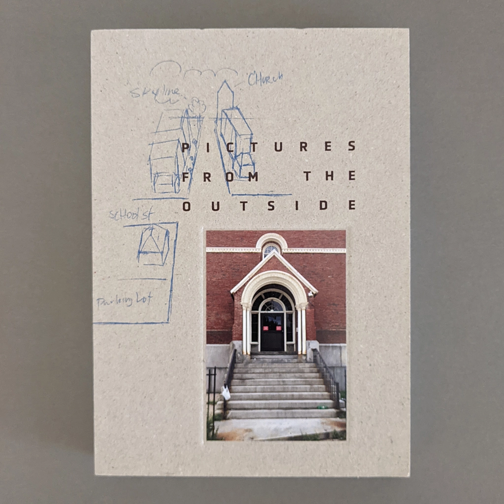
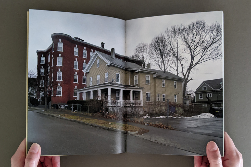
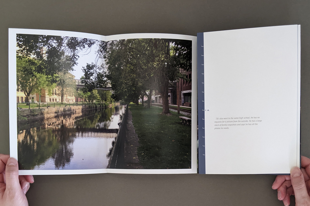
For Pictures From the Outside, Chantal Zakari asked her incarcerated adult students if there was a significant place they would like to see photographed, and then attempted to make the photographs they requested. The premise seems simple, but the vicissitudes of memory and the logistics of teaching a class in a prison conspire with the slippage between words and pictures to challenge the artist. The resulting book is complex and defies categorization. Its procedural approach, relinquishing of authorship, and play between text, image, and imagination echo Conceptual art. It makes visible the material and practical constraints of the prison system in nuanced ways akin to Institutional Critique. And its exploration of social relations and interpersonal communication resonate with various forms of social practice. However, these categories of contemporary art don’t fully convey the content created by the thirteen incarcerated contributors, whose reference points are further from the art world. Nor do they capture the combined effect of Zakari’s finished photographs, her written reflections on the process, the students’ writing (from plainspoken memoir to fantastic allegory), and documentation of the process, including hand-drawn maps and diagrams instructing Zakari’s photography and laser prints annotated with art direction.
Given all this, Pictures From the Outside is not a quick read, although it can be read in a single sitting. The weight of the subject matter is matched by the heft of the book, whose 136 pages are supported by thick binder’s board covers (uncovered but with printing and in-lay) and an exposed but durable smyth-sewn binding. Physically, its dimensions and relatively thick coated paper make the reader feel comfortable handling the book, including its two gatefold spreads that open to a panoramic 23.5 inches. Visually, unobtrusive page numbers and other thoughtful design elements help the reader navigate among the thirteen contributors without disrupting the unified statement of the book. In other words, Pictures From the Outside is a successful synthesis of form, content, and structure.
Indeed, the project exemplifies the book as medium in more than one sense. Yes, the book offers a moving, thought-provoking, and informative reading experience. But as Zakari explained in our interview, the reader of the finished book is a secondary audience. First, the book was created as a medium of exchange among Zakari and her students. In documenting its own creation, Pictures From the Outside records complex negotiations between people, between media, between times — between inside and outside.
Instead of saying more, I will let the interview below show why I think Pictures From the Outside is an excellent and important artists’ book.
[Chantal Zakari and I spoke via Zoom in November 2023. The transcript below has been edited for length and clarity.]
Levi Sherman: Was the project conceived as a book or did it evolve that way?
Chantal Zakari: Yes. I consider myself a book artist. I have a little bit of a problem with the term, I have to say — and I hate to start with the negative, but when people think of book arts, they think of handmade books. Whereas I’m always thinking of offset-printed multiples in editions of 500–1,000. That’s partially because I was trained as a designer, and offset is really what excites me. If I have an exhibit, it is usually a translation of the book. I love redesigning and re-organizing the same material in a three dimensional space.
I’m primarily interested in combining text and image and often the text is not me speaking. I either collaborate or interview. It’s not always a full collaboration. But, as you know, when you interview there can be collaborative editing, trying to get the text right requires some back and forth. I am mostly interested in making connections with people, often with subcultures.
LS: When did all this content start to cohere for you? When did you get the sense it would be successful?
CZ: I don’t know how to measure its success yet. I don’t have enough distance from it. What I could say is that it’s an honest book. I tried to stay close to my collaborators’ requests. I made the photos, brought them back to prison so that the students could make choices.
In fact, the reason why I started thinking about this project was because I wanted to talk about photography, and editing, as part of a class project. But the limitation of teaching inside is that students have no access to photography equipment. So, I decided that I would be the one to make the photos for them, and they could be my art directors and edit the images I bring back. It started as an excuse to teach about photography and text/image relationships.
LS: The role of art director raises questions about authorship and control.
CZ: Yes, from the development of concept, to the design of the book, authorship and control keeps shifting in this project. It originated with my idea, but then, their requests, their diagrams, my interpretation of their diagrams into photographs, their editing and comments, to finally, my design of the book. The book’s design is one hundred percent me, because by the time we had the content finalized, it was pretty much the end of the semester, and I couldn’t see them any more.
Except for one student who got out while I was designing. I was able to interview him in person outside the prison, as a free man, and we were able to have a more casual discussion. He saw the book while in progress and was able to give me feedback on the design.
Authorship in this project is layered. I’m not just the designer; I’m also participating, my voice is part of the book. My collaborators were editing the photos, but then there are some photos that are purely my creation. As I was photographing the requests, I also discovered other things I wanted to photograph. I included them in the book because they provide a greater context, for example the photo of the restaurant patio, or the bulletin board near the masjid… But as a designer, I was really interested in the connection between the diagrams, the photographs and the writings, and the overall sequencing of those three elements. The concept starts with the diagram which is a different way of thinking about space and a different way of reorganizing your memory of that space.
LS: You as the artist have the generative constraint of making a good photograph based on art direction from people who maybe haven’t seen the place in a long time. But that’s a very different type of constraint than incarceration. How do those different types of agency play out?
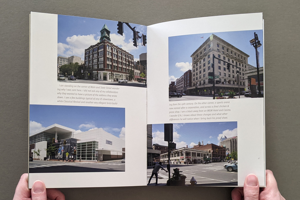
CZ: On many levels. First of all, my collaborators had control as to where I had to go and how I would photograph the place. Some of them kept it very simple, the back door of the courthouse, for example. Others asked for something more open ended, the night sky filled with stars.
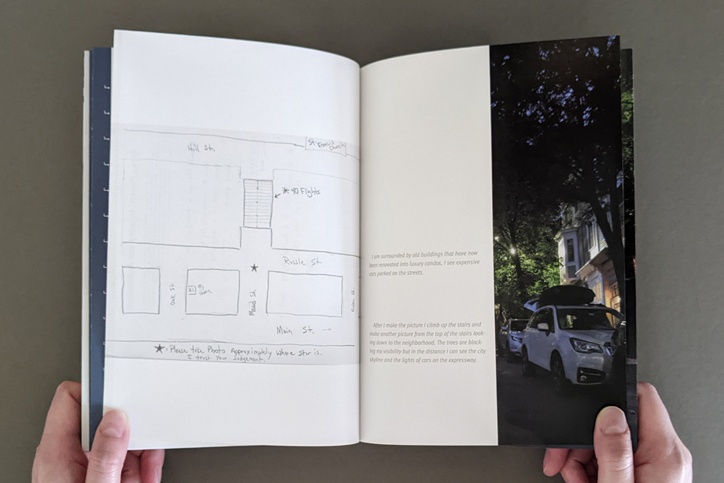
But the diagrams are meticulously designed. One has even a little star that says, Stand here, and then underneath — I love it because he says, I trust your judgment. I loved that level of control and also trust.
I think for them the appeal was to be able to place a request for a picture and try to visualize how it would look. Whereas, for me it was the excitement of bringing back a photo of a place they had not seen in years. So it was important that I follow directions as closely as I could.
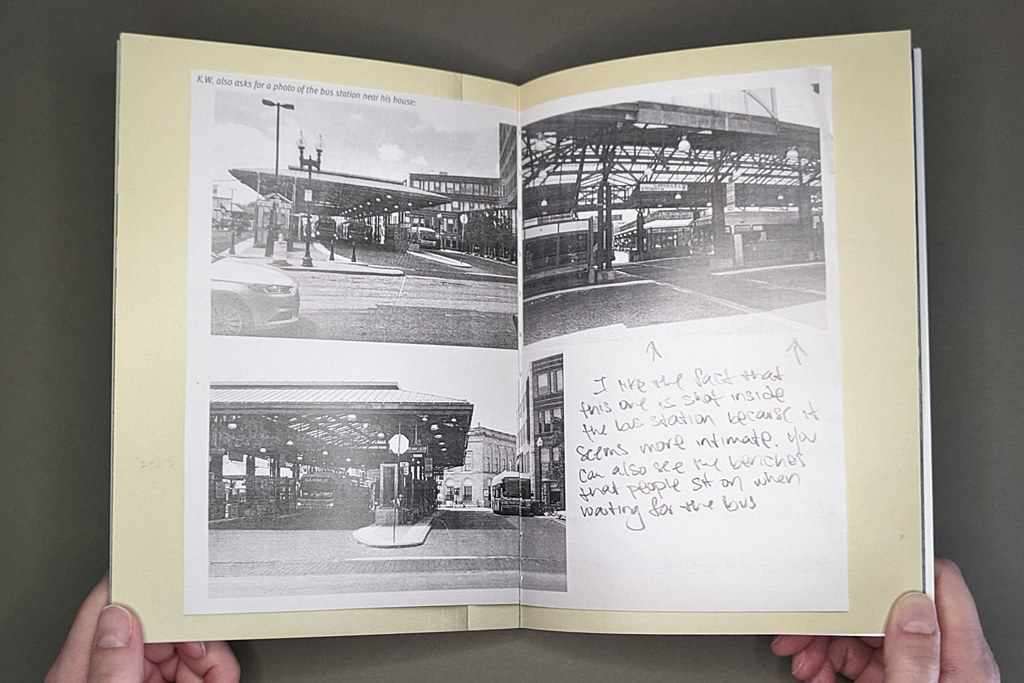
One good example is where K.W. is drawing a map of his neighborhood playground, and he’s got all the street names. Everything is written down clearly, but once I got there, I realized it’s not as accurate as it looks. K.W. had been inside for more than fifteen years at that point. He went in when he was sixteen. So, you know, there is no way he could have remembered all the street names accurately. And then, he wrote, stand here and photograph looking this way, it was completely the wrong orientation, it didn’t face the playground.
In photography, we talk about the connotation and denotation of an image. In this case, the students assigned me with the denotation of the photograph. This particular building, or the basketball court, or the night sky… But the connotation is in how a photograph is made, how it can be evocative, beyond the subject. It’s not just a picture of a building; it’s a picture of a building under a particular kind of weather. Or as N.M requests a picture of the night sky, but I chose to leave some light from the house right underneath the sky — and that’s my choice on how to frame the picture.
Once I brought back the photos we had discussions on how to edit them: why is this picture formally interesting, or why is that picture more meaningful? But even after they made some choices I traveled back to the sites to rephotograph. I had shot all the images in July, and I realized that I didn’t want some of the pictures to be shot on a bright sunny day, I wanted a cloudy day or a snowy day. So I revisited most spots later in the winter as well.
LS: Were people ever surprised by the photographs you made?
CZ: Well, K.W.’s example is a good one, because right from the onset he told me that the public housing where he grew up was demolished, and would I be able to find a picture of those buildings on the internet. I was only able to find two images. He said, yeah, I grew up in one of these buildings, but there were so many of them — who knows if it was that particular one or not? So K.W.s photographs are also about urban renovation and how our vision for public housing has changed, hopefully for the better.
The photographs I made show things as they existed a year or two ago, but the memories of my students are from fifteen, twenty years ago, they’re of the past. And the moment I made that picture it was frozen in time. Today, two years later, those places don’t look the same anymore. And by the time some of the students come out of prison, it’s not going to look like the photograph I made at all.
LS: Right, there’s photographic time. And the book is a time based medium with its own temporality, but there is also the duration of the physical book’s survival — which is different from the laser prints your students marked up (some of which are shown in the book). And then, of course, there is carceral time, which has a long history with photographic time, as Allan Sekula has shown.
CZ: Time when you are incarcerated is often thought of as empty time. That is not often true — incarcerated people have jobs, and my students were taking two classes, they were very busy. So, the time is not as empty as we tend to think.
LS: I wonder how that temporal complexity translates to the reading experience. I’m thinking of structural concerns like sequence and pacing, but also how to keep the reader invested even as they are kept outside or separate in some ways.
CZ: While designing the book I was thinking a lot about sequencing. The sequencing is based on connections I make between each story and photographs. I start with the idea of the home. C.V. asked me to go to his childhood home. He wanted me to photograph the house from a lower angle, from down the hill, the way he would have seen it when he came back from school. To me, there is the symbolic power of this image. It’s about a time when life is simpler, you look at the house from a bright sunny perspective, it’s a safe place, and a time of innocence.
From there, I move to K.W., who asked for a picture of his neighborhood; the bus stop, and the basketball court. Again, it has to do with childhood. R.G. asked for the bodega or S.A. for the Masjid. These are community spaces, what sociologists would call a third space. Several asked for a photo of their schools. A few of them were really good students at school, but for the most part many did not have fond memories of being at school.
The conceptual climax of the book, for me, builds in two places. One is C.M., who asked me for the back entrance of the courthouse — which is also the cover image. That is a key image, because, for him, this is really the place where he was transformed from an ordinary citizen into an incarcerated person. R.G. also asked for the image of the building, as he puts it “I caught my case,” that was very powerful to me. Not only because he trusted me with this information, but also because he was willing to confront his worst moment.
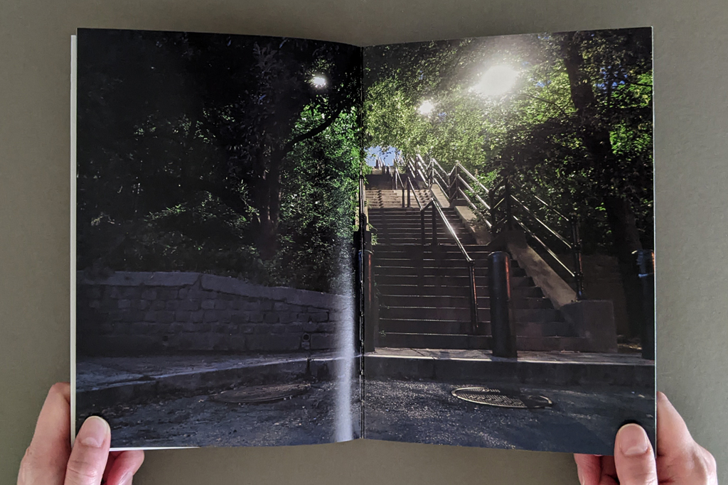
And then the second climax for me is the street alley of stairs that M.O. requested. It’s a place where he and his friends would find some privacy when they were teenagers. He talks about kissing girls. The text is full of emotions in that sense. His grandparents would take him up the stairs to go to church. You climb up the stairs to reach a church, a symbolic heaven… And what I really love is that when you turn the page, and you see his handwritten text, he says, the image is about him becoming a better person. M.O. asked for the picture to be made at night so there is a magical glow, and a certain amount of spirituality. The photograph, to me, becomes about redemption.
LS: The reader immediately recognizes that image of the back door to the courthouse from the front cover, which retroactively complicates whether you are inside or outside. The book draws the reader in, but also keeps them at arm’s length. For example, the contributors’ initials anonymize the person, but also serve as a thumb index, which helps the reader navigate and offers a place of physical contact between the reader and the writer.
CZ: I wanted you to be very aware of the change in voice from one person to another. They are each individuals with unique stories that merit their own space in the book. I hate that I had to reduce them to initials and keep them anonymous. I wish I could use their names, because their names are their identity, and it also would have given the reader a much more concrete description of their ethnic and racial identity — majority persons of color.
But, on the other hand, I also wanted to think of the book as one continuous piece, not just separate thoughts and separate experiences. In some cases, the stories connect pretty well. There are a lot of parallels.
There is one other thing worth mentioning about the design of the book: I started designing a horizontal book, because many of the photographs were horizontal. It allows for more space and more opportunities to juxtapose; I could literally have the diagram on one side and the photograph on the other side, which was very appealing to me. But eventually, when I made a prototype, I just didn’t like that it looked like a photo album. I wanted a smaller object that was a little bit more intimate. And the book was not thick enough. I wanted something that had more of a body to it. It didn’t feel right when I held it in my hands.
A smaller, vertical book, this version, really restricted some of the juxtapositions I was making. Instead these connections were translated into the turning of the page. It kept images separate from each other but the narrative became more dependent on the sequencing of elements.
LS: The page turning strengthens the continuity among the contributors, because they aren’t each isolated onto a single spread. The reader understands that the story continues even as the pages are turned.
That cohesion brings me back to the issue of text, image, and diagram. And not just text, but type and handwriting. So, there are different degrees of indexicality.
CZ: Because I couldn’t include their names, I had to include their handwriting. That’s the connection to their individuality. Also, because many were new to the computer, they were more comfortable writing by hand. On the outside, we have lost our connection to handwriting mostly because of technology, but in prison, they mostly use handwriting. And many of them have a beautiful handwriting. I saw it as a form of personal expression.
On the other hand, I couldn’t use their handwritten pages for the longer narratives. There needed to be some editing, so translating it into typography was more appropriate. Typography also gives the stories a certain amount of authority, less casual. Whereas when they’re giving me a personal note, saying, photograph the starry night, that, to me, had to be handwritten.
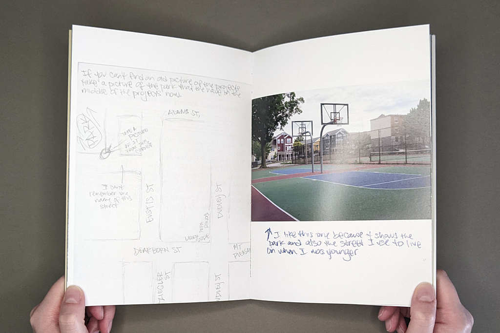
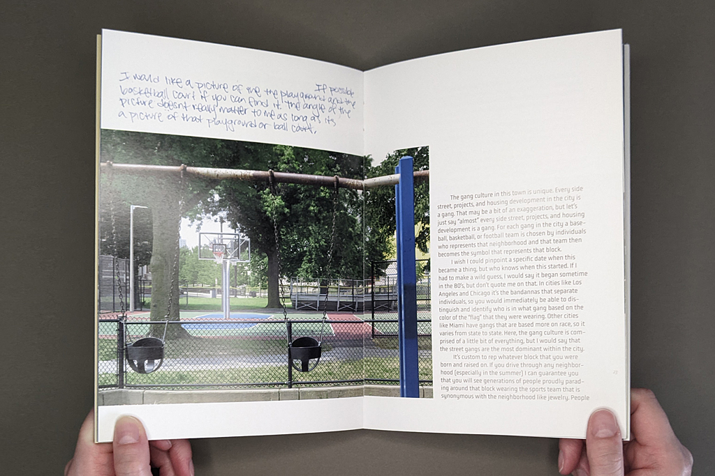
As for the connection between diagrams, photographs, and text, what interests me as an artist are indirect connections, more open ended and abstract links. New meanings come out of that, and the relationships are more interesting. So, for example, there is a photograph of a basketball court and swings in a playground which is coupled with the text of K.W. describing gang culture in his neighborhood. You know, you might associate those swings with childhood, but K.W. was at the playground and part of a gang at the same time. He lost both of his brothers to gang violence, and he himself was incarcerated because of gang violence. In his narrative he talks about neighborhood gangs identifying themselves through sports team logos. There are levels of meaning; the text does not become a caption to the image, and the image isn’t an illustration to the text. That’s really important for me. I am interested in creating new meanings through these combinations, and not simply captioning the photographs.
LS: To whatever degree it’s useful to distinguish between a photobook and an artists’ book, I think these complex relations between text and image are what makes Pictures from the Outside an artists’ book that uses photography, not a photobook. Even disregarding the conceptual way you use photography as a service and as a way of relating to people, which goes beyond a straightforward photobook, those new meanings come through at the semiotic level, between text and image.
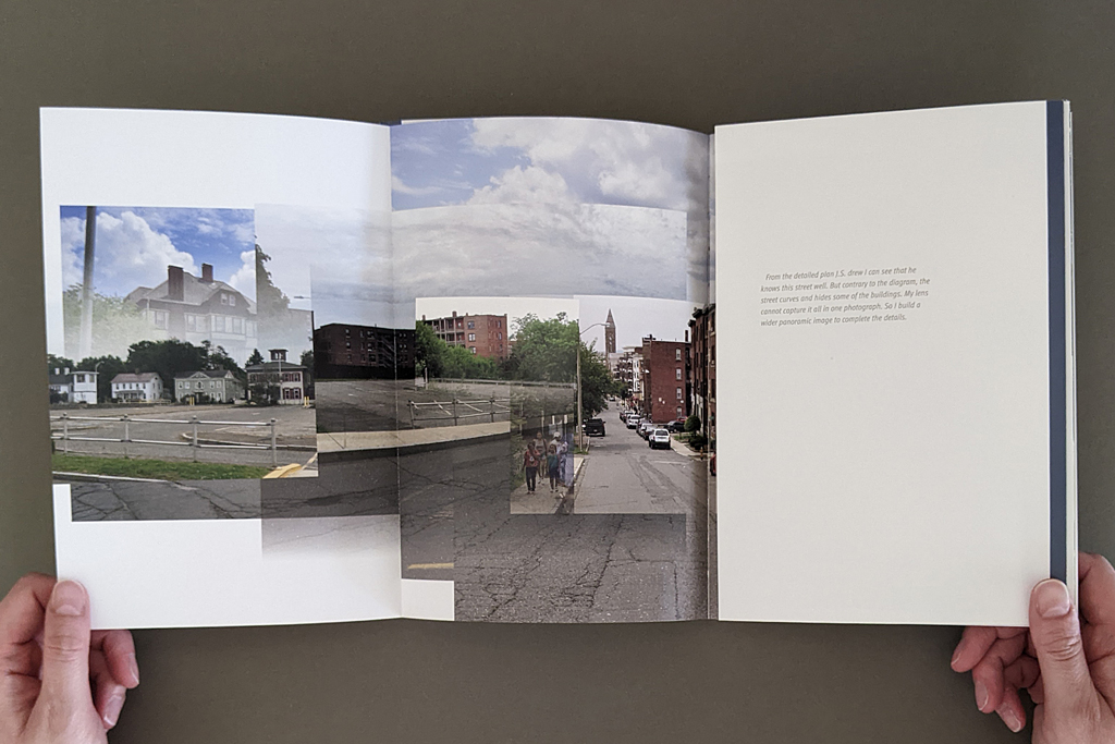
CZ: That’s an interesting observation, I hadn’t made that distinction. There are instances where the photograph is not enough, right? J.S. made a diagram, which is also on the cover. It is of a seemingly very straight street — midway a parking lot, and at the end of the street there is a church — but when I made the photograph it just didn’t all fit into the frame. He’s got a much more diagrammatic way of understanding the space that didn’t translate into my photograph. I wasn’t able to make that work. That’s why I created a photomontage for him, because in this instance I couldn’t capture the distortion of the space and fit everything he wanted to see.
LS: It was thinking about the inadequacy of any of these modes of communication on their own that made me wonder when the book resolved successfully. If photography alone is not enough, and verbal communication is not enough, then the book can combine them. But if it’s about bearing witness to incarceration, or to any one of these individual lives, is even the book adequate? Can text, image, and diagram do that?
CZ: For me, it was important that the photograph, as an object, was the gift. I was able to bring back the photographs into the prison. One book that I really loved — I read it a long time ago — Lewis Hyde’s The Gift. He talks about the art object as a gift that can be disseminated. Art is often part of the money system, right? We need to be able to make a living just as much as any other professional. As a result, you’ve got the gallery system, the fairs, the portfolios, the framing costs, you know — it’s expensive, we are part of an industry. But it’s nice to be able to just simply make an image and give it away.
The photo may or may not be good, but it’s the act of creating that photograph that was more important for me. I had the freedom to move freely; but my students didn’t, so that was my gift to them.
LS: It’s worth saying, though, that these are successful photographic images. Still, there are different materialities with different purposes and audiences. The grayscale laser prints that are shown in facsimile are different from the high-quality full-color printing in the rest of the book. The reader can see how those grayscale prints have been handled and annotated; the exchange is physically present. The finished book has its own tactile quality, which is important to the overall experience. The different materialities seem related to their respective audiences and the type of exchange that you, as the artist, have with each.
CZ: The laser prints are not precious, as objects. But the image is still very significant, because this is the first time that the students saw these places. Like C.M. — that was really the first time he had seen his childhood home in years, and that day he had tears in his eyes, even though I was giving him these shitty laser prints. He had tears in his eyes because those few dots were able to revive a memory from his past life. That laser print was also a way for him to connect to his peers, and share his past. My students had known each other through prison, but now there was a way to say, look, this is where I grew up. This is my home, my bodega, my elementary school, this is where I played football.
It’s just regular office paper. The beauty of it is that you can make notes on it and not feel like you’re destroying it. A lot of what I collected was in writing, because my time with them was very limited. So I used a lot of sticky notes to write down my comments, and they would respond back. The writing between us was very important. These objects are just bridges between us. In art, we give too much importance to the precious object. The laser prints worked just as well.
LS: I was glad you included the laser prints. They distill the idea of publishing, of using print media and text and image to communicate between people. It’s not just the information that’s being conveyed, but there is a negotiation of trust and agency.
Those different levels of communication might be a good segue to my last question, which is about your hopes for the project, and maybe the line between art and activism.
CZ: I have very strong feelings about art and activism. Thirty years ago, when I was in art school, I was interested in connecting my art to activism — partially because in art school I was taught to work in a studio in isolation of the outside world. And I was very uncomfortable with becoming an artist working in a bubble. I wanted to connect to a community, to make art that is relevant. My design skills helped me accomplish projects that would do that, and that’s how I ended up working in the book form. I also wanted to make cheap and accessible art objects, the multiple, that could be distributed and reach an audience outside the art world. I was very committed to that idea.
To some degree I’m still committed to that idea, but as the art world has turned toward political art, I have discovered that I am not interested in making didactic pieces. I don’t think I have any answers to these big problems, so I would never try to make art that says, you know, something direct like, stop smoking cigarettes. Maybe because as a kid, whenever somebody told me not to do something, instead, I would react negatively and do it. That strategy is doomed to fail.
Not knowing the answer is what excites me when I’m making art. If I don’t know the answer, then art becomes a process of discovery.
I have really strong feelings and many, many thoughts about incarceration and the prison system, but I don’t see this book trying to change anybody’s mind about that. Increasingly, I have very strong feelings about education in prison, and its power and limitations. But this book is not about that either. For me, the book is about the process of collaborating with these incarcerated men, to connect with them on a human level, to talk about photography and art, to make a connection to their past. To give them a voice to be creative. And if I could give you a sliver of what it means to be incarcerated, that’s great.
I am not on a crusade. I can do that through different means, not with my art. All art is political, but I don’t believe in didactic art.
LS: The distinction between political art and activist art is important, but sometimes gets lost.
CZ: Persuasive art, to me, parallels advertising, and that’s a complete turn off. So I am very cautious about making that distinction.
LS: Which is related to that aspect of unknowing or discovery. So, I’m wondering if there are ways you learned or evolved or came to understand things differently through this project?
CZ: Many things. From a formal point of view, trying to make twenty to twenty-five unique photographs about buildings, avoiding people, is a challenge, you try to be inventive and photograph them differently. I am not an architectural photographer, so I was focusing more on the environments. And as a book designer, I tried things that I had never tried before. So you’re always evolving in that way.
It’s not just the book; it was the whole experience of collaborating that probably transformed me. It would be too presumptuous for me to know exactly how I changed, but if you are open, you allow yourself to change all the time.
As an artist I have a hard time committing to making art about one issue. The next project I will do is probably something I have never done before. That’s not how the art world works, curators and gallerists want to know that you have a focused voice. I have similar approaches in many of my projects, but I like exploring a lot of ideas.
LS: Collaborating with students seems like an especially good way to learn through the process, to put yourself in the beginner’s mindset. I found myself thinking about photography and its limitations, how images are constructed and how they work on the viewer, and making connections with the visual literacy I teach as an art historian. What better way of “seeing seeing” than translating someone’s verbal description of a mental image through the mediation of a camera, print production, and the book? The project captures so much of what we try to do when we teach visual literacy.
CZ: When we teach, we assign projects, for example, go photograph a building. But the real teaching happens when we critique the work and discuss the nuances. How did you photograph the building? Or are you photographing when the light condition is very low? There are so many other elements that contribute to the meaning of a photograph, and how one reads it emotionally.
That’s what this book taught me. I went back many times to photograph these places. The class took place in June, the majority of the photographs were done in July, and I was back in class in August to bring back the images. That was the last time I saw my students. Later I went back to the sites in the winter to take more pictures under different weather conditions. Then I got a new camera, so I rephotographed the next spring and summer again. If you look at the photographs in the book the seasons keep changing.
I’m growing as an artist, but I don’t know if that’s the focus of the book. It’s not about showcasing my growth — that’s what happens internally when you’re working on a project.
LS: What’s next for the project?
CZ: I guess I would like to place these books in libraries. That’s what’s so great about a book. I could make a show, and it disappears within a month or two. But a book stays.
-
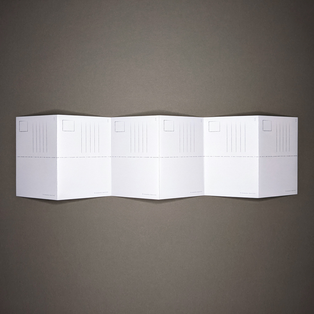
O meu coração bate sem mim
O meu coração bate sem mim
Alexandra Agostinho
Design by Rita Oliveira and production by Isabel Baraona
201923.25 × 6 in. open
Single sheet (6 accordion-folded pages)
4.3125 × 6.25 in. bi-fold paper enclosure with ribbon tie
Digital offset printing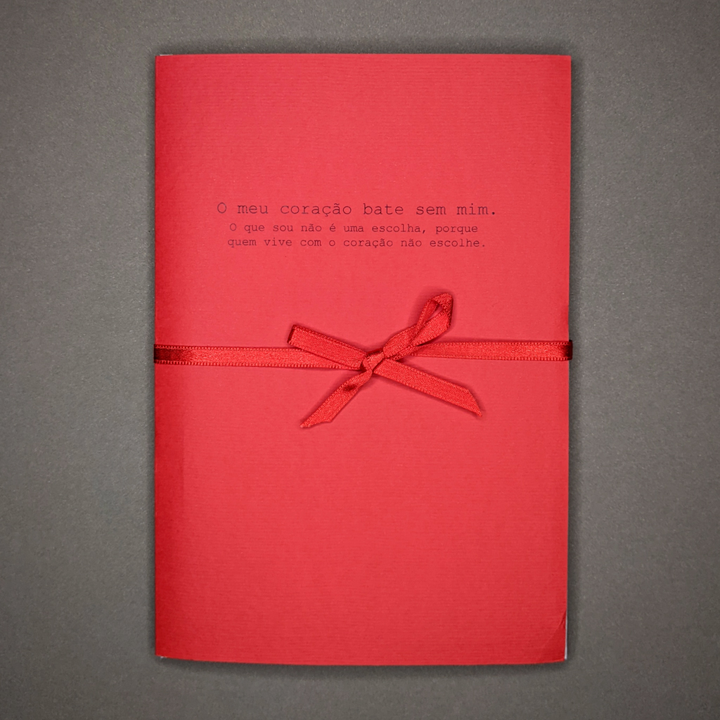
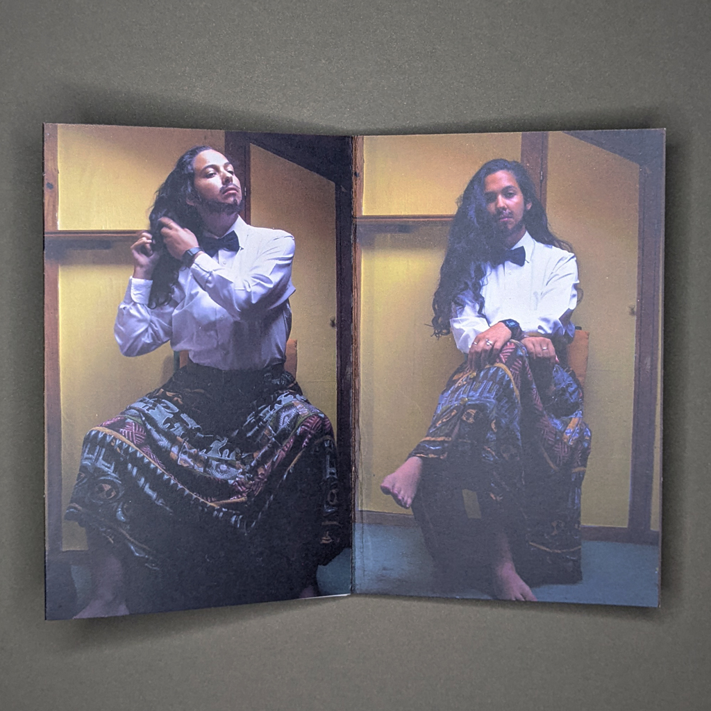
Alexandra Agostinho’s O meu coração bate sem mim is an instance of genderqueer expression that makes gender both a performance and an innate aspect of the person. The book is presented as a wrapped gift, complete with a bright red bow with matching paper as the cover, and the words (translated from the Portuguese), “My heart beats without me. What I am is not a choice, because who lives with the heart does not choose.” Inside the covers is a set of accordion-folded postcards with a series of six photographs of the artist, Alexandra Agostinho, taking their hair out of a bun and letting it settle on their shoulder while staring defiantly into the camera. Unlike other books of postcards, these have no perforation to separate them, and taking them apart would not only disrupt the order of the action in the images, but it would also tear apart the text that runs across the back of them, which is a repetition of the title.
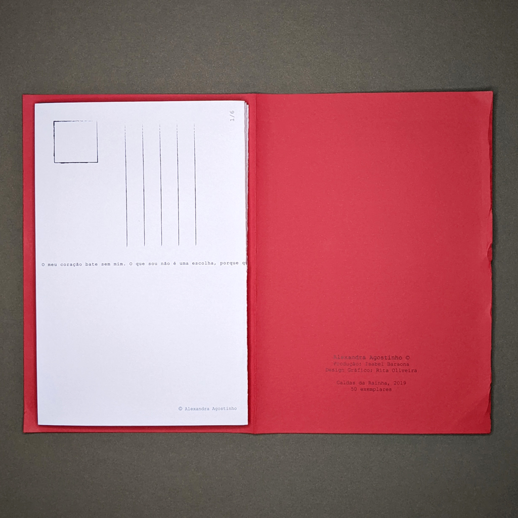
When I first opened this book, already excited by the joyful and passionate red of the cover, I audibly gasped. What I saw was a fellow gender non-conforming artist, complete with long hair and a colorful skirt, and with eyes locked into the camera, they also saw me. Using the common LGBTQ+ pronouncement that love is not a choice, Agostinho takes it further: their entire being, skirt and facial hair and all, is not a chosen mode of expression, but a natural occurrence of letting their heart beat. At a time when queer bodies are heavily politicized and even demonized, O meu coração bate sem mim is a powerful statement of self that refuses to back down.
For a time, I sat with this book trying to impose a performance vs. internal reality dichotomy onto it. Is this performed gender? Is this innate gender? Is it both or neither? I reached out to Agostinho for some background information that would help me read and talk about this work. They were inspired by a work by Ana Mendieta while taking a class about self-representation. During a staged photography session, this series of photos “happened” and they knew they “had to do something with them.” In Agostinho’s words, “The ‘self’ represented is an extent of a ‘self’ I know that exists within me, but I’m not acquainted with yet.” I was surprised that Agostinho expressed any uncertainty about this represented self, as the confidence exuded by their stance stood out to me immediately. Perhaps it’s the eye contact, or maybe the put-togetherness of the bow tie and crisp shirt juxtaposed against the well-loved shoes and bold skirt. I can’t help but read a knowledge of, and comfort with, the self in this book. That may be a deliberate performance, but the statement that the series “happened” implies that this is instead a captured moment of the heart beating without Agostinho’s control.
But in trying to impose the question of performance vs. internal reality that I too struggle against onto this book, I think I’d missed the point. Almost every aspect of this book is non-binary. As an artists’ book in postcards, it is neither in book nor postcard form. The text (which is also the title) along the back doesn’t fit into the boundaries imposed by the postcard setting. Because this series was taken during a planned photoshoot with planned feminine- and masculine-coded aspects, there is necessarily an aspect of performance on top of the natural expression of self. The masculine and the feminine are used together in the photographs in order to render each detail “none of both,” and the change we witness in Agostinho occurs in a single fluid motion.
This fluidity of the self is reflected in Agostinho’s thoughts on gender, which stuck with me as a direct reflection of my own experience: “Gender is a concept I can’t quite wrap my head around. I’m a being that goes through womanhood and is [supposed] to ‘be’ one and is seen as one, but that’s not how I see myself. But I’m still figuring that part out.” As readers, we are also left figuring things out. With very few words and even fewer images, Agostinho has created a nesting doll of themself. Upon opening and removing layers, we are met with that aspect of Agostinho that even they aren’t familiar with. What keeps me returning to this book is not just that feeling of learning a secret about someone or witnessing their vulnerabilities. I am drawn to reopen O meu coração bate sem mim to both see and be seen.
-
本の本の本
Antoine Lefebvre
本の本の本
2021
Antoine Lefebvre Editions21 × 10.5 in. open
48 pages
Perfect-bound softcover
Offset printing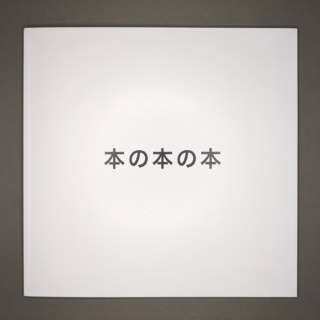
“The idea becomes a machine that makes the art.”
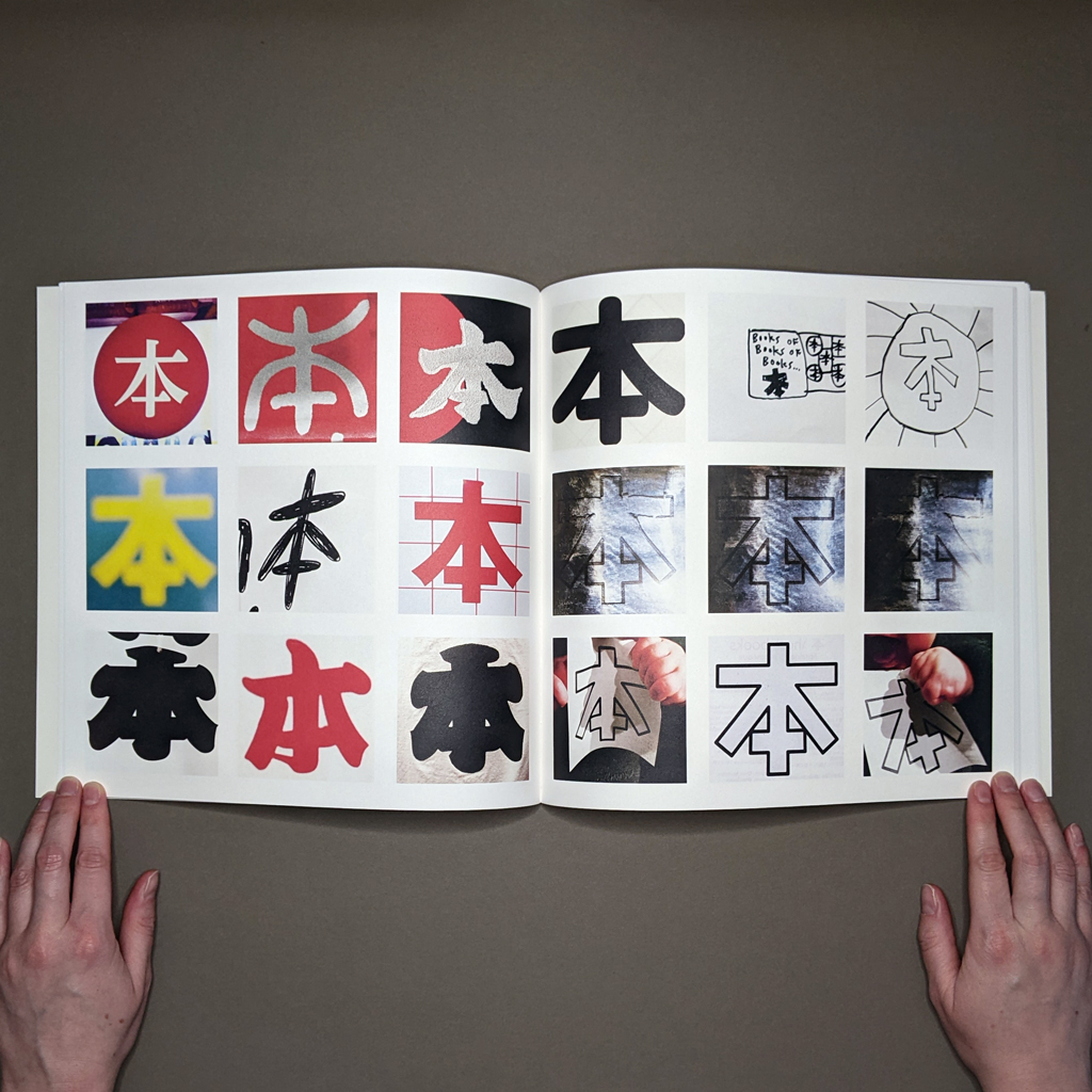
Sol LeWitt, “Paragraphs on Conceptual Art,” Art Forum, 1967.本の本の本 is a conceptual photographic artists’ book stemming from Antoine Lefebvre’s travels to Japan. Each duplex-printed page in the perfect-bound paperback has nine square photographs of the character 本 arranged in a 3 × 3 grid, forming spreads of eighteen images. The sheer variety of snapshots and their context — the materials and spaces where the character 本 appear — slows the reader, who must adjust to each ideogram’s weight, texture, and design. The character 本 is the lens Lefebvre provides the audience to view the idea of a book (which is one meaning of 本). Lefebvre’s thoughtfully crafted experience conveys to the reader that their mentally conceived book may be closer to its material counterpart than initially imagined.
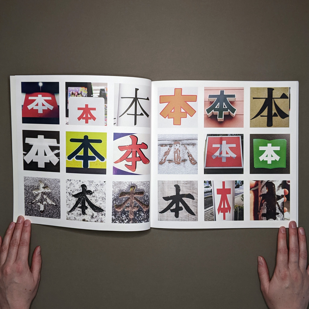
Across a range of media, Lefebvre’s artistic practice constitutes research into our physical relationship with geography. For 本の本の本, Lefebvre’s photographic research began during his initial 2016 residency at the Palais des Paris in Takasaki, Japan. The first one hundred photographs come from this initial work and were first published in a small brochure upon Lefebvre’s return to Paris, while the later series of photographs are from his return to Japan in 2019.
Lefebvre’s photographs are as much about the ideogram and the unseen environment just outside the digital border as they are about their actual content. Their arrangement in a grid is inspired by Sol LeWitt’s Photogrids, who presented the grid’s ubiquity in unexpected contexts. The grid binds Lefebvre’s photographs together but also designates a space for each photograph, like the plots of urban space physically inhabited by the signs and objects Lefebvre has photographed. The quilt-like pattern of each page demonstrates Lefebvre’s skillful layout design, and the multiple, modular use of the 本form makes its perception and reception immediately available to the reader.
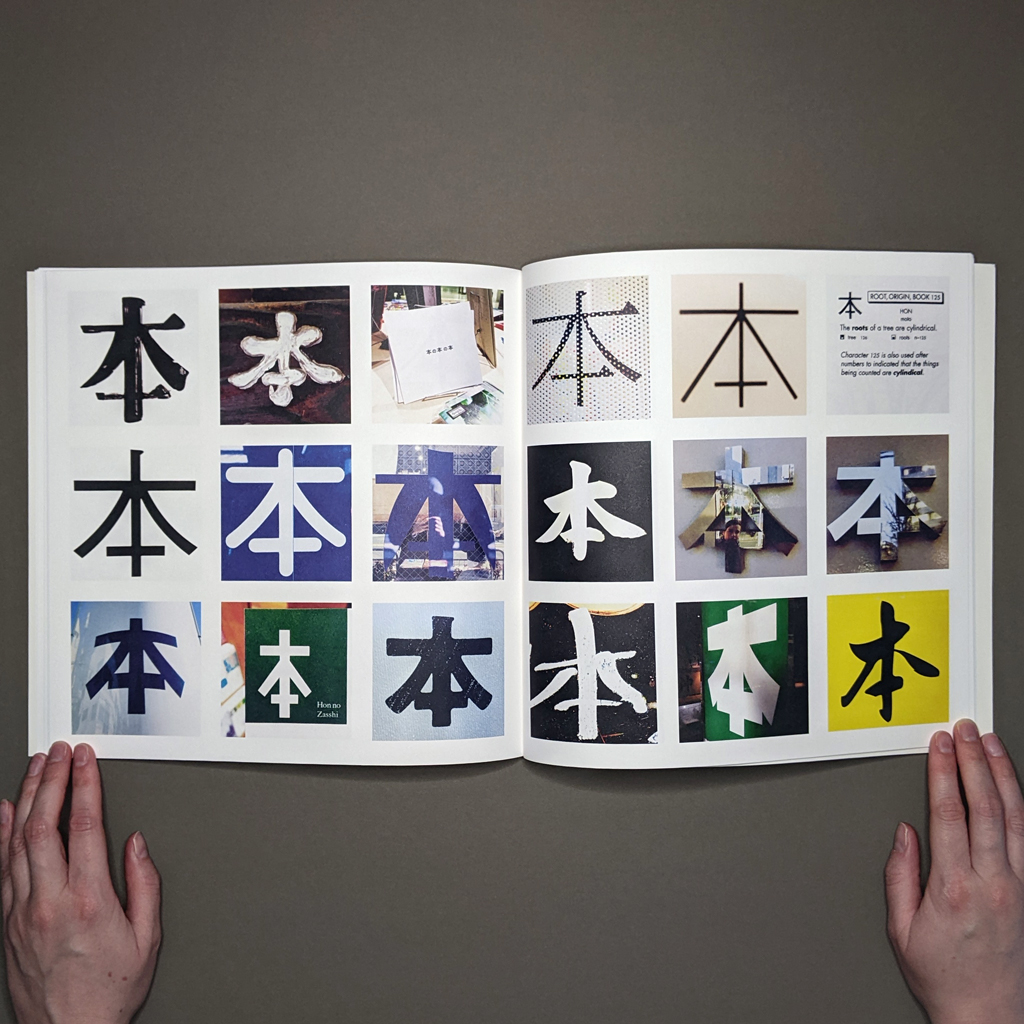
The viewer is aware that each 本 is unique in its color, surface, texture, and materiality; however, the photographs’ uniform, square format eliminates the reader’s sense of each character’s scale. As conceptual art, the photographs are meant to engage with the reader’s thoughts on what a book is as much as appeal to their emotional or visual enjoyment of the photographs. The work’s meaning is found in this conversation between artist, audience, and artwork.
Meaning — and language — are also deeply rooted in culture, and the project statement included in the book does provide helpful context on the multiple meanings of Japanese characters, Kanji, for those who may not be familiar with the language. I have practiced Japanese for a decade, and though I do not claim native proficiency with Japanese, this exposure offers insights into the linguistic and cultural nuances of the characters. By itself, the character 本 means “book,” but it holds numerous additional readings when associated with other Kanji. The interpretation of characters is derived from the context of the sentence. The book’s title playfully engages with this multiplicity of meaning, lightheartedly obfuscating interpretations, and pitting nuance against precise lexical meaning. Read as “Hon no hon no hon,” the title could be translated as “Books of books of books.” However, when we consider one of the alternative interpretations of 本 as the “origin,” the title becomes “The origin of the book of books,” or more concisely, “Origin of books book.” (Admittedly, considering the context, reading the title in any other way aside from “books of books of books” would be an imaginative stretch.)
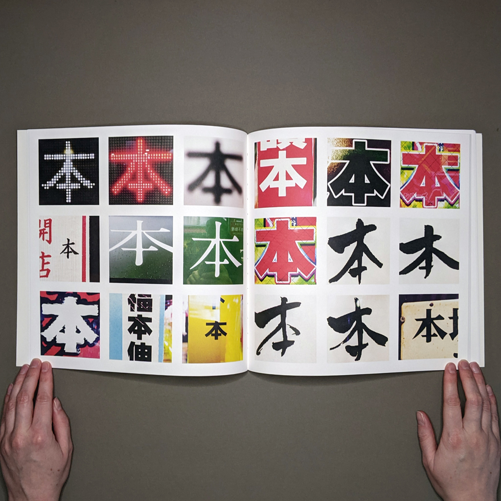
Inside the book, I do worry that Lefebvre’s cropping of the images to focus on 本 may force the artist’s view onto the reader. By cropping the character out of its larger environment, Lefebvre can change the character 本 to mean “book” when originally it did not. For example, one images pairs 日 with本 to form the word for Japan, while in another the character appears on the side of a drink can. However, Lefebvre’s photographs are not intended as a fixed catalog of the character 本. The book’s images and ideas remain susceptible to temporal evolution, mirroring the dynamic interplay between the audience’s interpretation and Lefebvre’s own developing comprehension of his research method. Throughout the book, Lefebvre offers momentary peaks into his process via handwritten notes and photographs of earlier exhibitions.
Lefebvre’s repetitive photographic works diverge from iconography’s conventional commitment to signification. Meaning is simultaneously distinctly multiple and conspicuously absent. Certain depictions of the character 本, especially those characterized by bold geometric forms, assertive graphics, or vibrant colors, invite interpretation through their immediate and visceral impact. Conversely, images that are visually and conceptually more opaque pose greater challenges for viewers to seamlessly correlate geographical space with personal conceptualizations of what constitutes “book.” In these moments, the artist steps back and the reader can wander through these pictorial spaces guided by their interests. Each viewer’s introspection is built from a lifetime of interacting with books, with each viewpoint and inquiry as unique as Lefebvre’s many photographs of 本.
My initial reading of the book was emotionally dry, interested more in the spectacle of each photograph’s logical execution than in uncovering a more subjective meaning just beneath the surface. Over subsequent readings, I considered how Lefebvre’s project readily shifts the audience between reading text and viewing image. Likewise, the book foregrounds two modes of inscription: writing and photography. Then I found myself looking at my bookshelves several times, considering the types of books I have collected, their textures, and how they are a curated library of my personality and current interests.
本の本の本 encourages the reader to consider the cultural complexities of the book — an embodiment of power dynamics, societal structures, and ideological conflicts — through the lens of the character 本. Its exploration of language, culture, and the nuanced meanings of Kanji adds depth to the interplay of text and image, making it a thought-provoking contribution to contemporary artists’ books and Conceptual art. 本の本の本 carries forward the spirit of Conceptual art as an origin in its own right, questioning the essence of the book and offering a profound reevaluation of the familiar.
-
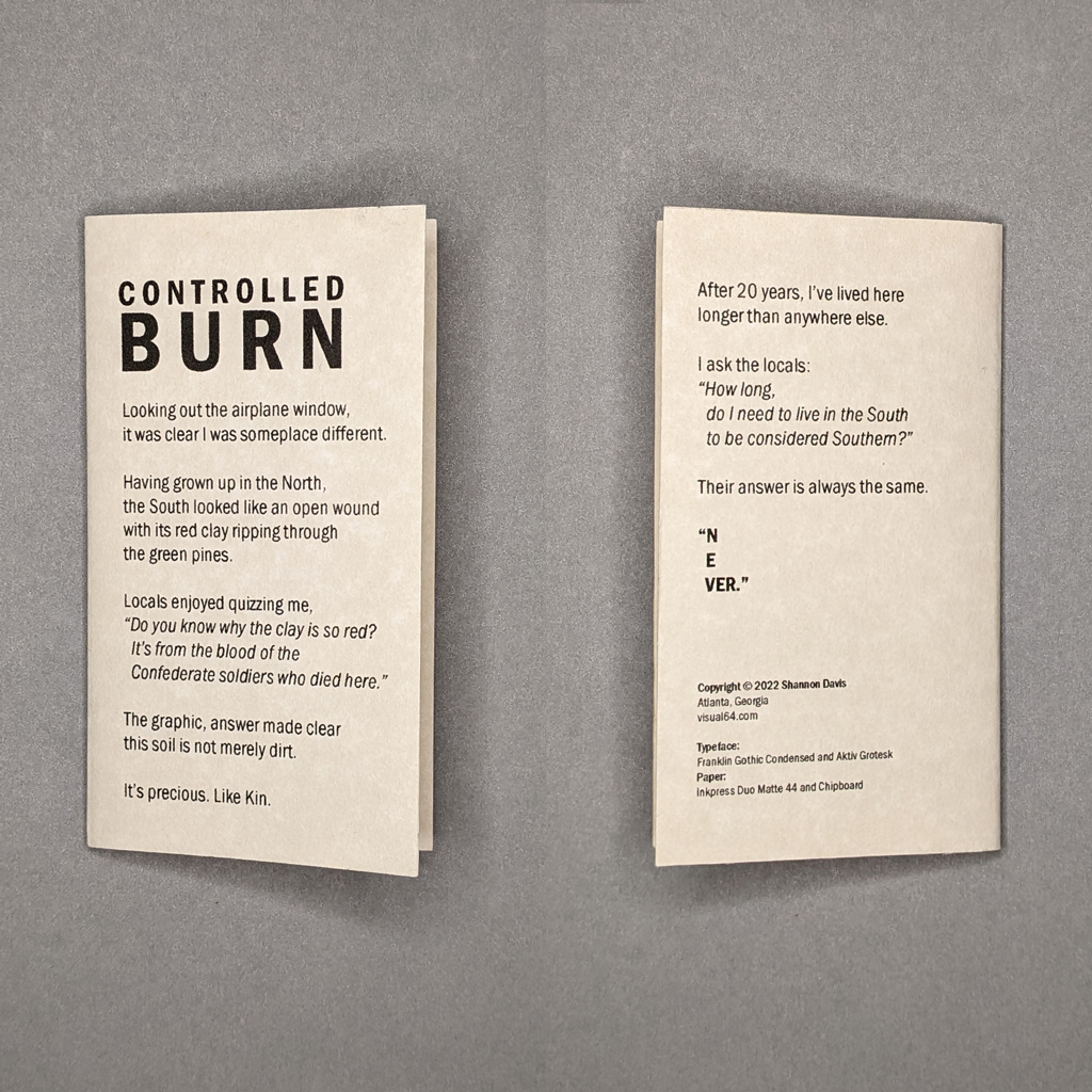
Controlled Burn
Shannon Davis
Controlled Burn
20224.5 × 2.75 × 1.5 in. enclosure
Accordion (4.5 × 25 in.) and 6-page drum-leaf pamphlet (4.5 × 2.5 in.)
Ink jet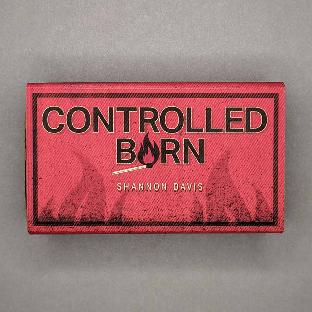
Controlled Burn is a photographic artists’ book drawn from a larger series of photographs. The two-sided, ink jet-printed accordion book is housed in a faux matchbox enclosure made of chipboard and wrapped with printed paper. The photographs, one per panel, are dark and saturated — visually but also figuratively. They are clearly staged and loaded with symbolism, even if the meaning isn’t immediately obvious. The accordion has no text, but Davis includes a small pamphlet with the book’s colophon and a poetic, first-person narrative text. In it, Davis reflects on the impossibility of a Northerner like herself fully assimilating into her chosen home in the US South. After twenty years in the South, but still not feeling at home — literally unheimlich — it is the uncanny that Davis explores in Controlled Burn.
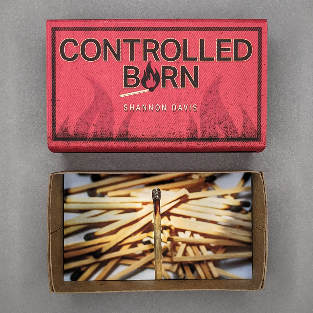
At first glance, the book’s enclosure passes as a matchbox. The hip, vintage-inspired design of the slipcase would make sense for a product that is all but obsolete, and Davis has gone as far as printing false striker strips on the front and back. The bottom tray of the box has an on-laid photograph of a pile of spent matches, with one in focus, as if the reader is holding the burnt matchstick before discarding it with the rest.
The front of the accordion repeats the enclosure’s cover images and includes a folded lip to facilitate easy extraction from the chipboard tray. Pulling on this lip, the reader reveals one horizontal image at a time, the accordion remains in the box until the final fold, thanks to its snug fit. On the reverse, the images are vertical. This simple change in orientation optimizes the reading experience, from the tentative, one-handed unboxing to the subsequent two-handed thumbing and stretching. Even fully extended, the book is easily held at a comfortable reading distance.
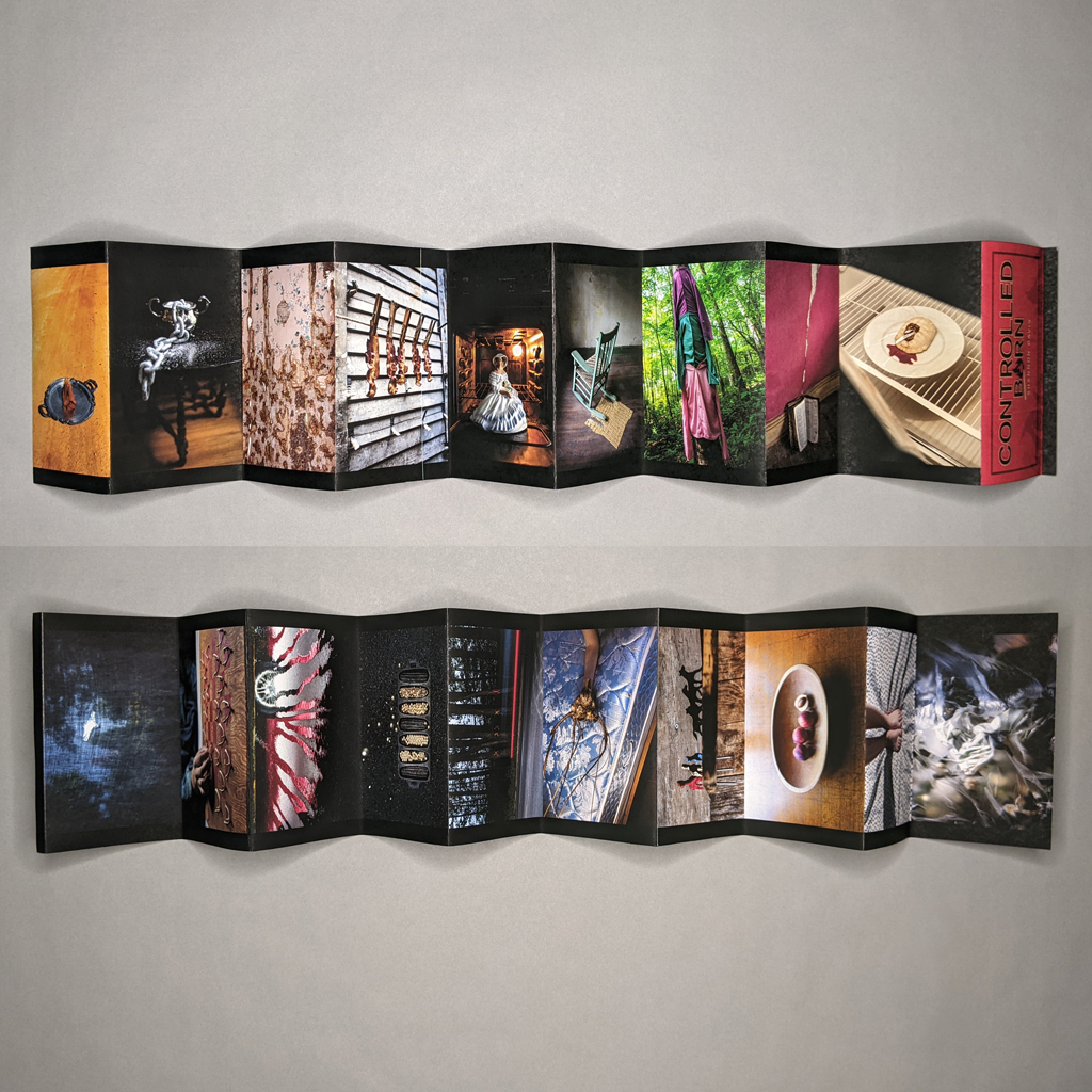
One consequence of this relatively small size (governed, it would seem, by the matchbox) is that the reader must look very closely at the images. Fortunately, the printing is high resolution. The colors are saturated, but the values are dark, and, in many images, a subtle vignetting pulls the eye toward the center. Their small size and shallow depth of field, combined with the black border running along the top and bottom margins, further gives the sense that the photographs are self-contained objects. The reader’s eye is drawn from one to the next not by visual movement or connection, but by compositional elements that echo one another. The book works through juxtaposition more than narrative continuity.
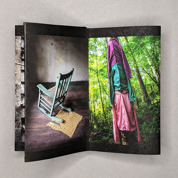
These echoes contribute to the sense of uncanny, the return of the repressed. The images themselves are highly constructed visual metaphors, Southern Gothic meets surrealism. Davis combines unexpected elements, often manmade and natural. A tree is dressed in a column of blouses, their empty sleeves hang eerily and rest on the shoulders of the blouse below. The spindly root ball of a plant seems to grow out of a human arm. Resting on an uncovered mattress, the assemblage looks more like a deer hunter’s taxidermy trophy. The images are almost uniformly unsettling, and their darker connotations creep into those that might otherwise seem neutral.
This overall mood is important, but the images also denote specific messages. If these are visual puns, one is reminded that jokes are the conscious expression of something suppressed. A toy football replaces the pit of a sliced peach (Davis lives in Georgia). An empty rocking chair crunches a carpet of crackers. A clod of earth is served on a silver platter in the middle of a red dirt road. Even as Davis reckons with her outsider status, the reader must rely on their own stereotypes of the US South to make meaning. However, the images are complex enough to remain open ended. And the abject constructions — crushed crackers on the floor or strips of bacon pinned to a clothesline — are at least as visceral as they are cerebral; the pun is rarely the punctum.
The fraught mood is both personal and political. Controlled burn is Davis biting her tongue to get along in the South, and it is also the racial tensions that still simmer just beneath the surface there. (Of course, racism is not uniquely Southern, and the stereotypes Davis plays with are one way that the rest of the country represses its own problematic histories.) Davis references both the personal and political in the pamphlet’s text, but she also notes that controlled burns are protective and restorative; they prevent uncontrolled fires and add nutrients to the soil. What then to make of the spent matches pictured in the book’s enclosure? Are we running out of controlled burns before a bigger fire erupts? Or could these matches catalyze a more fundamental change?
The duality of fire, both destructive and restorative, mirrors the narrator’s own ambivalence. She wants to be accepted by her community, but also wants to change it. Perhaps, then, it is this desire for acceptance that returns in Davis’s uncanny images as much as the repressed history of the South. A related duality plays out in the book, between content and structure. Each photograph forms a stable, coherent scene. Indeed, formal strategies like vignetting ensure that the images remain separate despite the accordion’s physical continuity. At the same time, the visual echoes among the photographs erode their integrity. What seemed wholly separate begin to feel like repeated flares from the same smoldering fire. Ultimately, Davis pitches the connectivity and circularity of the accordion against the autonomy of her carefully constructed photographs.
Controlled Burn is not just a collection of uncanny images. The book is a sophisticated exploration, a visual and material enactment, of a complex psychological experience. The reader is confronted, cerebrally and viscerally, with the desire to belong, the struggle to fit in, the telling of certain stories, and the repression of others.
-
One Star
4 × 6 in. closed
124 pages
Perfect-bound softcover
Digital printing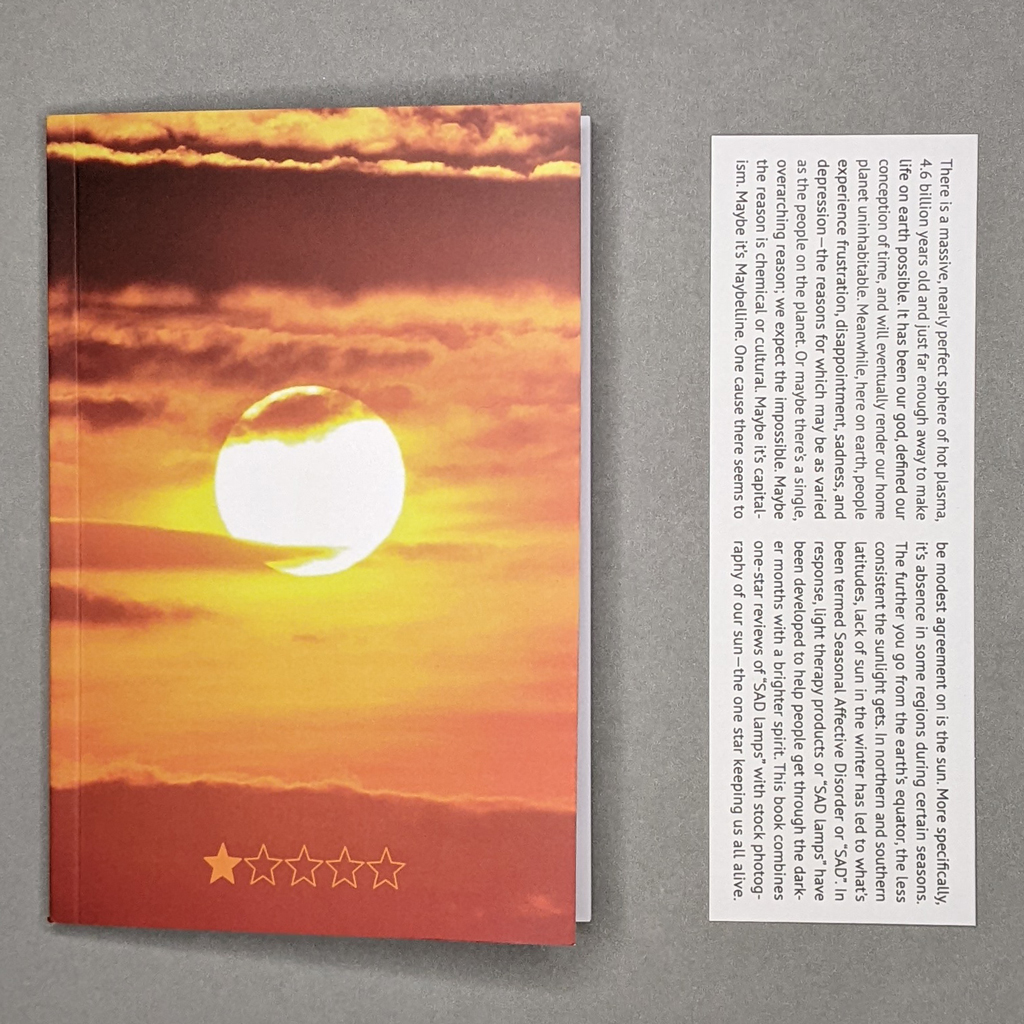
Zak Jensen’s self-published book One Star collects one-star customer reviews of seasonal affective disorder lamps interspersed with stock photographs of the Sun. A bookmark accompanies the book; on one side: the title, edition size, artist’s name, and date of publication; on the other: a preface.
The preface, which attempts to cover a lot of ground on a small surface, functions as an axiom, an interpretive key to reading the book. And since there’s nothing in the book to inform the reader about what’s about to happen, it’s helpful in providing a certain kind of orientation. The last sentence, for instance, clearly states One Star’s contents. Yet, even though the bookmark can be separated from the book, these prefatory remarks may have been better left unstated altogether. As if we may have forgotten, Jensen reminds us that the Sun exists, and that its presence and finiteness mark some of the contingencies informing human life on Earth. His cavalier etiology of depression strikes an overweening tone that undermines the found text in the accompanying book.
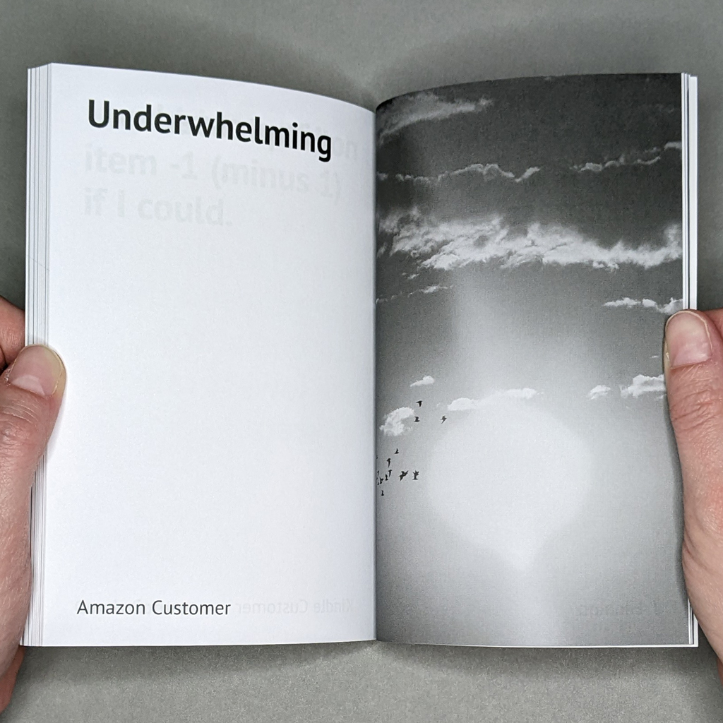
![One Star inside spread. Verso is a grayscale stock photo of the sun above a cloud. Recto reads: “Just regular light. / Amazon Customer”]](https://artistsbookreviewshome.files.wordpress.com/2023/11/pxl_20231126_180106942-square-1024px.jpg?w=1023)
However, there is a book within the book that Jensen has made that deserves attention. Without the bookmark, Jensen’s book becomes a critical act, ironically mobilizing tropes in ways that are at once destructive and moving, turning the world, for a brief moment in time, on its head. That book, on its face, would have appeared to be the same book that Jensen published (and it is): its orange, sherbety cover ablaze with an image of the Sun, setting or rising depending on your perspective, captioned by Amazon’s five-star rating system. The book’s title and Jensen’s name appears on the back cover, a move that generates intrigue when initially encountering the book (an intrigue that is prevented if the bookmark is read first).
What is this One Star? Who would dare review the Sun — and so negatively?
It wouldn’t take long for readers to discover that they’re reading one-star reviews of an object that emits light (the word “lamp” is absent from most of the reviews, but even when it appears, especially in conjunction with images of the Sun, it takes on a more tropological significance). The reviews quickly become jarring and mournful, especially when pictures of the Sun — very typical pictures of it — begin to emerge. It’s as if a taking stock were put in motion, a reminder of all that we have. Whether read as a joke or a eulogy, it would take merely a click, a search, to find the Sun, posted on the world’s largest marketplace by a hundred different sellers, some reputable, some not, and listed on sale for a limited time, sold in pieces, with free delivery, implicitly demonstrating that even as humanity hurtles piecemeal towards extinction the market remains unvanquished.
![One Star inside spread with text on both pages. Verso reads: “Not only does this piece of junk cycle through brightness modes and turn off by itself when you’re using it, but it turns ON by itself! / Laura”. Recto reads: “Stopped Working / It apparently has some kind of short. / Ann Wortham”]](https://artistsbookreviewshome.files.wordpress.com/2023/11/pxl_20231126_180329964-square-1024px.jpg?w=1024)
However, Jensen’s One Star takes a different approach. The Sun is not for sale on Amazon. The book and its bookmark stand beside one another, as near equals. Jensen’s one-star customer reviews remain more literal than figurative, but he uses the Sun as a second (subordinate) object to create a kind of strobe effect that engenders ambiguous interpretations, allowing the reader to apply the reviews to both objects. When a review explicitly refers to a SAD lamp, or when the reviewer blames Chinese manufacturers for a defective product, touting its inferiority, the ambiguity disappears. The best reviews — the most ambiguous — are those which neither name nor blame.
One Star is in conversation with a brief history of books that collect and reframe writing from consumer comments sections. The book would fit squarely, shelved alongside books such as Stephanie Barber’s Night Moves, Cory Arcangel’s Working on My Novel, and Vanessa Place’s You Had To Be There: Rape Jokes (Barber’s Night Moves collects YouTube comments of Bob Seger’s song Night Moves; Arcangel’s Working on My Novel is a Twitter feed that re-tweeted the best posts featuring the phrase “working on my novel”; and Place’s You Had To Be There: Rape Jokes is mostly culled from Reddit). Likewise, One Star uses found writing and reframes it in book form. One Star doesn’t challenge conventional book design, but it is easy to imagine certain reviews (e.g., “DO NOT PURCHASE”; “Trash./Does nothing.”; “Underwhelming”) coupled with an image of the Sun becoming posters for the walls of today’s nihilists.
Jensen’s method of juxtaposing two abject elements — product reviews and stock photographs — to create a new ensemble echoes the situationist tactic of détournement. But One Star seems less interested in interrogating relations of power or in constructing new situations opposed to capital’s spectacle than it is in reproducing those relations to maintain a status quo: the artbook as product.
Jensen risks reproducing the exploitative model of social media platforms, where users produce free content for corporations to sell. Placing the reviewer’s name on the back cover alongside Jensen’s and giving them a cut of the sales of the book they unknowingly helped create could have dispelled one of capitalism’s chief operating metaphors: that people are valuable insofar as they are useful.
One Star is timely. However, it’s impossible to discern the exact time frame during which Jensen gathered these reviews. Dates could help locate the book in history, providing the reader with a sense of where they were — like 9/11 — when the customer complaints were posted. One Star succeeds in recording and documenting the ephemeral existence of people who bought a product, commented on it, and then disappeared.
-
Music of the Uncanny Soundscapes
Neil Majeski
Music of the Uncanny Soundscapes
From the series: The Last State or the Penultimate
20204.5 × 7 in. closed
20 pages
Saddle-stitched, softcover pamphlet
Inkjet and laser[In a departure from the usual Artists’ Book Reviews format, this mini review is part of a series on Neil Majeski’s pamphlet series, The Last State or the Penultimate. The first of these mini reviews covered Majeski’s series as a whole.]
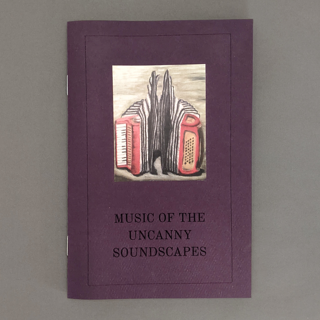
Neil Majeski’s Music of the Uncanny Soundscapes is the last pamphlet I will review from his series, The Last State or the Penultimate. The book fits thematically and stylistically with the others, but its subject matter marks a departure. Whereas the rest of the series centers on images and objects, Music of the Uncanny Soundscapes is about sound and music. It is also, however, about thought and perception. It is about hearing things and seeing things (in both senses): perceiving what is there and imagining what might be.
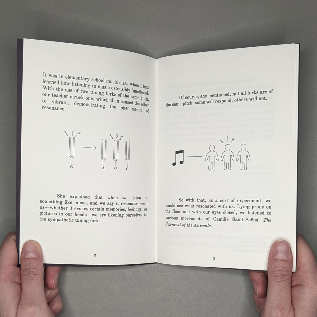
The short pamphlet has four distinct sections, though only the postscript is labeled as such. The first three are different approaches to the theme of resonant frequency. First, Majeski reminisces about an elementary school music lesson wherein tuning forks illustrate resonance scientifically but also metaphorically, as in music resonating with an attuned listener. Next, Majeski comes across a copy of the 1972 book An Individual Note, in which the groundbreaking composer Daphne Oram instead metaphorizes the music listener as a tuned circuit. Illustrated with textbook-style, duotone diagrams, Majeski explains the technical aspects of tuned circuits as well as Oram’s more philosophical musings.
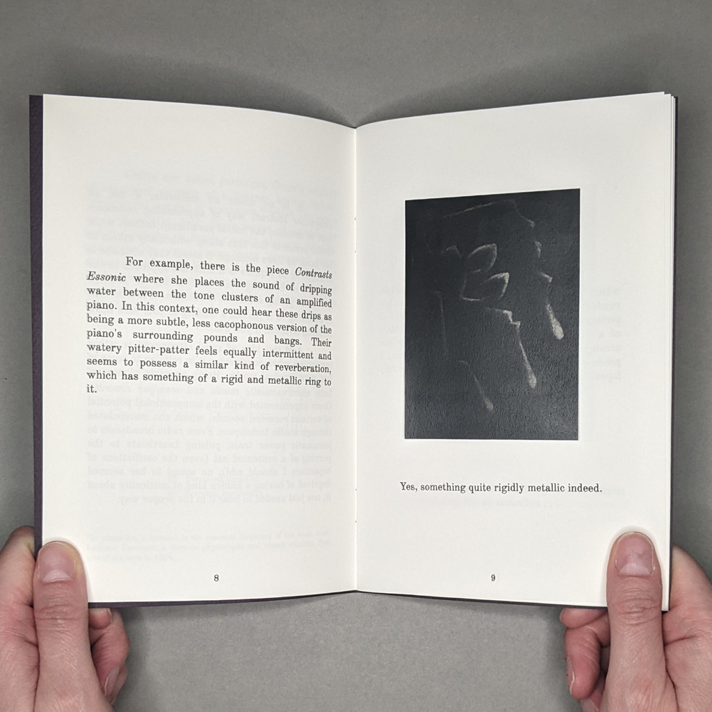
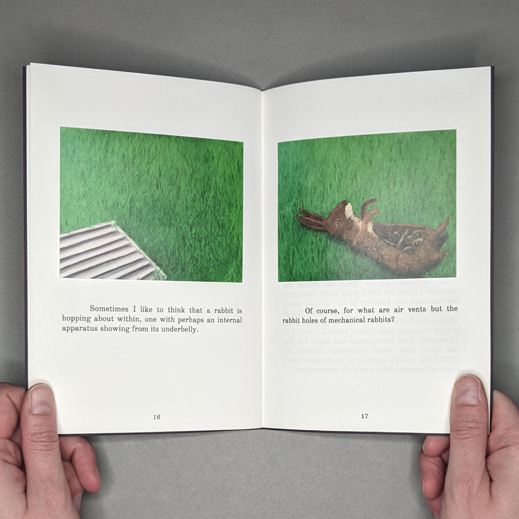
Finally, Majeski turns to an ekphrastic treatment of Oram’s music, leading to the sort of speculative interplay of image, object, and imagination that characterizes The Last State or the Penultimate. Over three pages, Majeski renders Oram’s percussive composition, In a Jazz Style, as a painted accordion that contorts and convulses, then lets out a “harsh, prolonged cry.” Now attuned to the music of everyday sounds (Oram samples dripping water, traffic noise, power tools, and the like), Majeski is free to interpret his own vernacular soundscape. He introduces a particular air vent near his home, whose grimy grating in the tipped-in photograph is at odds with his appeal to the reader to place their ear against the metal. To Majeski, the vent’s metallic pounding evokes a mechanical rabbit in the ductwork, all of which is duly illustrated on the following pages.
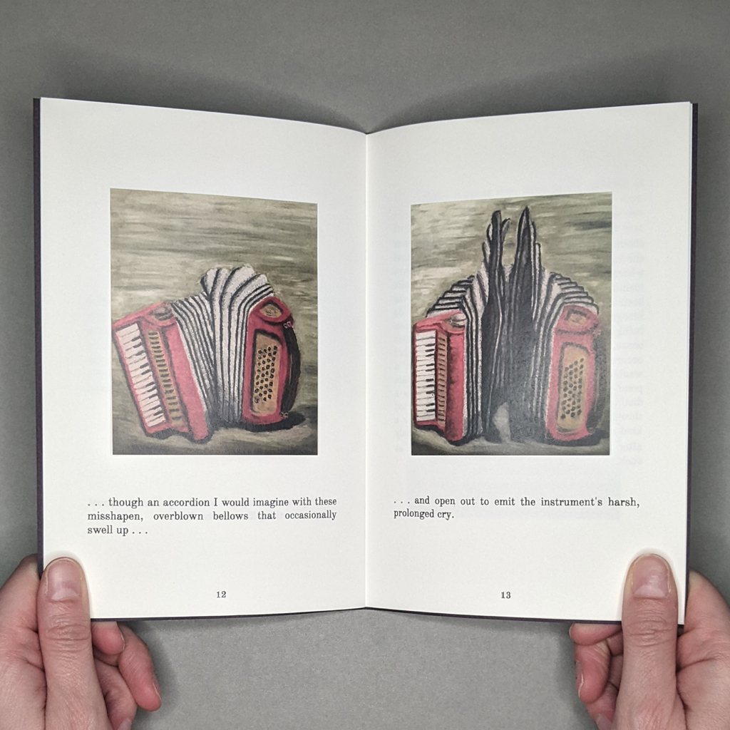
From the poetic attunement of the young music listener to the absurd image of a mechanical rabbit, the subject of Music of the Uncanny Soundscapes might be analogical thinking itself. Majeski’s abstract visualization of Oram’s composition Contrasts Essonic is a reminder that music is a metaphorical, not mimetic, art. Even the book’s seemingly literal illustrations reveal the limits of mimesis. Beneath a painting of an accordion, a line of text reads: “In many ways, I would say that it almost sounds something like an accordion….” Majeski’s qualifications — almost and something like — are moot, because even a perfectly accurate painting of an accordion tells nothing of its sound. The following page continues: “…though an accordion I would imagine with these misshapen, overblown bellows that occasionally swell up….” The painted accordion above this line is physically distorted, but the ambiguous word choice is telling — are the overblown bellows a part of the instrument, or are these sonic bellows swelling up, leading to the harsh cry on the following page? If music cannot represent like visual art, neither can visual art fully represent music. Sometimes hearing things and seeing things means imagining them.
In the postscript, Majeski returns to tuning forks, summarizing Oram’s discussion of nineteenth-century experiments by Rudolph Koenig. In these experiments, Koenig used a resonator to alter the pitch of a tuning fork. Subtly raising the pitch of the resonator (the receiver) caused the frequency of the fork (the transmitter) to decrease, and vice versa. The agency of objects is a major theme throughout Majeski’s series, and the notion of attunement rather than attention implies a reconfiguration of the sensing subject to accommodate the object. In fact, my review of Curious Details in Postcards questioned just how much agency the reader has in the face of a book’s careful manipulation of image, text, and sequence. Yet, Music of the Uncanny Soundscapes offers a rejoinder: the receiver also influences the transmitter.
-
Curious Details in Postcards
Neil Majeski
Curious Details in Postcards
From the series: The Last State or the Penultimate
20214.5 × 7 in. closed
24 pages
Saddle-stitched, softcover pamphlet
Inkjet and laser[In a departure from the usual Artists’ Book Reviews format, this mini review is part of a series on Neil Majeski’s pamphlet series, The Last State or the Penultimate. The first of these mini reviews covered Majeski’s series as a whole.]
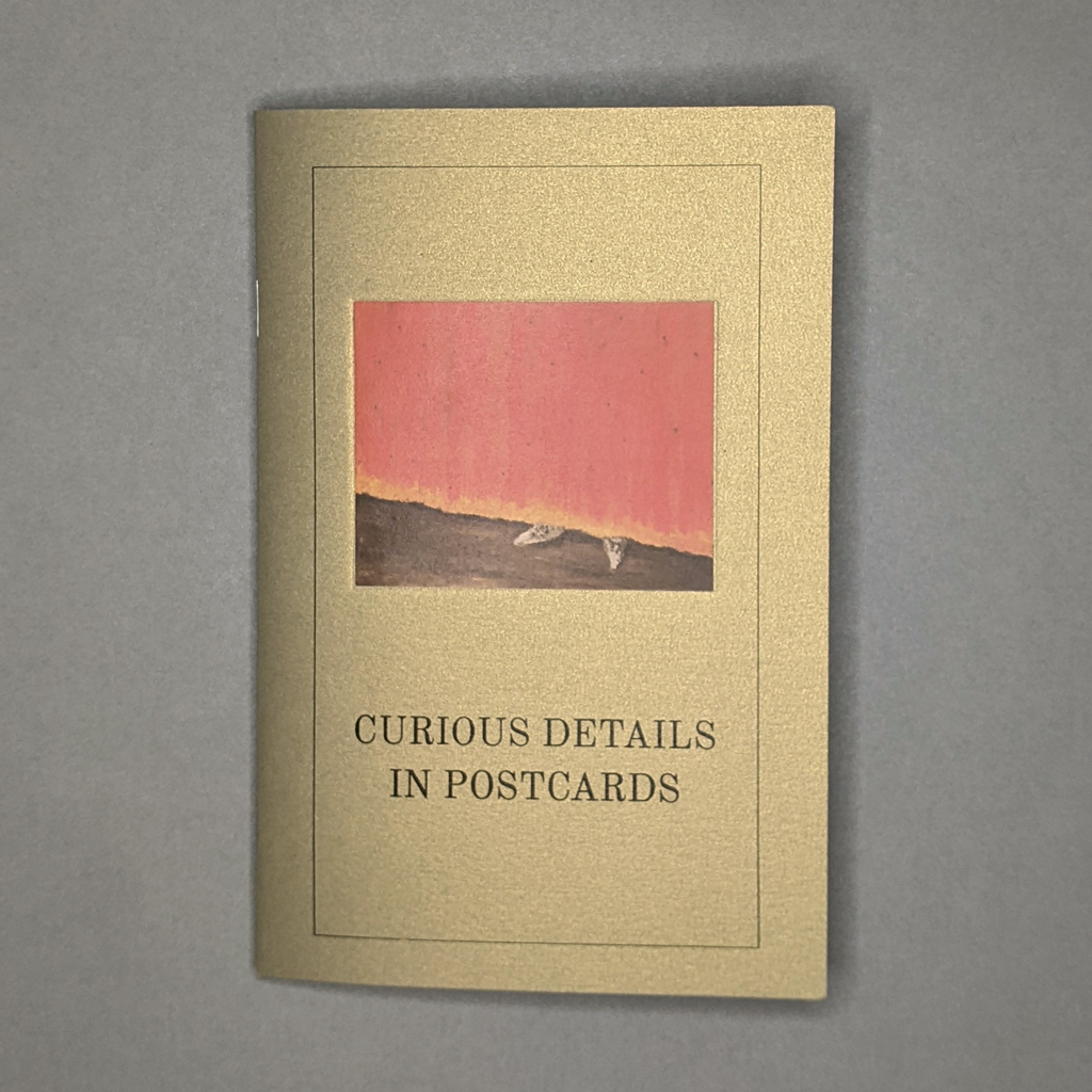
Of all the pamphlets in Neil Majeski’s series, The Last State or the Penultimate, Curious Details in Postcards strikes me as the most distinct. Published two years after the previous title, The Perverse Doilies, this fourth pamphlet approaches similar themes from new directions. It is also the most lavishly illustrated, with twenty-four color illustrations tipped in on as many pages. The sparkly gold cover paper seems suitably opulent, but the book’s subject matter, as with the rest of the series, is humble. Majeski takes the reader on a tour through a few vintage postcards, no doubt from estate sales and antique stores. If the rest of the series explores the power objects can exert, Curious Details in Postcards grapples with the relative agency of authors and readers.
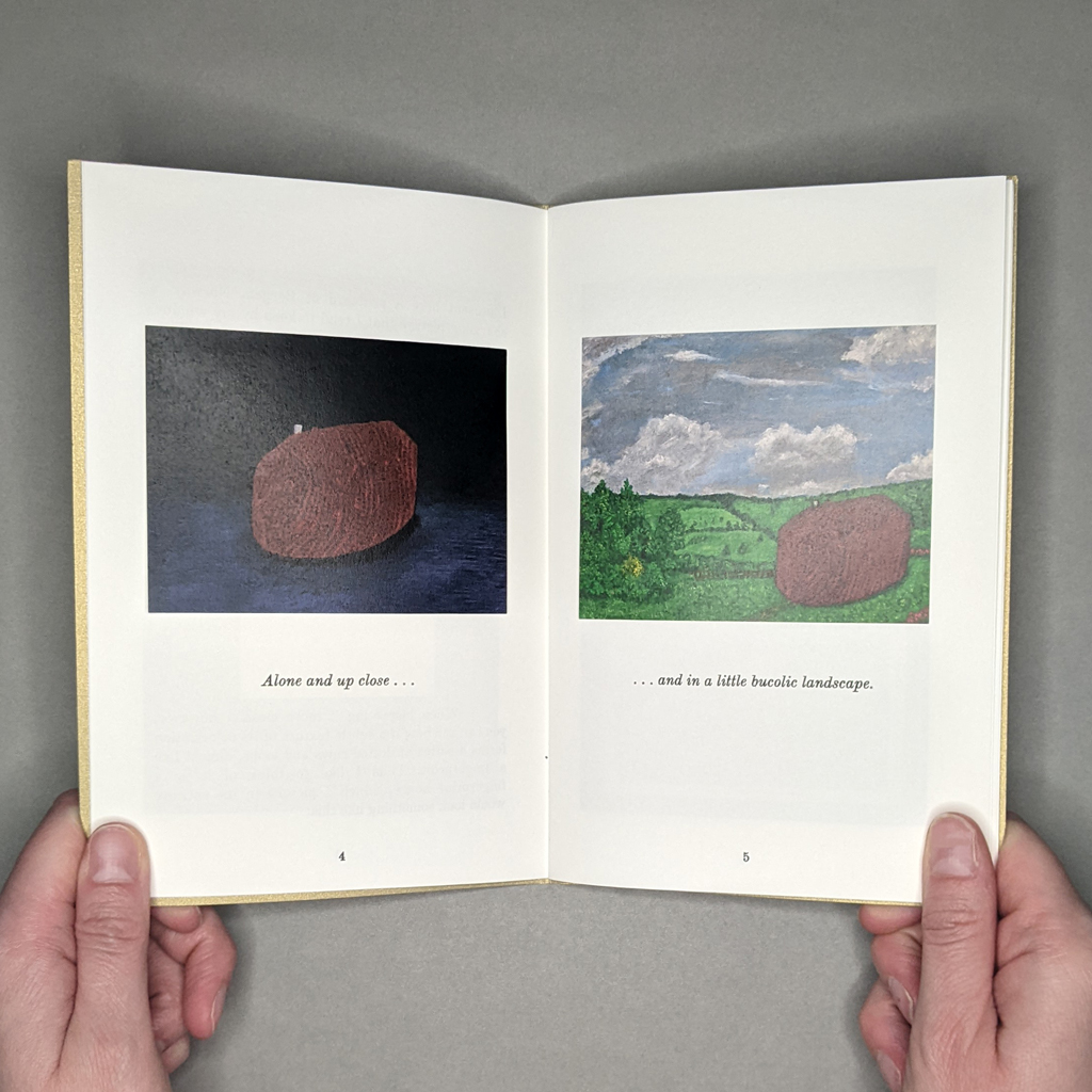
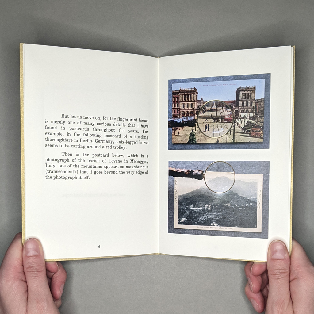
Majeski remains interested in the dialogue between object, image, and imagination, but Curious Details in Postcards puts the emphasis on images and imagination. He transports details from postcards into paintings, tracing his train of thought for the reader. He speculatively completes a house that is partly hidden behind other buildings, then imagines it into a bucolic landscape of his own design. He adds a humanoid face to a stalagmite to better demonstrate its animalistic form. Yet, even as the book’s text and image render free flowing ideas, Majeski reminds us that postcards are objects as well as images. In fact, some of the details he points out result from the postcards’ photomechanical production processes.
This attention to mediation, which is present throughout the series, is taken up with a new strategy in Curious Details in Postcards. Many of the illustrations tipped into the pamphlet are photographed through a magnifying glass. Majeski could simply scan the postcards at a high resolution and crop the enlarged details, but he chooses to show us the act of his (and our own) looking. These images remind the reader that looking is always interpretive, and Majeski’s text is accordingly rife with qualifications.
The subjective, if not unreliable, narrator walks the reader through each postcard in real time, as if the two are looking at the image together: “And this one I shall make a bit fun….” But just as he leaves the reader searching for a man hidden in a photograph of an apparently empty banquet hall, Majeski turns his attention to another matter entirely: a 1952 Met Museum catalogue of miniature paintings, English Paintings in the Huntington Gallery. In fact, the pamphlet on postcards sports a cover image from this second half, where Majeski is instead preoccupied with the pointy little shoes poking out beneath the floor-length dresses of various viscountesses.
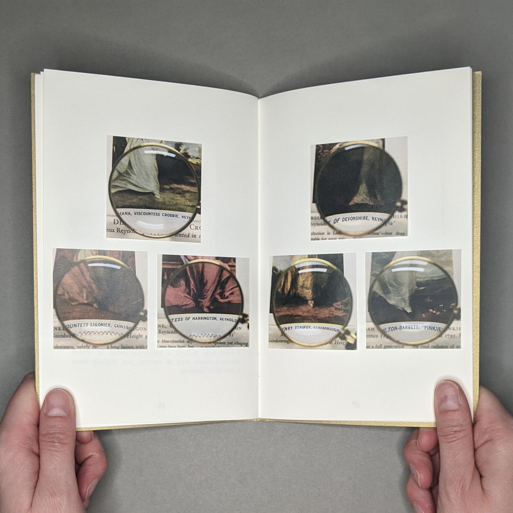
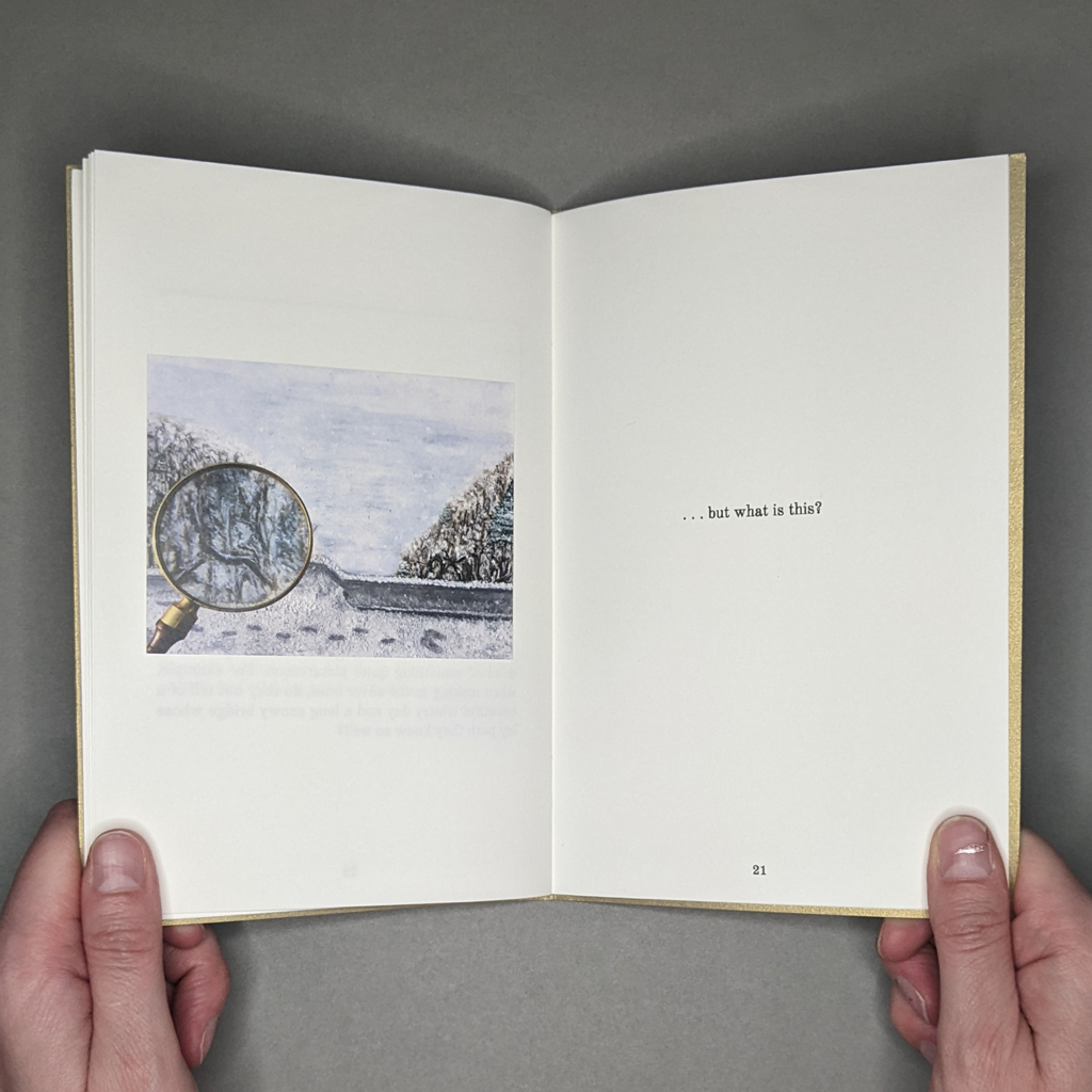
Six magnified feet, cropped out from their context, are arrayed across a two-page spread with an almost obsessive, fetishistic quality. The reader is suddenly aware of who is holding the magnifying glass and the camera. Majeski is not the painter, though; he has merely revealed an existing typology. In sharing his newfound interest, he mediates a strange dialogue between his readers and the original painters, patrons, and viewers.
By way of conclusion, Majeski’s mind wanders back to his postcards and imagined landscapes. He leaves us with a magnified view of his own painting — “…but what is this?” The rhetorical question is not just an exhortation to look closely, but a genuine expression of the curiosity that runs throughout The Last State or the Penultimate. By continuing to look and ask questions, Majeski seems to learn as much about himself as the cultures that produced his postcards and miniature paintings.
I thought about saying that the reader learns as much about themselves as Majeski, the postcards, and the paintings — it would have made a tidy end to this review — but the reality is more complex. Even as Majeski tells us to look closely, he orchestrates every aspect of what we see and read: sequence, juxtapositions, size, cropping, and so on. Furthermore, the real-time narration resists the reader’s ability to peruse the images in whatever order they please. Therefore, Curious Details in Postcards is, like Majeski’s paintings, ultimately a material rendering of his own thinking, a negotiation between object, image, and imagination. The fact that Majeski can delightfully subvert the reader’s expectations in such a short book, much less one that is part of a series, shows his firm command of the medium.
-
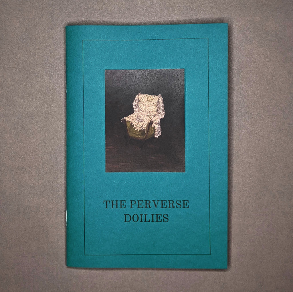
The Perverse Doilies
Neil Majeski
The Perverse Doilies
From the series: The Last State or the Penultimate
20194.5 × 7 in. closed
20 pages
Saddle-stitched, softcover pamphlet
Inkjet and laser[In a departure from the usual Artists’ Book Reviews format, this mini review is part of a series on Neil Majeski’s pamphlet series, The Last State or the Penultimate. The first of these mini reviews covered Majeski’s series as a whole.]
The Perverse Doilies begins, like much of Majeski’s work, in an antique shop. However, the pamphlet begins not with the eponymous doilies but with a mystery object. Leaving that mystery unsolved, Majeski tops the object with a gyroscope and dubs his readymade the “Telecommunic Spacecutter” before continuing on with a reflection on André Breton’s encounter, in Nadja, with a similarly elusive object at a flea market. Majeski includes photographs of both his and Breton’s mystery cylinders. Presumably the reader could identify Majeski’s object, and maybe Breton’s, but that is beside the point. Majeski wants to know what Breton means when he calls his object “perverse — at least in the sense I give to the word and which I prefer.” This sense of perversity is present throughout the Last State or the Penultimate series, though its connotations always shown, never told. It manifests in Majeski’s subtle manipulation of the tensions between narrative and non-narrative, between text and image, and among media, from photography and painting to the book itself.
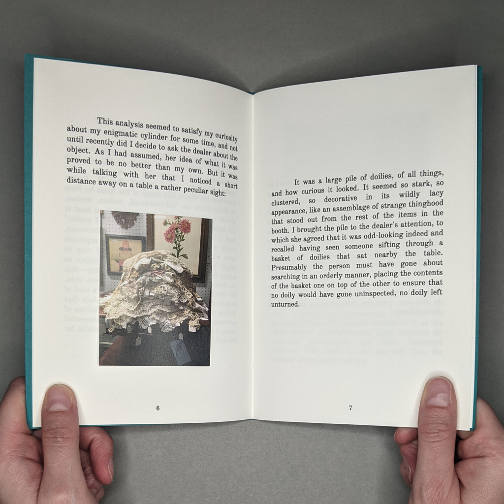
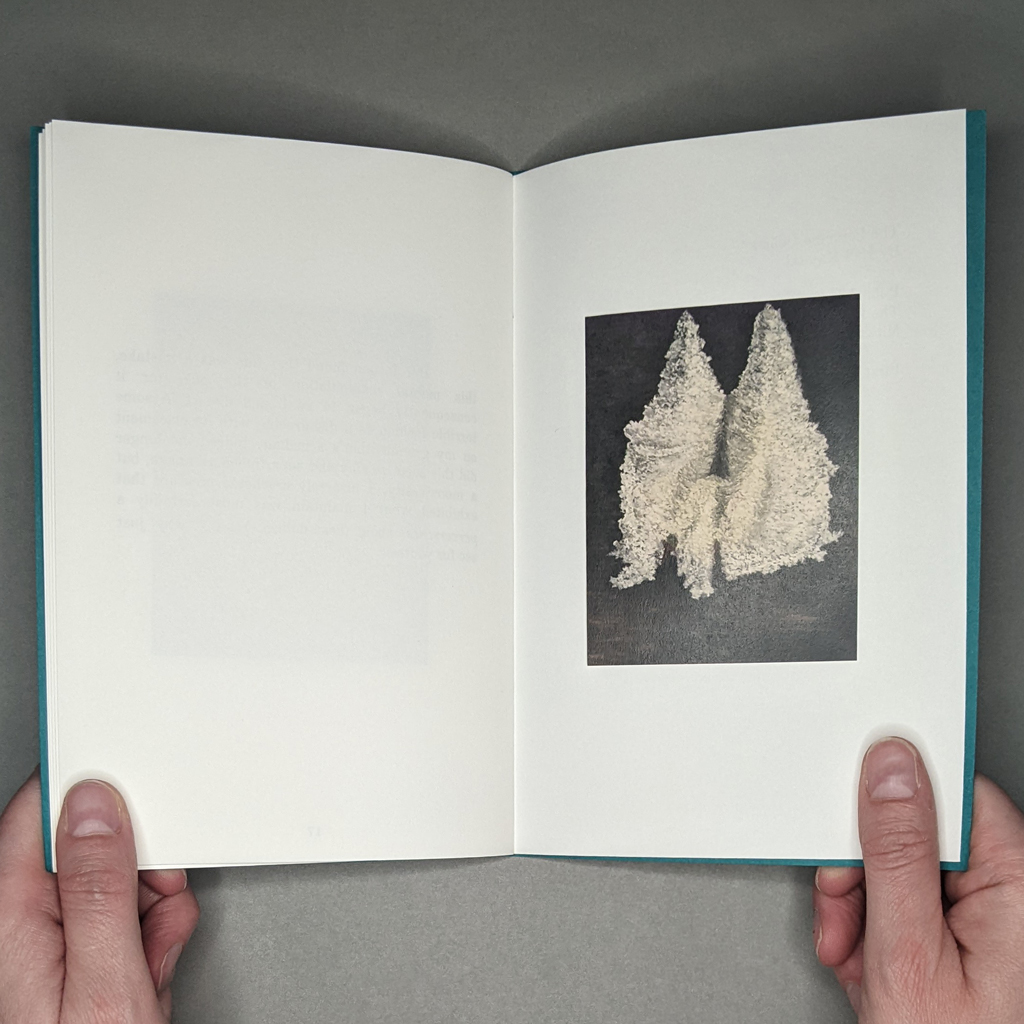
What is perverse is not merely outside norms or expectations, it is willfully so. A perverse object, then, has some sort of agency. Enter the doilies. Majeski finds the doilies, piled in an “assemblage of strange thinghood” in the same shop, just after his mystery object. Struck, he confers with the antique dealer, who believes a customer must have emptied the doilies from a basket and piled them one by one. This hardly dispels the sense of agency. If anything, the urge to examine dozens of doilies illustrates the power they exert. Even in the accompanying photograph, the doilies have an impressive visual presence. They slump into a monumental mass of macrame and lace from which numerous price tags dangle, suggesting the individual objects that comprise the assembly.
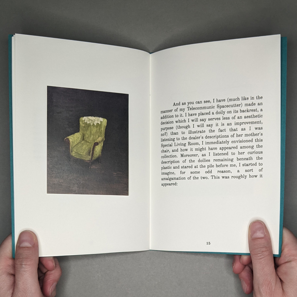
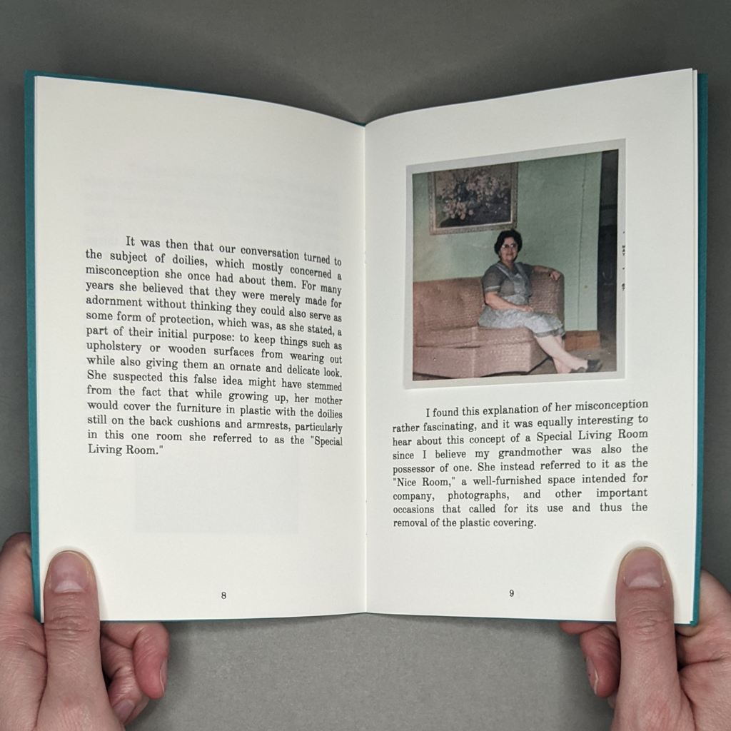
From doilies, which are designed in part to protect surfaces, the conversation turns to the plastic-wrapped living rooms of the antique dealer’s mother and Majeski’s grandmother, respectively. Hearing the antique dealer describe redundant doilies under the protective plastic in her mother’s “Special Living Room,” Majeski mentally transplants these into his grandmother’s “Nice Room.” Mentally and materially, since he illustrates the transformation in paint: a green armchair without and then, with the turn of the page, sporting a doily. By enlisting the reader to transform the armchair, the book’s interactivity enhances the move from mental to material.
The transformation also cleverly collapses temporalities, as Majeski does throughout the pamphlet series. He shares two photographs of his grandmother’s Nice Room, but both are from before his time (the room was decommissioned before he ever visited). The chair outlasted the Nice Room, and now survives in Majeski’s memory. As a mental artifact, he can manipulate it instantly: “And as you can see, I have…made an addition to it. I have placed a doily on its backrest….” But this instantaneous transformation is a feature of the codex, the turn of the page. In fact, Majeski’s mental exercises are in tension with his chosen medium of paint, with its evident materiality and presumed slowness. The book form makes a coherent narrative out of the disparate durations of photographs and paintings, memories and imaginings.
It is hard to say whether Majeski’s imagination or the objects themselves are the catalyst of that narrative. He mentally merges the armchair’s doily with a plastic cover, creating “a monster, a bizarrely crocheted creature,” which he renders for the reader in paint. With the turn of the page, the chair is completely engulfed. The perverse doily creeps beyond the outline of the chair, an amorphous mass with a gaping maw (though perhaps this last detail is the work of my own imagination). The text ends here; the painting is punctuated by an empty verso across the gutter.
If the book continued, no doubt a tangle of macrame would escape the borders of the next composition. I am reminded of the Sorcerer’s Apprentice in Fantasia, where an army bewitched brooms runs amuck, endlessly replicating and mindlessly repeating the task Micky Mouse has set for them. Or Strega Nona, where Big Anthony nearly buries his village in an avalanche of pasta. Majeski’s fairy tale ends before the master returns to restore order — or perhaps the doilies are in charge. The perverse doilies certainly exhibit a willful disregard for expectations, but there is an equally powerful, albeit less fantastical, lesson about the agency of objects. Majeski writes that his grandmother’s Nice Room “fell into disuse, becoming less of a living room than a kind of lifeless space full of fancy, preserved furniture.” This is the phenomenon at the center of The Perverse Doilies. The mid-century vogue for protective plastic and formal dining rooms may have passed, but it is not hard to see how — to invoke one more pop culture reference, this time Fight Club — “the things you own end up owning you.”
-
You are the star
8.5 × 11.5 in. closed
70 pages with several 4 × 6 in. photographs inserted
3-ring binding with acrylic covers
Ink jet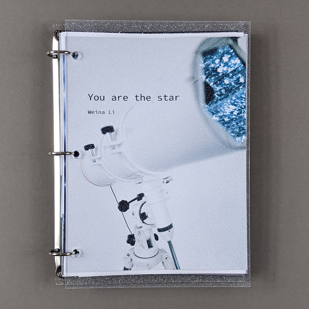
You are the star presents Weina Li’s art practice, but it is more than a portfolio; it is a work of art in its own right. The book is bound with a three-ring binder mechanism and clear acrylic covers impregnated with glitter. Inside a variety of coated and uncoated photo papers, colored cardstock, and transparent mylar support inkjet-printed text and image. A number of 4 × 6 in. photographs are interspersed, each hanging tenuously from a single binder ring. These snapshots slow the reader down, as do longer sheets with folded fore-edges. The sheer variety of materials also slows the reader, who must adjust to the weight, texture, and drape of each page. By thoughtfully crafting an elaborate, engaging experience, Li conveys to the reader the heart of her installations. That means You are the star grapples with big, existential questions.
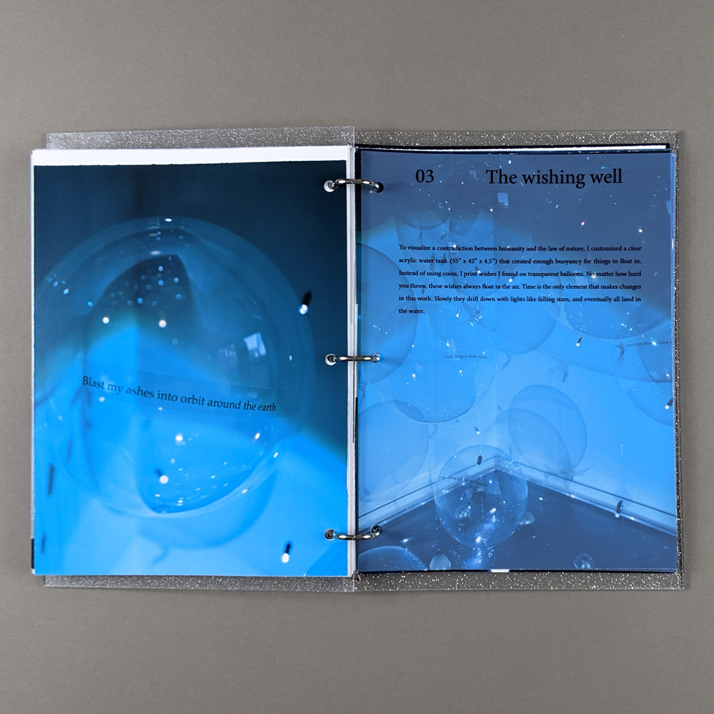
The book is divided into three roughly equal sections based on three recent bodies of work: You are the star/distance between us; Glorious my eyes have seen; and The Wishing Well. Each section retains the distinct look and feel of these projects, but the book lends further cohesion to Li’s consistent visual vocabulary. In You are the star/distance between us, Li contemplates her place in the cosmos via stargazing. Facing the vast unknowability of the universe, she paradoxically finds a universal connection with others in the radical aloneness of the human experience. Poetic, personal reflections mix with descriptions of the eponymous installation, in which participants gaze at one another through a kaleidoscopic, two-way telescope with pinpoint fiber optic lights. Glorious my eyes have seen instead employs a microscope, allowing participants to scrutinize tiny fragments of Emily Dickinson’s poetry. Li questions how language limits our understanding of the world. The Wishing Well addresses the age-old desire to change the world with language. Li borrows wishes from online, virtual wishing wells and floats the text on translucent balloons in a tank of water.

These brief descriptions are incomplete and inadequate, but that is the point. Li shows that language, whether visual or verbal, cannot communicate completely. But where ordinary language, even — or perhaps especially — scientific language, falls short, poetry can get closer. So, Li examines mediation itself: mirrors and lenses, projectors and screens. You are the star does the same with its transparent, reflective pages, and further deconstructs the medium of the book with its clear covers and conspicuous binding.
The book-as-mirror helps Li cast the reader into her existentialist introspection (the reader, after all, is the “you” in the title). Already self-aware thanks to the haptic reading experience, the reader is quite literally reflected in the glossy pages of the book. Seeing my white, male face projected over Li’s raised questions about identity and positionality that the book leaves unanswered — but what more would the reader expect when Li writes “You see, this story isn’t about me … You are the one participating in this unsolved mystery — The character of this story.”?
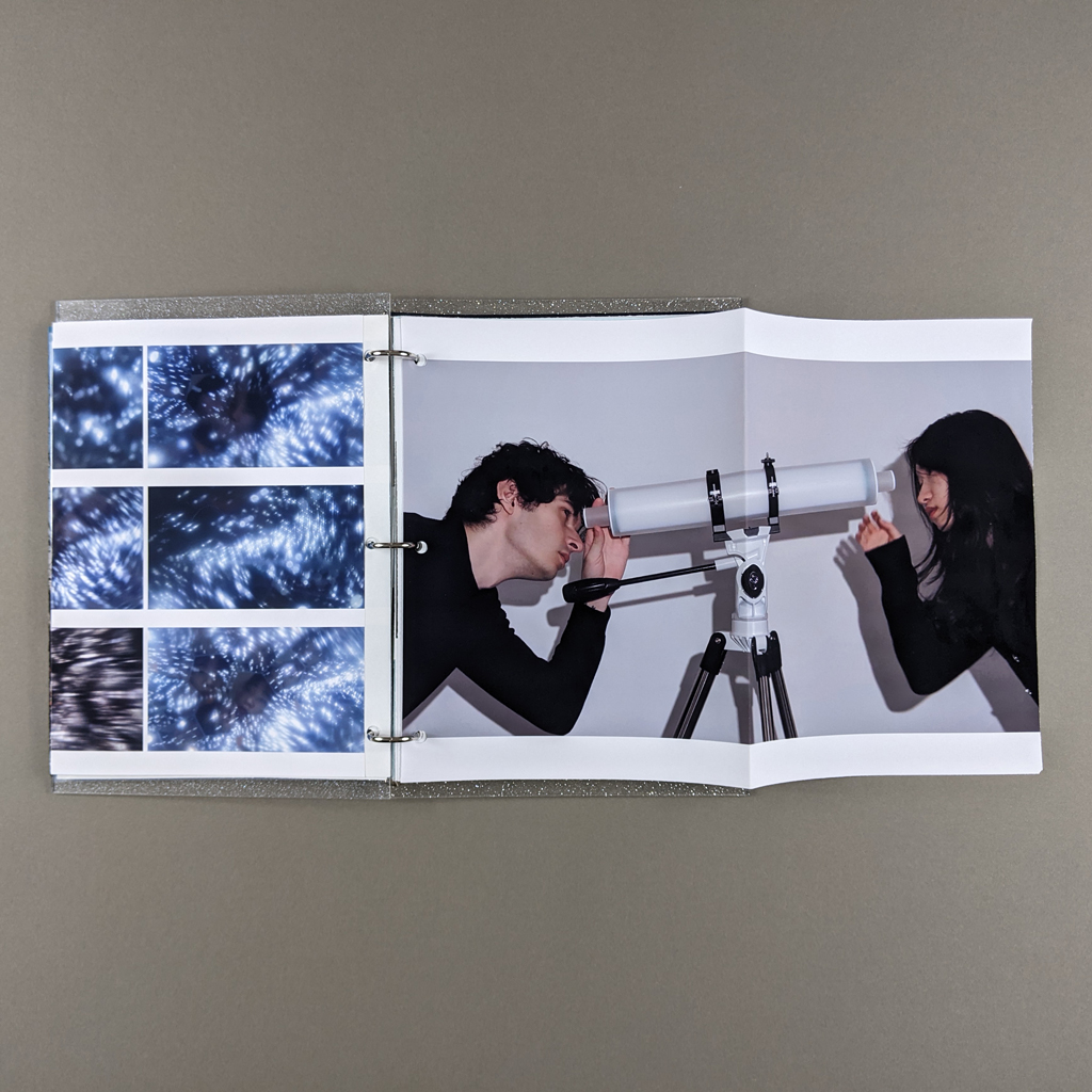
This process of discovery asks more of the reader than the passive projection of their gaze. Most obviously, features like the interspersed snapshots and longer folded sheets require increased attention. The folded sheets could simply be turned from recto to verso, but the curious reader who unfolds these pages is rewarded by their clever design. In one, a photograph of Li’s two-way telescope is folded down the middle, separating the figure on the left from the figure in the right. By opening the page, the reader joins the two people together. Another fold separates an image of Li looking through a microscope from a close-up of what she sees. Unfolding the sheet reveals a single scene: the close-up is a computer screen on the same table as the microscope.
Such moments are part of a broader strategy to remix existing artworks into new statements. Many of Li’s installations include text, and she deftly weaves together writing from the installations with writing about them. In some cases, Li uses the book form to frame a single word or passage. Across from a blank white verso, a close-up of a single balloon from The Wishing Well is all the more effective: “God, forgive all my mistakes.” Elsewhere, the book offers more holistic access to Li’s installations. These overviews could risk merely documenting existing work, but You are the star is more of a manifesto than an artist’s statement. It helps that Li’s descriptive writing is rarely didactic. Instead, she leaves absurd gaps between what she does and why, comically combining philosophical and technical language: “To visualize a contradiction between humanity and the law of nature, I customized a clear acrylic water tank (55” x 42” x 4.5”) that created enough buoyancy for things to float in.” The book remains a unified expression that transcends the projects within it.
Perhaps the book triumphs because, even when it comes to presenting her own art practice, Li seems skeptical of direct communication. You are the star mirrors, magnifies, and distorts her installations just as her installations mediate the natural world. If each reader receives a different message, however, it is not only a matter of mediation. Uncertainty lies in the message as well as the medium. Li’s art is about discovery and experimentation rather than settled conclusions. The questions are big, and the answers are few. Despite its careful sequencing and high-quality printing, You are the star retains the vitality of an artist gathering her thoughts in a binder.
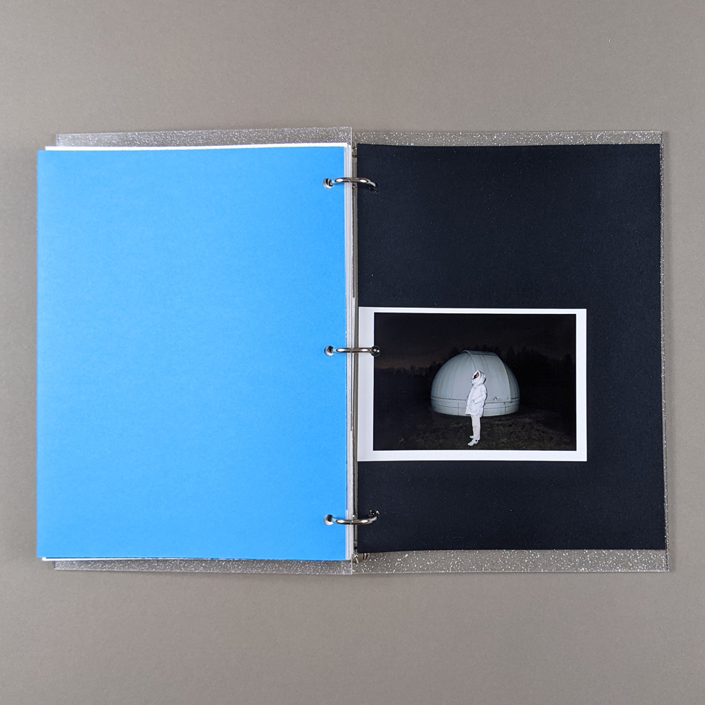
If Li remains uncertain about our ability to understand the universe or connect with one another, You are the star leaves me more optimistic. The book’s exploration of existential loneliness is undeniably affective, paradoxically proving art’s potential to connect people. It is because we are unable to perfectly communicate our thoughts and feelings with ordinary language that art is necessary, or indeed possible. You are the star shares a good deal about Li’s art, but more importantly, it conveys her uncertainty, curiosity, longing, and hope.
